#55: Quick access to fave notes

clip_image002

A few themes have re-appeared on Tip of the Week over the years … saving time by using keyboard shortcuts, finding useful but somewhat hidden bits of Windows or Office apps, etc. One of the most prominent seams to mine, however, has been an undying for Onay-no-tay.

The UX Paradox of Office Apps

Usability research into Office applications once found that 87%* of the new features users asked for, were already in the product – they just didn’t know how to find them. As more and more features were added to apps – Excel particularly, it seems – end-users just didn’t know how to “discover” them. By Office 2000, dynamic “intelli-menus” basically hid options which were more obscure or which an individual just didn’t use, and while it made things look simpler and less cluttered, it made the problem worse.

A wholescale UX rethink in Office begat the “Ribbon”, which is now pervasive in other apps; if you’re interested in such things, check out Jensen Harris’ 2008 presentation on what led to the Ribbon being conceived. The talk offers a great historical perspective but also goes over the thought processes on how these things come about.

* statistic is made up but the story holds true. Who cares if facts and figures are correct as long as the lies are well presented? How do you think Excel charts and PowerBI got so successful?

Not Just Another Toolbar

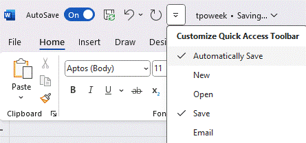
Even with the Ribbon to make things more ordered, sometimes it’s good to be able to jump straight to a feature you use commonly; the customizable Quick Access Toolbar on the top left of many apps gives you the ability to pin certain commands, and can be an invaluable way of getting to functions you like without delving into Ribbon tabs and menus.

clip_image004

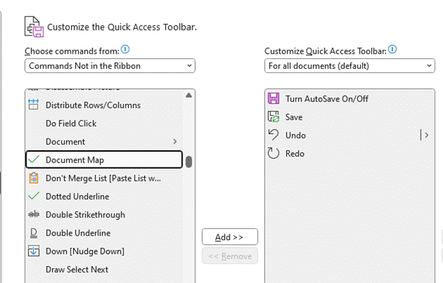
Click the down-arrow to the right of the toolbar and you can pick from a set of suggested functions, or by customizing it, you can delve into any part of the extensive menus and pin just that one feature there. There are commands which are not even on the Ribbon, but you could pin them to the QAT if you like them…

clip_image006

The QAT is present in Word, Excel, PowerPoint, Access, Outlook (classic) – but not New Outlook, to some users’ chagrin. It’s not uncommon to find a similar UI feature in 3rd party apps from the mid-2010s.

OneNote Favo(u)rites (again)

New Testament Tip of the Week #39 covered saving Favourites in OneNote: #39: OneNote Shortcuts, Favourites and Pins. Despite some of the guff being taken up with browser and mobile favourites, the good stuff in that tip was in (once again) recommending the fantastic OneTastic.

clip_image008

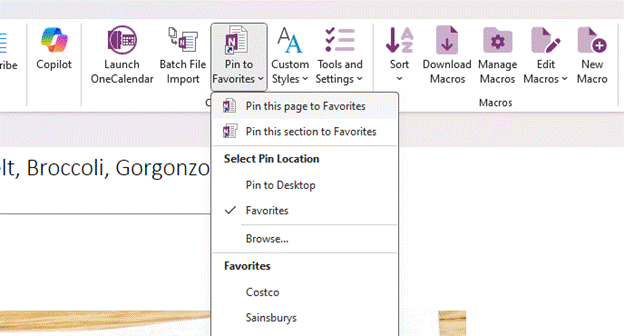
As well as providing an extensive macro capability, the OneTastic addin lets you pin a page or section to “Favorites”, and you can later go back to the same menu used to manage the pining, in order to access your previously pinned pages.

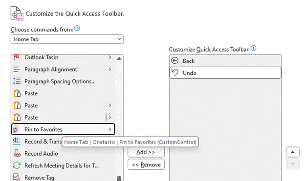
For extra goodness, try customizing the QAT and looking for Pin to Favorites…

clip_image002

Select it, click Add >> and hit OK. Now you’ll be able to access the drop-down for Favorites right there from the top left corner…

clip_image004[4]

Happy Friday!

#16: All about dat font

Typography and the use of lettersets and fonts was the preserve of (mostly) men working in the printing industry, until the invention of the laser printer alongside DTP and word processing software brought to the masses that ability to have 20 different fonts in all the sizes you like in a single document.

Historically, using lots of fonts, sizes and weights might have been a way of attracting attention – look at the 1843 poster which was the inspiration for John Lennon to write “Being for the Benefit of Mr Kite” as one example …

Mr_Kite_-_Full_Color_Photo (Custom) (1)

… but these days, simplicity and consistency is generally preferred.

For a fascinating diversion into modern history, check out Jock Kinnear and Margaret Calvert’s seminal work on the UK’s motorway signage. Most people wouldn’t give it a second thought, but carefully designing the font and the layout of the signs to be employed in the late 1950s was a central part of the rollout of the new motorway network.

To test how legible signs might be at speed, an assembled group of volunteers sat on a platform at RAF Benson airfield while sample signs were driven past on the roof of a car. The thinking was that if you’re travelling as fast as 60mph, you won’t have time to read the words on a sign, instead relying on their shape – so the consistency of capitalization, the tail of the g and the stem of the h in Birmingham become second nature to the driver.

clip_image004

For more font-related history, check out Simon Garfield’s surprisingly engaging Just My Type.

Back to the present

Typeface trends tend to be a dating mechanism; Times New Roman looks very mid-1990s, whereas cool kids would use a sans serif default like Arial. Microsoft switched to using the newly designed Calibri for Office 2007, moving from a default font whose primary purpose was to look good in print to one which was specifically designed to be readable on screen. Similarly, the Segoe font family took a leading role as the default font for Microsoft logos and in the UI of many apps.

Incidentally, if you want to try a font out to see how it looks in a large block of text, you can enter =lorem(nnn) onto a new line in Word, and it will generate nnn paragraphs of the ‘lorem ipsum’ cod Latin gobbledygook to fill your pages up. Or you could go to Copilot or ChatGPT and ask it to write a 1,000 word essay for you

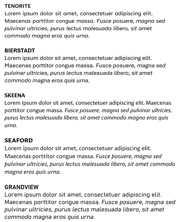
Well, Calibri’s default-ness has been under threat for a few years – Microsoft announced its intent to switch and outlined several new fonts which might be the default. Last year, it announced the decision to switch Calibri to a newly-named font called Aptos, previously known as Bierstadt.

clip_image006

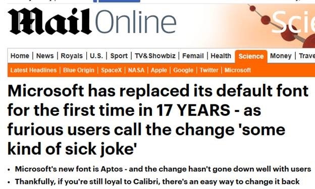
After a period of testing for preview customers, the switch has now been flicked and M365 users will see Aptos as their default. Cue some amusing anthropomorphism of the fonts’ particular characters and histrionic headlines from the usual clickbait foundries.

clip_image008

687 – Loop de Loop

clip_image001Sometimes, new application paradigms disrupt the old ways of doing things – like real time messaging could sometimes replace email, or shared online document authoring takes over from working in offline silos. Just as software development methodologies and tools come in and out of fashion amongst the cool kidz, so too does the idea of doing everything online in a browser vs using those fusty old desktop apps that you might have installed.

One new application that springclip_image002 to prominence in recent years is Notion; it showcased a canvas-based approach to colloborative workspaces with components that could be shared and reused in an entirely browser or mobile app based environment.

Notion went from a small startup 10 years ago to a multi-billion valuation, despite initially fending off VC cash. The user base is supposedly skewed to teenage-to-mid-30s, though old timers like Paul Thurrott and the team behind the Windows Weekly podcast notably use Notion to manage the prep notes for each episode. He was initially less than complementary when Microsoft unveiled a similar-looking new service, born out of components of the “Fluid Framework” which been unveiled at Build in 2019 as a new way of doing co-authoring on compound documents.

Loop is the name given to this new Microsoft 365 collab tool, announced in clip_image003preview in 2021 and expanded somwhat shortly thereafter. It’s still a preview – some software companies have products in preview lasting multilple years, even if they don’t ultimately cark it.

Loop can be accessed at loop.microsoft.com either by using a “work or school” account as part of M365, or a Microsoft Account to sign-in to a personal version. Loop mobile apps now have support for personal accounts too. Admins in Microsoft 365 environments need to enable Loop for use – if you visit loop.microsoft.com as an end user and it’s not available, you’ll be told as much and asked to find your IT admin to get them to switch it on.

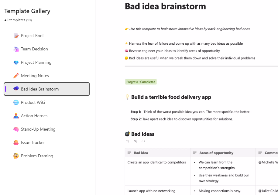
Loop components can belong to a workspace which itself has numerous pages – when you create a new page, you’ll see a selection of templates to get you started:

clip_image004

… and there’s a larger gallery which has more ideas, basically just pre-built pages with a smattering of ready-configured Loop components.

clip_image005

Inevitably, commentators compare Loop and Notion though one major difference is that rather than doing everyting in the online workspace, Loop components can also be shared and embedded within Office documents, emails or in Teams, which is arguably more flexible.

If you copy a Loop component to the clipboard and paste it into an email, you’ll see it embedded – though if using a table in your mail (such as is used in some weekly missives to try to control their layout), you’ll be disappointed as it appears you can’t embed Loop components inside a table.

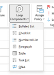
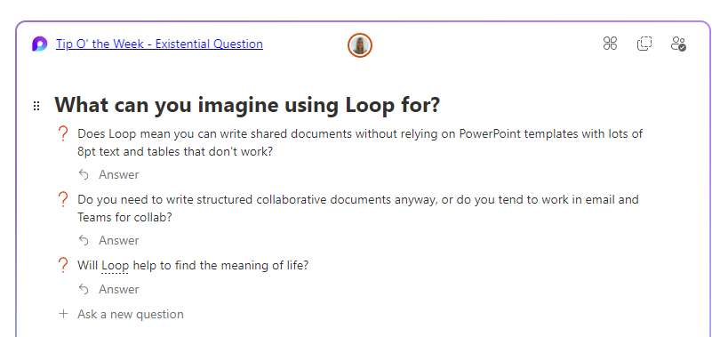
clip_image007Create a new Loop component inside a mail or Teams session, and it won’t be part of an existing Workspace – it’s basically just an attachment but still offers multi-user capabilities. If you insert the component from the menu then it auto-creates the name assiged to that component and there’s nowhere that you can rename it within the email etc.

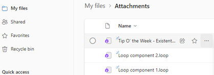
Head over to clip_image009OneDrive and look under My Files / Attachments, and you’ll see the created component – just click the ellipsis to the right and choose Rename from there, and it will show up with that name, wherever you embedded it.

Example:

Screenshot 2023-06-23 093135

682 – Lens scanning

clip_image002

Continual advances in the quality of smartphone cameras mean that most people don’t use a physical camera any more; unless you are really demanding when it comes to control over digital imagery, phone cameras are good enough for most people, most of the time.

Compact cameras have evolved too, providing phone-beating snaps through better sensors and lenses than could possibly fit in the body of a handheld communicator. More light hitting a larger sensor through a bigger, higher quality lens gives you a better starting position to get a decent picture, though smartphones have powerful software and – increasingly – cloud services available to help improve the photo after it’s been captured. Higher-end cameras are changing, too – even Hasselblad (famed for moon shots but also for the most famous photo of the world) is ditching the DSLR model and going mirrorless. The horror!

clip_image004Marrying high-resolution imaging with powerful software in the palm of your hand does give you access to new capabilities that a generation ago would be almost unimaginable science fiction.

clip_image006Check out Plant Viewer to identify which is weed and which is flower, or Google Lens to capture information from the camera or even just to try to identify whatever you’re pointing it at.

As the world has discovered with ChatGPT and Google’s Bard, responses from AI powered services are not always quite correct, even if they appear convincing.

As any fule kno, this item in question is in fact a Seiko RAF Gen 2 (not a Gen 1), even though Google successfully found one for sale, that looks identical.

Google Lens is available on iPhone and iPad too, and depending on the Camera app you use on Android, it might also be launched clip_image008from there (and most Android devices will launch the Camera app if you double-tap on the power button, so it’s a quick way of getting to Camera, even if the device is locked).

Microsoft Lens is one of the best “Lens” or scanning apps in either mobile store (Fruity | Googly). Formerly “Office Lens”, at one point also available as a Windows app (but now discontinued) and since rebranded somewhat by its listing in the mobile app stores as Microsoft Lens: PDF Scanner, though it can do lots more.

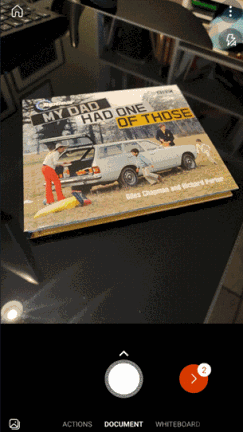
The premise of Microsoft Lens is that clip_image010you can point the camera at something and scan it, by taking a high-resolution photo of the thing and then using the software to manipulate, crop and adjust the image. The most obvious use case is scanning a Document; start the Lens app, lay the doc out as clearly as you can and then step through grabbing each page in turn.

clip_image012The red > icon in the lower right shows how many pages have been captured so far. In earlier versions of the Lens app, you’d try to frame the page at the point of capture but now you just grab the images one-by-one (using the big white button) and do the tidying up later.

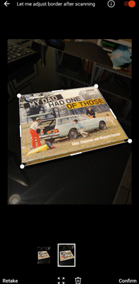
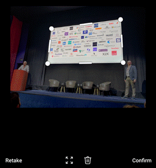
Press that red button and you’ll go to the UI where Lens tries to identify the corners of each page, and lets you tweak them by dragging the points. You could retake that individual image or delete it from the set of captures.

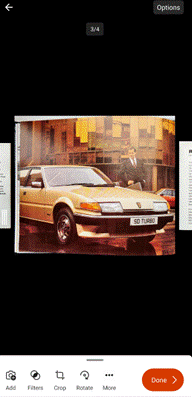
Press the confirm button on the lower right and you’ll jump to a review of the captured images, giving the option of rotating or adjusting each one, cropping, applying filters to brighten and sharpen them and so on. Once you’re happy that you have the best-looking images, tap on Done to save your work.

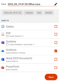
clip_image014You could send all the pictures into a Word or PowerPoint doc, drop them all into OneNote or OneDrive as individual files, or combine all the “pages” into a single PDF and save to your device or to OneDrive.clip_image016

There are other tools on the primary screen of the Lens app, too, if you swipe left to right. The Whiteboard feature lets you grab the contents off the wall and applies a filter to try to flatten the image and make the colours more vibrant.

There’s a Business Card scanner which will use OCR to recognize the text and will drop the image of the card and a standard .VCF contact attachment into OneNote, ready to be added to Outlook or other contact management tool.

The Actions option on the home screen gives access to a set of tools for capturing text and copying it to other applications or reading it out. There’s also a QR code and barcode scanner too.

clip_image018One somewhat hidden feature of Lens could be particularly useful if you’re sitting in a presentation and want to capture the slides for your notes.

clip_image020Start the Lens app, and instead of using the camera to grab the contents and then faff around trimming them, tap the small icon in the bottom left to pick images from your camera roll. This way, you could just snap the slides quickly using the normal camera app and do the assembling and tweaking inside the Lens app, later.

This photo was taken on a 4-year-old Android phone, 3 rows back from the stage at an event using the Camera app with no tweaks or adjustments. It was then opened in Lens, which automatically detected the borders of the screen and extracted just that part of the image into a single, flat picture.

clip_image022That logo on the top right looks familiar…

For more info on Lens, check out the Android and iOS support pages. Oh, and it’s completely free.

675 – Does size matter?

clip_image001

When disk size was measured in Megabytes and network bandwidth even less, size of files really mattered. When non-floppy floppy disks were sized in 1.something MB, IOMega Zip drives promised 100x as much storage for only a few times the outlay.

The dramatic growth in capacity and drop in cost of storage has radically outpaced Moore’s law, where a gigabyte of disk storage might have cost $100 in 1997 and only $10 by the year 2000. Nowadays, if you bought your gigs on a spinny platter, they’d cost you less than $0.01 each. For most end users, solid state storage has largely replaced the traditional hard disk and even with 10x performance, the price is still only a few cents per GB.

That said, storing data in the cloud costs money over the long term, and has a potentially negative environmental impact – a Stanford report from a few years ago estimated that saving and storing 100GB in the cloud for a year costs the equivalent of 0.2 tonnes of CO2, or about the same as a one-way flight from Seattle to San Francisco. So reducing unnecessary cloud storage can be worthwhile.

clip_image003

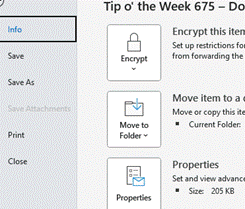
If you’re writing an email in Outlook, you can see the current size from the File | Info menu.

clip_image005In Word, Excel and PowerPoint, you can see the document size and other useful info in the same place (varying details depending on which application).

A previous Tip dealt with the scourge of bloating PowerPoint files, where it’s not uncommon to have unnecessary large images lurking within the template you’re using, but there’s a simple trick that’s common across all Office apps – compressing picture size.

clip_image007Especially if you’re embedding photos from a phone or even screen-grabs from a high-res display, individual files can be in the multi-megabyte* category. In many cases, you might resize your image so doesn’t take up such a huge part of your document, but the app will still be storing the full resolution of the image – including any bits you’ve cropped out – behind the scenes.

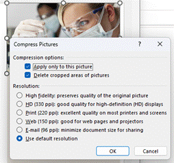
To compress pictures in your document – and let’s use PowerPoint as an example given that it’s the chief culpritclip_image009simply select an image and in the Picture Format menu which appears, choose the Compress Pictures option.

This will let you determine the level of detail to keep for this image – if it’s a simple presentation, then it probably doesn’t need a very high definition picture. You also select whether to keep or discard any cropped areas, and importantly, whether to apply to just this one or by clearing the top option, applying to all images in the file.

Try taking any large PowerPoint file, delete cropped areas and apply Web or Print resolution to all images, and you might see it drop to 10% of its previous size.

clip_image011

The Compress Pictures option is also available from the folder picker in the old File | Save As dialog, and there are other options to change the default resolution available from within the File | Options menu.

*Remember kiddos, there are 1000 MB in one GB; smart alecs might believe that a kilobyte would be 210 bytes – 1024 – but for 25 years international standards have defined that as a kibibyte or KiB, trying to assert with less ambiguity that a kilobyte is actually 1000 bytes, therefore a Gigabyte is 1,000 x 1,000 x 1,000 = 1,000,000,000 bytes, whereas a Gibibyte – srsly – is 1,0243, or 1,073,741,824 bytes).

669 – Hazelnut in every bite

imageWhat has a hazlenut in every bite? That’s right, a Topic from the British sweetie shop of yesteryear, and nothing at all to do with what’s near Tufty’s nest. Sadly discontinued last year, due to falling demand, there’s no accounting for taste.

Topics are still available today to users of Microsoft 365, as a way of curating certain scraps of knowledge that they can share with other users within the same organization. The very first version of Microsoft SharePoint (codenamed “Tahoe”) had a capability that aimed to do much the same thing – “Best Bets” were a way for an administrator to guide the search experience so that if someone ran a query for a term, rather than returning hundreds of old PowerPoint files that contain that word, it would take the searcher to a more official site.

clip_image002Viva Topics – because everything is getting Vivafied just as in the days of Tahoe, every other product had Live and/or .NET in its name – is part of a growing family of “employee experience” offerings; it’s an addon to even the top flight Office Microsoft 365 subscription, but adds AI-powered discovery as well as the means to manually curate things.

After deploying Topics and assigning licenses to the appropriate users, topic pages can be automatically created based on the documents that exist already – the Search and underlying Graph services can identify subjects that look like are active, with people contributing to them through documents, conversations and so on. Codenames or location names, for example, could be quickly identified and suggested.

A Knowledge Manager could also be assigned to create or approve new pages; individual users could be empowered to do it themselves, though that might end up in something of a mess. Best practice would be to have some kind of form or email-based request, where a user would ask for a topic page to be created and they would then own the content within.

clip_image004

Discovery is pretty easy – depending on how it’s set up, if the title of a topic is mentioned on a SharePoint site, it can be automatically highlighted on a pop-up card with which will give a summary of the topic, and a link to more the main page which contains furtherinformation.

clip_image006Topic pages themselves can be full of useful info; a search for documents or other pages that the SharePoint environment behind the scenes considers to be related, as well as specifically curated sources of information, contact cards for the people who are managing the project or involved with the customer, links to docs or other websites etc.

clip_image008

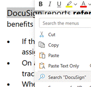
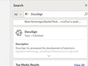
Within Office apps like Word or Outlook, if the user highlights a word or phrase and chooses to Search for it, a sidebar in Office will run a search online and across internal sites for that word – this is avialable to everyone, with or without Topics deployed.

If Topics has been configured and the searched for term is a topic (or is one of the topic’s synonyms, or is otherwise related), then the user will see it fairly prominently in the search results.

Now who’s for some chocolatey nuts?

0x29A – It’s only a number

Last week’s ToW was the six-hundimagered, three-score and fifth, and while this week’s is one more, it’s probably best if it’s not mentioned. As well as being called out in a certain old book, said number also features greatly in legend, light musical entertainment and popular fiction.

Other numbers attract a certain amount of superstition – some tall buildings don’t have a thirteenth floor, for example, and even big companies like Microsoft have been known to clip_image002dodge bad luck by not shipping a v13 of a product (like Office – look at the File | Account | About dialog in any Office app, and you’ll see the version number – Office 2007 was v12 and Office 2010 was v14). Some cultures don’t much like the number 4 or 14 either.

clip_image004One numerically interesting but easily overlooked app in Windows 11 is the venerable Calculator. Start it by pressing the Windows key and entering calc, or if you’re truly blessed, you might even have a physical button on your keyboard. The app starts in whichever mode it was last run – by default, a simple calculator with the same kinds of functions that were common on the popular pocket calculators of the 1980s.

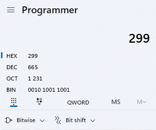
But look at the hamburger menu on the top left and you’ll see so much more – from Programmer functions to convert numbers from clip_image006one clip_image008base to another (so you can decode hex error messages or “funny” binary t-shirts*), to a whole array of converter functions which let you quickly change currency (at the current rate) or transform from one measurement standard to another.

There’s a neat date calculator too, so you don’t need to resort to using an Excel formula to count how many days there are between two dates.

Back in Standard mode, you’ll see the history of your calculations on the right side, and you can use the Memory functions to store multiple numbers for future use; much better than the old one-and-done M- clip_image010M+ and MR buttons on a pocket calc. There’s also a mode which keeps the calculator window on top of others, even if it isn’t the active window at the time.

If you have a full-sized keyboard, you’ll also probably have a NumLock key – that turns the numerical keypad on the right side on and off. In the early days of the PC, smaller keyboards didn’t have separate cursor keys, so these were sited on the keypad. In order to use these cursor functions – and the others, often doubled-up PgUp / PgDn etc – you’d switch NumLock off. And then swear when you went to use the numerical pad to quickly enter a number into some DOS application, only to find you’ve moved the blinking cursor around instead.

*convert each of the 8-bit binary numbers in the t-shirt to decimal; assuming the decimal number is the ASCII code corresponding to a letter, open a new blank doc in Word, and holding down the ALT key, enter the decimal number on your numeric keypad. Oh, if you’ve only got a laptop with no separate Numlock/keypad, bad luck.

649 – Exploring SharePoint libraries

clip_image002SharePoint is now old enough that it could walk into a bar and buy itself a beer. It has changed a lot over the versions; starting out as a server product that would produce “portals” (or “digital dashboards”) it grew quickly to being rather more document-centric. SharePoint became the back-end for OneDrive for Business storage, and both have evolved a long way.

Two years ago, SharePoint was said to be used by over 200 million users. The following year, the Gartner MQ had it way out in front on the “Ability to Execute” Y-axis and slightly behind only one other supplier on the “Completeness of Vision” X-axis. It won’t be long now for the next MQ report to appear.

Nowadays, SharePoint underpins quite a lot of Microsoft 365 functionality, such as apps like Lists which provide a groovier UI over the top of the base web services, and the document oriented collab in Teams.

clip_image004If you look at a file library in Teams, you’ll see a bunch of SharePoint-y options – you can Sync the content offline and it will be held offline, using OneDrive to sync it (and if you like, syncing only the files you’ve opened rather than the whole shebang).

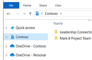
clip_image006The Sync’ed libraries show up in the Windows Explorer app, and in any number of applications’ File | Open / Save dialog boxes, so you can access and interact with the files through the apps you use rather than browsing to SharePoint.

You’ll see a collection of folders that have been set up to Sync, shown with your organization name, alongside any personal OneDrive and OneDrive for Business synced libraries.

The Download option (next to Sync on the Toolbar in Teams), creates a single ZIP file your computer, with the entire contents of the folder you’re looking at, so use it carefully.

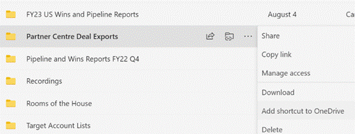
clip_image008One somewhat overlooked option further to the right of the toolbar (or may be on the ellipsis (“…”) menu): Add shortcut to OneDrive. This creates a shortcut link to the current SharePoint folder within your main OneDrive for Business storage, making it easy to find that SharePoint folder in the future, even though it’s not synced offline. The Add shortcut option is also visible on the ellipsis to the right of sub-folders when viewed in SharePoint or Teams.

Don’t add shortcuts to libraries – or sub-folders – which are already being Synced offline. That would be bad.

One downside to the OneDrive shortcut approach is that it just dumps the link into “My Files”, which is the root folder in OneDrive. The shortcut is named the same as the original source – so if you have lots of Teams folders with the same name (eg “Documents”), they will clash with each other as adding a new link would try to create a shortcut with the same name as one that exists already.

clip_image010

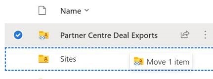
One solution would be to create a subfolder in OneDrive, called Sites (or similar), and after creating the shortcut to your latest Teams/SharePoint site, go to the root OneDrive folder and move your new shortcut – maybe renaming it too, so you can see what its parent site was (since the shortcut doesn’t make it clear what the source SharePoint site is) – you’d then have a Sites folder with lots of Shortcuts like Project Team – Documents etc.

Another side benefit of using shortcuts rather than Syncing offline, is that if you have multiple PCs – or feel like accessing OneDrive through a browser on a different machine altogether – you will always have access to the same collection of shortcuts, whereas the Sync offline capability is configured separately on each machine.

#639 – Macros, Ghosts and GALs

VB and MacrosSince the early days, Microsoft always kept an eye on what its competitors were doing. It was once de rigeur to produce “battlecards” which would show feature-by-feature how one product is better than its competitor, thus assuring the customer they should buy this one. Thankfully, times have mostly moved on to just building as good a product as possible and then let customers and the markets decide – sometimes, they get improved and honed over time to be the best out there, and sometimes they get dispatched to the boneyard as times move on.

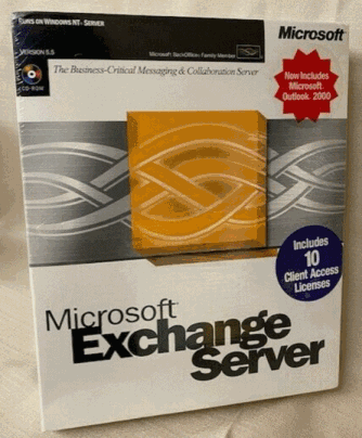
Exchange Server boxIn the late 1990s, Office and Exchange (and later, SharePoint) Server were seen as Microsoft’s entrants into the burgeoning “Groupware” market, which became subsumed into “Knowledge Management” c2000. Key competitors to Exchange & Outlook were Lotus Notes and Novell GroupWise, both of which came from being collab tools and gained email functions. Notes was arguably much more mature and feature rich even if the UI was sometimes clunky, GroupWise was much leaner but found a niche in several industries. Amazingly, GroupWise is still a thing and Notes evolved first into IBM Notes/Domino and was eventually sold off to now be HCL Notes and HCL Domino.

One of the early moves Microsoft made to elevate Office apps to more than just writing documents, was to try to make the docs more capable through adding Macros, and later, Visual Basic for Applications. This allowed a moderately skilful user to dabble in programming to make smarter applications centered around documents; what seemed like a good idea at the time unwittingly unleashed a wave of malware, where bad actors wrote macros to do undesirable things. Following the “Melissa” worm in 1999, Office stopped Macros running without asking the user for permission. Using Macros for anything more than tinkering never really took off.

Blocked Macro warning

Macros disabled entirely

Microsoft announced in February 2022 that all Office Macros in content received online would be disabled completely; this was temporarily rolled back in some test builds for some changes to be made in how it works, but for many, the warning will still be there if you open a Macro-enabled file that you’ve downloaded or been sent.

Unblocking MacroThere are still some very useful Office macros out there, and if you do need to run one that you know is from a trustworthy source, there is a workaround – save the file to your PC locally, then right-click on it to look at the file’s properties, tick the “Unblock” option and apply that. You’ll now be able to choose to run the macro unencumbered.

One such handy macro was discussed back in December 2021 in ToW 611, and is used to find Ghost meetings – ie ones you have arranged but everyone has declined (or at least not accepted). The macro spins through all future meetings in your calendar and lists the ones you’ve organised but where you’re likely to be the only attendee who shows up. Particularly useful at this time of year if lots of people are about to take time off over the summer, and may have declined a few recurring meetings but you – as organiser – still have them in your calendar.

Ghost Meetings

For the latest version of the macro, download the ZIP file to your machine and expand it (or just copy the XLSM file that’s within and put it somewhere else), do the property Unblock thing as above, open in Excel, click the button to allow content, then the Scan Calendar button and you’re all set. You still need to go into Outlook and look at the appropriate date then decide if you want to cancel those meetings or not.

Another more powerful macro – though a little more esoteric – is one which does bulk resolution against the Global Address List, so if you give it a list of display names and/or alias names, it will show the full name, title, department, office, email, and alias name of that person. Handy if you want to get the full details of everyone who is going to attend a meeting, but if you just have a longish list of names then you could just paste them in and see how it goes. This was covered back in ToW 575. One usage scenario recently was to estimate the number of people who were attending a group meeting, but were based at other offices and would therefore need accommodation.

Here’s an example output of over 500 names who were invited to a large meeting; by just providing their display names in column A, it took the sheet about 30 seconds to complete, with 10 identified as distribution lists and 50 unknowns who couldn’t be resolved, either due to no longer being in the GAL or because there were more than one possible name listed.

GAL resolving

If you can manually find the unknown person/people in the GAL, then get their alias name and paste that into column 1 instead of the ambiguous display name, then try to run it again.

632 – New Old Things

old and new shoesMicrosoft veteran Raymond Chen has a great developer blog, The Old New Thing, which inspired the subject line for this week’s Tip, coming as it does, hot on the heels of the Build developer conference. There is also timely news around refreshment of old productivity applications.

OneNote has featured plenty in ToW previously, including a mention in the recent Journaling tip, with a nod in SteveSi’s ongoing historical missive which described members of the development team unhappy with the change of name from its code-name “Scribbler”, referring to the new “OneNote” app as “Onay-No-Tay.

A few years ago, OneNote was dropped from the Office suite and was due to be replaced by the new “modern” version in the Windows (now Microsoft …) Store. For a while at least, that shiny new one got all the innovation, even if its brand-new architecture meant it missed a lot of the old app’s functionality. In a somewhat surprising but welcome turn-around, old OneNote was reprieved, and both apps are going to converge at some later point – ie the desktop one will pick up features that only exist in the Store app, and eventually that version will cease to be.

New OneNote UIOld OneNote UIPending an eventual confluence of the two OneNote Windows apps, the desktop one is gradually getting new functionality and a visual refresh. The graphics bring it into line with Windows 11’s theme of rounded corners, subtle animations and a gentle 3D feel. To some, blink and you’ll miss them, but it does make the app look quite a bit smarter.

There’s a more prominent “Add Page” buttonSort and add, with the page sort function that was added back in February 2022 alongside. There are a few other tweaks in the refresh that has started to roll out, like some new Ink functionality with Ink-to-shape and handwriting-to-text like in other Office apps.

More is to come, including improved sharing capabilities and a neat dictation functionality that would allow you to record a spoken explanation for something while using Ink to highlight or illustrate; when another user plays back your monologue, the ink will be synchronised too. For more info on what’s coming, see here.

Results of OCRCopy Text from ImageOne handy feature that has been in desktop OneNote for years but never made it into the Store version, is the ability to use OCR magic to extract text from images. Try pasting an image into a notebook, then right-click on it to Copy Text from Picture into the clipboard. It does a surprisingly good job, even when the pic is not very clear and if the text on it is really small.

Copying screen-grabs when someone is doing a demo in a browser, so you can get the long and complex URL for the thing they’re showing is a particularly useful way of using this feature.