
Or do we? Is it just the way everything is going to be paid for?
The business model of computer software used to be that you bought a license to use a piece of software and, as long as you had the disk it could be installed from, you could keep using it for as long as you want. Maybe if you need support, you’ll pay an ongoing fee (“maintenance”) which could be a chunky %age of the initial purchase cost, but that would likely give you access to later upgrades too.
Subscription software has radically changed the market over recent years, just as entertainment streaming services has largely replaced buying stuff on physical media. For business software, 85% of the market is in subscription software/services compared to more traditional licensing, according to some estimates.
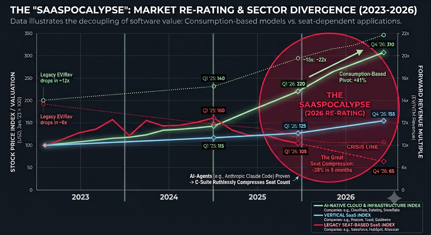
Breathy commentators also predict agentic AI to be the death knell of Software-as-a-Service – the SaaS-pocalypse – yet who’s to say that most vibe coding isn’t just trying to make something that looks a lot like an existing SaaS product…? And if people are building software services – AI or not – how are they going to price it for sale?
Microsoft recently launched a new Copilot service (another one?) called Copilot Cowork, which muddies the waters a little by being charged on a usage-based model rather than a fixed per-seat/per-month approach, as is the case with most end-user-oriented stuff.
Any developer who’s used AI services in AWS, Google or Microsoft Azure clouds will be familiar with the idea that you pay for what you use, so you’d better be clear on what people are going to do with it before you give them the keys to the shiny SaaS offering you’ve built. Or you might end up like the Mustangs leaving cars & coffee on a Sunday morning.
What do we want? We don’t know
Users of subscription services of any type aren’t always happy – they might feel like they’re tricked into taking out subscriptions that will cost them more in the long run if they forget to cancel.
Also, what’s to stop the provider jacking up the price in subsequent terms, effectively forcing the decision to move to something else? Anyone in the UK who is a Sky TV subscriber will know all about that rodeo. See also #65: Enshittifcation 2025 pt 1 – progressing well
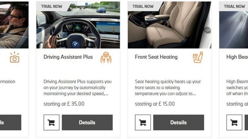
Car companies have also been playing with this idea for a while – BMW, for example, had the idea that some car features could be enabled by an ongoing subscription instead of an upfront-cost like the initial purchase of the car.
And there have been various rental schemes where you pay a monthly fee to have access to a fleet of cars, rather than owning or leasing a specific one. Zipcar closed their scheme last year so maybe the uptake wasn’t good enough to sustain it.
The SKU dilemma and manufacturing complexity
Whenever a product manufacturer gives customers the ability to customize stuff, it can make their lives inordinately complex, unless they are already pretty much bespoke.
Rolls Royce Motor Cars found that if you’re obscenely rich enough to buy one of its vehicles, then you could be persuaded to shell out even more to customize it to your own spec. Since they don’t make very many cars, it doesn’t cost them much more to make each one different, yet they can charge an additional 40% or more on top of the sticker price. And now the sales model is to persuade every buyer to customize, therefore making them piles of extra cash.
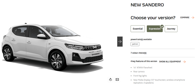
Prospective car buyers of more modest means will probably have played around with online configurators, where they choose the numerous model variants, trims, add-ons, colour and wheel options etc.
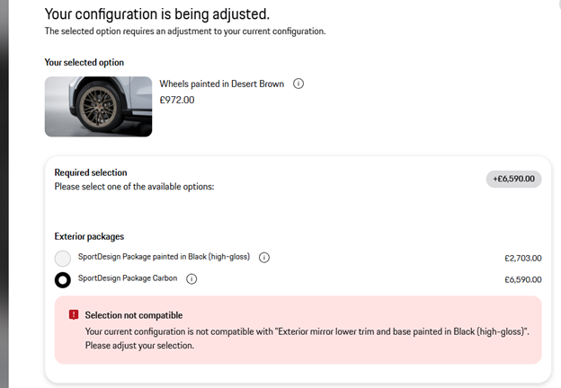
Part of the problem with building anything complex and with many options is that the number of possible combinations can quickly get very high, and that may make it more complex to manufacture and to support in the long term.
It gets worse if some option requires others, or is blocked by others too; if you want the premium comfort seats, you need to have the multifunction steering wheel, and that’s only available in one colour… and the winter experience pack might give you a heated windscreen but that means you can’t have the head up display… and so on.
Companies who need to have many variables and options when building out a product or service proposal might turn to custom business software like Configure Price Quote (CPQ), to try and manage the complexity – with one provider using a Truck configurator as a demo. This kind of software finds its way into lots of manufacturing processes, but also unusual ones too – like the funeral home which used CPQ to produce a custom quote based on all the types of coffin, flowers, music etc that it might offer.
If car companies could simplify their manufacturing process by essentially building most of the underlying hardware to be the same, then use software to differentiate the versions or models, that would be great, right? Some, like Tesla, offer a few main variants of each model which all come with the same kit installed. The only real variation at a customer level is choosing the colour, and possibly including add-ons like roof racks or floor mats, none of which need to be included at manufacturing time.
Manufacturers have grown to love the option sheet, though. Rinsing your customer for thousands more just so they can have some gizmo has been a high-margin exercise for years. Ferrari used to charge over $4,000 to enable CarPlay on its cars (even on their $500K SF90 of a few years ago) even though all the kit to make it work was already there. If you pointed out that it comes as standard on basic $20K rental car hatchbacks, you’d probably have been met with a shrug and a thousand-yard stare.
Intel’s 1998 hardware dilemma
Manufacturing CPUs like Intel’s Pentium range of the late 1990s used to be structured where they’d try to make the high-spec, top speed processors that sold for the most money. Some of the underlying silicon wouldn’t quite pass the tests to be certified, so they could disable some of the components or run them at a lower speed, and the chips would pass. These were then bundled as cheaper, lower-spec CPUs. Alternatively, they could set out to make slightly lower-spec CPUs and achieve a higher rate of manufacturing success. Everybody’s happy.
Except, as manufacturing processes improved, it became easier to get reliable quality, but there was still high demand for low- and mid-range processors. So, Intel upped the production of its high-end silicon, but started knobbling some of the resulting chips, forcing them to run slower and selling them badged-up as a lower grade CPU for a lower price. Meet the market demand where it’s at, while protecting the higher margin top-end stuff.
Inevitably, hackers found a way around…
BMW felt the wrath of customer feedback
As mentioned earlier, in 2022 BMW had the genius idea of building in heated seats to all their cars in a given range. If you’re making a seat anyway, the extra cost of installing the heating bits and all the supportive wiring is going to be relatively small, compared to the hassle of having bottom warming as an optional extra that needs to be treated differently as each car rolls down the production line.
Heated seats might be standard for the higher-spec, more expensive models, but what if they’re usually optional for the cooking ones? Well, they could be installed but inactive unless the customer decided to pay $18/month to use them…
Customer feedback was very clear that they don’t like to think they’re paying twice for something, and if they’re built in to start with then the customer has already forked out for them, thank you. BMW climbed down.
Other car manufacturers have toyed with having customer subscriptions; some make you pay if you want connected services like controlling your car from an app, though many will bundle them in for free as long as you keep taking your car to one of their authorised service centres.
Volvo even had a subscription service where you basically get the VaaS (Vehicle as a Service) – but that has been rolled back now, presumably through low uptake.
Paying to play is here to stay
Car makers won’t give up easily, though. Especially in electric vehicles, there are many opportunities to limit or expand the functionality based on unlocking things in software, or possibly using hardware control modules to unlock capability that is already installed.
Volkswagen offers a bunch of upgrades to its cars, including a performance boost that can be paid for as a monthly fee or paid all up front (and stays with the car). Other manufacturers – like Polestar and Mercedes – also offer paid-for performance upgrades which just unlock latent capability rather than add anything new to the car.
While this sounds like a bit like a racket, software has always been this way, even in perpetual license times. You could download the trial version of a product and as soon as you put in a license key, it’s fully unlocked. Or there’s the fact that a different license key for Windows Server would unlock higher level capabilities, even though all the actual code is there on every version.
Tip: keep a single list of every subscription
If we accept the inevitability of subscribing to streaming services, Amazon Prime for easy delivery, news sites or other online content as well as security or VPN etc software, it’s worth spending the time making a OneNote or similar table with every single thing you subscribe to, when it’s due to renew and how much it costs.

The act of keeping such a list updated might help to decide if you really do want to keep all these things active, especially when the “for your security, we’ve had to increase the price by only 10%…” renewal email arrives…


")


