|
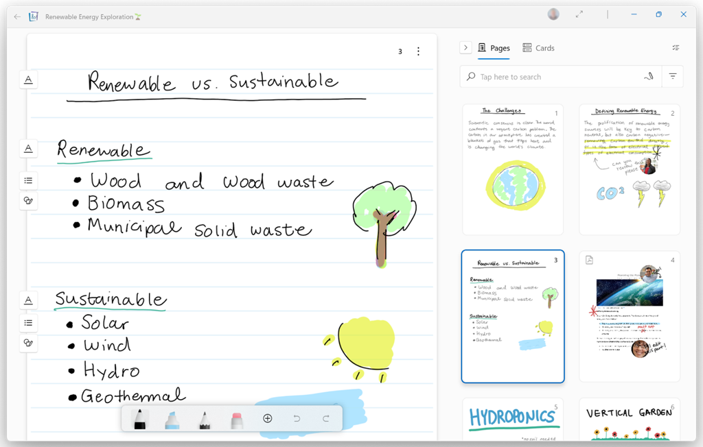
OneNote has featured plenty in ToW previously, including a mention in the recent Journaling tip, with a nod in SteveSi’s ongoing historical missive which described members of the development team unhappy with the change of name from its code-name “Scribbler”, referring to the new “OneNote” app as “Onay-No-Tay”. A few years ago, OneNote was dropped from the Office suite and was due to be replaced by the new “modern” version in the Windows (now Microsoft …) Store. For a while at least, that shiny new one got all the innovation, even if its brand-new architecture meant it missed a lot of the old app’s functionality. In a somewhat surprising but welcome turn-around, old OneNote was reprieved, and both apps are going to converge at some later point – ie the desktop one will pick up features that only exist in the Store app, and eventually that version will cease to be.
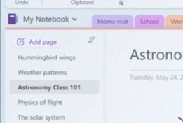
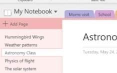
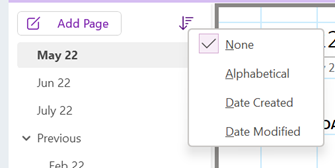
There’s a more prominent “Add Page” button More is to come, including improved sharing capabilities and a neat dictation functionality that would allow you to record a spoken explanation for something while using Ink to highlight or illustrate; when another user plays back your monologue, the ink will be synchronised too. For more info on what’s coming, see here.
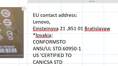
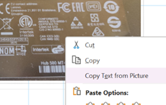
Copying screen-grabs when someone is doing a demo in a browser, so you can get the long and complex URL for the thing they’re showing is a particularly useful way of using this feature. |
Tag: Office
625 – Journaling now and then
|
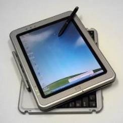
Turning to technology and looking back to relatively near-term history brings up all kinds of product that was ahead of its time or was ultimately overtaken by other developments that nobody saw coming. Sometimes, the perfect blend of genius, timing, execution and luck combines and creates a durable and wildly successful category – like the Smartphone and the plethora of services and apps that were created. Inversely, one of those tech innovations that was just a bit ahead of its time was the Tablet PC; a fully-functional Windows PC that was blessed with a pen and touch screen so you could take notes by hand just like on paper, yet by flipping it around it could be used to run Office apps and all the other stuff you’d need a PC for, 20 years ago.
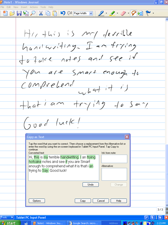
One new app that was built for the Tablet PC to take advantage of its pen, was Windows Journal, a relatively simple yet effective note-taking app, with surprisingly good handwriting recognition built in. To read more from someone who was in the room – figuratively and, at times, literally – around the time of Tablet PC, the Journal software and the Office app originally called Scribbler which went on to become OneNote, check out Steven Sinofsky’s Hardcore Software post. It’s a fairly long but fascinating read. Using pen and paper for taking meeting notes might be less popular now, but many of us will still jot down reminders or lists on Post-it notes, perhaps doodling on paper to help creativity and flow. If you have a pen-capable computer now, the newly released Microsoft Journal app is worth a look. Billed as an app for digital ink enthusiasts, this new Journal presents a modern take on the original Windows Journal idea – an infinitely scrollable canvas for jotting down anything, though with AI capabilities in the app providing quiet yet powerful functionality. Journal started as a research project (from the “Garage”), but has now graduated into a fully-fledged, supported app. Read more about it here.
|
623 – What’s .new pussycat?
|
Having blazed a trail with email in Hotmail and later Outlook Web Access, in 2010 Microsoft launched the first version of the Office web applications, meaning you could run lightweight Word, Excel and PowerPoint in your browser, as a companion or even as an alternative to the full-fat desktop versions. A few years earlier, Google Docs released as an online word processor (and later, other types of productivity apps, rebranding as G Suite and now Google Workspace). There are pros and cons of the browser-only experience; you tend to sacrifice some functionality compared to the desktop applications in favour of ubiquitous availability, though web clients can be updated more easily and sometimes new features appear there first – as ToW #605 covered, with snoozing email. Check out What’s new in Excel for the web or look for the summary covering Visio, Forms, Words and more, here.
If you like being browser based rather than desktop bound
|
602 – re-drawing Whiteboard
|
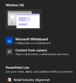
Fortunately, there are digital equivalences – you could be in a Teams meeting and co-authoring a document, where multiple people are editing at the same time and marking up comments. You could be watching someone share their 4K screen so they can walk through only a few dozen PowerPoint slides, or you might even have had a play with the shared Whiteboard app that’s been around and been part of Teams for a while now.
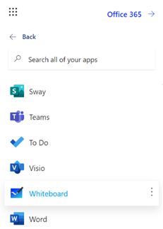
The whole UI has been given an overhaul in line with the latest colourful design ethos, and there are lots of neat new features like the automatic shape recognition for mouse-driven drawing. Hold the Shift key down while you’re drawing with a mouse pointer or a Surface pen, and it’ll straighten lines for you. It’s available in a variety of guises; there’s a web UI (app.whiteboard.microsoft.com) and it shows up in the menu on the top left of Office 365 web applications, such as subscribers would find by going to office.com and signing in with your ID. It’s on iOS and Android, though updates may flow through at different rates to other platforms.
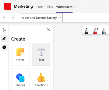
You can pin whiteboards to Teams channels or chats too; just add a Tab, select Whiteboard from the app list, and the content will persist within that context rather than a point-in-time meeting. |
595 – Emoji reboot
|
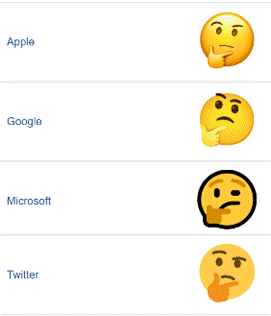
Emojis are mostly agreed and defined by the Unicode Consortium, which controls the Universal Coded Character Set, adopted by many systems to maintain compatibility between each other. When a user sends a symbol in a text message, the phone of its recipient needs to know which character was being sent or confusion may occur. Interpreting what the actual emoji symbol means is still down to the end user, and there are many pitfalls to avoid.
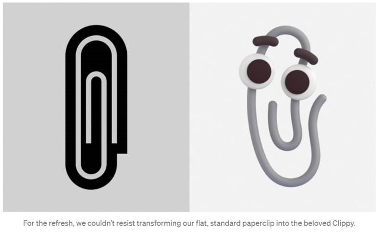
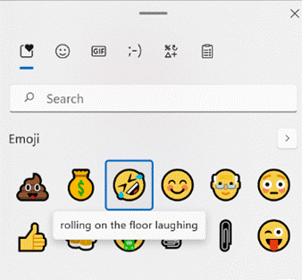
Microsoft decided to adopt a “flat” emoji look in the Windows 10 timeframe, but that is starting to change again with the upcoming release of Windows 11 and the evolution of Microsoft 365 – as Art Director and “Emojiologist” Claire Anderson previewed, we’re going 3D and Fluent, due late this year. Oh, one more thing… ToW reader Paul Robinson draws attention to the shortcut way of inserting emojis in Windows – it’s been a feature for a while now – just press WindowsKey + . and it will allow you to insert emojis into pretty much anywhere that accepts text. The UI for the emoji panel is changing in Windows 11 too, with GIFs and other types of symbol being included and the whole thing is easier to search. A useful tooltip shows you what the symbol represents, though as said before, be careful with the potential interpretation of some of them. Peachy.
Paul likes to start Teams channel names with an emoji, and if you want to illustrate one difference between old world and new, try using them in email subject lines and see just how they appear in Outlook |
593 – It’s a Date
|
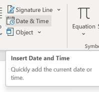
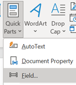
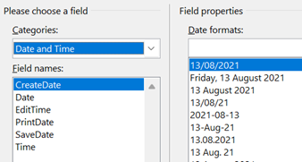
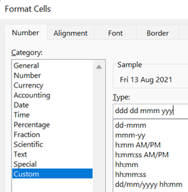
On the Insert tab / Quick Parts, look under Field, then pick the doc property and format you’d like to show. It is worth pointing out that showing a date as 10/1/21 (or similar) is ambiguous given that a few hundred million people will expect it be month-day-year while many of the remaining 7 billion will assume the day comes first, with a couple of billion presuming the format should normally start with the year, such as yyyy-mm-dd (which is arguably the most sensible of all; and it sorts properly, too). A more daily usable short format like dd-mmm-yy (ie 13-Aug-21) should perhaps be the norm, especially when the date is appearing as text in a document. Pressing SHIFT+ALT+D in Word will insert the current Date as a field (so you can edit the format to remove ambiguity) and SHIFT+ALT+T inserts the current time too. In PowerPoint, both of these combos bring up the “Date & Time” dialogue to add the chosen content and format as plain text.
While in Excel, it’s worth learning the short cut key to insert the date and time – CTRL+; and SHIFT+CTRL+; respectively (no doubt there’s a reason why Excel has a different shortcut to other Office apps – some legacy of Lotus 1-2-3 perhaps?). OneNote fans will want to remember that SHIFT+ALT+D / T combo as it inserts the date/time into the notebook; really handy when taking notes of a phone call or similar. SHIFT+ALT+F puts both day and time, something that Word doesn’t offer. In both Desktop OneNote and users of the Windows Store version, it’s just plain text that gets added, so you’re on your own when it comes to formatting. OneNote pages will typically have a date & time showing under their title – on the Desktop version, it’s possible to change that so as to mark a page as having been recently updated. No such luck on the lame duck Store version.
At least when stalwarts insist on writing – or worse, saying – a short-form date as something like “ten one”, there’s more than half of each month where one number in the date could only mean “day” – starting with the thirteenth (as in, 8/13 can never by the 8th of a month, but 8/12 could be a few days before Christmas to Europeans, or the date when tweedy Americans start looking for grouse in the Yorkshire moors and Scottish Highlands). |
578 – Let’s talk about fonts
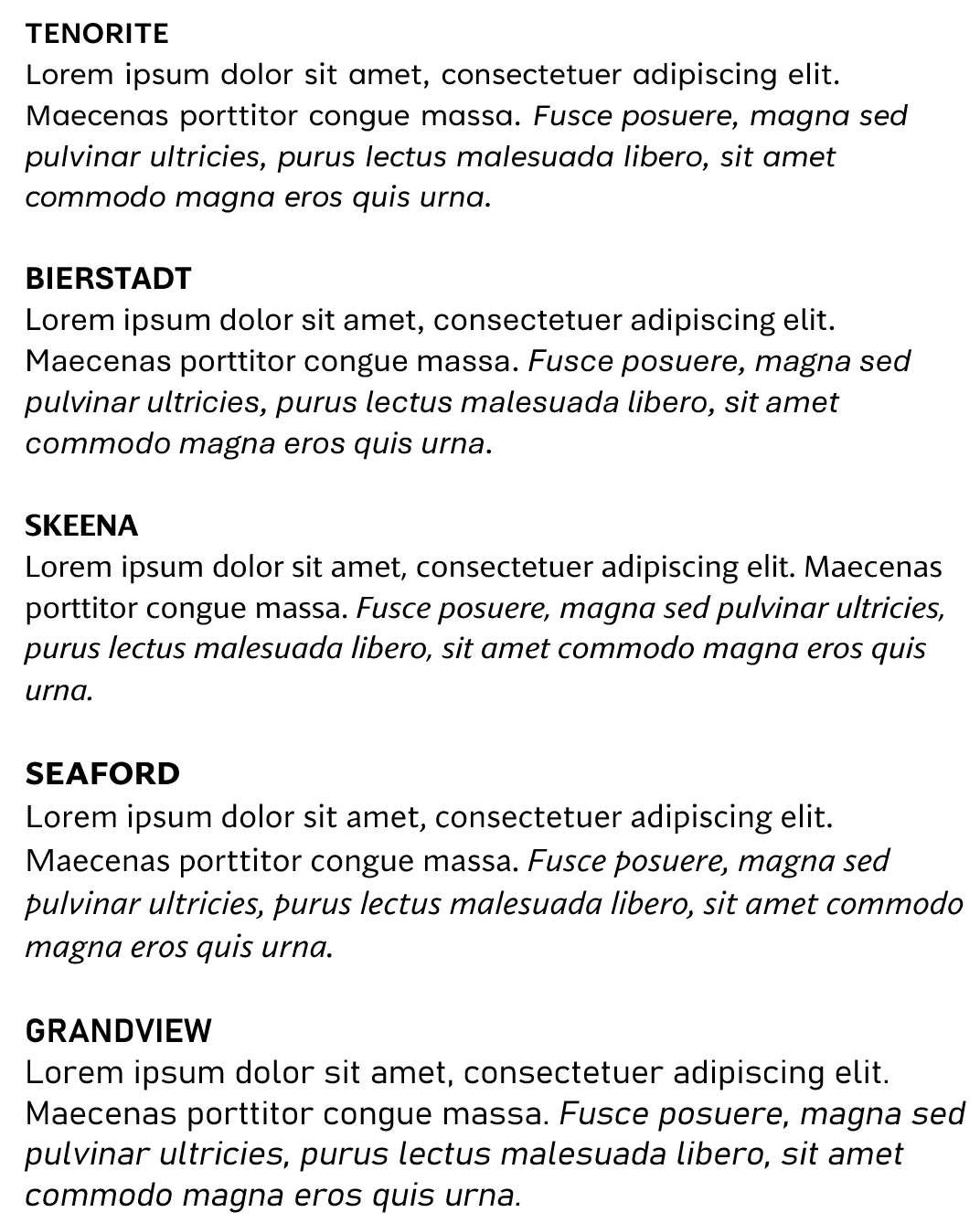
 Most people don’t really think too much about which font they’re using in written works. The novelty of having different font designs, weights and sizes soon wears off, especially if you like to try all of them in the same document. Most people don’t really think too much about which font they’re using in written works. The novelty of having different font designs, weights and sizes soon wears off, especially if you like to try all of them in the same document.
Yet, there is a lot of thought which goes into creating a font, especially when considering how it’s likely to be used. Typeface design goes back to the earliest days of printing, with fashions changing from heavy and elaborate block type to lighter and perhaps easier to read lettering. To serif or to sans? The author Simon Garfield has written extensively on the subject of typography, including articles on What’s so wrong with Comic Sans? or The 8 Worst Fonts In The World and his really excellent book, Just My Type, which delves into the history behind lots of common typefaces and how or why they came about. It really is fascinating. Even the design of the text used on road signs was a hot topic in the 1950s, with the UK facing a need to choose a standard for the upcoming motorway network, which could be easily read at speed. Designers Jock Kinneir and Margaret Calvert came up with many road signs and the typeface design still used today (theorising that at 70mph, a driver looking for Birmingham won’t actually read the letters, but will recognise the shape of the word). Trials were done by fixing words to the top of a Ford Anglia and driving it past a group of seated, bemused volunteers, to test the fonts’ efficacy. A lot of technology we take for granted today has its roots in the 1970s at Xerox’s PARC research establishment or was materially advanced there – ethernet, bitmapped displays, laser printers, the mouse, the GUI, object orientation, distributed computing and so much more – and the two founders of Adobe, who went on to define PostScript, started their work together there. This font-rendering software – along with the Apple Macintosh & LaserWriter and the Desktop Publishing software PageMaker – laid the way to revolutionise the printing industry.
“Cloud Fonts” are available to Microsoft 365 subscribers (more info here) – in Word, go to File / Account and look for the optional settings. Five of the Cloud Fonts collection are being considered to be the new default font for Office apps in the future… which would you choose?
|
555 – checking Accessibility
|
These technologies often spawn wider usage in unforeseen ways, and in many cases are developed not for goals of making a fortune or having global influence, but to help a particular individual:
Microsoft has a long history in pushing accessibility technology – Windows 95 was the first You can jump straight to many of the settings applets by running ms-settings:easeofaccess-keyboard or ms-settings:easeofaccess-speechrecognition and so on.
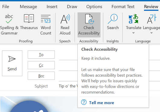
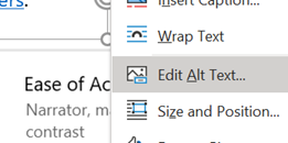
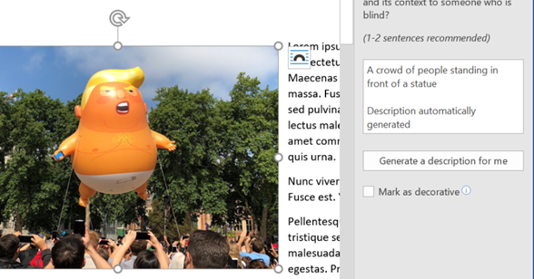
The Check Accessibility option on the Review tab in Office apps like Word and Outlook, should be run just as you’d check the spelling of a document when you think it’s finished. The tool will give you a series of recommendations with guidance as to why it may be better to change aspects of the document. Not every one will be viable – you may want to have images in a particular place on the page, for example, rather than just in-line with text – but many are quick to correct.
One call to action would be update your own sig to add Alt Text, or to mark the images as decorative so screen reader software ignores them. For more tips on how to write documents which are more accessible, see guidance from Microsoft or from the University of Washington. Some resources for developers or web page designers from the UK Gov, with plenty of links to other sources – Testing for accessibility – Service Manual – GOV.UK (www.gov.uk). |
518 – The App(s) of Office
|
Ever since the demise of Windows Mobile and the collateral damage caused to Microsoft’s previous Universal Windows Platform apps strategy by not having a universal platform any more, their future has been in some doubt. In fact, since late 2018, it was reported that the Office “Mobile” apps for Windows were being de-prioritized in favour of the desktop variants (with the exception of OneNote), and separate mobile apps for the surviving mobile platforms.
In these enlightened days, Microsoft builds quite a lot of apps for iOS and Android, more especially the latter since it has a larger number of users (and seems to be growing its share in key markets) as well as being more open when it comes to the both the end-user and developer experience (though Apple may be changing its tack a little). Recently, the Office team has shipped a whole new, unified Office app for Android and for iOS – more details in the team’s blog, here. The app brings together Word, Excel and PowerPoint, but also adds a bunch of other related things – like Sticky Notes, and some related and useful technology like the ability to manage PDF files, extract text from an image and more. Back in Oct 19, MJF wrote about this strategy and more recently has suggested more features are on their way. |
Tip o’ the Week 498 – Go do, To Do (you do so well)
|
After Microsoft’s acquisition of 6wunderkinder (the company that made Wunderlist), it was announced that, at some stage, the Wunderlist application would be retired but still there’s no confirmed date or anything, with back-end engineering apparently taking a good bit longer than was first expected. When the To-Do app was launched, it was a somewhat poorer cousin. Now, the story is that To Do v2 has enough of the functionality of Wunderlist, and lots of new capabilities (such as Cortana integration), that it’s time for Wunderlist users to transition. See more of the detail here. See what’s new in versions of To[-]Do. For further To Do tips, check the help center. The founder of 6wunderkinder has taken to Twitter to offer to buy back Wunderlist before Microsoft shuts the service down. It remains to be seen if the offer is being considered or not… |

