
Following on from last week’s missive on finding problems in your home network, this one turns its attention to network of the internet service provider (ISP) itself. Just like any other utility provider, there is a lot going on behind the scenes before the pipe or cable that shows up at your property delivers its stuff. As UK Gov CTO David Knott says, the simpler something looks, the more complex it probably is.
If you think there are problems with your internet connection’s speed or reliability, and it’s not your fault, there are a few things you can do to try and pinpoint where the cause lies. Being quite specific can also help short-circuit the early stages of the supplier’s support desk, where they’ll be getting you to clear your cookies and restart your browser.
Let’s assume that any WiFi devices are working and the home router itself is connecting OK – the lights on your device are behaving like they should be connected.

I bet none of you losers has their own named port on their broadband router
Sometimes the connection to the ISP might be ropey – even if the lights are on, it could be worth logging into the admin page on your router to see if there are any tell-tales or warnings. There’s probably a log of events that might show repeated disconnect/reconnect loops, or other tell-tale errors. If you have a fancy-pants NAS device or similar, you might even be able to collect the logs and give better reporting.

It’s worth checking a public speed test site, like www.speedtest.net, to see if it thinks you should be getting decent performance. Pay attention to that Ping ms number – as mentioned previously, latency is the enemy of anything that needs real-time communications like a Teams/Zoom meeting or online gaming. Streaming video can often deal with poor latency since it will buffer at least a few seconds in advance, though if it gets really bad then it might still be unworkable.
HOW NETWORKS WORK
Without grossly oversimplifying things, when you try to connect to a remote resource (say, www.google.com), your computer will use the magic of DNS (short for the Domain Name System) to figure out what is its actual address on the internet, then will attempt to reach it.
Imagine going on a journey with tens or hundreds of junctions along the way; at each turn you don’t need to know all of the directions to the destination, only that it’s further along this road rather than the other way. When connecting to a remote internet site, there will be many “hops” that your data will take – and the connections between each of those points could be a cause of problems.
Given that the internet was conceived to survive a nuclear war, traffic should find a way but sometimes there’s a single link that can throw everything off. If a single website is slow but everything else works, it’s probably that site. But if everything seems slow or unreliable, it’s more likely there’s a problem with your ISP’s network, or possibly the network it connects to.
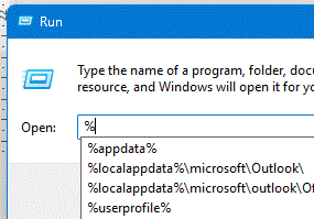
To test a single connection, there’s a built-in command (again, on Windows, press Win+R an enter cmd) called tracert, which will basically ping everything between you and that remote site:

In this case, it sends 3 requests and measures the round-trip time of each; sometimes you’ll see an isolated spike or a drop out but that’s not unusual. In many cases, for popular sites like Google or Bing, you’ll only really be connecting to a nearby node anyway. Look up the IP Address on whatismyipaddress.com and you’d see, in this instance, that Google.com lives in a Datacenter in London, but if the same experiment was repeated from a PC in LA, the IP address and therefore final destination that corresponds to www.google.com would be different.
If you think your network problem is a bit more transient, you could try an old bit of Windows software called WinMTR (or a lightly refreshed version called WinMTR Redux). This will repeatedly run TraceRT probes and show you the results over time; if you see one particular hop which spikes a lot and it looks like it’s part of your own ISP’s network, then it could be worth sharing this info with them in the hope they go and switch that router off and back on again…

In this instance, the first hop into the ISP network – 217.47.72.122 – appeared to be the problem as it and everything later had terrible latency (almost a whole second where you’d normally expect a few milliseconds). This above example was presented to a well-known UK national telecoms provider some time ago, as proof that the problem was with them, and to stop ordering the end user to faff about with ADSL microfilters or get engineers out to test the phone line.
Another example shows that while there’s no cataclysmic issue, there appears to be a delay in some of the connections further up the line – probably not worth escalating but it might explain why some sites feel slow while others don’t:

The nice thing about WinMTR is that you could save it to OneDrive / Google Drive and run it directly without needing to install anything. If you’re happy to add some troubleshooting software in advance of having a problem, another alternative could be PingPlotter:

WHAT IF IT’S DNS?
Ask anyone who has worked in IT support and at some point, the DNS infrastructure or your connection into it will be the thing that breaks everything else. Moving everything off-premises to a cloud-based environment merely means that DNS is someone else’s problem, but if you can’t figure out how to connect to the cloud, it’s yours.

Normally, when your ISP gives you a connection, they also provide the address that your computers will use to make DNS queries. Your broadband router might act as a proxy, so the devices on the home network just ask it to resolve DNS queries, then it will connect to your ISP’s DNS service and relay the response back.
If everything else appears to be working but your connection is still flaky and slow, it may be that your ISP’s DNS service is stuffed. To the end user, you’d try to connect to www.google.com and it would spin for a while and eventually get an error saying it had timed our or could not be found; this could just be that your PC asked the router, which passed through the request to the ISP’s own DNS server(s), but if there’s a problem connecting or they’re not working properly, then a reply might not come.
Fortunately, there is an option to sidestep this – temporarily, maybe – and use somebody else’s DNS service instead.
Google operates a free, public DNS service, on addresses 8.8.8.8 and 8.8.4.4. If your ISP’s DNS is not responding well, try substituting the default automatic provisioning of DNS server addresses that your machine will likely have, with hard-coding Google’s DNS – see Get Started | Public DNS.

If all else fails, you might just have to endure the ISP’s support desk to get someone to check the connection back to you, or just give up and go outside instead.


 and a boy are standing o")


")


