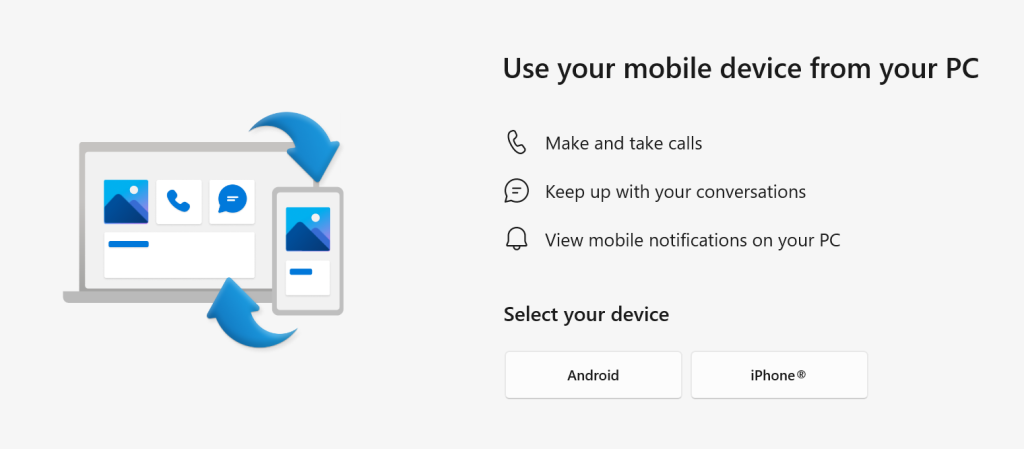
#18: Linking Phones and PCs

If you’re using a PC with Windows 10 or 11 and you have a smartphone, it’s worth exploring the Microsoft Phone Link app which lets you interact with the handset from your computer.

Microsoft has made several attempts to link phones and PCs, from the Continuum feature at the twilight of Windows Phone’s life (before it was knifed) to a variety of bespoke apps for Samsung devices and ultimately “Your Phone”. The latter has now evolved and expanded to be “Phone Link”. The array of features varies slightly depending on what OS your phone is using, and which manufacturer it originates from.

The app is likely pre-installed on Windows; make sure it’s up to date. It then needs to pair with a companion app called Link to Windows on your phone – either Android or iOS. For step-by-step instructions on how to set it up, see Sync Your Smartphone to Your Windows Computer.

For Android users, arguably the most compelling quick win is being able to easily access Photos without requiring them to have synced to Google Photos or OneDrive first – while the phone is connected to the PC either via Bluetooth or through the same WiFi network, you can interact with the last 2,000 photos on the device’s camera roll, so copying and pasting them into other apps is a snap.

iPhone users will have to use other means to get their hands on pics, at least for now.
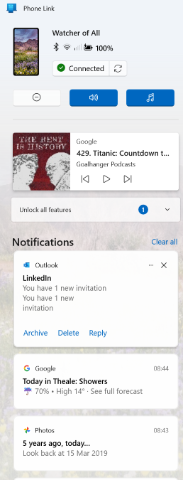
The Phone Link app allows notifications on the device to be seen and managed on PC, which sounds more useful than it really is. It can also set the PC up to use the phone to make and receive calls (think of it like the PC is a smart Bluetooth headset), though some handsets might be a bit flaky. It seems even new phones don’t always provide the right level of support for some features to work well, such as Google nobbling the ability to output to an external display over the USB-C port on Pixel phones (a behaviour which will be fixed, at some point).

Some Android devices will allow you to display and control phone apps on the PC itself (or even mirror the whole phone screen) – which can be very useful, especially if you’re having to input a reasonable amount of text. It’s pretty much always going to be quicker to type on a keyboard than tap on a screen. Other options do abound, though, depending on the apps you use – there’s a native WhatsApp client for the PC, for example, so you could use that rather than relying on Phone Link.

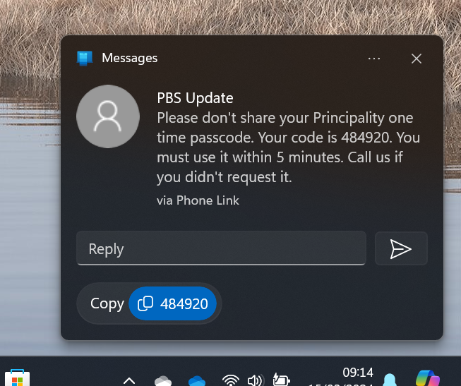
You can use the PC to work with text messages on the phone, even supporting iMessage for Apple devices. Arguably the handiest part is when you get a text message as part of a multi-factor authentication sequence like logging into a bank account. The notification which Phone Link displays includes a “copy” shortcut so you can easily grab the code and paste it into the waiting logon page… even if the phone is on the other side of the room.
687 – Loop de Loop

clip_image001Sometimes, new application paradigms disrupt the old ways of doing things – like real time messaging could sometimes replace email, or shared online document authoring takes over from working in offline silos. Just as software development methodologies and tools come in and out of fashion amongst the cool kidz, so too does the idea of doing everything online in a browser vs using those fusty old desktop apps that you might have installed.

One new application that springclip_image002 to prominence in recent years is Notion; it showcased a canvas-based approach to colloborative workspaces with components that could be shared and reused in an entirely browser or mobile app based environment.

Notion went from a small startup 10 years ago to a multi-billion valuation, despite initially fending off VC cash. The user base is supposedly skewed to teenage-to-mid-30s, though old timers like Paul Thurrott and the team behind the Windows Weekly podcast notably use Notion to manage the prep notes for each episode. He was initially less than complementary when Microsoft unveiled a similar-looking new service, born out of components of the “Fluid Framework” which been unveiled at Build in 2019 as a new way of doing co-authoring on compound documents.

Loop is the name given to this new Microsoft 365 collab tool, announced in clip_image003preview in 2021 and expanded somwhat shortly thereafter. It’s still a preview – some software companies have products in preview lasting multilple years, even if they don’t ultimately cark it.

Loop can be accessed at loop.microsoft.com either by using a “work or school” account as part of M365, or a Microsoft Account to sign-in to a personal version. Loop mobile apps now have support for personal accounts too. Admins in Microsoft 365 environments need to enable Loop for use – if you visit loop.microsoft.com as an end user and it’s not available, you’ll be told as much and asked to find your IT admin to get them to switch it on.

Loop components can belong to a workspace which itself has numerous pages – when you create a new page, you’ll see a selection of templates to get you started:

clip_image004

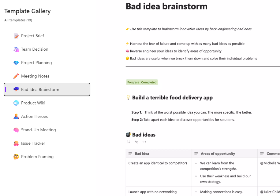
… and there’s a larger gallery which has more ideas, basically just pre-built pages with a smattering of ready-configured Loop components.

clip_image005

Inevitably, commentators compare Loop and Notion though one major difference is that rather than doing everyting in the online workspace, Loop components can also be shared and embedded within Office documents, emails or in Teams, which is arguably more flexible.

If you copy a Loop component to the clipboard and paste it into an email, you’ll see it embedded – though if using a table in your mail (such as is used in some weekly missives to try to control their layout), you’ll be disappointed as it appears you can’t embed Loop components inside a table.

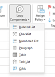
clip_image007Create a new Loop component inside a mail or Teams session, and it won’t be part of an existing Workspace – it’s basically just an attachment but still offers multi-user capabilities. If you insert the component from the menu then it auto-creates the name assiged to that component and there’s nowhere that you can rename it within the email etc.

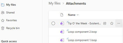
Head over to clip_image009OneDrive and look under My Files / Attachments, and you’ll see the created component – just click the ellipsis to the right and choose Rename from there, and it will show up with that name, wherever you embedded it.

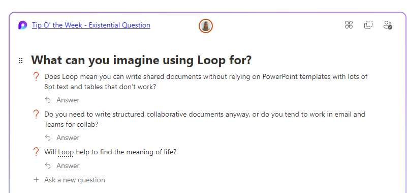
Example:

Screenshot 2023-06-23 093135

683 – OneNote Docking

imageSince the OneNote desktop app is getting a reprieve from its previously-announced retirement, and the anointed successor UWP app is itself being put on notice, maybe it’s worth looking at a few tweaks which can make the old app a bit more useful. There were a load of updates announced about a year ago, and further improvements to the OneNote family are on the way too.

If you use OneNote to take meeting notes – especially if you’re meeting virtually and want to have your notes alongside the Teams/Zoom/Chime app – then it makes sense to arrange the windows side by side. Students of ToW past will know that in Windows 11, pressing WindowsKey+ ‎← or → will snap the current window to the sides of your display, and there are other ways to control window placement if you have especially complex desktop arrangements.

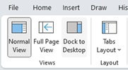
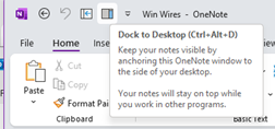
clip_image002clip_image004There is an old feature in OneNote which is worth revisiting; Dock to Desktop. Invoke it at any time by pressing CTRL+ALT+D or go to the View tab to select it.

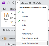
You could also try pinning it to the Quick Access Toolbar on the very top left of the OneNote window. The QAT in Office apps was covered way back in ToW #321, from March 2016.

clip_image006Docking has the effect of minimizing the UI for OneNote and sending it to a (horizontally resizable) section of your screen, on right-hand-side.

Usefully, it also means other apps respect that space, so even if you maximize another window, it will only grow to appear alongside your docked OneNote.

clip_image008

If you don’t like the position of the docked window, drag it using the “…” at the top of the pane, and position it on the top, bottom or the left side of the screen instead. If you press CTRL+ALT+D again while docked, it will fill the entire screen – maybe useful if you have a 2nd monitor.

The rest of the minimal UI lets you access the pen menu, restore back to the full UI or you can use a somewhat obscure feature called Linked Notes. This will add a link back to another clip_image010document that you could also be working on; you’ll see an icon showing the source document when you select text that has been linked.

Hover over the icon and you can get a summary or thumbnail of the document, and left-click the icon to open the document.

The original intent with Linked Notes was that you could use it across Office apps and also when browsing the web; how useful to be able to make notes on a specific web page and then jump back to the source when revisiting the notes you took! Sadly, the feature was integrated only to the dearly departed Internet Explorer, and it is not available in modern browsers. The topic of Edge support has been raised in online forums but thus far, responses have been less than forthcoming.

Even the Help page on Linked Notes talks about how it works with Word 2013, PowerPoint 2013 and other OneNote 2013 pages… no mention of Excel either.

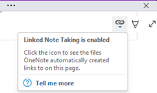
clip_image012If you do find yourself going back in time and using Linked Notes, you’ll see an additional icon (when un-docked and back in full OneNote mode) in the top right of any page where you have links, allowing you to go straight to the source docs or to manage the links themselves.

671 – Excel-lent

imageEven old dogs like Excel have some new tricks up their sleeves. The spreadsheet application category was defined by VisiCalc in the late 1970s, and was a driving force behind the success of personal computers; accountants and finance managers and the like could quickly do their own sums instead of waiting for a report from the Data Processing department which fed and watered the big iron. When the PC came out, Lotus 1-2-3 was king of the hill and Microsoft’s Multiplan was an also-ran, until Windows arrived and the new Excel program moved from underdog to top enchilada.

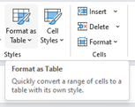
clip_image001First off, if you’re going to use Excel to create a table of some sort, start by Formatting as Table. It makes it so much easier to manage the data later – sorting, filtering, formatting are straightforward.

If clip_image003you choose that your table has headers, the name of the top row will also be marked with an arrow to filter the list, and also appears in any formulae you might develop.

clip_image004Rather than referencing cells in a formula by A2 etc, you could put the cursor onto the field you want to reference, and the name of the column will be used, and when you enter that fclip_image006ormula, it can be easily copied to every row.

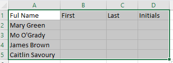
clip_image007Excel has other smarts, though – let’s forget about formulae in this case, and just type the First name in column B; dragging the bottom right corner of that cell all the way to the bottom of the table, will fill every cell with “Mary” but a little Auto-Fill Settings prompt will appear at the bottom. Click that and you can change it to Flash Fill.

clip_image009Et voila! Excel has figured out the relationship between the text and applied the same clip_image011pattern to all the other rows in the table. Repeat the exercise in this case by filling Green in the Last name and MG in initials. A quicker way of applying auto-fill is to put the cursor in column C and press CTRL-E, then repeat on column D.

If you find yourself working with tables and the columns aren’t wide enough to show the data fully, you can clip_image013quickly widen one column by double-clicking on the bar to the side of the column heading; select several colums at the same time and double-click on one of the width adjustors and they’ll all be resized to fit. The same trick works on rows, by double-clicking on the height adjustor on the far left of the row.

If you want to select all the table, put the cursor in the very top left corner of cell A1 and you should see it change shape to a diagonal pointing arrow; click once to select the whole table. Another way would be to put your cursor in the table and press CTRL-A; that selects the entire data portion. Press CTRL-A again if you want to include the header row too.

clip_image015

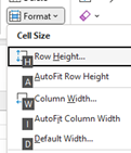
clip_image017If you have the table selected, press ALT and release it – you’ll see a load of letters appear over the menus, which jump to specific functions. Press and release H to go to the Home tab, then O to jump to the Format menu, then I for auto-width or A for auto-height.

The final magic Excel trick for today is autocomplete.

If you start typing a text value in a cell, Excel might clip_image019look at others in the rows above and offer you an autocomplete option – just clip_image021press tab or downarrow and it will fill in that value for you. Another option is to press ALT and and down arrow when you first enter or select the cell; it will show a drop-down list of all the previous values, and you can either use mouse or up/down/enter keys to select the one you want. Excellent!

643 – Wireless extensions

clip_image002[6]

A computer on every desk and in every home”; that original Microsoft motto, all the way back from a time when any sane person would have said it was nuts. Looking back now, though – hands up, who has only the one computer at home?

clip_image004[4]The WindowsKey+P shortcut key has been used since Windows 7, for sending your screen output to another device. At one point, this was maybe a meeting room’s projector – hence “+P”. You’d plug it into the VGA port on your laptop, press Win+P and you’re away. These days, does anyone “project”? Or just mirror or extend their desktop to another connected display or monitor?

You’ll commonly be able to wirelessly “project” to a large screen on the wall in a meeting room nowadays, rather than having to faff about with ceiling-mounted projectors, with all their bulb issues, noisy fans and the multitude of connectors required.

clip_image006[4]Windows 10 and 11 has a nice wireless projection UI, used to “Cast” to a wirelessly-available device, such as a TV which uses the somewhat messy Miracast standard. Either through native support, or by adding a media stick like Roku, Chromecast or FireTV, most TVs can be made to receive the display output of your laptop.

One somewhat underappreciated feature, though, is the ability to set your PC to be the recipient of wireless projection from another machine. This could be used to show something to a nearby colleague, displaying your desktop on their PC, or to share your PC screen to a room where someone else is currently plugged into the screen / projector, and you can project to their machine rather than unplugging them.

Lesser known is the ability to wirelessly extend your desktop to another PC, effectively using it as a 2nd monitor.

clip_image008[4]To kick off proceedings, press Start and type project to find the shortcut to Projection Settings.

If you haven’t set it up previously, you’ll need to add the Wireless Display optional feature; have a look through the others in the same dialog to see if there’s anything else that takes your fancy.

After adding Wireless Display, clip_image010[4]you’ll be able to set various options about how and when to receive connections. Start the “Connect” app on the destination PC and you can run a source desktop in a window or make it full-screen.

clip_image012[4]This projection feature can be used to extend the desktop of your main machine onto a second PC.

If you have a spare laptop or a home desktop PC which has Wi-Fi capability, you could set it up to be the recipient of projection from your main work machine, as long as they’re both on the same wireless network, and without the need to join in domains or have the icy grip of corporate control extended to your own hardware.

Select the option to extend your desktop to the remote machine and you can use it just like an additional monitor.

clip_image014[4]

As many of us are used to having multiple screens in our home office, it could be worth carrying a second laptop if you go into an actual office where decent 2nd screens might not be available.

Having better kit at home than in the office is just one thing to deal with when going back to a workplace


623 – What’s .new pussycat?

clip_image002Many products evolve due to exposure to their competitors – adopting and refining the best features, and sometimes that evolution even starts to overtake the original. Many traditional desktop applications moved to online variants or were supplanted by newer concepts, such as shifting to mobile apps. Experiences that were clunky – like banking – moved to sometimes lower-functionality but more convenient apps, just as consumers adopted mobile payments and contactless cards.

Having blazed a trail with email in Hotmail and later Outlook Web Access, in 2010 Microsoft launched the first version of the Office web applications, meaning you could run lightweight Word, Excel and PowerPoint in your browser, as a companion or even as an alternative to the full-fat desktop versions.

A few years earlier, Google Docs released as an online word processor (and later, other types of productivity apps, rebranding as G Suite and now Google Workspace). There are pros and cons of the browser-only experience; you tend to sacrifice some functionality compared to the desktop applications in favour of ubiquitous availability, though web clients can be updated more easily and sometimes new features appear there first – as ToW #605 covered, with snoozing email.

Check out What’s new in Excel for the web or look for the summary covering Visio, Forms, Words and more, here.

clip_image004Not sure about living in a browser? Modern-living afficionados can get by, using only web apps like Outlook, OneNote, To-Do and more.

If you like being browser based rather than desktop boundclip_image006, you could start a new document from the address bar by simply entering word.new, excel.new or powerpoint.new. Others include docx.new, ppt.new, teams.new, sway.new

clip_image008You could add such links to your browser favourites; therefore, a new doc is but a single click away.  There are many more .new shortcuts – Google’s in-house domain registry launched the service a few years ago, so not unsurprisingly, Mountain View hoovered up a lot of the relevant ones if you’re of a Googly persuasion. See docs.new, sheets.new or slides.new, mail.new

612 – New Year, New You (someday/maybe)

clip_image002The years go by so fast, let’s hope the next beats the last”– a sentiment that rings so true over the last couple of new year celebrations. Whether setting resolutions to do new things, read more, lose weight, be a better human etc, we all tend to reflect, even if just trying to do the same things as before but a bit better. Steve Clayton’s Friday Thing for the end of December had some great tips on things to do and try in the coming year.

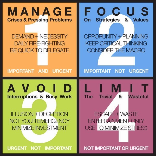
If we can’t reduce volume of professional communications (be that emails, Teams messages, whatever – just look at Steve cleaning his mailbox and removing >100,000 Sent Items from a single year), then maybe we could do a better job of managing the stuff that we have to deal with. Much ink has been spilled on how to be more effective and how to get things done, but one useful time/focus management principle to revisit is sometimes known as Eisenhower’s Matrix, of which a variety of depictions exist:

clip_image003

The premise is that any task has separate degrees of importance and urgency; we tend to prioritize urgent and overdue things versus things that are actually important. Discipline in task management can give us the clarity to not worry about seemingly urgent yet non-important tasks, and to stay focussed on things which are important, regardless of their urgency.

Carve out 75 minutes if you can – because this stuff is important – to watch Randy Pausch’s lecture on Time Management, with the context that when it was recorded, he knew he only had weeks left to live: talk about prioritizing important vs urgent.

How you put time and focus management into practice will differ depending on your own style and what tools you want to use. For the Windows / Microsoft 365 user, there are a few quick wins to consider:

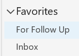
  • clip_image005If you use flags in Outlook to mark messages needing your attention, think about setting a “Follow Up” search folder as the top of your list of Favorites. You can even make the Follow Up folder the default one so Outlook always opens that instead of your Inbox. You could try setting up a scheduled task to open your Follow Up folder every day (since most of us don’t restart our PCs very often, Outlook will typically stay running; this way will make sure you’ve got Follow Up open first thing every day)

  • Take better notes – remember that you can quickly create a OneNote notes page from an Outlook appointment; we’ll see some improvements coming to the original OneNote client in 2022, so if you’ve switched to using the Metro Modern Store app “OneNote for Windows 10”, then it’s worth revisiting the original. Do check out the fantastic OneCalendar addin to desktop OneNote, which helps you look back on notes you took.
  • Remember that Outlook Tasks and Microsoft To Do integrate with each other; see the Ignite session for how to use them more effectively. You can also highlight action items (from your meeting notes?) in OneNote, and quickly create Outlook tasks. While Tasks and To Do items don’t quite have full interop, there are 3rd party solutions out there and there are lots of templates in PowerAutomate which can do groovy things with Tasks, notifications and so on.
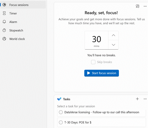
  • The Windows 11 Clock app has a nice new “Focus sessions” time management feature, to help you concentrate on important tasks, and it now supports signing in with Microsoft 365 credentials so you can see your corporate Tasks / To Do items in the list.


    clip_image007

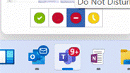
    clip_image009To help maintain focus, you can quickly set your Teams status to Do Not Disturb by hovering over the application icon on your Taskbar and clicking the appropriate status.

    If you’re easily distracted, you could also switch Outlook to Offline mode so you don’t get any new email whilst you focus – a good alternative to closing Outlook down altogether, since you may need it for whatever work you’re doing.

    clip_image011
    clip_image013Go into Outlook, under the Send / Receive menu, click the Offline button on the taskbar and you won’t get any more email until you click the Offline button again to reverse the process and re-emerge later.

595 – Emoji reboot

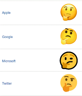
clip_image002Emojis can trace their roots back to the first 🙂 from September 1982. Originally knows as emoticons or simply smileys, many of us have adopted these icons like a form of punctuation, especially in social media / Yammer / Teams type comments. This topic was last visited 4 years ago in ToW 391.

Emojis are mostly agreed and defined by the Unicode Consortium, which controls the Universal Coded Character Set, adopted by many systems to maintain compatibility between each other. When a user sends a symbol in a text message, the phone of its recipient needs to know which character was being sent or confusion may occur. Interpreting what the actual emoji symbol means is still down to the end user, and there are many pitfalls to avoid.

clip_image004Once both sender and recipient of a message or comment agree which emoji to display, the application or platform they’re each using still has to decide what it will look like, and sometimes the iconography – and therefore the subtext – will have changed over time; see the Pistol Emoji (emojipedia.org) as just one example.

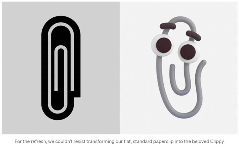
Microsoft decided to adopt a “flat” emoji look in the Windows 10 timeframe, but that is starting to change again with the upcoming release of Windows 11 and the evolution of Microsoft 365 – as Art Director and “Emojiologist” Claire Anderson previewed, we’re going 3D and Fluent, due late this year. Oh, one more thing…

clip_image006

clip_image008

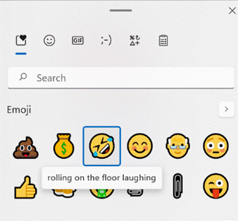
ToW reader Paul Robinson draws attention to the shortcut way of inserting emojis in Windows – it’s been a feature for a while now – just press WindowsKey + and it will allow you to insert emojis into pretty much anywhere that accepts text.

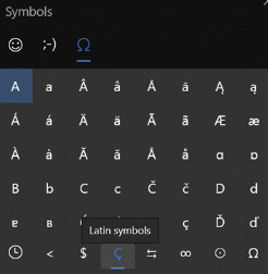
The UI for the emoji panel is changing in Windows 11 too, with GIFs and other types of symbol being included and the whole thing is easier to search. A useful tooltip shows you what the symbol represents, though as said before, be careful with the potential interpretation of some of them. Peachy.

clip_image010In Windows 10, the same keystroke brings up a simpler yet slightly more confusing UI. Both old and new (under the Symbols grouping) provide a neat way of finding and inserting clip_image012other special characters; arguably quicker than fishing about in the Office menu, and certainly better than faffing around with typing in ANSI codes.

Paul likes to start Teams channel names with an emoji, and if you want to illustrate one difference between old world and new, try using them in email subject lines and see just how they appear in Outlook clip_image014versus Outlook Web App… clip_image016

575 – Who’s meeting?

clip_image001Organising a meeting in Outlook means sending out requests to participate – effectively you’re creating an appointment or event in your own calendar, then converting into a meeting by inviting other people to join you. If you’re putting something in your diary and want other people to know about it, but without expecting them to join you (eg you’re going on vacation and presumably don’t want your teammates to tag along), simple tricks can reduce the annoyance you might foist onto your co-workers…

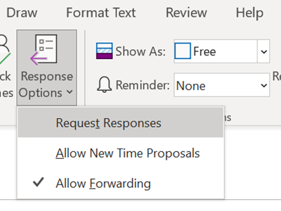
  • clip_image003Create a separate appointment for sharing (rather than forwarding one already used to block out your own calendar)
  • Under Response Options, clear the default “Request Responses” option, so they don’t need to respond
  • Set Reminder to None so people don’t get a notification fired, unless you think you’re important enough to make sure they know at the time, that you’re away
  • Show As: Free, so your appointment doesn’t block out their calendar and get in the way of other people who are trying to book proper meetings with them. Think of this as an FYI for colleagues’ calendars.

Who has responded? Have most people declined?

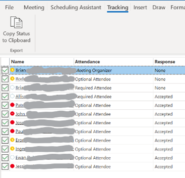
clip_image005When you open a meeting you’re organising and which you do want people to respond to, you’ve always been able to see (in the Tracking tab) how many people have accepted or declined etc. A couple of years back, Outlook added the feature of Tracking if you’re an attendee, so anyone in the same tenant as the organizer can see who else has accepted etc.

If you are organising or attending a large business meeting with lots of attendees, it’s useful to be able to slice and dice the attendees more effectively – have most people declined and should I move the date, for example – click on the big Copy Status option at the top of the list.

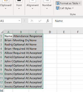
clip_image007It’s now easy to paste the info into a blank Excel sheet, and before even changing selection, hit the Format as Table option on the Home tab; confirm the selection area is OK, tell it you want to add a header row and choose a style that suits.

If you right-click the table and select Table > Totals Row then if you filter the headings – like the responses, for example, you’ll be able to quickly see how many Accepted, Declined and so on.

What could be interesting, too, is showing attendees names alongside their role, department, which office they’re from, their actual email address etc…
clip_image009

Well, thanks to the magic of macros, use this Address Book Resolver spreadsheet, and just paste the responses from the Copy Status… step into cell A1, then hit the Resolve button.

Some attendees might be external users (so won’t be known to your address book), and some of the names in the first column might not be unique enough to resolve, and will be highlighted (alongside external users) by a red Unknown in the Job Title column.

clip_image011If you manually look up an unresolved internal user in the Outlook address book, and find the correct alias name for that person, paste it into the first column instead of their name, and re-run the Resolve function.

To use this sheet for resolving any list of bulk display names or alias names, just paste them into column A (and hide Columns B and C if you’re not using the output from a meeting invite tracking list).

To prepare the spreadsheet for use, download the Address Book Resolver file as above (here it is again). Open the ZIP file and open the enclosed XLSM file or save it somewhere on your machine, then open it. Make sure you Enable Editing, then Enable Content so you can run the Macro that does the lookups.

This is an evolution of the Alias resolver sheet posted back in ToW 417.

566 – Who’s Better, Who’s Best?

clip_image002A little over 10 years ago, a then-Microsoftie called Philip Su rolled up his sleeves and wrote a website that helped him – and others – to traverse the corporate organisational structure; over time, other people and teams added functionality and even depended on the service, to the extent that it was eventually picked up by the IT function and supported as a corporate tool.

“Dr Whom (sic) showed profile pictures of people along with reporting hierarchy and other contact info gleaned from the corporate directory, alongside self-provided stuff like what projects you were working on or what interests you.

There are plenty of other ways to look at corporate structure and profile information, assuming they’re correctly defined in the directory – there’s the /who app in Teams, for example, as featured in ToW #487, and there’s also a quick way of looking at someone’s Org chart by entering /org in the search bar on Teams – the quick way being to press CTRL+E to jump to the Search bar, then type /org [TAB] name (or enough of the name to have your target showing at the top of the list) then [ENTER] to jump straight to the Organisation tab of their contact.

clip_image006

You can find the same information in desktop Outlook by opening someone’s contact or profile card, or in the Microsoft 365 “People” web app. Outlook & People bring together both a corporate directory and your own personal contacts list. Did you know, incidentally, that the silhouette shown in Outlook 2010 for a new contact (if you didn’t provide a photo) was based on an infamous photo of a well-known business leader?

But inside MS now, Dr Whom has been succeeded by Who+ (accessible to FTEs), which brings much tighter connections with LinkedIn, giving more of an emphasis to discoverability for networking internally, finding new career options and the like.

One question not listed in the Who+ FAQ is, “Will Who+ be available to customers?” – and the answer is: no, not yet – it’s just a Microsoft internal tool for now.

One reason may be the recent announcement of Microsoft Viva – an employee experience platform, which appears to be an amalgam of existing Microsoft 365 services (Teams, SharePoint, Yammer…) with LinkedIn, and a load of forthcoming new functionality plus 3rd-party services and tools.

Back in September, it was announced that Microsoft was working to try to help employee burnout during the pandemic, and partnering with mindfulness experts Headspace was one example bringing in external content. Satya talked with Headspace’s Andy Puddicombe during the Ignite 2020 keynote.

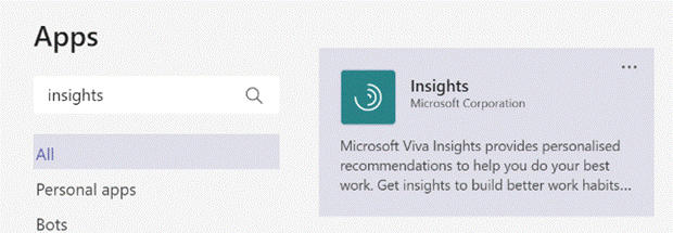
Most of the Viva platform is still in development, but some applications – like Insights – are being repackaged as part of the initiative.

clip_image008

Check out the Viva Insights app which should already be visible in Teams – click the Apps icon in the clip_image010Teams bar on the lower left, and search for Insights to add it. Insights helps to surface things from your email, and also identifies time that you could protect as Focus Time – so you don’t get interrupted.

Thinking about naming, make sure you don’t confuse Viva with the 1970s saloon from Luton (as El Reg pointed out) or its revived but short-lived modern snooze-box cousin. Or with paper Mexican donkeys. Or that song by the well-known crooner. Just visit http://aka.ms/viva to find out more.