|
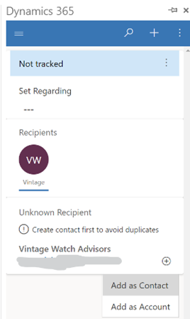
Depending on the rules of your particular system, you’ll probably need to provide a job role and maybe some other fields, and you might not be able to associate that contact with an account yet – perhaps you’ll need to save it to Dynamics first, then make the association with the account to which the contact belongs.
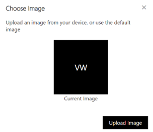
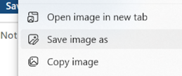
Getting images from LinkedIn can be a little more laborious especially if you’re doing this in batches. Here’s a fairly simple technique to make it easier.
|
Category: Office
655 – Like my email
Every time you buy anything, stay anywhere or eat something, you’re peppered with requests to review and recommend whatever it was. If review / like fatigue has not yet set in, there’s now the ability to signal a reaction with emails in Outlook and M365.
The likey-likey feature is only present for emails in your own organization – ie. you can’t like that email that informs you’ve won the state lottery, or that your Apple ID has been compromised (though it is reported that sometimes the reactions do work across tenants). You can, however, send an appropriate emote to any email that originated from someone in your organization (even if there are other externals on it).
 In desktop Outlook, look for the smiley icon in the response area at the top right of a message in the preview pane or when you open it outright; Outlook Web App has a similar UI which might contain other extensions’ icons next to the smiley too.
There isn’t a could have been a  meeting or a please take me off this email button, but whenever you click on the like, love, laugh etc icon, the reaction is visible to the originator of the mail. (Happy Silver Anniversary, btw, Bedlam DL3 – hope you get on the EBC wall)

 To see what people have to say of the guff you send, look at the Notifications icon in the top right of Outlook / OWA, and as well as any mentions you may have from people who can’t type your name without putting an @ in front of it, you’ll see a summary of who has reacted to each message, and how.
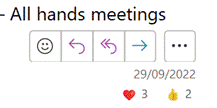 Alternatively, look in your Sent Items and if you select a message you can see what reactions it has had; there isn’t an easy way to show reactions in the table view so you could see which messages are the most popular without having to preview or open them up. It probably can be done – though likely a palaver for limited utility.
Here’s a challenge – if you’re a ‘Softie and you got this in email, react to the message and see if we can break the internet.
Thank you for all that you do!
653 – Bookings with me, you, everybody
Ideally, within an organization where people are expected to work together, they will use tools that have been around since the 1980s and actually share their calendar with their colleagues.
Outlook users can usually see blocks of when someone looks free or busy, when looking in the Scheduling Assistant tab on a meeting, though it won’t show external attendees and unless the attendees have chosen to share their calendar details, you won’t see anything other than tentative, free, busy or out of the office. Hopefully, some eejit won’t have blocked everyone else’s calendars by informing their colleagues of an impending day off.
 When dealing with people in other time zones, there is a clue to whether they are likely to be able to join a meeting (quite apart from whether they have their calendar blocked or not) – the Work time setting is meant to show others what days and hours their expected work time is supposed to be.
Looking at the scheduling assistant grid, the light-grey area is supposed to be not-work time, and if there are any  lighter-coloured blocks, that means they’re free and open for booking. Individually, you might also see their time zone displayed in their Profile Card when clicking on the user’s name in Outlook, Teams etc. Again, this is available for people in the same organization, so when dealing with external parties another approach will be required.
A variety of 3rd party services exist to help people find time when others are free – a bit like a restaurant or hotel booking service, tools like Calendly or HubSpot (others are available) offer to expose your free time slots to selected external people, so they can find a slot that you are available and reserve it for a meeting with them. Office users could also use FindTime, which effectively sends a poll of suggested times to a group of people and gets them to vote on which one suits them best.
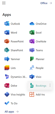
There’s also a Bookings application which is part of Microsoft 365; accessible via the app launcher icon (the grid of squares on the top left if you login on office.com using an account with an active M365 subscription). Bookings is designed to manage scheduling across a group of people – like in a hairdresser’s salon, where multiple members of staff could be available on different shift patterns, but a simple web UI is presented to an end customer so they can find a time when their favourite snipper is available.
Regular ToW contributor Ian Moulster spotted a new addition to Microsoft 365 which appeared in July, and though it may have common underpinnings, it’s a different offering to Bookings – called Bookings with me.
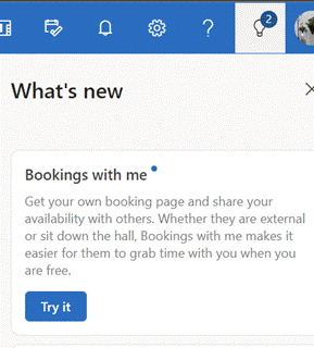 You might spot the Bookings with me notification in the top right of Outlook Web App, or try setting it up at outlook.office.com/bookwithme.
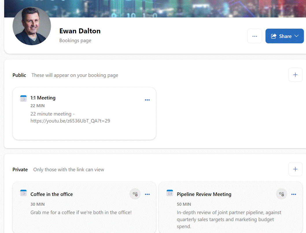
If available in your subscription, you can then set up a booking page with a menu of meeting types you want to accept – eg 20 minute 1:1 Teams calls in “public” (ie available to anyone who has your booking page URL – you might even add it to your email signature), or more specific meetings that are “private”, which you can choose to make available individually to sets of people. There are numerous of controls over how much time before and after the meeting, what days/times it can happen etc. Availability is synced with your Outlook calendar.
When you share the booking page or private URL with people, they just find themselves a time that’s free, and either sign in with a M365 work or school account or give another email address. If the latter, they will get an email with a verification code to enter into the booking form (M365 users are presumed already clean), and after confirming the code, they’ll get a meeting request sent from your calendar, with location and/or Teams details.
650 – All hands meetings
Even though Dilbert isn’t funny any more there have been some good ones in the past, satirising corporate life. People who used to be cubicle or office based might struggle to deal with the new reality that most office workers would rather not be in the office 5-days-a week, 9 to 5, yet bosses would prefer people to not be slacking off at home in their PJs.
Zoom, Teams and other platforms adopted a metaphor in an online meeting, where attendees can figuritively raise their hand so they can be asked to speak. It works well when the people running the meeting have the discipline to check that they don’t have a forest of lifted paws before asking, “are there any questions?” to their audience.
It helps if presenters are not doing the lowest-common-denominator thing of sharing their desktop to present slides. Using Teams’ own slide sharing means you can see the chat, and who’s joined, and whether they have their hand raised.
 Meeting participants also need to have the practice of raising their hand and waiting to be invited to talk, rather than blaring in to raise new topics or talk over others. Other attendees can also see who has their hand raised (look in the video gallery and you may notice those who have their hand raised are highlighted) and if you look in the People pane, you’ll see the order that attendees raised their hands as well, so if you’re the organizer then you can ask the top and most patient questioner to contribute at a point that makes sense.
A new etiquette has sprung up in hybrid meetings, though – how to balance commentary from remote attendees with chatter that’s happening in the room? Ordinarily, you’d rely on body language in a meeting room to decide it’s time to interject, nodding and perhaps making hand gestures yourself.
When some / half / most of the attendees are remote but you’re in the physical meeting room, it might be prudent to actually join the same Teams meeting on your PC – you’d only be sitting in the room looking at email on your screen anyway – and use the hand raise function before speaking, even if you’re sitting next to other contributors. This way, you’re on the same footing as all the remote attendees and it shows that you are at least giving the pretence of thinking about them too.
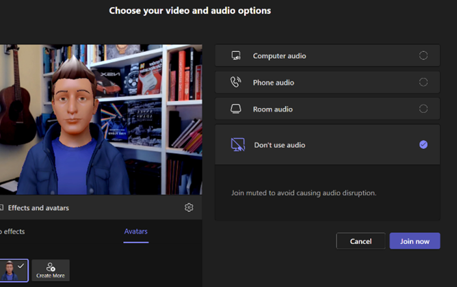 When joining a Teams meeting on your PC, there’s a yeah-yeah dialog box which pops up just before entering the “room”, which presents various potentially relevant audio related options. The norm would be to use comptuer audio, then select what speakers/mic you want to use.
These join options can also give you a number to dial in to (or be called by the meeting, so you can stay silent and camera-less on somebody else’s dollar).
If you’re the first to join while in a physical Teams Room, you could bring the room system into your meeting and control it from your machine.
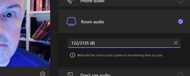 If you are a bod in the room, though, then choose “Don’t use audio” to avoid any mic or speaker issues, causing endless echo. That way, you can enter the online meeting while being in the actual room, interact with other attendees on chat and use features like reactions and hand raising just as if you’re sitting at home.
Just remember that you are, actually, in front of other people, and also remember to change the default option back to “Computer audio” next time you enter a truly remote meeting, or you’ll spend the first few minutes saying “hello, hello? Can you hear me…?”
649 – Exploring SharePoint libraries
 SharePoint is now old enough that it could walk into a bar and buy itself a beer. It has changed a lot over the versions; starting out as a server product that would produce “portals” (or “digital dashboards”) it grew quickly to being rather more document-centric. SharePoint became the back-end for OneDrive for Business storage, and both have evolved a long way.
Two years ago, SharePoint was said to be used by over 200 million users. The following year, the Gartner MQ had it way out in front on the “Ability to Execute” Y-axis and slightly behind only one other supplier on the “Completeness of Vision” X-axis. It won’t be long now for the next MQ report to appear.
Nowadays, SharePoint underpins quite a lot of Microsoft 365 functionality, such as apps like Lists which provide a groovier UI over the top of the base web services, and the document oriented collab in Teams.
 If you look at a file library in Teams, you’ll see a bunch of SharePoint-y options – you can Sync the content offline and it will be held offline, using OneDrive to sync it (and if you like, syncing only the files you’ve opened rather than the whole shebang).
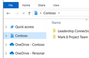 The Sync’ed libraries show up in the Windows Explorer app, and in any number of applications’ File | Open / Save dialog boxes, so you can access and interact with the files through the apps you use rather than browsing to SharePoint.
You’ll see a collection of folders that have been set up to Sync, shown with your organization name, alongside any personal OneDrive and OneDrive for Business synced libraries.
The Download option (next to Sync on the Toolbar in Teams), creates a single ZIP file your computer, with the entire contents of the folder you’re looking at, so use it carefully.
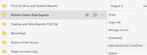 One somewhat overlooked option further to the right of the toolbar (or may be on the ellipsis (“…”) menu): Add shortcut to OneDrive. This creates a shortcut link to the current SharePoint folder within your main OneDrive for Business storage, making it easy to find that SharePoint folder in the future, even though it’s not synced offline. The Add shortcut option is also visible on the ellipsis to the right of sub-folders when viewed in SharePoint or Teams.
Don’t add shortcuts to libraries – or sub-folders – which are already being Synced offline. That would be bad.
One downside to the OneDrive shortcut approach is that it just dumps the link into “My Files”, which is the root folder in OneDrive. The shortcut is named the same as the original source – so if you have lots of Teams folders with the same name (eg “Documents”), they will clash with each other as adding a new link would try to create a shortcut with the same name as one that exists already.
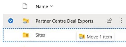
One solution would be to create a subfolder in OneDrive, called Sites (or similar), and after creating the shortcut to your latest Teams/SharePoint site, go to the root OneDrive folder and move your new shortcut – maybe renaming it too, so you can see what its parent site was (since the shortcut doesn’t make it clear what the source SharePoint site is) – you’d then have a Sites folder with lots of Shortcuts like Project Team – Documents etc.
Another side benefit of using shortcuts rather than Syncing offline, is that if you have multiple PCs – or feel like accessing OneDrive through a browser on a different machine altogether – you will always have access to the same collection of shortcuts, whereas the Sync offline capability is configured separately on each machine.
646 – Finding stuff in OneNote
![clip_image002[6] clip_image002[6]](/wp-content/uploads/2022/09/clip_image0026_thumb.png) Many people ❤️ OneNote. It has evolved much over the ~20 years since it sprang from the “Scribbler” project at the turn of the century and was released in the Office 2003 wave, under the name which the developers disdainfully referred to as “Onay-no-tay”. A recent update to the OneNote strategy for Windows was covered in Tip #632.
Many people ❤️ OneNote. It has evolved much over the ~20 years since it sprang from the “Scribbler” project at the turn of the century and was released in the Office 2003 wave, under the name which the developers disdainfully referred to as “Onay-no-tay”. A recent update to the OneNote strategy for Windows was covered in Tip #632.
![clip_image004[4] clip_image004[4]](/wp-content/uploads/2022/09/clip_image0044_thumb.jpg) There were other OneNote tips a few weeks previously, in Tip #617, including OneTastic, a great addin to the traditional desktop app – the
There were other OneNote tips a few weeks previously, in Tip #617, including OneTastic, a great addin to the traditional desktop app – the Metro Modern app never had an addin capability.
As well as powerful macro capabilities, which can do things like generate tables of contents or sort pages and other works in ways that the base app doesn’t offer, the OneTastic addin includes the OneCalendar application – also available to install separately – which lets you see which OneNote pages were edited on each day.
If you keep a note of every meeting, stored in different places – by topic, by customer etc – then this is invaluable when it comes to finding notes, as you can see what you last wrote on a given day.
Of course, OneNote has searching capability where you could look across notebooks for key words. There is the ability to Tag notes too, and you can search across notebooks for tagged content.
![clip_image006[4] clip_image006[4]](/wp-content/uploads/2022/09/clip_image0064_thumb.png) A powerful yet somewhat hidden search capability in desktop OneNote is also available – you can press CTRL+F to search on a given page, or CTRL+E to run a simple query across multiple places, for where a particular word is mentioned.
A powerful yet somewhat hidden search capability in desktop OneNote is also available – you can press CTRL+F to search on a given page, or CTRL+E to run a simple query across multiple places, for where a particular word is mentioned.
![clip_image008[4] clip_image008[4]](/wp-content/uploads/2022/09/clip_image0084_thumb.png) Look, however, at the “Pin Search Results (Alt+O)” option at the bottom – it opens search results in a pane to the side, and lets you sort by different criteria, e.g. date modified.
Look, however, at the “Pin Search Results (Alt+O)” option at the bottom – it opens search results in a pane to the side, and lets you sort by different criteria, e.g. date modified.
This ALT+O option can only be invoked from within existing search results, so if you want to find all your recent notes with a searched-for word, press CTRL+E to start, then ALT+O and search by date modified to see the results clustered by month.
640 – Smart Dates
For all the time that computers have been used, date handling has been a problem. Bad dates cause problems from sorting lists to processing payments, yet many systems force the user to figure out what it expects by way of date entry – from web sites which force 2-digits (a la 01/01/22 vs 1/1/22) to non-localised apps which assume a date format without allowing it to be changed?
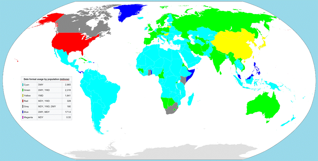
If you ever say a date out loud like “this report is due by eight-one”, meaning 8/1 or 1st August, then 91% of the world’s population will need to interpret that differently to how they represent dates, since most will expect the format to be day-month-year, or arguably most sensibly, year-month-day.
Try saving things like expense reports or invoices using the file name starting yy-mm-dd or even yyyy-mm-dd and they’ll be much easier to handle (aside from just sorting by created date, of course).
When a user enters a date into a Windows app, the vast majority will respect the format set by the operating system, known as the User Locale.
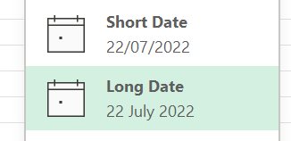 That doesn’t help too much if the author of a spreadsheet – for example – is in one locale and
 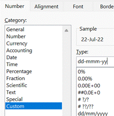 other users are elsewhere; if the default date format is numeric, then the field remains in the format of the author, and that may cause befuddlement.
Switching display format to Long Date – or even setting a shorter custom format – could avoid confusion. Under the covers, Excel still stores the date in a universal format, but people might interpret it incorrectly when display in a different format.
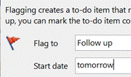 Other tools can handle dates in surprisingly smart ways – even since its first version in 1997, Outlook lets you enter text into date windows like a Due Date for reminders or tasks – any time you are presented a date field that lets you type as well as select a date from a calendar picker, you can put stuff in like tomorrow, 2 weeks, next Friday, third Tuesday in October etc. There are shorter versions – 2w, 3m 10d – or you can string things together, like Monday before Christmas.
 Microsoft To Do has also has some date smarts; if you type in a new task to track, it can read dates and times out of your task description and automatically set due dates and Reminders.
 It has other kinds of parsing – in 3 days etc – though not quite as comprehensive as Outlook’s. There are also a load of special dates recognised (at least in the US).
So far, this functionality is available on Windows and iOS apps and for the most part it’s really neat. If it detects a date you don’t like – you’re suggesting something may happen, rather than it is happening on 1st May, for example – then just hit backspace to clear that association.
#639 – Macros, Ghosts and GALs
 Since the early days, Microsoft always kept an eye on what its competitors were doing. It was once de rigeur to produce “battlecards” which would show feature-by-feature how one product is better than its competitor, thus assuring the customer they should buy this one. Thankfully, times have mostly moved on to just building as good a product as possible and then let customers and the markets decide – sometimes, they get improved and honed over time to be the best out there, and sometimes they get dispatched to the boneyard as times move on.
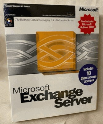 In the late 1990s, Office and Exchange (and later, SharePoint) Server were seen as Microsoft’s entrants into the burgeoning “Groupware” market, which became subsumed into “Knowledge Management” c2000. Key competitors to Exchange & Outlook were Lotus Notes and Novell GroupWise, both of which came from being collab tools and gained email functions. Notes was arguably much more mature and feature rich even if the UI was sometimes clunky, GroupWise was much leaner but found a niche in several industries. Amazingly, GroupWise is still a thing and Notes evolved first into IBM Notes/Domino and was eventually sold off to now be HCL Notes and HCL Domino.
One of the early moves Microsoft made to elevate Office apps to more than just writing documents, was to try to make the docs more capable through adding Macros, and later, Visual Basic for Applications. This allowed a moderately skilful user to dabble in programming to make smarter applications centered around documents; what seemed like a good idea at the time unwittingly unleashed a wave of malware, where bad actors wrote macros to do undesirable things. Following the “Melissa” worm in 1999, Office stopped Macros running without asking the user for permission. Using Macros for anything more than tinkering never really took off.
Macros disabled entirely
Microsoft announced in February 2022 that all Office Macros in content received online would be disabled completely; this was temporarily rolled back in some test builds for some changes to be made in how it works, but for many, the warning will still be there if you open a Macro-enabled file that you’ve downloaded or been sent.
 There are still some very useful Office macros out there, and if you do need to run one that you know is from a trustworthy source, there is a workaround – save the file to your PC locally, then right-click on it to look at the file’s properties, tick the “Unblock” option and apply that. You’ll now be able to choose to run the macro unencumbered.
One such handy macro was discussed back in December 2021 in ToW 611, and is used to find Ghost meetings – ie ones you have arranged but everyone has declined (or at least not accepted). The macro spins through all future meetings in your calendar and lists the ones you’ve organised but where you’re likely to be the only attendee who shows up. Particularly useful at this time of year if lots of people are about to take time off over the summer, and may have declined a few recurring meetings but you – as organiser – still have them in your calendar.
For the latest version of the macro, download the ZIP file to your machine and expand it (or just copy the XLSM file that’s within and put it somewhere else), do the property Unblock thing as above, open in Excel, click the button to allow content, then the Scan Calendar button and you’re all set. You still need to go into Outlook and look at the appropriate date then decide if you want to cancel those meetings or not.
Another more powerful macro – though a little more esoteric – is one which does bulk resolution against the Global Address List, so if you give it a list of display names and/or alias names, it will show the full name, title, department, office, email, and alias name of that person. Handy if you want to get the full details of everyone who is going to attend a meeting, but if you just have a longish list of names then you could just paste them in and see how it goes. This was covered back in ToW 575. One usage scenario recently was to estimate the number of people who were attending a group meeting, but were based at other offices and would therefore need accommodation.
Here’s an example output of over 500 names who were invited to a large meeting; by just providing their display names in column A, it took the sheet about 30 seconds to complete, with 10 identified as distribution lists and 50 unknowns who couldn’t be resolved, either due to no longer being in the GAL or because there were more than one possible name listed.
If you can manually find the unknown person/people in the GAL, then get their alias name and paste that into column 1 instead of the ambiguous display name, then try to run it again.
635 – Outlook Wunderbar and Full Screen
|
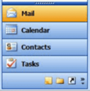
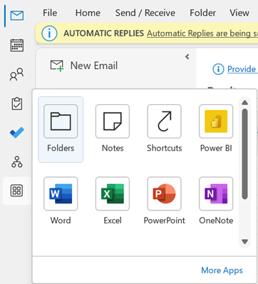
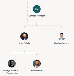
Other apps can be pinned to the new bar, too – including things like the Org Explorer, which presents a much more graphical way of looking at the org chart than the old Address Book in Outlook.
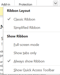
You could try Simplified Ribbon to reduce the size and hide some of the more esoteric functions. Show tabs only reverts to a simple menu bar, and when you click on one of the options, the ribbon for that tab is displayed. You can toggle easily between Tabs Only and the full ribbon by pressing CTRL+F1. There are loads of other shortcuts for Outlook though some are a little obscure.
If you need to search your mailbox while in full-screen, press ALT to temporarily display the ribbon, and look for the highlighted keys that can jump to specific tab or function.
|








![clip_image002[4] clip_image002[4]](/wp-content/uploads/2022/08/clip_image0024_thumb.gif)
![clip_image004[4] clip_image004[4]](/wp-content/uploads/2022/08/clip_image0044_thumb.gif)
![clip_image006[4] clip_image006[4]](/wp-content/uploads/2022/08/clip_image0064_thumb.gif)
![clip_image008[4] clip_image008[4]](/wp-content/uploads/2022/08/clip_image0084_thumb.gif)
![clip_image010[4] clip_image010[4]](/wp-content/uploads/2022/08/clip_image0104_thumb.gif)
![clip_image012[4] clip_image012[4]](/wp-content/uploads/2022/08/clip_image0124_thumb.gif)

