|
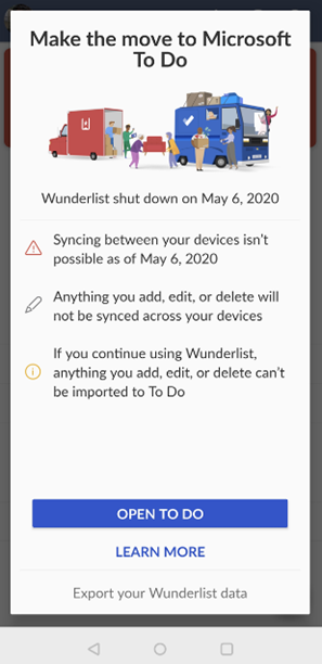
Nearly 5 years ago, Microsoft acquired a German developer called 6wunderkinder, who built a cool, cross-platform task management tool, Wunderlist. Over the half-decade since, the back-end of Wunderlist was basically rebuilt so it could run on Azure (instead of its previous cloud platform), and many of the team who had developed Wunderlist moved to working on the Microsoft To Do app suite. The
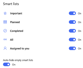
The Microsoft To Do service has The To Do team also updated the mobile apps (as announced on their blog), with a collection of new features and views of tasks, and the Windows app has also been tweaked lately too. New features include new Smart Lists, such as “All”, which shows everything in one huge list, grouped by category. “Tasks” across different apps are being integrated more and more – To Do now lets you create tasks from flagged emails, or integrate tasks from Planner. Teams is going to rationalise tasks into a single UI too. |
Tag: Productivity
512 – Sticky Notes and Glancing
|
Happy New Year! Whether it’s a way of keeping up with the NY resolutions you haven’t broken yet, or just a casual way to remind yourself to do stuff, Post-It Notes or the more generic “sticky notes” can be a useful tool. ToW # 446 talked about a handy Windows app that is now installed by default on Windows 10. Sticky Notes has been through a number of iterations, and now in v3.7 it’s looking pared back yet really functional. Sure, you can use Outlook Tasks and To Do to track significant actions, long-term projects and the like, but sometimes you just want a simple list to get you through the morning or to take shopping. If you open Sticky Notes, and click on the body of a note itself (to set focus to that window and start editing the text), then you’ll see the menu and close controls; clicking the menu lets you quickly change the colour of your note (so if you have several open, you can
You can type, write (with your finger, or a stylus), or grab pictures from camera or existing files, all into a note, then share and make sense of it later. You can sync your sticky notes to other devices: just go to the settings icon (from the taskbar context view or within the Notes list) to configure syncing using either an Office 365 or Microsoft Account. Sticky Notes has even replaced the venerable “Notes” function in Outlook, which has been around since 1997 – go to the Wunderbar in Outlook and you may need to click the ellipsis to see the Notes pages; it’s very old-school looking and not everything is carried over quite the same, but it’s a welcome integration that replaces another duplicate way of doing the same thing. It’s part of a long-term plan, so it seems. Multi-device
If you set up sync between devices, it’s quite amusing to open the web client, the PC app, and then on your phone, add a new note… and see the other two update within seconds. Technology #ftw – far more useful than the kind of toot being peddled at CES in Las Vegas this week. On an Android phone, though, the best way to use Sticky Notes is through the integration with the Microsoft Launcher – if you’re not a phone tech geek, you might not realise that with Android, you can supplant the entire home screen UI of the phone with any number of variants. Microsoft has a mature and highly regarded launcher, that
Cortana integration featured in the Launcher at one point, though it’s planned to disappear for many of us. In a “for your comfort and safety” type announcement, news came that Cortana will disappear from the phone in favour of being part of other M365 apps in time. More to follow, no doubt… |
Tip o’ the Week 500 – Greatest Hits
|
On days like these, it’s easy to reflect on previous glories and favourite moments. Brits of a certain age, start playing that TOTP chart rundown tune (without getting distracted by YouTube clips of what was actually in the charts back in the day – some of it was undoubtedly great, some just bad noise)… and get ready for probably the 5 best Tips of the Week since the whole sorry enterprise started nearly 10 years ago… Horizontal lines – this one is incredibly handy when you’re formatting an email or document and need to demarcate a section of content. Simply type three (or more) dashes “—” and press enter. Bingo, thank Autocorrect for that piece of magic. First seen all the way back in Tip o’ the Week #16: All wiyht. Rho sritched mg kegtops awound? OneCalendar / OneTastic – a fabulous addin to the pensioned-off OneNote 2016 (and its predecessors), the OneCalendar function shows you a calendar view of note pages, arranged by when you edited them. It’s brilliant if you use multiple notebooks, and you want to recall something you knew you did on a particular day (like the previous week’s regular call). OneCalendar spawned OneTastic, a suite of other useful addins and macros for OneNote.
Actually, as ToW 393 covered, searching in old OneNote is better, anyway. ALT-O – who knew? OneCalendar was first discussed back in Tip o’ the Week #98 – OneNote calendar front-end
Originally uncovered in Tip o’ the Week #101 – Finding files for dialogs WindowsKey + V – a fairly new entrant to this chart, a feature that arrived with the October 2018 update to Windows 10, and was redesigned a little in May 2019: it shows you the clipboard history, so you can recall URLs, screen grabs etc that you might have copied a few steps ago. Hugely useful once you remember it’s there, once you’ve enabled it. See more in Windows help. First look was in Tip o’ the Week 482 – Paste History 404 – not so much of a tip, as a practical joke played in email. It doesn’t work quite the same in the browser, but you’ll get the idea. Also has some of the best tangential links to random content. Guess what? It was in Tip o’ the Week 404 – [%subject%] not found %&
Thanks to all the regular readers who provide feedback, ideas and encouragement! Will anyone still be here for ToW1000? |
Tip o’ the Week 491 – PowerPoint layout tips
|
There are many resources out there to try to help you make better slides – from how-to videos to sites puffing a mix of obvious things and a few obscure and never-used tricks (eg here or here), and PowerPoint itself is adding technology to try to guide you within the app.
If you don’t see the Design Ideas pane on the right, look for the icon on the Design tab, under, er Designer. The PowerPoint Designer team has recently announced that one billion slides have been created or massaged using this technology, and they have previewed some other exciting stuff to come – read more here. A cool Presenter Coach function will soon let you practice your presentation to the machine – presumably there isn’t some poor soul listening in for real – and you’ll get feedback on pace, use of words and so on. Watch the preview. No need to imagine Presenter Coach is sitting in his or her undies either. When it comes to laying out simple objects on a slide, though, you might not need advanced AI to guide you, rather a gentle helping hand. As well as using the Align functionality that will ensure shapes, boxes, charts etc, are lined up with each other, spread evenly and so on, when you’re dragging or resizing items you might see dotted lines indicating how the object is placed in relation to other shapes or to the slide itself… In the diagram above, the blue box is now in the middle of the slide, and is as far from the orange box as the gap between the top of the orange box and the top of the grey one. There are lots of subtle clues like this when sizing and placing objects, and it’s even possible to set your own guides up if you’re customising a slide master. |
Tip o’ the Week 473 – Teams Shortcuts
|
As world+dog moves from internal corporate email to Teams, Slack etc, it’s handy to know how to get the best out of the new messaging environment. Before abandoning Outlook already, here’s a reminder of some especially useful shortcut keys:
And there are lots and lots more. When it comes to using Teams, one of the most useful shortcut tips is essentially the same as the Outlook set above – CTRL-number takes you to one of the nodes on the side-bar that corresponds to the number from the top – eg CTRL-4 will jump to Meetings, which is handy if you have Teams calls in you
Click the “Join Teams Meeting” icon on the Ribbon in Outlook instead, and you’ll skip this. If you’re super-skilful then you can jump straight to that command without lifting your fingers from the keyboard – just press the ALT key and you’ll see There are many other shortcuts in Teams, with varying degrees of usefulness. Customising the UI is still a bit clunky (eg you can’t add shortcuts straight to the sidebar or move items on it up and down) but you may be able to find a quick way of doing the things you need most. To see a summary of shortcut keys whilst in teams, just press CTRL-. (ie CTRL and full stop/period ‘.’). |
Tip o’ the Week 469 – To-Do Files and Accounts
|
It’s also now possible to add multiple accounts to the Windows To-Do app; so you can have several Office 365 or personal Microsoft Accounts – and switch between them without needing to sign out and in again. Maybe something that Teams could aspire to… To keep up with further news, check out the To-Do blog, or the Twitter account. |
Tip o’ the Week 466 – Mobile Teams Tips
|
In the Teams mobile app, if you look at the Calls tab, under History, tap on a line and then the card to the right side of the list of icons, you’ll get a contact card and the ability to respond back – using Teams – to any one of the listed phone numbers.
Finally, one of the great new functions in Teams mobile is the building-in of Just search for a contact’s name, and their organisational tree is only a tap away. For more tips on using Teams Mobile, see here. |
Tip o’ the Week 448 – Sometimes, size does matter
|
Nowadays, with 50 or 100GB mailbox quotas being the norm, most Outlook users don’t need to worry about reducing the size of their mailbox other than to keep it from being too hard to use – a tidy mind and all that. But if you have massive mailboxes, the storage and organisation of all your content may put an unnecessary strain on your PC, so it’s worth taking a few steps to check and clean up if you can. In Outlook 2016, go to the File menu and l … and marvel at a dialog box that hasn’t changed since the earliest days of Outlook, evidenced by the fact it measures size in KB rather than MB or even GB… Limits to be aware of There are some recommended limits that have been given to Exchange/Outlook users over the years – not just about the overall size of the mailbox, but the number of items in certain folders and even the number of folders themselves. See a 2005 post on the Exchange blog here, for example, which advises keeping the item count low on certain folders (< 1,000 items in the Inbox, Calendar and Contacts folder was the recommendation then – also on the Exchange Blog, check out some of the examples in this post for early pioneers of huge mailboxes). In more recent versions of Outlook, though, there are some guidelines to avoid performance problems:
Now, you’re probably not going to have too many folders with more than 100k items though it might be worth checking Sent Items and Deleted Items. Unfortunately, the mailbox size tool above shows you the total size of each folder, rather than the number of items – and if you want to know how many folder you have, you’d need to manually count them in the scrolling list box: not an easy task if you have lots of them. It’s quite possible if you’ve had your mailbox for a while, and you’re a very diligent filer (especially if you use a methodology like GTD or tools like ClearContext), you could inadvertently have more than 500 folders – and if you use AutoArchive, then you could find a lot of them are empty, since the archive process moves the items out into another location but leaves the folder structure behind.
FolderCount to the rescue Here’s an interesting little hobby project – a macro-enabled Excel sheet which cycles through all the folders in your mailbox, tells you how many items are in each one and offers to get rid of the empty ones for you. It can be run in:
Use with caution; though anything that is successfully “deleted” will be moved to Deleted Items first, therefore you’ll need to run it again to actually do the damage (or just empty your Deleted Items… a thought that fills some people with dread). To run it, click on the link above, save the file locally, open it up in Excel and you’ll need to Once you’ve done that, click on the appropriate button to let it run. I’d suggest starting with the top one until you feel brave… *The Thread Compressor tool was made available externally after a time, but the domain disappeared… the actual Outlook Addin is again available here, but you’re a bit on your own as far as installing and using it is concerned… |
Tip o’ the Week 446 – What’s brown and sticky?
|
A: A stick… Q: What’s yellow and sticky? Yes, the Post-It note (which has gone on to spawn many imitators, sometimes known as just “stickies” or “sticky notes”) was essentially invented by accident almost 50 years ago, by a scientist at 3M who was trying to make a super-strong glue but instead came up with one that didn’t really stick very well but was at least reusable and didn’t leave any residue behind. Of course, the real story is a lot less simple – the product really took more than a decade to perfect, and convincing people that it was a viable business took several attempts, but eventually it went on to be one of the most-bought office supplies in history. The digital equivalent has had decades of evolution too, from a simple note app from the company that brought you Tiny Elvis to the Sticky Notes application that shipped with Windows 7, and innumerable similar apps in the various mobile and desktop app stores. Starting with the Windows Insider “Skip Ahead” community (but soon to roll out wider), the Microsoft Sticky Notes app has been heavily revised, consolidating the multiple windows that would typically be left on your desktop with a single list, and then pop-out notes that feature multiple colours, support for ink, cross-device syncing and more. Keep an eye out for the Sticky Notes 3.0 arrival on your PC. As MJF says, with the same team now responsible for OneNote, To-Do/Wunderlist, and Sticky Notes, it’ll be interesting to see how deeply integrated they get. |
Tip o’ the Week 443 – Starting modern apps
Apps pinned to taskbar The taskbar in Windows obviously shows you what’s currently running, but can also be used to pin frequently accessed apps or – by default at least – those that Windows thinks should be frequent (Edge, Store, etc – right-click on them to unpin if you disagree). You’ll see a highlight line under the apps that are running, so those without the line are simply pinned there. If you start typing the name of a favourite app at the Start menu, If you drag the pinned apps around, they’ll stay in that position relative to each other, and new apps will always start to the right (or underneath, if you use a vertical taskbar, as you really should). Now, if you press WindowsKey+number, you’ll jump to the app that is n along the line, and if that app isn’t running, then Windows will start it. So in the picture above, pressing WindowsKey+2 would start Edge, or WindowsKey+3 would bring Outlook to the fore. Shortcut to desktop
Assuming your Start menu isn’t full screen then you’ll be able to drag icons or tiles from the menu to the Desktop, and if you right-click the shortcut and look at Properties, you’ll see a Shortcut key: This method differs from the taskbar one above, because each press of the shortcut you set might start a new instance of the app (if it supports that) – which may or may not be desirable. If you end up with several windows of OneNote, for example, you could cycle through them by repeatedly pressing the appropriate WindowsKey+n as above. Keep on Running There’s no better mark of being a real PC deity than by launching your apps through running the executable name… you know the drill? WindowsKey+R to get the Run dialog (it’s so much faster than pressing Start), then enter the app’s real name and you’re off to the races. winword, excel, calc, notepad… they’re for novices. The genuine hardcases might even dive into the (old fashioned, obvs) Control Panel applets like ncpa.cpl rather than navigating umpteen clicks. Looking at the shortcut to OneNote’s modern app above, though, it’s clear there isn’t a simple executable to run – onenote will launch the on-life-support OneNote 2016 version. Many modern apps do, however, let you launch them from the Run dialog by entering a name with “:” at the end… Examples include:
|



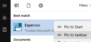 then right-click on it in the list, you can choose to pin it. So far, so good.
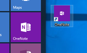 You could try an old-
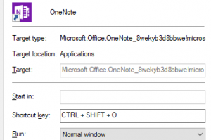 option… just press some key sequence that makes sense to you and press OK to save.