|
Streaming technology has risen with the availability of high-speed, low-latency internet access, allowing users to play on-demand – rather than watch or listen at the time a broadcaster decides – and is wiping out the need to record live TV to watch later, maybe even obsoleting the concept of broadcast TV. Perhaps the next vanguard is the gaming industry – as Microsoft and Sony get ready to launch next-generation consoles, buying a disc-based game to install and play will soon feel as old-hat as going to Blockbuster to rent a VHS for the night. Streaming games on-demand as part of a subscription service may be norm, rather than buying and owning a title outright. The console isn’t the only destination, though – streaming to mobiles is on the way.
Back in the workplace, streaming takes a different form, from virtualizing and delivering applications on-demand to running whole desktops somewhere else and displaying the output on a remote screen, not unlike the old mainframe/terminal model. And of course, there’s streaming of other types of media besides applications.
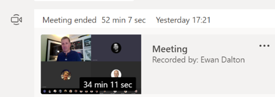
If you miss that, or weren’t at the meetin Unfortunately, you won’t get paid millions of dollars and given tons of free stuff but you might get some sort of corporate kudos and recognition.
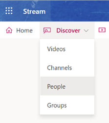
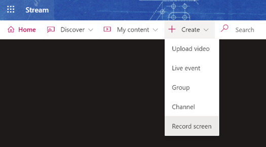
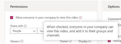
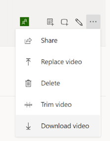
It’s not just for storing recordings of meetings in the hope that people who couldn’t be bothered to turn up the first time will somehow tune in to watch the re-run; you can create new content and upload that for your colleagues to view, too. You could use the Record a Slide Show feature in PowerPoint, to make an (editable) recording of you giving a presentation and publishing it, or if you’re just looking to do something quick and easy (up to 15 minutes in duration), you can even kick off a screen-recording (with audio and video) from the Stream site directly.
Maybe record it to a VHS tape and post it to them? |
Category: Office
543 – Dynamics CRM and Outlook
|
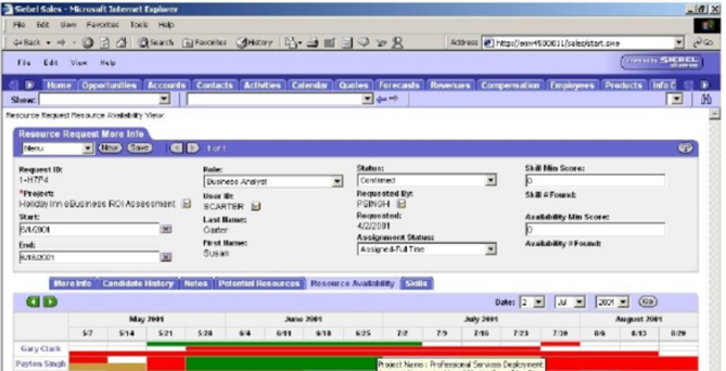
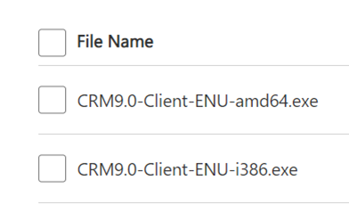
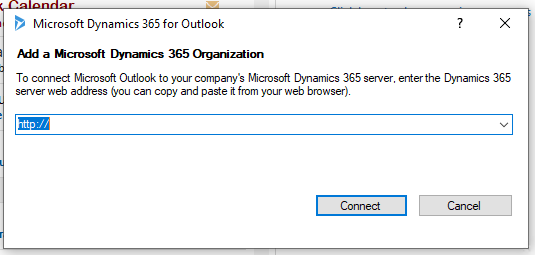
Mark Benioff, another ex-Oracle exec, set up Salesforce.com in 1999 to not only establish SaaS as a viable way to deliver “line of business” systems (as part of the first Application Service Provider boom, which was largely wiped out by Dot Bomb), but to ultimately eclipse his former employer in terms of market value. Time also moves on – now that Salesforce is the big dog in the CRM world, there are lots of competitors snapping at its heels… Pega, Zoho and many more. Not least, Microsoft – the Dynamics CRM business (now part of Dynamics 365 Customer Engagement) is growing fast, and even courted the “Father of CRM” to choose D365 for his new enterprise. If you use Microsoft’s Dynamics 365 CRM as part of your job, and use Outlook on your PC for mail, calendaring and contacts, there’s a handy way of connecting the two. Dynamics Connector for Outlook There have been several versions of a way to link Outlook and Dynamics together; the latest, Dynamics 365 App for Outlook, will fully supplant earlier versions in October 2020. See the admin guide for more on what the connector does and how it works. The installation can be a little clunky first time, though – you’ll need to install the connector software from here, which starts by downloading and extracting the setup files to a folder on your PC. Make sure you’re getting the right version for your copy of Office – to check, in Outlook, go to File | Office Account | About Outlook and look to see if you have 32 or 64 bit version installed.
Once you have the base version installed (a process which takes a good few minutes: you also have the option to enable offline usage, which means setting up a local database to hold the content), don’t bother starting it yet – go straight ahead and run the update to the current version (strangely, a larger download than the original install). Once that’s downloaded and installed, you’ll need to restart Outlook if it’s running.
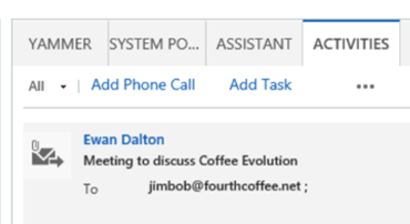
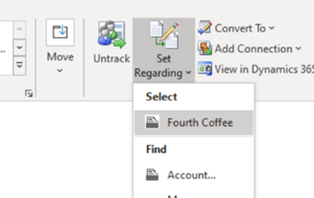
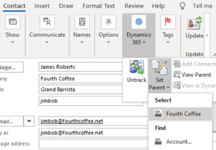
You’ll see a new Dynamics 365 tab on the main menu, offering a variety of CRM-specific activities.
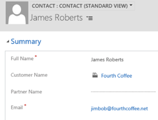
… meaning there’s no excuse to not have your important contacts listed in CRM. You can even match the contacts’ LinkedIn profiles, and create an org chart of all the listed contacts. |
542 –Excel Special Paste
|
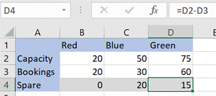
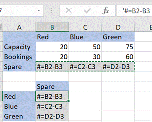
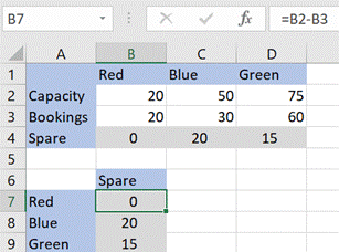
As an example, if you took the small table below and wanted to copy and paste the calculated values on row 4, you’d need to deal with the fact that the formula will change – offsetting the D and the 2 reference to wherever you paste it (eg if you pasted the copy into E4, the formula would be =E2-E3) – normally, a powerful and useful function, but a potential nuisance.
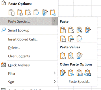
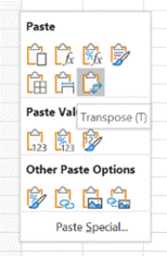
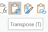
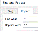
An older UI for selecting the options is available if you click on the Paste Special… command at the bottom of the pop-out, or by pressing CTRL+ALT+V to pop out the Special dialog. One of the more particularly useful features of Paste Special in Excel is the Transpose option – if you select and Copy a row of data then Paste / Transpose it, the data is rearranged as a column (and vice versa). Great news in many cases, but if you want to paste cells and keep the original formulae (without resorting to using absolute references formula references using $ in the formula itself, eg setting =$D$2-$D$3), there are no default options to transpose the orientation of the cells but not change the formulae. One trick if you ever find yourself in this position, is to bulk change the formulas so they won’t get modified when you paste the cells; do a Find & Replace to change = to something like #=. After pasting and transposing, reverse the process to restore the formula
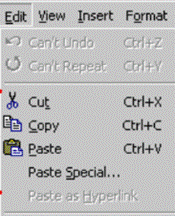
It’s an edge case but could save you lots of time if you need to do it. For most of us, getting to grips with shortcut keys in Excel would make things more productive – as well as numerous combos of CTRL-something, there are simple keys (like pressing F4, which repeats the very last command … so if you’ve just coloured a cell yellow, move the cursor to another cell and hit F4 to make that one yellow too… if you’re doing very repetitive things, this can save so much time). There are also more complex sequences; press the ALT key in Excel (and other Office apps, too) to see the key combos that A little bit of legacy/history – press ALT-E then S to jump to the Paste Special menu – why E? Even though it’s long gone, really old versions of Excel had an Edit menu, and the commands on any menu – in any application – that have an underscore under a letter (like Paste Special) are highlighting the key you can press to jump to that command. So ALT E / S used to be the combo to get Paste Special circa Excel 2003, and it still exists today. |
538 – OneDrive updates
|
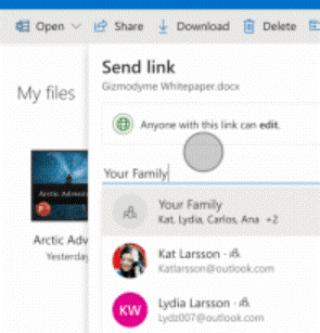
Along the way quite a few associated names and services have bitten the dust – Microsofties celebrate/commemorate old products on the Next of Kin Yammer group: raise a glass to OneCare (an unfortunate name choice if you’re a Cockney, ain’t that Irish Stew), and all manner of other products that turned out to be Red Shirt / Non-speaking parts, like MSN Music/Zune Music/Xbox Music/Groove, and now Mixer. If you still have a “SkyDrive Camera Roll” folder in your OneDrive storage, that’s probably a legacy of having synced photos from a Windows Phone and then later having installed OneDrive on your modern mobile. You can rename the folder to something else now – at one point, it was not supported but that’s no longer the case. Using OneDrive on the move makes a lot of sense – even if only to back-up photos from your phone. The web UI lets you see the pictures in a variety of interesting ways, showing the places you’ve been or the things you’ve photographed. In OneDrive for consumers, you get 5GB of free storage on signing up – not bad, but Google Drive gives you 3 The pricing is such that unless you wanted to buy only a few extra GB, it makes sense to go for the M365 option – £60 a year for a personal subscription that gives a 1TB (ie 1000Gb) storage capacity, or pay £24/year per 100GB block if you want to buy storage on its own and forego the other stuff you get with M365, notably the Office apps. Despite a bit of confusion over what the differences are between OneDrive for Business and OneDrive (not described as for business, so presumably for home/personal use), it continues to evolve with additional capabilities – as covered in ToW passim. The OneDrive for Business / Sharepoint and OneDrive for Now, the OneDrive team has unveiled a slew of new features for both ODfB and OneDrive personal – like Dark Mode on the web client, or the ability to share files and folders more easily with colleagues, or share with family and friends by creating groups of people who will be sent an invitation to view and contribute. And the upload file size limit has been raised from 15GB to a whopping 100GB. |
518 – The App(s) of Office
|
Ever since the demise of Windows Mobile and the collateral damage caused to Microsoft’s previous Universal Windows Platform apps strategy by not having a universal platform any more, their future has been in some doubt. In fact, since late 2018, it was reported that the Office “Mobile” apps for Windows were being de-prioritized in favour of the desktop variants (with the exception of OneNote), and separate mobile apps for the surviving mobile platforms.
In these enlightened days, Microsoft builds quite a lot of apps for iOS and Android, more especially the latter since it has a larger number of users (and seems to be growing its share in key markets) as well as being more open when it comes to the both the end-user and developer experience (though Apple may be changing its tack a little). Recently, the Office team has shipped a whole new, unified Office app for Android and for iOS – more details in the team’s blog, here. The app brings together Word, Excel and PowerPoint, but also adds a bunch of other related things – like Sticky Notes, and some related and useful technology like the ability to manage PDF files, extract text from an image and more. Back in Oct 19, MJF wrote about this strategy and more recently has suggested more features are on their way. |
516 – More Teams Sharing
|
514 – tweaking Outlook’s Ribbon
|
One major change was the introduction of the Ribbon – a then-new way of organising the complex menu structure that sat within the individual Office apps. Despite complaints from some users, it quickly became established as a good way of presenting, in context, useful features that might otherwise have stayed buried in some deep menu structure. Competitors copied it too.
So far, so good, but it you like the “Classic” Ribbon, there’s a lot you can do to get rid of some of the guff and keep the useful features more prominent. Looking at the first Ribbon image above, about 40% of the space is consumed with a handful of addins that might be useful, but not necessarily deserving of such prominence – your own list may differ, but the stuff on the right side tends to be a series of groups with a single, large icon in each.
If you reduce the number of groups on a tab, the remaining ones may spread out and show larger icons or more detail – handy on the Home tab, if you like to use Quick Steps, which will expand out of one column.
Once you have the new tab created, it’s simple to start dragging and dropping defunct groups from the home tab onto the new one – things you might use occasionally but they don’t need to be on the main screen. Customisations are particular to the Ribbon you’re looking at – so if you organise the Classic one then switch to Simplified, you’ll still see the old arrangement until you customize that one too. You might want to export your finished layout too. Looking at the restyled Ribbon above, all of the groups from Delete to Tags have been stretched to show more prominent icons or reduce the menu level a little, and Quick Steps has grown from one to four columns wide. Much more useful.
|
507 – Momentum of Teams
|
It’s been a busy few weeks on the Teams team. As an aside, what do you call a team that’s set up in Teams? Is it a Teams Site, or a Teams team, just a “Team” or …? Documentation talks about creating a team, which is fine when you’re already in Teams, but talking with someone about Teams teams can be a bit like a tongue twister. It was recently announced that Teams has 20 million daily active users, up from 13 million since July. Talk to enterprise customers who have adopted Teams, and many have a user base that really loves it. There may be more to the story, but as many Office 365 users get Teams as part of their subscription, it’s inevitable that its usage will grow. It’s great to hear stories of how customers are using technology like Teams to positively change the way they work.
See the recent The App Studio in Teams allows enterprise developers to build their own extensions and addins quickly.
Live captions – similar in approach to the subtitles in PowerPoint presentations that were recently discussed – is already available in a preview for some users. Captioning and transcription is also available for Teams Live Events, if you enable the feature in the setup of the event. |
506 – OneNote 2016 reprieve
|
Office 2019 was no longer going to ship with OneNote – the desktop app was not being developed beyond OneNote 2016, but it would still be freely installable if desired. Efforts would be focussed on the Modern / Store / “OneNote for Windows 10”, which shares a lineage with the mobile apps; there’s a lot to be said in favour of this strategy, since it would bring the UX of the Windows Store, tablet, phone and web apps into alignment. For regular ToW readers, this has been covered ad nauseam. Well, blow me down, a brilliant Ignite session from @Ben Hodes only went and wound the clock back (and simultaneously painted it forward)… [Check out Union Jack Man at 42:18 in the video stream if you want a laugh] OneNote 2016 is getting some CPR, and will be installed by default with clean Office setups again, early in 2020. Point of clarity – a clean Office2019 / Office 365 install doesn’t currently include OneNote 2016 … but upgrading from an existing Office install that already had OneNote, does. If need be, go to http://aka.ms/installonenote to install OneNote 2016. Some new features are coming, too – like Dark Mode, @mentions, To Do integration and more. The OneNote for Windows 10 code base is being back-ported to the older Win32 version; in time, the same underlying code will exist, even if there remains two versions of the product. It was previously reported that across the Office suite on Windows, the Win32 codebase will be favoured going forward, even though Modern versions were released for several of the traditional apps. We will have to wait and see.
Did you know that if you insert an audio recording into your OneNote page, that any handwritten or typed notes you take while the recording is underway, will be linked to the corresponding place in the audio? Later, if you click on a block of text or handwriting, you can play back the recording at just that point, or if you just start playing the audio, the notes you took will be highlighted as the playback progresses.
No such function appears to exist in the OneNote for Windows 10 app; maybe that’s a good thing. After all, OneNote 2016 only lets you turn it on after an ominous-sounding warning… |
502 – Presenting PowerPoint Subtitles
|
When they do it properly, you’ll often see presenters kick off by fishing
PowerPoint will typically be set up to use Presenter View by default, and the screen that’s being shared will be showing the speaker notes / next slides etc, while the full-screen content is being displayed on the 2nd monitor that isn’t being shared.
Choose the language you’d like to display, the location of the subtitles and when you start presenting, the machine will listen to every word you say and will either display what it thinks you’ve said in your own language, or it can use an online service to translate to subtitles in over 60 languages. It’s fantastic. See more here. Go and try it now.
Windows has a closed captioning setting page that applies to other apps that support it, too, if you’d like to show subtitles on video that has the content already defined. Closed Captioning is legislated by several countries, for traditionally-broadcast media as well as online video. You may also want to add captions to videos that you plan to embed – more, here. |












![clip_image002[4] clip_image002[4]](https://tipoweek.azurewebsites.net/wp-content/uploads/2020/03/clip_image0024_thumb.png)
![clip_image004[4] clip_image004[4]](https://tipoweek.azurewebsites.net/wp-content/uploads/2020/03/clip_image0044_thumb.png)
![clip_image006[4] clip_image006[4]](https://tipoweek.azurewebsites.net/wp-content/uploads/2020/03/clip_image0064_thumb.png)
![clip_image008[4] clip_image008[4]](https://tipoweek.azurewebsites.net/wp-content/uploads/2020/03/clip_image0084_thumb.png)
![clip_image010[4] clip_image010[4]](https://tipoweek.azurewebsites.net/wp-content/uploads/2020/03/clip_image0104_thumb.png)
![clip_image012[4] clip_image012[4]](https://tipoweek.azurewebsites.net/wp-content/uploads/2020/03/clip_image0124_thumb.png)
![clip_image014[4] clip_image014[4]](https://tipoweek.azurewebsites.net/wp-content/uploads/2020/03/clip_image0144_thumb.png)
![clip_image016[4] clip_image016[4]](https://tipoweek.azurewebsites.net/wp-content/uploads/2020/03/clip_image0164_thumb.png)


