Some inventions solve a relatively discrete problem, which has a hugely unforeseen impact on wider society. When Sir Tim was guddling about with hyperlinked documents in a basement in Switzerland, he could never have imagined what the WWW would become.
Similarly, the shipping container was patented as a way of making it easier to get stuff on and off big ships, but according to the Economist, had a greater impact on globalisation than all trade agreements in 50 years, put together.
Predating the big metal box, the humble Barcode arrived in the early 1950s, as a way of marking goods with a unique SKU (or Stock Keeping Unit for everyone who thinks SKUs only apply to software licensing), though the idea had other uses – in the early 60s, British Rail successfully scanned rolling stock travelling past at 100mph using a system of metal plates.
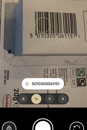
The barcode is simply a way of making it – supposedly – easy for a machine to identify the thing; its most commonly used scenario is, of course, the supermarket where the codes are all scanned at checkout. Mildly sweary comedian Eddie Izzard joked about it nearly 30 years ago though nowadays many of us are familiar with self-checkout and all the joys they bring.
1D to 2D
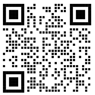
The 1-dimensional barcode is simply a way of representing a single number using a variety of lines that can be read by a light. As image processing technology advanced, Japanese motor parts giant Denso (variously connected with Toyota), came up with a system of labelling parts using smaller, square codes that could be scanned from any angle and even had some error-correction built in so if the lighting was poor or the label had been damaged, it still had a chance of being read. Importantly, a single 2D code can contain a lot more information – initially used to hold the individual SKUs or serial numbers of every component in a bigger box, making it easier to bulk-manage automotive parts.
Denso Wave Inc still owns the patent behind (and even the Trademark of) the QR (Quick Response) Code but generously doesn’t try to gouge a royalty from it, like many others might.
It’s not uncommon to see tiny stuck-on QR code labels on all kinds of auto parts like spark plugs; you might see them included on event or travel tickets, or anything that just needs a numerical ID Try reading them with your phone camera and all you’ll probably get is a number, just like if you point the camera app at a regular barcode.
Contemporary uses – URLs
A handy benefit of the extra capacity of QR odes is their ability to represent a URL. Perhaps the most-used is when you see a poster promoting some service or app (especially in captive environments like on trains or in airports), and it has the QR so you can download that app or connect to that site right away.
Reading the code is easy – at one point, a separate QR code reader app would be required but now with the camera apps on iOS or Android, you should be able to scan the code by just pointing and tapping on the pop-up.
Do be careful, though – generating QR codes is simple and there’s nothing stopping a nefarious sort from printing their own labels and sticking them on things, luring people to following a link to the wrong place. If the destination URL looks dodgy, don’t go through with it.
URL shortening services are handy, with or without QR codes. Sites like tinyurl.com or bit.ly give you a useful way of taking a huge URL – like a link to a document or photo in OneDrive or Google Drive – and making it shorter and/or more memorable. An example is bit.ly/tipoweek. Bit.ly also offers the ability to generate customized QR codes.
The risk with any URL shortener is that it’ll go away – both of the above examples have been around for years but if you encode a short URL into a QR code then you better hope it doesn’t change. Google famously announced the death of its own “goo.gl” shortening service, the axe on which comes down soon. Link Rot is a real thing. Also, having a URL fronted by a shortening service doesn’t necessarily give the user the confidence that they’re not about to be redirected to some site of disrepute.
Microsoft uses its own “aka.ms” for stuff that it wants to direct to, but many of the links are created and owned by individuals – so if you’re following one that was set up by someone who’s no longer there, better hope that it has been adopted by someone else or you’ll end up in Bing.
QR Codes are Ugly and Boring
There’s no getting away from the fact that QR codes are a bit of an eyesore; but they don’t need to be very big to be scanned using a modern mobile phone, and the error-correction functions mean you can add a lot of stuff to a QR code without fundamentally breaking it.
Some advertising can discretely show a code…

… or could add their own logos and other flairs. Here’s the bit.ly/tipoweek QR with extra pazzaz, courtesy of QuickQR.Art…
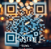
There are various paid-for online services which will generate fancy QR codes for you – don’t try and rely on Copilot or ChatGPT to take an existing QR code and jazz it up – their predilection for moving stuff around in images will almost certainly destroy its scan-ability.
Microsoft Tag Nuts and QR Wins
A researcher in Microsoft came up with a similar idea but using coloured triangles to offer a more visually arresting and more data-dense equivalent to the QR Code.
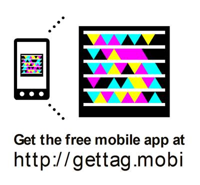
Tag didn’t last long; within a few years, it was put on death row. Even at the time, marketeers were predicting the death of the QR Code because none of the mobile platforms had native support, so you’d always have to use a 3rd party app, thereby denting its appeal.
The Tag platform limped on but was eventually killed by its acquirer, 10 years ago. In the meantime, the mobile camera apps added QR Code scanning functionality so it’s more mainstream, and the pandemic saw a bump with bars and restaurants asking people to scan a code to order their scran online.
[source – QR Code Statistics for 2025: Usage, Trends, Forecasts, and More from qrcodechimp.com]
Even if you take a snap on your mobile phone camera, you might be able to go back in and look at the QR ode if there is one. On Google phones, open the photo using the Photos app and select Google Lens to scan it for QRs.
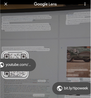
On a desktop, copy the image to clipboard, go to Google.com and click the lens icon
Then paste your image into the resulting page, and you should get the QR code resolved. FWIW, Bing images offers none of this.
Quickly Sharing a site with QR
Though QR codes can be used to do all kinds of things like join a WiFi network or start a mobile app, the bread-and-butter use is to share a website URL.
Chrome will let you generate a QR code by going to Settings -> Cast, save and share
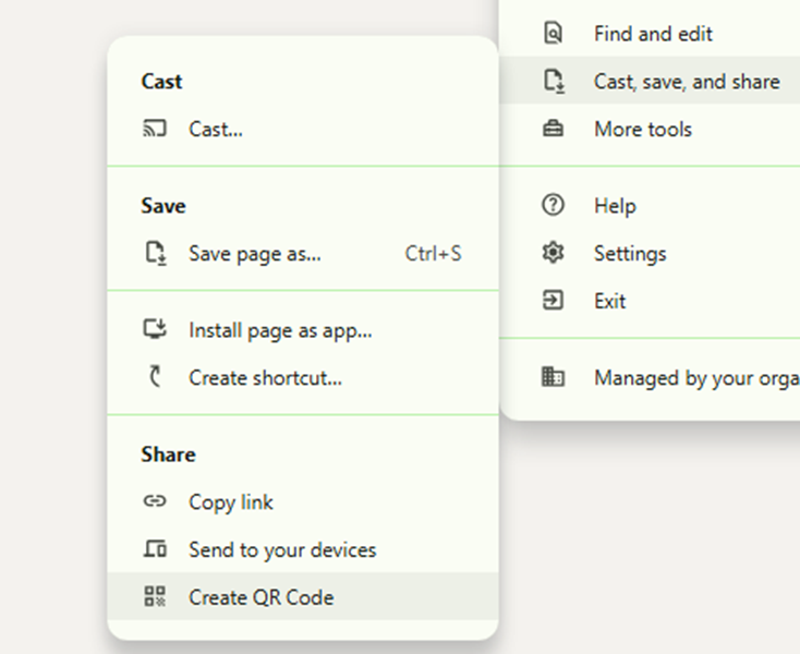
You could add the “Create QR Code” shortcut to the toolbar if you find yourself doing it a lot.
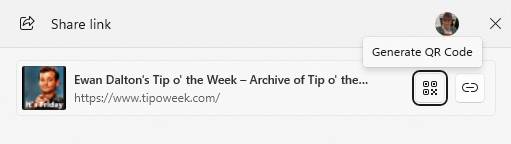
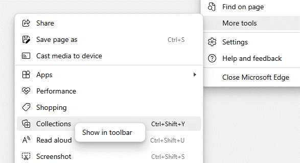
Edge lets you do a similar thing, though can get to the QR Code bit more quickly by clicking the Share icon on the toolbar, or via the menu at Settings -> More Tools -> Share.
These could be useful if you’re building a presentation and want to share things with the people in the room, or have them contact you at the end. Even if presenting via Teams/Zoom, the QR codes can be scanned from a user on a PC at home so are worth including, especially for short URLs which won’t change (even if the thing they redirect to does).
Maybe the most useful way of QR sharing is when on the mobile; you want to quickly share a site with someone else on their phone. There are, of course, any number of ways you could do it, but on both mobile Chrome and Edge, go to the Menu -> Share and it’s right there…
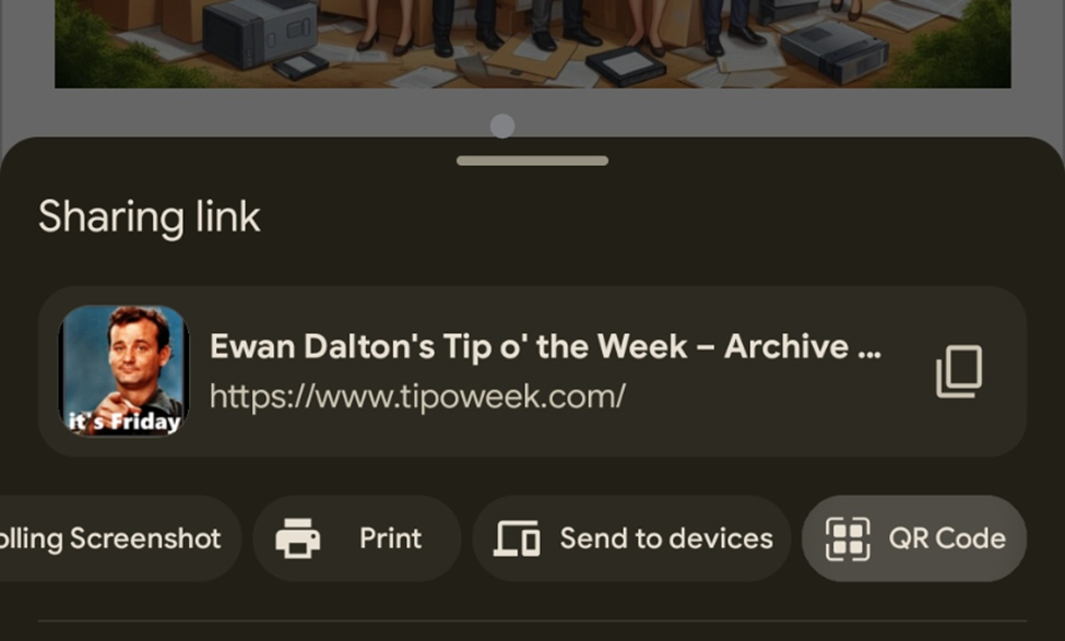
Get the recipient to fire up their camera and click on it, and they will be on the site shortly.
LinkedIn Sharing
Even easier, if you’re at some networking event and you want to share your LinkedIn profile with someone (to show them how super-proud and humbled you are to be there), go to the Search box at the top of the app and just tap once in it – then the QR icon appears. Tap that, and bingo!


