#45: Copilot updates flying in

clip_image002

Microsoft unveiled “Wave 2” of Copilot for Microsoft 365 earlier this week; if you haven’t seen the video, you can catch it here, or check out Teams guru and MVP Tom Arburthnot’s tl;dr summary of the key announcements and the demos.

BTW, if you are a Microsoft partner, you might have heard during MCAPS Start in July, that (woo-hoo!) Microsoft was going to give you some free Copilot licenses as part of the benefit of being in the partner program.

The latest Benefits Guide shows that Copilot goodness is indeed coming in January 2025, but it might be a bit less generous than expected… Basically, don’t bank on getting more than a handful of seats as part of the package, and if you don’t think Copilot gives you enough benefit to bother paying for it, then, well…

Talking of “what’s new” with Copilot, Microsoft veteran Malcolm Bullock has a thought-provoking explanation of what he means by “Nothing has changed but everything is new”.

Some of the stuff that was announced in the Wave 2 jamboree will be coming later this year, such as Copilot automatically prioritizing your emails in Outlook. Other pieces – the Narrative Builder in PowerPoint, for example, are here already.

The PowerPoint Copilot functionality is amazing. Give it a couple of lines of content and it will generate a whole load of slides by finding out information to flesh out your idea. If you’re an expert in an area then it might seem to give a glib, high-level overview with not-quite-correct images, but all of that can be tweaked and updated later.

Here’s an example:

clip_image004

… and literally a few moments later, it presented…

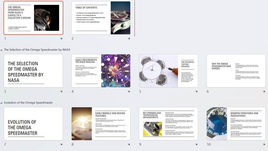
clip_image006

Not bad at all. At least it has a framework which could be used to flesh out stuff in more human detail.

While Copilot might have its most immediate use in helping to create content like images or writing documents/emails for you, there are other collaborative benefits too, some of which were covered in the announcement. As Malcolm says above, maybe we will need to tweak how we collaborate (using channels instead of chat for group discussions, for example) to properly harness the capabilities to good effect.

On asking Copilot in Edge to summarize the announcement page to less than 200 words, it offered:

· Copilot Pages: Introducing a dynamic, persistent canvas for AI collaboration, allowing teams to work together in real-time with AI-generated content.

· Enhanced Microsoft 365 Apps: Significant improvements in Teams, Excel, PowerPoint, Outlook, and Word, including new features like Copilot in Excel with Python for advanced data analysis.

· Copilot Agents: New AI assistants to automate and execute business processes, with an easy-to-use agent builder for creating custom agents.

· User Feedback and Updates: Over 700 product updates and 150 new features based on feedback from nearly 1,000 customers, improving performance and user satisfaction.

So there are lots and lots of new features coming, if not here already. Yay.

Meetings, transcripts and notes

One of the nicer new widgets that Copilot has brought recently is for putting meeting notes into OneNote. Previously, to record what happened in a meeting, you’d ask either Teams Premium or Copilot to generate some kind of notes, then copy/paste the text into OneNote alongside other stuff you might have jotted down yourself during the meeting.

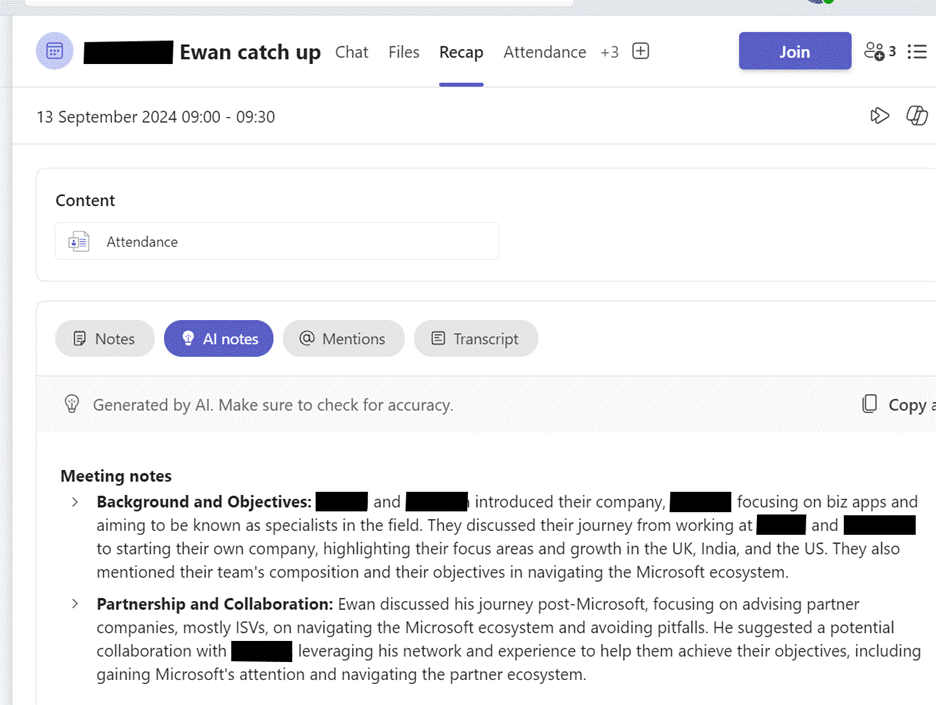
Now, it’s made the process a whole lot easier – first, you need to be sure the meeting has been recorded or transcribed. If you go back to the Meeting inside Teams (look in the Chat node), you might see a Recap option which will give you the summary of what happened, along with actions that were discussed:

clip_image008

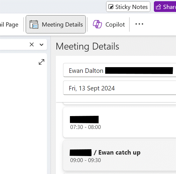
Now, go into OneNote, navigate to your existing notes page for a meeting (or create a new one) and go to Insert Meeting details. It will offer you a pane on the right side showing a selection of meetings from your calendar.

clip_image010

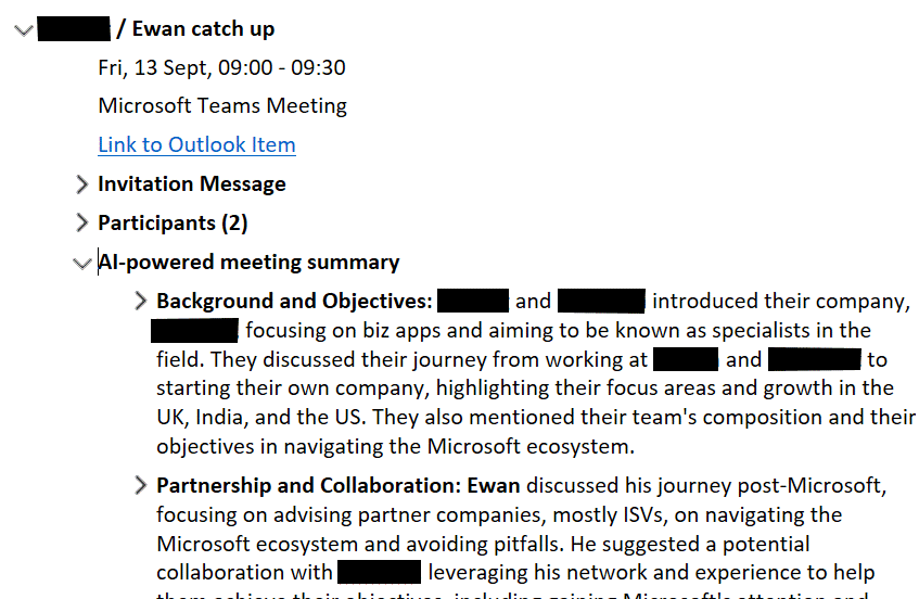
Previously, this would have copied just the bumph from Outlook like the date/time, subject and who the attendees were – useful as that is – but now has added a bunch more…

clip_image012

It’s a brilliantly useful way of adding some extra content to notes you might already be taking, or just to more easily organize notes and follow up actions from within OneNote rather than grubbing about in Teams to find them.

#41: New ≠ better

Tip o' the Week

Last week’s tip talked about product Roadmaps and the search for new features; this week’s focuses on two evolving applications that readers may have a fondness for or perhaps an aversion to.

As previewed in Tip o’ the Week #678, both Outlook and Teams have been getting some New-ness by having completely re-written applications with the goal of taking the baton from the old one. This model doesn’t always turn out to be successful – see the confusion that was OneNote supposedly transitioning from a classic Windows app to a Store / UWP app, then giving up and moving back. Or the slow-motion car crash that is Sonos’ new app rollout.


As an aside: LinkedIn really doesn’t make it easy to search previous newsletter articles; that’s one reason why these are also published at www.tipoweek.com, providing a nicely tagged way of re-locating stuff that you might have seen before.


Sometimes, the effort that goes into keeping an old application fresh, secure and performing well can be more than just re-writing it from scratch and phasing the old one out. But Better does not always come with New, at least not in the early stages.

One Teams to Rule Them All

Three years before its pandemic-fueled usage explosion, Teams was launched as a kind of amalgam of Skype for Business and the technologically separate and consumer-oriented Skype (which still exists, to some degree). Teams came along with added collaborative stuff that had been brewing for some years, to try to offer an alternative to Slack.

To help the development cycle, and to keep a degree of parity between Windows, Mac and web apps, the original Teams app used a variety of technologies which caused a pretty high memory overhead on Windows. Later acknowledge by Microsoft, the decision was taken to rearchitect completely with the goal of reducing memory usage by half whilst doubling performance.

After releasing “New Teams” in October 2023, that left Microsoft with 3 separate Teams clients – the original, resource hog one, then the New Teams one which did more-or-less the same things, and the inexplicable “Teams for Home” which was a different version that could only use a Microsoft Account to sign in.

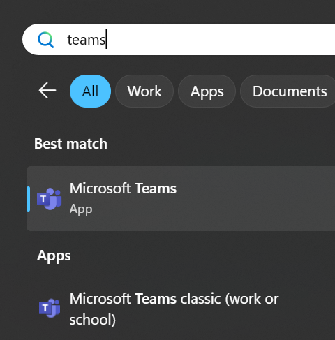
Fortunately, Microsoft has updated New Teams (now just “Microsoft Teams”) to fold in the “Teams (free)” / “Teams for Home” functionality, so there’s only really a single version of note. If you still want to make sure all your PC’s memory gets a good workout, the original Teams app is still available as “Teams classic (work or school)”, at least for now. Phew.

The Old Dog and the New Pup

Outlook has a much longer legacy, dating 20 years before Teams and with some of its innards back to the early 1990s and the original Exchange “Capone” client (and Exchange was dubbed “The Big Dog of BackOffice“).

Microsoft has a long-held desire to move away from the old design and architecture, to something more “Modern” and webby. Just as Teams was built using technology that could span different client architectures, the intent is to create a new Outlook family centered around the same Web UX as seen in Outlook Web App.

Having been in preview for a while, the now-released “New Outlook” was being developed to replace Windows’ built-in Mail & Calendar app(s) in the near future, though not to universal approval. Plus ça change and all that.

Some reviewers want to hold on to the Mail & Calendar apps

Building an app which is effectively a web experience but looks like a desktop one, has its own challenges that Microsoft is trying to address before the inevitable full retirement of Old Outlook in favour of the new one.

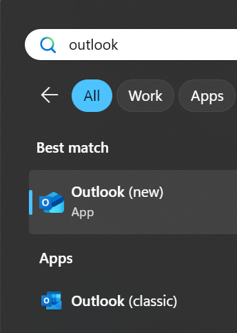
If you’re an existing Outlook (classic) user, do not be tantalized by the Try the new Outlook option on the top right – press the button only if you’re already prepared for the consequences.

Actually, you can run classic Outlook and New Outlook side by side if you like; selecting the “Try the new…” button just means that trying to start Old Outlook will just bring up the new one instead; if you go through the routine of Trying the new, it will set up your profile and when done, you can switch it off and have both clients set up to connect to the same accounts.

There are some downsides. Web Applications aren’t typically very good at being offline, and email is one of those things that you might like to use when on a plane or even being on a slow network. New Outlook is getting some offline capabilities but don’t expect it to be the same as the old one.

And don’t even think about using local archives, not for a while…

Most users of Teams would see the New version as an improvement, even if it doesn’t match all the functionality of the original. It’s certainly easier when switching around between tenants, such as when you’re working with several different companies. Almost everyone will automatically get the new version in place of the old, with a few diehards holding out before eventually being subsumed.

New Outlook is going to take a bit more time to get used to. There is a feature comparison which gives some idea of the differences; if you don’t get vast amounts of email, then New Outlook is OK. If you have multiple email accounts to deal with, it makes a reasonable fist of showing them in one place rather than needing a separate browser window for each, but then Old Outlook did that too. Somewhat annoyingly, New Outlook can’t combine mailboxes into a single Inbox view, like the mobile Outlook client does, and it won’t let you search across different mailboxes either.

It looks like Old Outlook will still be with us for at least 5 years – maybe it’ll live on while email has not yet been replaced by other messaging apps like WhatsApp and Teams.

#40: Product Roadmaps – over/under promise/deliver?

clip_image002[4]

Since the early days of personal computing, products were always defined and sold to their eager customers on the basis of what features they had, or were going to have. ACME Computers would produce a feature matrix showed its widget program was better than XYZSoft’s similar one because it could start quicker or store more pages or print nicer fonts or whatever seemed important at the time.

Talking about features – or, even better, showing them – would be enough to convince users to open their chequebooks, so before RoI, business value, personas or use cases showed up, the product feature sheet and product demo were all important.

The brilliant Bob Cringely wrote in his seminal tome Accidental Empires of many significant bits of the history of the PC, Mac et al (or Accidental Empires: How the Boys of Silicon Valley Make Their Millions, Battle Foreign Competition, and Still Can’t Get a Date to give its full title). One tale was of a young Bill Gates demonstrating Word for Mac 3.0 somehow navigating a demo of a product so buggy that any number of clicks in the wrong place could have blown the whole thing up.

As well as selling what you have – or are going to have, real soon now – to prospective customers, there’s also a need to show that more stuff is coming down the line. The Product Roadmap shows long-term commitment and vision but also ties you into doing things that people bought your product for, even if they prove harder than you thought or less important because other things have changed.

Does saying you’re going to deliver this feature or that function tie one hand behind your back, but without it, customers could go elsewhere? In the old days, a roadmap or a demo of something that wasn’t really finished was as much a reason to stop people buying a competitor’s product, causing them to wait to see how yours turns out, as it was to get them to commit to buying something today – especially when the thing you’re showing isn’t yet available.

In the 1980s and perhaps later, Microsoft was a well-established peddler of “vaporware” – BillG even received a “Golden Vaporware” award for the years-late arrival of Windows 1.0, though the practice of promising much a long time before delivery had been going on for more than a century before.

When it all goes wrong

Sometimes a company will have scored such a momentous own-goal that its roadmap is more a plan for recovery and survival, than a yellow brick road to a brighter future. One such example is maker of homey WiFi HiFi gear Sonos, who rushed out a whole new software stack so they could launch some new products.

Sadly, the new app was missing a lot of features from the old one, was slow and unreliable and in forcing it out, they shot themselves in both feet and greatly annoyed many of their loyal fans.

clip_image004[4]

Sonos’ CEO later had to apologize and promised to make things better over coming months, surely made harder by recently announcing a 6% staff layoff. Added to the 7% cuts made the year before, whatever the future holds for them might be that bit harder to reach.

Microsoft Roadmap update

Sometimes, a roadmap leads to a cul-de-sac – the product is killed, dies of natural causes or similar. But when it supposedly gets many users, the majority won’t really care what features and functions are being added day-to-day.

Over in Redmond, the roadmap of specific products and features might seem less important (unless they’re selling the products, or others selling products to them), yet quite some effort goes into maintaining roadmaps for the Microsoft 365 offerings. Presumably it’s to keep existing customers informed and happy enough, reminding them what they’re getting for their continued subscription. Or sometimes to provide early signal that certain things are going away, even if only so they can later point to that notice when someone moans about their favourite thing being wiped out.

clip_image006[4]

The Roadmap site has been growing its coverage outside of core M365 products, and there are other sources of roadmap info – Azure, Windows (and info for Insiders), Dynamics & Power Platform and probably more.

In other parts of Microsoft, the moderately-loved Paint 3D – the supposed successor to the venerable MSPaint – has now been given it’s marching orders. Back when the future was in 3D – from the TV in your living room, to the massive goggles on your face, it’s was all about that 3rd dimension until it wasn’t.