|
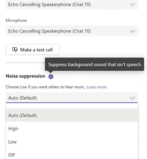
There are numerous new calling features coming, which will help in managing real (PSTN) phone calls and VoIP calls, as well as a Read more about the new devices here. There are also some useful updates to bring other applications into Teams meetings, like allowing you to set up Polls in advance (using Microsoft Forms, configured within the Teams app with an easy-to-use wizard), and using Power Apps and other elements of the Power Platform, it’s never been easier to roll your own apps for including in Teams. There’s a $45K prize fund available for the best apps that are built and submitted by February 2021, so if you have ideas, better get cracking… |
558 – Sharing your holidays
|
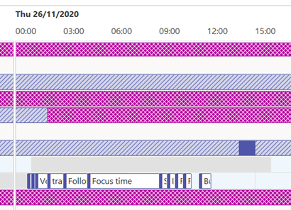
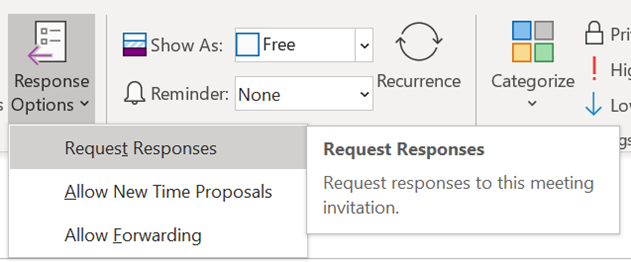
Really progressive people might even be sharing their calendar details with you, so you can see what they’re doing – useful, as all-day busy events obliterate everything else if details are not shown. If you’d like to tell other people you’re going on holiday, then you should create a 2nd appointment and invite your colleagues to it; but there are 3 important steps to take when you do this so you don’t muck up their calendar and annoy them to boot. When creating your second “FYI” holiday appointment:
While we’re setting the appointment up, it’s OK to not use Recurrence too – some people think that the way to make a multi-day appointment is to set a one-day meeting that recurs every day for a week. Don’t do that. Just set the start and finish Now all you need to do is create a suitably informative and entertaining Out of Office message and you’re all set! |
557 – Making URLs more friendly
|
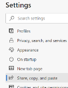
Early browsers might have been pedantic about the user entering the protocol into the address box, since the application wouldn’t know if you wanted to use ftp, gopher or this new-fangled http thing to try to open the page. So you had to spell out the whole address – with the right number of slashes and colons, sometimes even having to get upper and lower case parts of it exactly correct – or just get denied. Of course, it’s easier to enter URLs these days – a good proportion of end users just type the thing they’re looking for (eg “bbc news”) into the address bar, and it will search on their favourite engine to display a list of results upon which they then click. Others will know that if you enter a term in the address bar and press CTRL+ENTER, the browser will add the www and the .com to either side of it, and on Chrome, the Still, pasting a URL into a document or email can sometimes look messy, especially if it’s a link to a file on a Sharepoint or Teams site. Public websites sometimes will have an address which tells the story – like https://www.upi.com/Top_News/Voices/2020/11/19/SpaceXs-Starlink-satellites-are-ruining-stargazing-for-everyone/9351605790233/ – but a new feature in Edge browser aims to make things a whole lot more friendly. In the latest versions of Edge, instead of pasting the raw address (with all of its slashes, symbols and numbers), when you add a URL into an Office document, the link will use the title of the page as the “text to display” instead of the URL itself. As a result, the UPI story above would look like “SpaceX’s Starlink satellites are ruining stargazing for everyone – UPI.com”. When pasting a link to a shared document, instead of it showing up like https://microsoft.sharepoint.com/:b:/t/Store%20Planning%20Team/EX3o-R5PRT5Kk-Ndmh5GKFgBx0OfjIWI9d4CGT4nZGi0Dw90980 or similar, Office apps will try to fetch the source document’s details and render its name as the displayed text, hiding the URL under it: If you’re sending the link in an email, it will even check if all the recipients have permission to open it, and offer to help you fix that by changing the permissions or by attaching the document instead of a link to it. This might even realise the dream that one day, people will stop emailing documents to each other and instead will use proper collaboration tools. We can but hope.
This useful feature was a preview in the Edge beta, but is now part of Edge 87 that released last week. One potential side effect, though, is if the website you’re looking at doesn’t properly manage its page title (as displayed in the browser tab), it could paste as the wrong thing: some sites might set the title when you search for something, but then not set it properly when you click through into the results. You can always right-click the link and Edit Hyperlink to fix the issue if that occurs, and hope that enough people complain to the site owner so they fix it. |
556 – Using MFA more widely
|
So 2FA – or its cousin, Multi-Factor Authentication (MFA) – is a better way to secure things, as a remote system can validate that the user knows something which identifies them (their username & password, secret phrase, date of birth etc etc) but also has something that identifies them too; a security token, smart card, digital certificate or something else that has been issued, or even just a mobile phone that has been registered previously with whatever is trying to validate them. Although such systems have been around for a while, the average punter in the EU has been more recently exposed to 2FA through a banking directive that requires it for many services that involve transfer of funds, setting up payments or even using credit cards. In some cases, the tech is pretty straightforward – you get a SMS text message with a 6-digit one-time code that you need to enter into the mobile app or website, thus proving you know something (you’re logged in) and you have something (your phone), so validating that it really is you. Or someone has stolen your phone and your credentials… MFA is stronger than 2FA, as you can combine what you know and what you have, with what you are. An example could be installing a mobile banking app on your phone then enrolling your account number, username & password; the know is your credentials, and the have is a certificate or unique identifier associated with your phone, as it’s registered as a trusted device by the banking service that’s being accessed. Using your fingerprint to unlock the app would add a 3rd level of authentication – so the only likely way that your access to the service (for transferring funds or whatever) could be nefarious, is if you are physically being coerced into doing it. 2FA and MFA aren’t perfect but they’re a lot better than username & password alone, and Microsoft’s @Alex Weinert this week wrote that it’s time to give up on simpler 2FA like SMS and phone-call based validations, in favour of a stronger MFA approach. And what better way that to use the free Microsoft Authenticator app? Once you have Authenticator set up and running, It’s really easy to add many
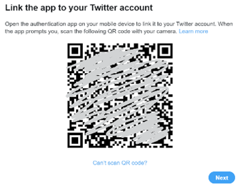
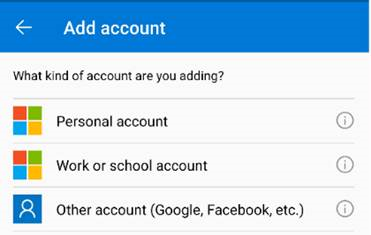
In the Microsoft Authenticator app itself, add an account from the menu in the top right and then choose the option that it’s for “other” – presuming you’ve already have enrolled your Work or school Account (Microsoft/Office 365) and your Personal account (MSA, ie Outlook.com etc). After tapping the option to add, point your phone at the QR code on the screen and you’re pretty much done; you’ll need to enter a one-time code to confirm it’s all set up – rather than getting an SMS, go into the list of accounts in the Authenticator app home screen, open the account you’ve just added then enter the 6-digit code that’s being displayed. This is the method you’ll use in future, rather than waiting to be sent the 6-digit code by text. As you can see from the description, there are lots of other 3rd party apps and websites that support MFA using authenticator apps –
|
555 – checking Accessibility
|
These technologies often spawn wider usage in unforeseen ways, and in many cases are developed not for goals of making a fortune or having global influence, but to help a particular individual:
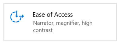
Microsoft has a long history in pushing accessibility technology – Windows 95 was the first You can jump straight to many of the settings applets by running ms-settings:easeofaccess-keyboard or ms-settings:easeofaccess-speechrecognition and so on.
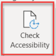
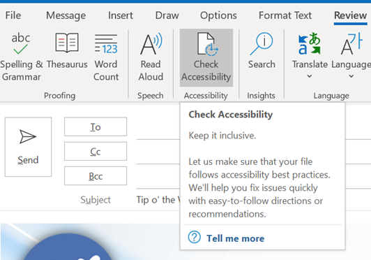
The Check Accessibility option on the Review tab in Office apps like Word and Outlook, should be run just as you’d check the spelling of a document when you think it’s finished. The tool will give you a series of recommendations with guidance as to why it may be better to change aspects of the document. Not every one will be viable – you may want to have images in a particular place on the page, for example, rather than just in-line with text – but many are quick to correct.
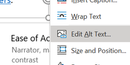
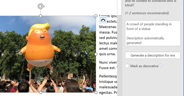
One call to action would be update your own sig to add Alt Text, or to mark the images as decorative so screen reader software ignores them. For more tips on how to write documents which are more accessible, see guidance from Microsoft or from the University of Washington. Some resources for developers or web page designers from the UK Gov, with plenty of links to other sources – Testing for accessibility – Service Manual – GOV.UK (www.gov.uk). |
554 – Outlook signatures shortcut
|
Still, having your LinkedIn photo (and a link to your profile) along with salient information makes a lot of sense, especially when emailing someone for the first time. You can edit your signature in Outlook directly, by going to File | Options | Mail | Signatures, though you may find it better to do the creative stuff in Word, then copy/paste the results into the Outlook dialog. If you feel like freshening up the signature you use, there’s a nice template document with 20 sample signature designs to give you inspiration, here, and some instructions on how to make best use of it, here. The signature that you create is stored by Outlook as a collection of files in a folder on your PC – if you want to look and see, press the Windows key to bring up the Start menu, paste %appdata%\microsoft\Signatures and hit enter. There was a previous Tip (ToW #267) on how to set up synchronisation between multiple PCs using OneDrive, if that kind of thing is of interest.
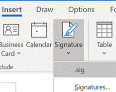
When sending mail in a new window, you get the full ribbon menu of options, which includes the ability to insert your signature in the message – handy if you have it set to not include by default (eg in replies, where you might not normally want a full signature).
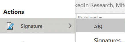
The search box will show you a bunch of content from search results as well as relevant actions from the many menu options in Outlook – it can jump to pretty much every feature, if you can’t remember where to find it The Signature action is the same as the menu option which lets you choose from one of a number of possible signature blocks to insert – in this example, there is only one, called .sig.
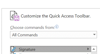
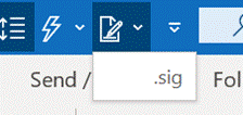
Now, when you’re replying to an email in the main Outlook window, the insertion of your signature block is only a couple of clicks away. |
553 – Android Autobahn
|
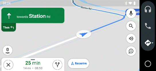
The main Android Auto app can either be run manually or set to start automatically when the phone connects to your car’s Bluetooth system. The app displays a simplified arms-reach or voice-driven UI, showing navigation, telephone and music apps, and the settings allow for a good amount of choice – Waze or Google Maps, Spotify or Amazon Music etc. Assuming you’re There are 120-odd Android Auto compatible apps, so even if you don’t see their UI on the main menu, you could respond (with voice) to incoming messages on WhatsApp, or choose to listen to podcasts with Stitcher as one of several interchangeable “music” apps. If your car does support Android Auto (check compatibility here) then it might take a bit of experimenting to understand how to connect it and how to get the car’s display to show the app outputs, though the results are largely the same as what you’d see if you just ran the host Android Auto app on your phone screen directly. You might be able to replace the satnav system in an older car with one which does support Android Auto – see here for some ideas – as aftermarket satnavs are increasingly simple, ditching a CD/DVD player and maybe not even having a radio tuner – perhaps all you need in your car stereo is a 7” screen to which your phone connects, and an amplifier. Some retro-fit satnav systems use Android as their own OS, and offer a whole host of Carlos Fandango features for little more than the cost of a maps update for an older in-car system. |
552 – snip snip, cap cap
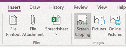
|
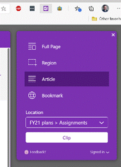
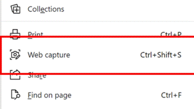
There’s also the
Eventually, the new Edge will adopt some of the functionality that legacy Edge had when it comes to annotating web pages with ink, adding notes to pages etc – but the forthcoming web capture is a first step. Note – if you use Mouse Without Borders, it already has the CTRL+SHIFT+S keyboard combo in use, so you’ll need to change that… |
551 – Ticking away the moments
|
There’s a great little app built-in to Windows 10 called Alarms & Clock, which lets you set alarms on your PC, show a world map with multiple locations / time zones displayed, and also provides a neat countdown or count-up timer.
You can create multiple separately-controlled timers with different durations & names; so you could have an overall meeting countdown timer, and then a separate one for each participant, if you were acting as the time cop to keep everyone else in line. The Stopwatch is simply a fast-running counter of elapsed time, and by using the Those of us who still wear physical, mechanical wristwatches may be passingly familiar with a few features that have existed for decades to achieve the same kind of function, albeit more for individual rather than shared use. So called “diver” watches were popularised in the 1960s and 70s, as tough, waterproof and utilitarian. The most striking feature of any dive watch is generally the rotating numbered bezel which goes around the outside. The simple idea was that when you entered the water (knowing you might have 20 minutes of air), you would turn the bezel so the arrow / zero marker was set to where the minute hand was at that point – meaning a later glance at the watch will tell you how many minutes have passed since. Lots of other non-dive watches also have rotating bezels or indicators, and can be useful for things other than scuba – when the activity above started at 5 minutes to 10, the bezel was set, and it’s easy to see in a trice that was 11 or 12 minutes ago. Not sub-second accurate, but it’s a simple way to mark the passing of time. Many chronograph watches – which combine the function of a stopwatch and a regular timepiece – have a Tachymetre scale around the outside, yet most people these days will have no clue what it’s for. The basic function of the watch is that pusher buttons on the side will start and stop the movement of the chronograph hand which ticks round to indicate elapsed time. The deal with the TACHY scale is that if you know a distance – the length of a straight on a motor-racing track, for example – and you time something going over that distance, then you can quickly calculate its speed across the ground. In practice this is easier said than done, since the TACHY scale reads how many of the <distance> would be covered in an hour at this speed. If the measured distance was exactly 1km or 1mile then it’s an easy calculation – if it took 12 seconds to cover 1km, that would equate to 5km per minute or 300km/h. If the measured distance was a fraction – let’s say the length of the 12-second straight was 150m – then the calculation would be 300 x 150m per hour, or 45km/h. By the time you’ve done that in your head, the subject will be half a lap further on…
If you were cruising at 120km/h, and started the timer, then stopped it when it reached 120 on the scale… (after 30 seconds) – then you know you will have travelled 1km in that time. Yes, there probably are hundreds of times a month when you need to know exactly this. Pulsations
Watches with Pulsations bezels are sometimes nicknamed “Doctors’ watches” as the utility is to help count a patient’s pulse – the method being you start the chronograph, count 15 pulses and the corresponding number on the bezel would tell you what the pulse/minute rate is. Smart watches, eh, who needs them when you have space-age timing technology like this? |
550 – That’s not my name
|
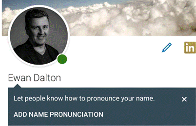
If you have the kind of name that people habitually get wrong, there are things you can do to mitigate, like adopting a shorter and easier-to-pronounce and/or spell version. This tactic is often seen where people from cultures with long and complex names choose a “western” handle as well, just to make their own lives a bit easier. Or you could just put up with people getting your name wrong and don’t worry about it. An alternative trick is to provide people with your own pronunciation – that way, even if they forget, they can go back and check how you say your name. In the days of Microsoft Exchange Unified Messaging, you could choose to record your own name, as well as calling in to set your voicemail greeting, manage your calendar and so on. Exchange UM made a great demo back in the day, but presumably didn’t get used enough as it has now gone away.
Tap on your own photo in the top left of the LinkedIn app, then choose View Profile – and the rest is fairly self-explanatory. You record your name, and after you’ve confirmed that you’re happy with the playback, save it and from now on, anyone who looks you up will see the speaker icon next to your profile name. Alternatively, YouTube has a variety of pronunciation tutorials. |


