|
A while back, Microsoft released a new app for Microsoft 365 users called Lists, which was essentially a front-end to SharePoint, itself a staple of the Office 365/Microsoft 365 offering since the beginning, and providing much more functionality than simply a place to stuff documents. The original SharePoint Portal Server 2001 (codenamed “Tahoe”) is nearly old enough to buy itself a beer in its homeland, and relatively advanced logic and custom data validation & handling has been a major part of its appeal for a lot of that time.
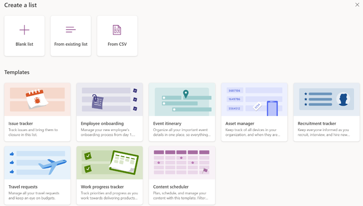
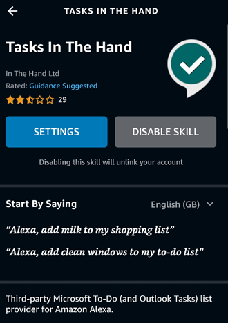
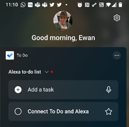
Recently, the Lists experience was made available – in preview – for non-M365 users who could sign in with their Microsoft Account. A “lightweight” version of the app, it’s still pretty functional and pitched at individuals, families or small businesses who need to keep lists of things. Taking a slightly different tack, the To Do application is a good way of making other sorts of lists – that could be Tasks or flagged emails as well as simple tick-lists to mark off what needs to be done. In something of an overlap with Lists, To Do can share its lists with other people – think of To Do as primarily for personal use that you might share, whereas Lists is for managing shared endeavours first and foremost.
|
Category: Teams
613 – Ready for your close-up?
|
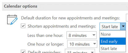
Outlook made some helpful suggestions in response – just one example of new AI functionality showing up by dint of subscription services.
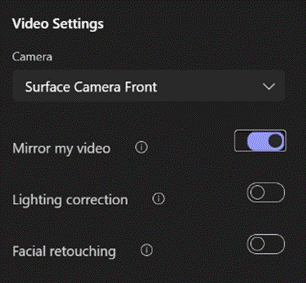
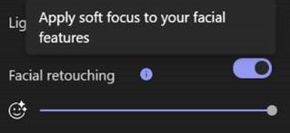
Mirroring your video makes it easier to interact with your own environment while you’re looking at the screen, though it doesn’t affect what others in the meeting see. Lighting Correction is a one-setting tweak for fixing the contrast and brightness, which can be handy when it’s dark outside and your room lighting isn’t ideal.
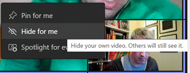
Check out the Teams blog, and look forward to lots more new features arriving later in the year. Another tweak in managing your own video comes from users’ feedback, where they don’t want to see their own video window, thinking that it’s distracting when looking at a gallery of other attendees in a meeting.
Perfect for checking out how the facial buffing has worked out. |
607 – How’s you call health?
|
The same issue occurs en masse at the broadband provider’s network, where their resources are shared between users on the assumption that they won’t see all of them demanding full speed at the same time: a contention ratio of 50:1 is pretty common, meaning if your neighbours are hammering their connection then it may affect you (assuming you’re on the same provider).
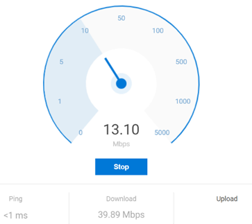
If you’re using Teams or other realtime conferencing tools, it’s arguably more important to look at the latency (or “ping”) and the upload speed, than focussing on the headline download speed; if you have a device uploading lots of data, it might rob your bandwidth and ramp up the latency, which will be the enemy of any kind of synchronous comms. Check your latency over time with an online tool (like TestMy Latency) or download WinMTR to look for spikes in latency. It’s worth making sure your PC isn’t causing issues itself, by running out of memory or pegging out the CPU and therefore giving a poor experience: the topic of looking for poor home network perf has been covered previously in ToW #533 amongst others.
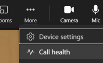
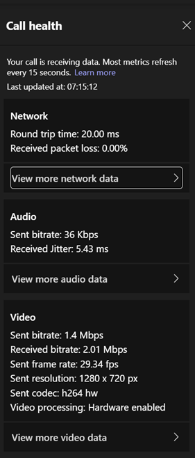
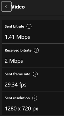
As an end user, see here to understand how to interpret the various data. Hover over the little info icons to the side of each headline to see a bubble explaining in one-line what this is measuring. It’s quite interesting. For admin guidance on what bandwidth and latency requirements you should have to perform acceptably, see here. |
602 – re-drawing Whiteboard
|
Fortunately, there are digital equivalences – you could be in a Teams meeting and co-authoring a document, where multiple people are editing at the same time and marking up comments. You could be watching someone share their 4K screen so they can walk through only a few dozen PowerPoint slides, or you might even have had a play with the shared Whiteboard app that’s been around and been part of Teams for a while now.
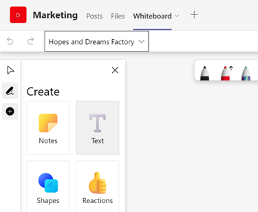
The whole UI has been given an overhaul in line with the latest colourful design ethos, and there are lots of neat new features like the automatic shape recognition for mouse-driven drawing. Hold the Shift key down while you’re drawing with a mouse pointer or a Surface pen, and it’ll straighten lines for you. It’s available in a variety of guises; there’s a web UI (app.whiteboard.microsoft.com) and it shows up in the menu on the top left of Office 365 web applications, such as subscribers would find by going to office.com and signing in with your ID. It’s on iOS and Android, though updates may flow through at different rates to other platforms.
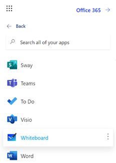
You can pin whiteboards to Teams channels or chats too; just add a Tab, select Whiteboard from the app list, and the content will persist within that context rather than a point-in-time meeting. |
596 – Sorry for the eye-chart
|
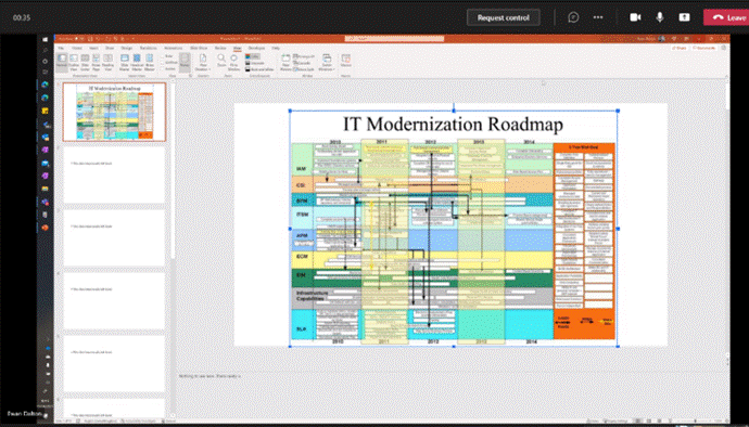
Some would apologize for the fact that the chart/table of data/timeline with 6pt text annotations etc, was too small for the audience to read. “I know this is an eye chart, but…” So hurray when all such in-person meetings were banished to Teams or Zoom if you’re lucky, or if you’ve been a horrible person in a previous life, you may have inflicted upon you Webex, Amazon Chime or whatever Google calls Hangouts these days. When presenting in Teams, there are some simple best practices to follow; some have been covered previously in ToW 576, with more online elsewhere.
As well as tweaking the layout, and hiding/showing components like chat or the participant list, you can zoom the Teams client in and out by using CTRL = and CTRL – (or CTRL + / – on your numeric keypad if you have one), or by holding CTRL and moving the mouse wheel up and down, if you have a suitably-equipped rodent connected. This method, however, just makes the Teams UI get bigger and smaller, so although it might increase the size of the pane being used to present content, it is a marginal gain.
|
594 – One day, meetings != Teams
|
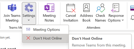
When you create an appointment in Outlook and decide to turn it into a Teams meeting by clicking the icon on the Then there’s the text that gets added to the end of any existing appointment text, which gives dial-in info and provides a link for users who like to click on URLs or who are running a calendaring client which doesn’t support Teams natively. Some degree of customization can be done to this auto-text, but it’s an admin task rather than an end-user one.
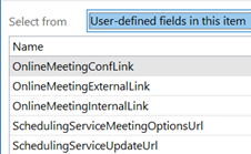
The option is accessed from the main Outlook window, under File | Options | Calendar, and is just above the groovy feature which lets you choose to shorten the default meeting time, so as to allow you and the attendees to get out of your chair once or twice in a working day. From the ToW history files: When you create a thing in your calendar that’s just for you, that’s an Appointment. When you start to invite other people to your thing, then it becomes a Meeting. The Outlook UI changes when you’re dealing with Meetings vs Appointments (e.g., see tracking information on who accepted your meeting invitation, etc). When the Teams integration to Outlook was first rolled out, the workflow to create a meeting was typically to put the time in your diary, invite your desired attendees, then click the Teams Meeting button to add all the extra stuff that anoints the meeting to become a Teams one. That was a one-way process, though – if you clicked in error or decided to forego the online element, you either had to hack out the properties and text (since merely removing the “join” links in the text didn’t get rid of the Join Meeting UI in Outlook, as that was lit up by the contents of the various custom fields in the item) or, more likely, ditch the meeting and create a new one.
The bypass feature is meeting-specific, so if you are scheduling 1:1s with customers or partners, you might want to let the striaght through, but if hosting a larger meeting then having a lobby could let you get your internal team straight before bringing in your guests. |
585 – Heading to Viva
|
In the UK’s 1970s, Ford had the Fiesta (small), Escort (mid), Cortina (large), Capri (sporty) and Granada (executive). GM operated in mainland Europe as Opel (Kadett/Rekord/Monza/Senator etc) and in the UK, as Vauxhall (Chevette/Cavalier/Carlton etc). Brits of a certain age may fondly? remember the Escort-sized, everyman family car: the Vauxhall Viva. The announcement of the employee wellbeing platform, Microsoft Viva thus brought a misty-eyed moment of reflection for some…
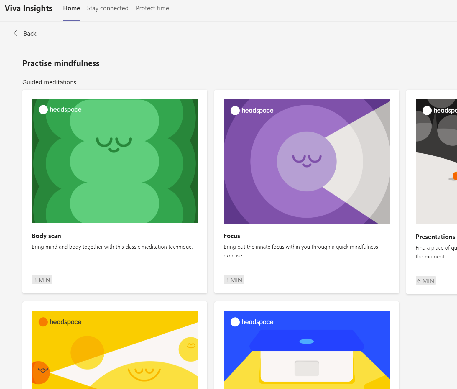
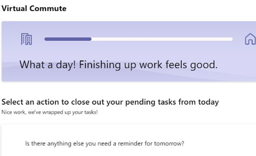
The Insights-defined “Virtual Commute” and calendar-blocking Focus Time has been mentioned previously in ToW #577, but it’s had a new shot in the arm as well as announcements about forthcoming improvements, such as the ability for Teams to quieten notifications when you’re in a focus period, and quiet time when Teams and Outlook will shush pinging you outside of working hours. Now rolling out to Viva Insights is a set of mindfulness and meditation exercises curated from Headspace, who produce a load of online video as well as Netflix series and in-flight channels. See more about Headspace in Viva Insights, here. |
577 – Wir Fahren auf der Autobahn (virtuell)
|
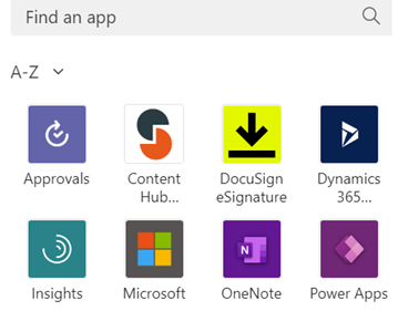
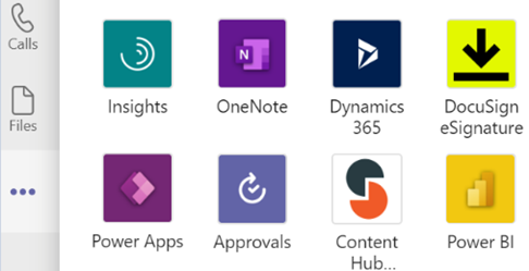
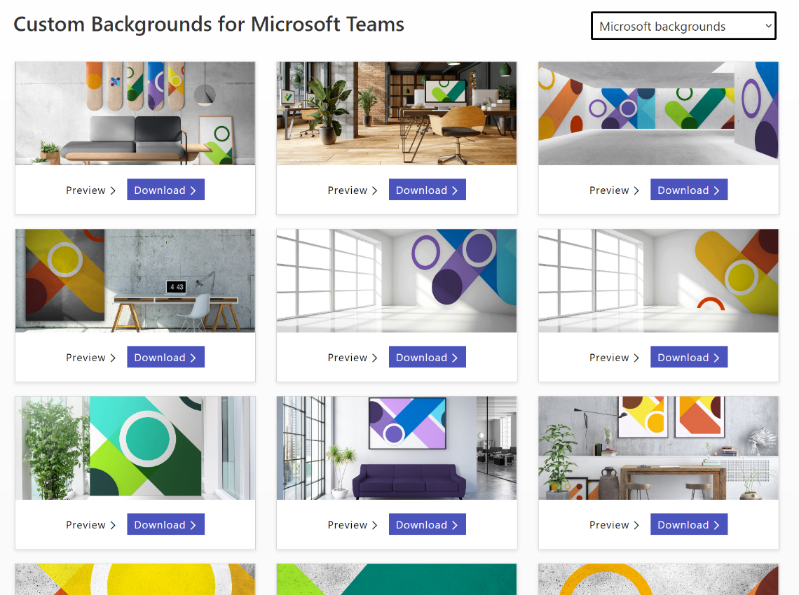
You can jump between the apps in Teams by pressing CTRL+n, where n is the corresponding location on the bar (ie CTRL+1 for the top app, CTRL+2 for next down etc). Open the Insights app to see the first-released Viva application, which has also been recently updated. Viva Insights lets you send praise to colleagues, do some quick & mindful breathing exercises, check on actions you may have mentioned in email (eg “I’ll get back to you on Monday…”) and block out time that’s currently free in your schedule to give you a chance to focus on work you’re supposed to do, rather than meeting with people to talk about it. Newly added, is the Virtual Commute – go to the Protect Time tab, or look in the top-right settings menu “…”, to set up the time to finish your work day. You can now have Teams remind you that it’s time to go home, even if you’re home already. Jared Spataro wrote recently about the need to give yourself breaks between meetings and to transition from “work” to “home” modes. If you’d like to jazz up your Teams background image rather than showing your real backdrop, check out the Viva backgrounds now available in the custom backgrounds gallery for Microsoft Teams. |
576 – Presenter guidance
|
It’s still worth tailoring your presentation style, especially so when you can’t necessarily see the audience – that guy who’d be dozing off in the front row of the presentation room? He’s now doing that on mute and with camera switched off. Creating compelling content is another huge topic which is even more important than the means by which you present it.
If you have a specific reason to share the screen or app then please at least “Present” in PowerPoint, since simply showing a PPT window is a massive waste of screen real estate and your attendees won’t be able to read it.
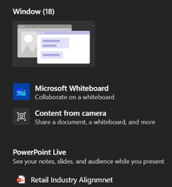
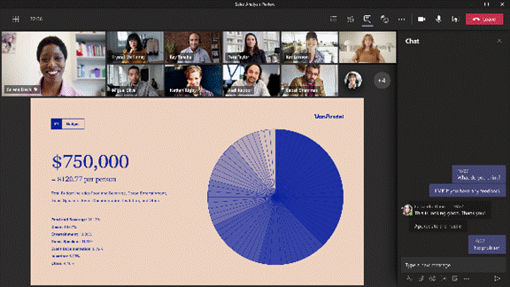
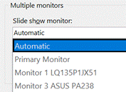
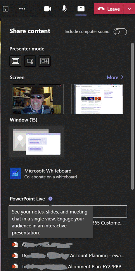
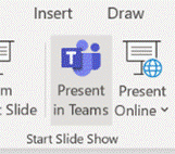
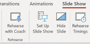
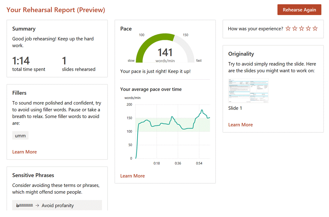
The simplest way to present slides on Teams is to use the This view will let you share content in a more efficient manner, and also gives the option of letting other presenters easily manage the transition from slide-to-slide, rather than having to rely on trying to take control of the presenter’s PC in order to advance them, and avoiding the “Next Slide Please” request. Attendees can privately move around your deck if you allow it. You can also start the sharing from within PowerPoint, as long as the source slide deck is saved to OneDrive or Sharepoint, as the content is rendered as a web view. Go to the Slide Show tab Assuming you’ve managed to create slides which are not a mess and are comfortable about how you’re going to present them, the next step might be to polish your own performance. You could use Rehearse Timings to do a dry run of your presentation, and it will record the time it takes to cover each slide (and will also save that timing so If you’d like an unbiased assessment of your presentation style, try out the new Rehearse with Coach feature – as well as getting some real-time tips during the rehearsal, you’ll get a report when completed, praising for a job well done or admonishing you for speaking too fast, just reading the slides out loud, using, errm, non-inclusive language etc – all of which might be used to help improve your delivery for the next time. Have a play with the Presenter Coach – presuming it’s an automated service rather than a real human listening in, it’s fun to try and see how the recommendations given – see how many profanities you can get it to recognise? |
574 – Teams Times Countdown
|
As many of us have spent the last year meeting people through Teams instead of in person, our methods and behaviours may have altered. Most people stopped getting dressed up as if they were going to work, though some found that after months of wearing jogging pants and hoodies, actually getting smartened up helped them get into “Work Mode”. There’s even the idea of having a virtual commute to separate work life from home life.
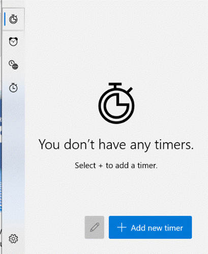
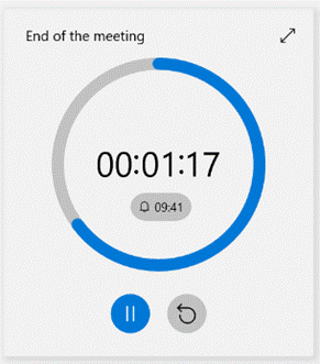
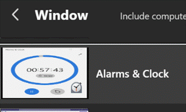
Clicking the double-arrow on the top right will make the timer fill the whole Alarms & Clock app, and you could even make that app full screen if need be. It’s possible to have multiple timers running simultaneously – you could set one for the duration of the meeting, then line up timers for each point on the agenda, though you do need to start them manually.
A more gentle use of this technique would be if you’re going to allow attendees a couple of minutes to join before getting started – so you’d start and share the timer and then people will know that it’ll get underway at 2 minutes past the hour. If you’re hosting a long meeting with breaks scheduled, the same could be used to indicate when proceedings are going to resume. |

