#50: Object Oriented browsing notes

clip_image002

Obscure Computer Science theory had an obsession with “object orientation” some years ago; both a technique in how applications are written but also design thinking on how they might be used. Sensei Steve Jobs, while walking the earth before coming back to save Apple, had a famed obsessions for design and rooted his NeXT computer on an object-oriented approach. The NeXT Cube itself was arguably ahead of its time, but in 1990 cost a cool $10K (that’s about $25K in today’s money). There were few takers, though the odd geek still gets excited to pick them up 2nd hand.

An example of object orientation in user interaction is that you go to a thing you want to work with, rather than a tool with which you want to work. Elements of this are all over UX in Windows, like going to a document in Explorer, and it lets you open, edit, print, etc. Most people will still go to Word and open a file from there; that’s why the Most Recently Used list and Search features exist.

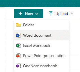
To start something new, you’ll likely open your app of choice then use it to create a file or open an existing one. When did you last go to SharePoint and use the New -> menu option to create a document in situ, much less a OneNote notebook? Exactly.
clip_image004

There are other places where things are less cut and dried: you might open a notebook like OneNote, Evernote, Notion etc, and start taking notes on a thing you’re working on. Or you might want to be in the flow – in a Teams meeting, or viewing a document on which you want to make some side notes – and it makes more sense to bring the notepad to the side and ideally keep the context so when you revisit that document or that webpage, you’ll (optionally) see the notes you had previously.

Progress is not forthcoming

Sadly, as apps evolve some features are sacrificed perhaps because telemetry tells the developer that they’re not much used, or they just decide that newer things are more important. One key villain in this regard is the “new” (Chromium) Edge browser, which left behind many of the features of the old(“Spartan”) Edge, which might not have been much used but then neither was the old Edge. The dev roadmap appears to focus on more ways to inject adverts and to jam Bing services and Copilot into everything, than to actually make the browser as useful as the one it replaced.

Linked Notes

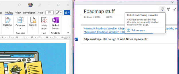
As covered 18 months ago on old testament ToW 683, OneNote has the capability to be docked to the side of whatever other window is being used, and in some cases, maintains a link to the document that is in the main window.
clip_image006

You’d create the page you want to make notes on in OneNote, and when Linked Notes are enabled, it will tie back to the Word etc doc you were using in the other window. That way, if you re-open the notes in OneNote you’re only a click away from pulling up the document they relate to.

If you later go to back to it in Word, however, or open the doc directly from Explorer, there’s no obvious way to bring up the notes you were taking, without going to OneNote, finding the page you took the notes on, and perhaps docking the window again. Even the Linked Notes option on the Review menu doesn’t quite work as expected – it’s for establishing a new link, not reanimating an old one.

This is an example where true object orientation would work well – you’d open the Word doc which you had linked to OneNote, and you’d automatically see the notes in a sidebar.

Remember Internet Explorer?

Even ye old IE had an option of being linked in OneNote so you could take notes on a page you were viewing. Sadly, Edge has torched this feature – along with Reading List and one of the more helpful and semi-OO feature, which didn’t use OneNote but was still potentially handy…

Web Notes RIP

Web Notes was a feature of Old Edge, for jotting down simple notes on whatever page you were viewing, and the next time you visited that same page, the notes would be shown alongside.

Imagine if you were looking to buy a house or pretty much any other major piece of shopping; whilst conducting research, you might browse to several properties of interest and could make some notes about each one – near a good school but close to a busy road, nice rear garden, high crime area down the road, neighbour has planning permission to build a house in their back yard…

It could be so useful to jot the notes as you go and have them presented again if you happen to revisit the same page in future (so you remember you’ve already looked into it). If you could later see a list of every note you took, with a link back to its source, so much the better.

Sadly, there is no way to do this in Edge, without relying on extensions. There are many out there but none really hit the brief well – if you find a better one, please do mention in the comments below.

The OneNote Clipper is worth a look if you want to keep a list of notes with links back to pages, but is old school in that you’d go to OneNote to find that list and then see which pages you had commented on, rather than the more Object Oriented approach of viewing a page and having the notes offered to you.

clip_image008

Perhaps the extension which comes closest to the functional requirement (even if it doesn’t win many prizes for looks) is Note AnyWhere, available from the Chrome store (and can therefore be installed on both Chrome and “new” Edge).
clip_image010

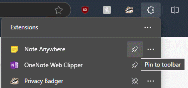
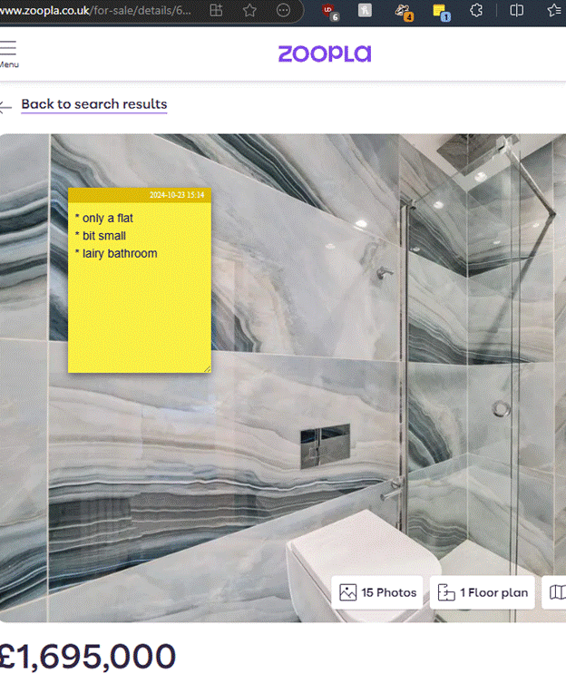
For ease of use, after installation, click the Extensions icon on the toolbar and Pin the Note Anywhere icon to the toolbar, after which taking notes on a new page is only a couple of clicks away. When you next visit a page, previous notes will be displayed (or you can choose to just show a number on the toolbar by the icon, to show how many notes you’ve made).
clip_image012

It would be nice to have some simple formatting, and searching previous notes is a little clumsy (requiring you to sign up and sync with the developer’s web front end), but for a free app that doesn’t (yet) nag you to subscribe for extra functions, it’s not half bad.


PS – Remember, this weekend is when Europe (mostly) ends Daylight Saving Time, meaning next week could see clashing of meetings arranged with international attendees, before North America catches up on 3rd Nov. New Zealand and some of Australia has already made the leap.

This topic has been covered ad nauseam on previous ToWs … spring forward, fall back

#49: Managing Multiple Messaging

image

It used to be easy: you had an inbox (real or electronic) and new mail arrived. You’d check the inbox for anything that needed your attention, otherwise just get on with whatever it is that you were doing otherwise. Now, there are so many messaging apps that it can be a headache to not only keep on top of all the inbound contact, but to recall in which app you were having a conversation you want to go back to.

It might be easy if your professional comms is all done via email, but if you’re an itinerant consultant working with several companies, you might even have numerous professional email addresses too so keeping an eye on them all can be a chore.

There’s always a chance you’ll be dealing with LinkedIn or SMS messages with work connections as well, and with friends and colleagues there might be Facebook, WhatsApp and many more.

Two quick tips this week might help to get on top of things, if only a little.

Finding work-related messages in M365

If you use Teams and Outlook for work, with Microsoft 365, then you might already experience discombobulation when looking for something a colleague sent, or some comment discussed in the context of a project… was it in the status email, or in the chat of a meeting? Or a direct message in Teams?

clip_image004

Fortunately, the “Work” search options might be able to help. If your organization has it enabled, go to either Bing.com/work or look at the search option in Office.com while you’re signed in, and you’ll be able to search documents and other sources of data within your M365 environment.

clip_image006

One such is Messages – and the handy shortcut to jump there is aka.ms/messages. Type a search term in there and it will look across both your Outlook mailbox, but also in any Teams messages you might have been part of. Once you get used to checking it – and using the Work search for documents and other stuff – it’s a game changer.

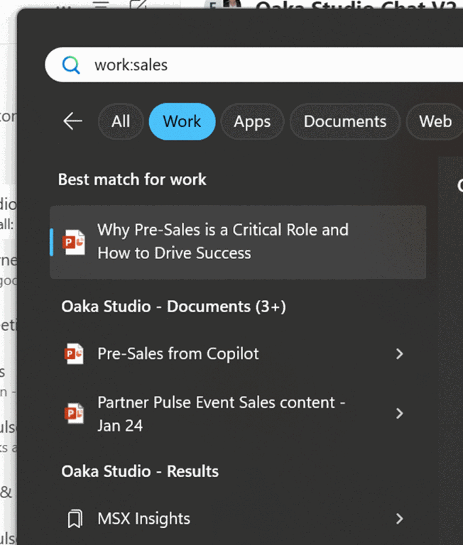
Another trick, for finding documents in your work context, is to search from Windows Search directly by pressing the WindowsKey and typing work: followed by something you’re looking for.

clip_image008

Search across OneNote

Though it’s not strictly messaging, you might have taken notes during a meeting (or even had your friendly Copilot overlord do it for you), potentially spread across several OneNote notebooks.

clip_image010

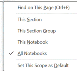
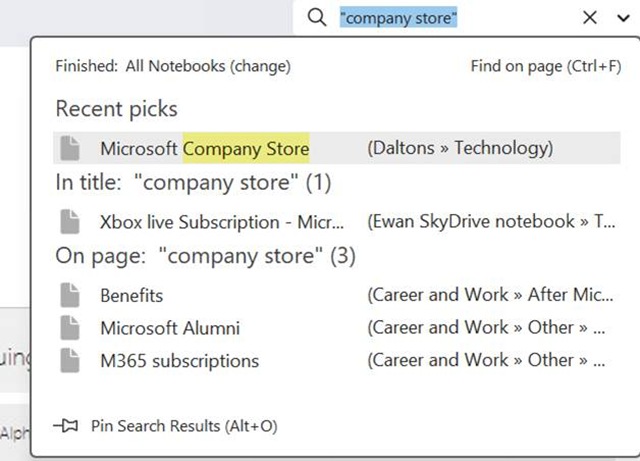
The search box in OneNote lets you choose if you want to perform a query across the current page, section, notebook etc – but the results you get back can be a bit clumsy to interpret as it doesn’t give any details on which are really old pages and which might have been written recently.

clip_image012

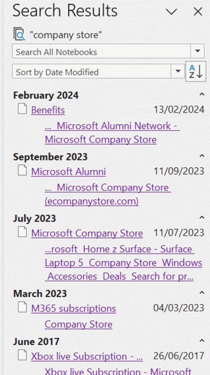
If you haven’t discovered the obscure ALT+O to pin search results, try it out – it lets you group by section, page title or date, and you can expand and collapse the groupings to help locate the most likely page more quickly.

clip_image014

Now, where did you put your glasses?

#47: Using Copilot for (consistent) meeting notes

clip_image002

GenAI” like Copilot and ChatGPT has been evolving quickly over the last year or two, and the more experience people have in using it has also changed their approach. Just as providing better questions to get more accurate search queries from Google / Bing, getting the best results from Copilot or the like might depend on being specific enough with your questions.

Here’s a tip courtesy of Kat Beedim, Microsoft 365 MVP from Microsoft partner, CPS. Kat is using Copilot to summarise the output of a Teams meeting, in an alternative way to the built-in Copilot for Microsoft 365 method which generates a pretty decent summary (and was recently discussed in context of the OneNote integration). While the content is generally good, using the standard approach, you will likely get differing formats of notes from one meeting to the next, depending on what was said.

Kat’s approach is to download the transcript from a meeting that you’ve attended; this may be available to anyone who joined the meeting, even if the tenant hosting the meeting doesn’t itself have Copilot provisioned. In other words, if you have access to Copilot and you can get the transcript from a meeting (which you didn’t organise, maybe even one organised by a different company) then you can generate the meeting notes.

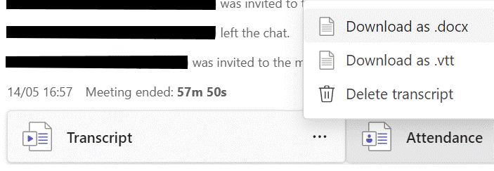
To see if the meeting was transcribed, go back to the Chat or the Recap from the meeting within Teams and you might be able to download the transcript (as a .DOCX file).

clip_image004

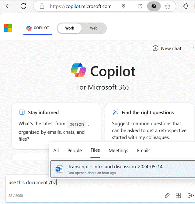
Save the transcript file to OneDrive in the same tenant where your Copilot for M365 is, and within a Copilot prompt you can reference it… if you go to Copilot (Work) and press “/” in a prompt, it will let you choose a file (or other source of data).

clip_image006

Kat has provided a very polite and detailed prompt for Copilot to generate meeting notes; by using the same prompt after every project or team meeting, the same format of notes will be preserved.

Copilot, please assist me in converting the attached /(start typing the file name to select it)
into detailed meeting minutes.

Here’s what I need:

1. Identify Key Sections: Break down the transcript into distinct sections: attendees, apologies, introductions, summary of concerns, previous actions discussed, further discussions, recommendations and actions, date of next meeting. Keep to that order.

2. Summarise Discussions: Provide a detailed summary of the discussions for each agenda item, capturing the main points and any consensus reached.

3. Highlight Decisions: Clearly state any decisions made, including the rationale behind them and any dissenting opinions if applicable.

4. List Action Items: Enumerate the action items that came out of the meeting, specifying the responsible party and the deadline for each task

5. Note Attendees: Include a list of attendees and their roles or titles, as well as any apologies for absence.

6. Format for Clarity: Use full sentences and paragraphs, tables, and bold text for emphasis where necessary to enhance readability. Do not use bullet points.

7. Review for Accuracy. Ensure that the minutes reflect an accurate and impartial record of the meeting, and make any necessary edits for clarity and conciseness. Please format the minutes in a professional and presentable manner. suitable for distribution to all meeting participants and for record-keeping purposes. Thank you.

You could also open the transcript directly in Word and enter the gist of the prompt above in Copilot within Word, though formatting is a bit nicer when done from the Copilot for M365 prompt. It might be possible some day to tell it to generate a new document using a set template, but that appears to be a manual process for now.

Feel free to have a play with the prompt to get the format and the answers you want; you have 2,000 characters to give your instructions so be as descriptive as you like.

Kat’s video demo is on Write meeting minutes with Copilot – YouTube.

#45: Copilot updates flying in

clip_image002

Microsoft unveiled “Wave 2” of Copilot for Microsoft 365 earlier this week; if you haven’t seen the video, you can catch it here, or check out Teams guru and MVP Tom Arburthnot’s tl;dr summary of the key announcements and the demos.

BTW, if you are a Microsoft partner, you might have heard during MCAPS Start in July, that (woo-hoo!) Microsoft was going to give you some free Copilot licenses as part of the benefit of being in the partner program.

The latest Benefits Guide shows that Copilot goodness is indeed coming in January 2025, but it might be a bit less generous than expected… Basically, don’t bank on getting more than a handful of seats as part of the package, and if you don’t think Copilot gives you enough benefit to bother paying for it, then, well…

Talking of “what’s new” with Copilot, Microsoft veteran Malcolm Bullock has a thought-provoking explanation of what he means by “Nothing has changed but everything is new”.

Some of the stuff that was announced in the Wave 2 jamboree will be coming later this year, such as Copilot automatically prioritizing your emails in Outlook. Other pieces – the Narrative Builder in PowerPoint, for example, are here already.

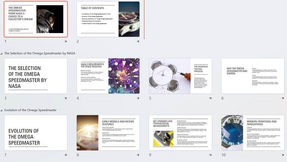
The PowerPoint Copilot functionality is amazing. Give it a couple of lines of content and it will generate a whole load of slides by finding out information to flesh out your idea. If you’re an expert in an area then it might seem to give a glib, high-level overview with not-quite-correct images, but all of that can be tweaked and updated later.

Here’s an example:

clip_image004

… and literally a few moments later, it presented…

clip_image006

Not bad at all. At least it has a framework which could be used to flesh out stuff in more human detail.

While Copilot might have its most immediate use in helping to create content like images or writing documents/emails for you, there are other collaborative benefits too, some of which were covered in the announcement. As Malcolm says above, maybe we will need to tweak how we collaborate (using channels instead of chat for group discussions, for example) to properly harness the capabilities to good effect.

On asking Copilot in Edge to summarize the announcement page to less than 200 words, it offered:

· Copilot Pages: Introducing a dynamic, persistent canvas for AI collaboration, allowing teams to work together in real-time with AI-generated content.

· Enhanced Microsoft 365 Apps: Significant improvements in Teams, Excel, PowerPoint, Outlook, and Word, including new features like Copilot in Excel with Python for advanced data analysis.

· Copilot Agents: New AI assistants to automate and execute business processes, with an easy-to-use agent builder for creating custom agents.

· User Feedback and Updates: Over 700 product updates and 150 new features based on feedback from nearly 1,000 customers, improving performance and user satisfaction.

So there are lots and lots of new features coming, if not here already. Yay.

Meetings, transcripts and notes

One of the nicer new widgets that Copilot has brought recently is for putting meeting notes into OneNote. Previously, to record what happened in a meeting, you’d ask either Teams Premium or Copilot to generate some kind of notes, then copy/paste the text into OneNote alongside other stuff you might have jotted down yourself during the meeting.

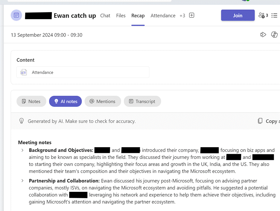
Now, it’s made the process a whole lot easier – first, you need to be sure the meeting has been recorded or transcribed. If you go back to the Meeting inside Teams (look in the Chat node), you might see a Recap option which will give you the summary of what happened, along with actions that were discussed:

clip_image008

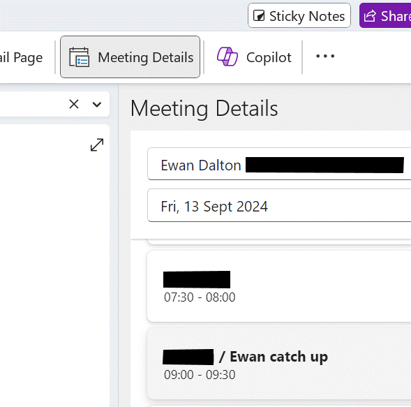
Now, go into OneNote, navigate to your existing notes page for a meeting (or create a new one) and go to Insert Meeting details. It will offer you a pane on the right side showing a selection of meetings from your calendar.

clip_image010

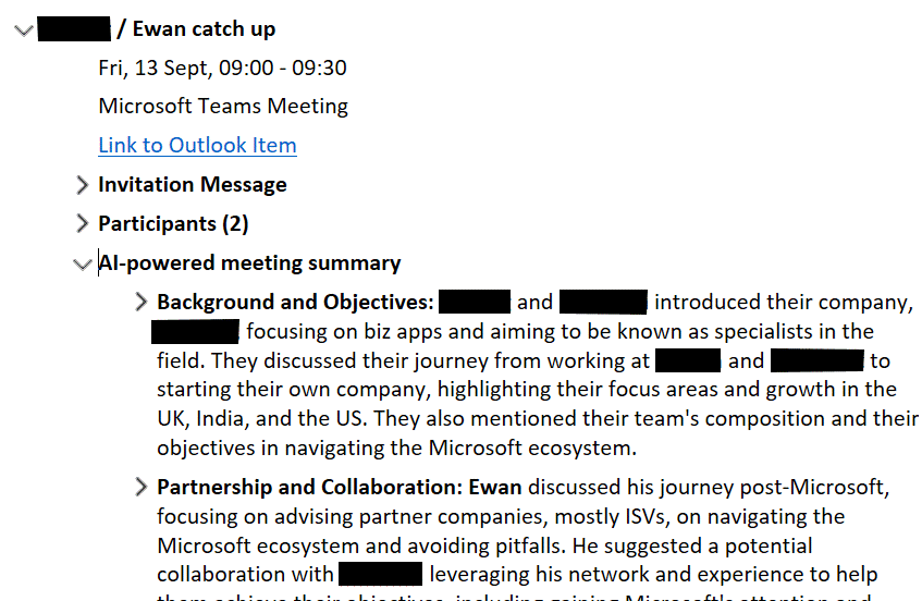
Previously, this would have copied just the bumph from Outlook like the date/time, subject and who the attendees were – useful as that is – but now has added a bunch more…

clip_image012

It’s a brilliantly useful way of adding some extra content to notes you might already be taking, or just to more easily organize notes and follow up actions from within OneNote rather than grubbing about in Teams to find them.

#39: OneNote Shortcuts, Favourites and Pins

clip_image002

Regular ToW readers may share in a collective for OneNote – and there have been plenty Tips over the years to celebrate. There are other note-taking apps out there, of course, but if you have invested time and years of notes in one, it’s hard to shift.

OneNote comes in a variety of versions spanning web, mobile, Mac & PC, and you have the ability to organise pages of notes in sections, groups and whole separate Notebooks, should you wish. Notebooks can be shared with other people and could be used to contain stuff that’s specifically for one particular project or role.

Personal vs Work

If using OneNote on the web (which needs you to be online to access it), you could have different browser profiles for work and home, and therefore all your work notebooks would be in one and your home-related ones in another. The PC version of OneNote lets you mix notebooks from different accounts, so you could have them all open in one app – handy for some, though it can lead to lots of notebooks being open and searching right across them can be bothersome (see Classic ToW #646 for help with that).

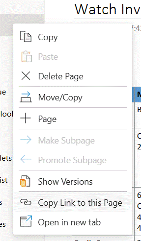
If you keep going back to a few pages for shopping lists or the likes, it’s quite easy to grab a link directly so you can find it again quickly. Go to a section or page in the web version and you can right-click to copy a link to it, forming a simple https:// URL to wherever the source is stored (on OneDrive if you’re using a personal Microsoft Account or in SharePoint if using a M365 login).

clip_image004

Save that URL to wherever makes sense for you and it will launch directly to that page in a new browser upon activation.

Desktop vs Web

If you’re using the PC OneNote app, however, you’d want to have the page open in that app rather than in the browser. In the old days, you could drag a OneNote page to your desktop or some other Explorer folder, and it would create a shortcut to it – but not any more.

If you repeat the above process of right clicking / copying a link when in the app, then paste the resulting link into Notepad or similar, you’ll see there are actually two links – firstly, a https:// formatted URL and a second beginning onenote:https:// and finishing &end.

clip_image006

Select and copy the line(s) beginning onenote: to the end, then you can create a shortcut elsewhere – it’s a bit of a palaver, but…

· right-click on desktop or in your chosen folder,

· choose New > Shortcut and paste the onenote: link in there… hit Next,

· give it a meaningful name and save it

· now you could launch OneNote directly to your chosen page, with a simple tap or double click on that icon.

OneTastic to the rescue

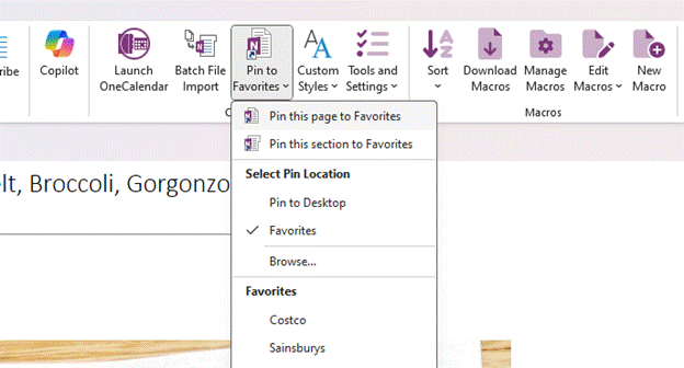
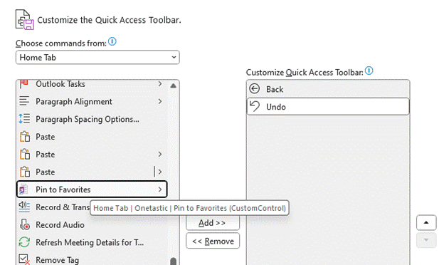
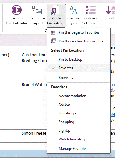
A simpler way is to use the Pin to Favorites (sic) feature in the most excellent addon, OneTastic; this lets you create and pin links to a variety of locations, perhaps most usefully within the “Favorites” section of that menu itself – and to recall a Fav in future, just go to that menu to quickly navigate to several pinned OneNote pages and sections.

clip_image008

The “Favorites” location can be accessed in the file system if you like, too – just press WindowsKey+R to get the Run command up, then enter %appdata%\OneTastic and you’ll find the folder in there.

Pin it on the move

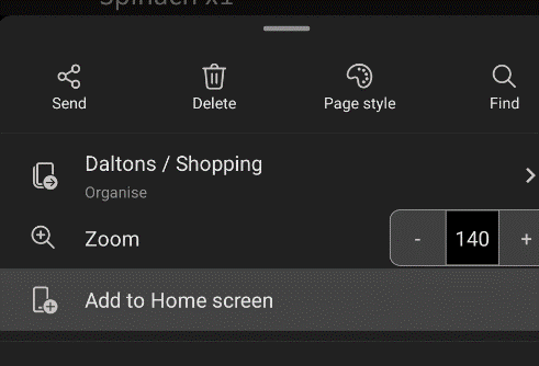
Mobile users have a simpler way, at least Android users do. Within OneNote, select the 3-dot menu on the top right of a page, and you can Add to Home screen; this will try to pin a shortcut to whatever kind of homescreen / launcher you have.

clip_image010

iOS users might need to rely on a Widgety solution instead.

#21: Dating OneNote

Designer (2)

It’s not hard to find websites listing “the best apps for … in 2024”, usually covering the same options that were doing the rounds in 2023 and 2022, with a few tweaks. The category of note taking, across web, desktop and mobile, is a common theme, sometimes offering head to head comparisons between leading options like Evernote vs OneNote. If you’re committee to one note-taking app, you’re not very likely to switch, but maybe there are people who scatter their stuff across multiple services and apps and are looking to centralise on just the one.

OneNote has had plenty of attention in ToW’s passimsee the archive – but even with decades of familiarity, it’s easy to miss some really useful capabilities that can improve the user experience. Let’s have a look at some, concerning the topics of date (and time, probably, since the continuum thingy means the two are inextricably linked).

Inserting dates & times

clip_image002This one is easy, and its utility will depend on how you go about taking notes. If you start a new page for each conversation or topic, then you’re probably covered to a large extent. When you insert a page, OneNote will automatically tag the top of it with the current date and time…

In the days when (at least) two OneNotes (yes) were jostling for position, the new One wouldn’t let you edit the date or time of an existing page, but the old One did … and since it vanquished the upstart, still does. Just click the date (or time) and then the calendar (or clock) icon that appears next to it, and you can set the appropriate measure.

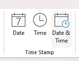
clip_image003If you’re more the type who has one long page of notes (around a single topic, or a single person who you meet multiple times, for example), then inserting the present date/time is near essential when appending or updating stuff – just go to the Insert menu and choose your datum | data.

Of course, keyboard warriors will want to remember the handy shortcuts to insert the current date (ALT+SHIFT+D), time (ALT+SHIFT+T) or both (ALT+SHIFT+F). The first two also work in Word and in Old Outlook (which uses Word as its editor), but don’t work in New Outlook, which doesn’t.

Reviewing old edits

clip_image004One easily-missed trick in OneNote is to see when a piece of text was last updated. It’s pretty clear if you’re sharing the workbook with someone else, as their updates are (optionally) highlighted and can also be searched for.

clip_image006Look at your own notes and if you hover the mouse over any text or other content, you’ll see a small grey paragraph marker on the left; right click on the text and you’ll see, at the bottom of the context menu which appears, the author who made the last change, and when.


Search and find by Date

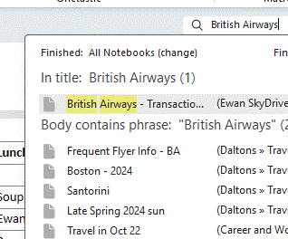
If you have a lot of notes, searching for a specific term might return many results, possibly spread across multiple notebooks and not necessarily presented in a useful order:

clip_image008

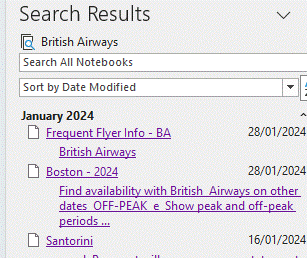
Look at the bottom of the search results dialog, however, and you’ll see an obscure feature: Pin Search Results (ALT-O), which will open the results in a side window, allowing you to filter and sort them more effectively.

clip_image010

This clearly makes it easier to find the most recent edits you’ve made with your search term. Add this ALT+O to your OneNote arsenal. While you’re at it, make sure you also install OneCalendar, which shows a view of your previously-edited pages on the days you edited them.

#17: Stickier than a sticky thing

clip_image002

When a researcher at 3M accidentally failed to invent the kind of adhesive they were trying to, and instead produced what went onto become the iconic yellow sticky note, no-one could have imagined that more than 50 years later, there would still be a $2.5B market for them.

Even digital note-taking hasn’t quite replaced the scribbled-down utility of a little note by the side of your desk, though IT security boffins would surely wish that users would stop writing their passwords down and sticking them to the side of the screen.

Software developers have, of course, produced many apps which can be used to semi-replicate the quick note-taking capabilities of the paper version, and 3M even sued Microsoft back in 1997 for referencing a similar feature in Office 97 as “post-it”. Oops.

Fortunately, hatchets were buried and 3M even launched a Post-It® app for Teams, though that lasted less than a year and has since “gone away”.

Microsoft produced its own Sticky Notes app (also for iOS devices and Anroid phones, especially if you’re using the Microsoft Launcher) which latterly integrated with OneNote and even back to the old Outlook notes capability.

Windows users might also be excited to learn of the new Sticky experience which was announced a few weeks back – currently available in the preview version of OneNote, but soon to arrive as a fully-fledged replacement of the previous Sticky Notes app.

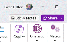
You may see “Sticky Notes” appear next to the Share drop-down at the top right of the OneNote window; click that to open a new window showing your current notes.

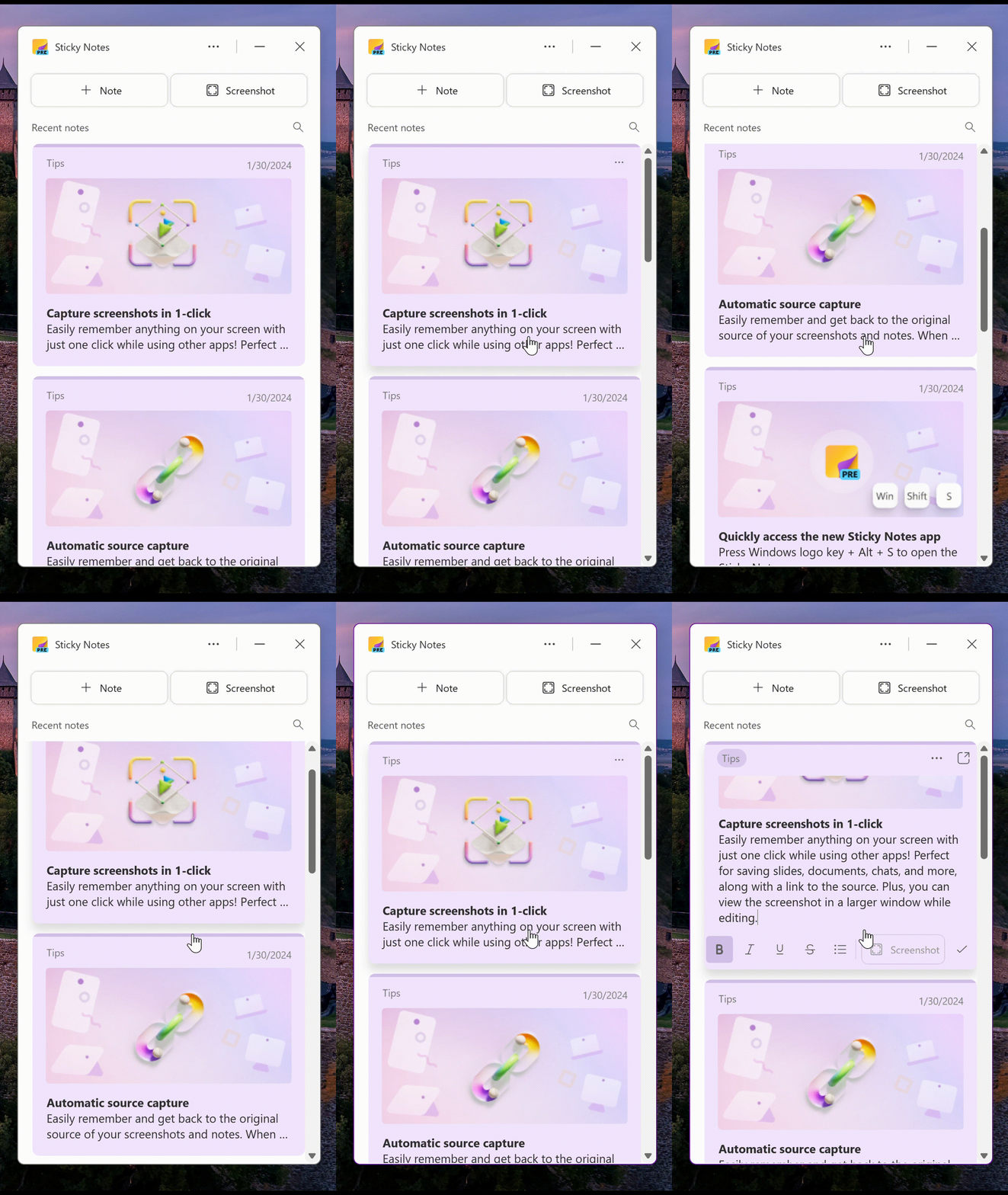
clip_image004

There’s an easy way to take screenshots with a single-click though it will grab the entire window so you might need to go and do some after-the-fact editing. In that vein, it appears that the notes are stored in your M365 mailbox – https://www.onenote.com/stickynotes – rather than in the “Quick Notes” section as defined in the OneNote app.

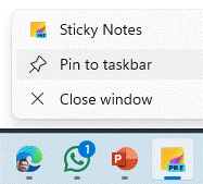
At some point, it may appear as a separate application which will retire the current UWP-based Sticky Notes 6.0 application that’s still listed in the Store. For now, you could launch the new Sticky Notes from within OneNote, then Pin to the taskbar so you can quickly jump to it in future. An alternative is to press WindowsKey+ALT+S, which will start it up.

clip_image007

The app can be docked to the side of the desktop so even with other apps in full-screen mode, you can reference numerous recent notes, and when you create a new note, it will add a link back to the web page or document you were viewing when the note was added.

If you like to get the latest previews of Office apps and services, sign up to Join the Microsoft 365 Insider Program and decide how often you’d like to get updates containing both features and fixes.

It’s baaaack… Tip OF the Week returns

OnMSFT.comOK, I said it was gone but it’s just been resting.
Tip o’ the Week is no longer the internal email in Microsoft, but was being published weekly on the OnMSFT.com site – as “Tip of the Week”…

[UPDATE – January 2024 – OnMSFT.com has been acquired by another site so may be transitioned, or disappear altogether…]

Tip of the Week #1: That function key most Office users don’t know about deals with function keys in general and in particular that shortcut to repeat the last thing you did in an Office app…

Tip of the Week #2: The OneNote addin everyone needs covers the shift to and from UWP apps and the benefit of moving back to OneNote’s traditional architecture due to the incredible OneTastic addin that is only available on that version.

Tip of the Week #3: Using Multiple Calendars in Outlook – Most people who use Outlook probably know that you can show multiple calendars at the same time, even overlaying them. But have you ever tried using the list view to show a table of appointments instead, so you can see everything that is coming up?

Tip of the Week #4: Calendar sharing using Bookings with Me – Microsoft has had a few goes at making it easier to share your availability with other people, from the basic Free/Busy in Outlook (typically within your organization) to tools like FindTime, which sends a poll to every attendee to get them to vote on the best time for them.

If you’re looking at offering your availability to others – especially if outside your organization – then the relatively new “Bookings with me” is worth a look. Think of it like Calendly but it’s part of (some) M365 packages…

Tip of the Week #5: Time management in & out of Windows – Did you ever have to call the speaking clock or set your watch off the clock at the bottom of the TV news? Fortunately, time setting in Windows is mostly automatic but here are some tips for how to tweak it, how to display other clocks and how to know what the time really is…

Tip of the Week #6: Managing Screenshots – SHIFT+WindowsKey+S is a supremely useful key combination; capturing parts of the screen with Snipping Tool and its numerous variants has long been a handy feature and as it gets updated, it’s getting better all the time.

Tip of the Week #7: Taskbar icons for Edge profiles (and other apps) – How to change the icon on your Win11 taskbar for different profiles of the browser, to make it easier to distinguish between them.

Tip of the Week #8: Juggling with Daylight Saving Time – Handling that awkward period where multiple parts of the world move into a different time, but not all on the same week…

683 – OneNote Docking

imageSince the OneNote desktop app is getting a reprieve from its previously-announced retirement, and the anointed successor UWP app is itself being put on notice, maybe it’s worth looking at a few tweaks which can make the old app a bit more useful. There were a load of updates announced about a year ago, and further improvements to the OneNote family are on the way too.

If you use OneNote to take meeting notes – especially if you’re meeting virtually and want to have your notes alongside the Teams/Zoom/Chime app – then it makes sense to arrange the windows side by side. Students of ToW past will know that in Windows 11, pressing WindowsKey+ ‎← or → will snap the current window to the sides of your display, and there are other ways to control window placement if you have especially complex desktop arrangements.

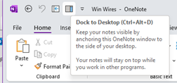
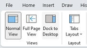
clip_image002clip_image004There is an old feature in OneNote which is worth revisiting; Dock to Desktop. Invoke it at any time by pressing CTRL+ALT+D or go to the View tab to select it.

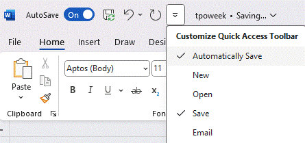
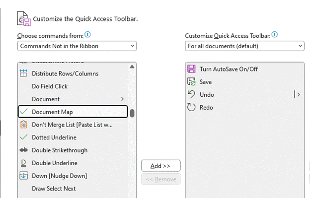
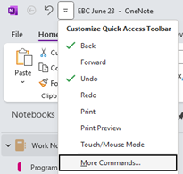
You could also try pinning it to the Quick Access Toolbar on the very top left of the OneNote window. The QAT in Office apps was covered way back in ToW #321, from March 2016.

clip_image006Docking has the effect of minimizing the UI for OneNote and sending it to a (horizontally resizable) section of your screen, on right-hand-side.

Usefully, it also means other apps respect that space, so even if you maximize another window, it will only grow to appear alongside your docked OneNote.

clip_image008

If you don’t like the position of the docked window, drag it using the “…” at the top of the pane, and position it on the top, bottom or the left side of the screen instead. If you press CTRL+ALT+D again while docked, it will fill the entire screen – maybe useful if you have a 2nd monitor.

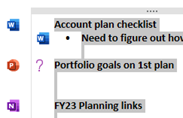
The rest of the minimal UI lets you access the pen menu, restore back to the full UI or you can use a somewhat obscure feature called Linked Notes. This will add a link back to another clip_image010document that you could also be working on; you’ll see an icon showing the source document when you select text that has been linked.

Hover over the icon and you can get a summary or thumbnail of the document, and left-click the icon to open the document.

The original intent with Linked Notes was that you could use it across Office apps and also when browsing the web; how useful to be able to make notes on a specific web page and then jump back to the source when revisiting the notes you took! Sadly, the feature was integrated only to the dearly departed Internet Explorer, and it is not available in modern browsers. The topic of Edge support has been raised in online forums but thus far, responses have been less than forthcoming.

Even the Help page on Linked Notes talks about how it works with Word 2013, PowerPoint 2013 and other OneNote 2013 pages… no mention of Excel either.

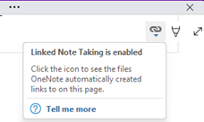
clip_image012If you do find yourself going back in time and using Linked Notes, you’ll see an additional icon (when un-docked and back in full OneNote mode) in the top right of any page where you have links, allowing you to go straight to the source docs or to manage the links themselves.

682 – Lens scanning

clip_image002

Continual advances in the quality of smartphone cameras mean that most people don’t use a physical camera any more; unless you are really demanding when it comes to control over digital imagery, phone cameras are good enough for most people, most of the time.

Compact cameras have evolved too, providing phone-beating snaps through better sensors and lenses than could possibly fit in the body of a handheld communicator. More light hitting a larger sensor through a bigger, higher quality lens gives you a better starting position to get a decent picture, though smartphones have powerful software and – increasingly – cloud services available to help improve the photo after it’s been captured. Higher-end cameras are changing, too – even Hasselblad (famed for moon shots but also for the most famous photo of the world) is ditching the DSLR model and going mirrorless. The horror!

clip_image004Marrying high-resolution imaging with powerful software in the palm of your hand does give you access to new capabilities that a generation ago would be almost unimaginable science fiction.

clip_image006Check out Plant Viewer to identify which is weed and which is flower, or Google Lens to capture information from the camera or even just to try to identify whatever you’re pointing it at.

As the world has discovered with ChatGPT and Google’s Bard, responses from AI powered services are not always quite correct, even if they appear convincing.

As any fule kno, this item in question is in fact a Seiko RAF Gen 2 (not a Gen 1), even though Google successfully found one for sale, that looks identical.

Google Lens is available on iPhone and iPad too, and depending on the Camera app you use on Android, it might also be launched clip_image008from there (and most Android devices will launch the Camera app if you double-tap on the power button, so it’s a quick way of getting to Camera, even if the device is locked).

Microsoft Lens is one of the best “Lens” or scanning apps in either mobile store (Fruity | Googly). Formerly “Office Lens”, at one point also available as a Windows app (but now discontinued) and since rebranded somewhat by its listing in the mobile app stores as Microsoft Lens: PDF Scanner, though it can do lots more.

The premise of Microsoft Lens is that clip_image010you can point the camera at something and scan it, by taking a high-resolution photo of the thing and then using the software to manipulate, crop and adjust the image. The most obvious use case is scanning a Document; start the Lens app, lay the doc out as clearly as you can and then step through grabbing each page in turn.

clip_image012The red > icon in the lower right shows how many pages have been captured so far. In earlier versions of the Lens app, you’d try to frame the page at the point of capture but now you just grab the images one-by-one (using the big white button) and do the tidying up later.

Press that red button and you’ll go to the UI where Lens tries to identify the corners of each page, and lets you tweak them by dragging the points. You could retake that individual image or delete it from the set of captures.

Press the confirm button on the lower right and you’ll jump to a review of the captured images, giving the option of rotating or adjusting each one, cropping, applying filters to brighten and sharpen them and so on. Once you’re happy that you have the best-looking images, tap on Done to save your work.

clip_image014You could send all the pictures into a Word or PowerPoint doc, drop them all into OneNote or OneDrive as individual files, or combine all the “pages” into a single PDF and save to your device or to OneDrive.clip_image016

There are other tools on the primary screen of the Lens app, too, if you swipe left to right. The Whiteboard feature lets you grab the contents off the wall and applies a filter to try to flatten the image and make the colours more vibrant.

There’s a Business Card scanner which will use OCR to recognize the text and will drop the image of the card and a standard .VCF contact attachment into OneNote, ready to be added to Outlook or other contact management tool.

The Actions option on the home screen gives access to a set of tools for capturing text and copying it to other applications or reading it out. There’s also a QR code and barcode scanner too.

clip_image018One somewhat hidden feature of Lens could be particularly useful if you’re sitting in a presentation and want to capture the slides for your notes.

clip_image020Start the Lens app, and instead of using the camera to grab the contents and then faff around trimming them, tap the small icon in the bottom left to pick images from your camera roll. This way, you could just snap the slides quickly using the normal camera app and do the assembling and tweaking inside the Lens app, later.

This photo was taken on a 4-year-old Android phone, 3 rows back from the stage at an event using the Camera app with no tweaks or adjustments. It was then opened in Lens, which automatically detected the borders of the screen and extracted just that part of the image into a single, flat picture.

clip_image022That logo on the top right looks familiar…

For more info on Lens, check out the Android and iOS support pages. Oh, and it’s completely free.