|
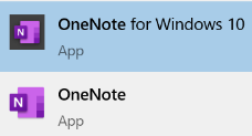
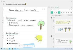
To try to simplify the roadmap somewhat, the app formerly known as OneNote 2016 is now just “OneNote”, and the Store app that shares more of its UX with the mobile and web versions, is OneNote for Windows 10. For more detail on the differences between all the versions, see here. At one point, the plan was to discontinue the more functional desktop app, and shift development to the simpler Store version, however that plan was rowed back and OneNote (the Office app) will continue to be part of Office, even though it wasn’t installed by default in 2019. The perpetual version of Office (as opposed to the subscription service that is Microsoft 365) will be updated later this year, and OneNote will still be part of that. Probably.
As has been covered on ToW passim (here, here), you can start OneNote from the Run command, by pressing WindowsKey+R then onenote <enter> for the desktop version, or onenote: for the modern Windows 10 version. In the latter, you can also pin particular pages to the Start menu, handy if you want to jump to a particular page of quick notes or ideas.
Or maybe by typing a quick few lines at first, and formatting as a list once you’ve got some text. There are some shortcuts to help that formatting; in both OneNote and OneNote for Windows 10, to quickly select what you’ve just typed, hold the shift key and press the up arrow to grab a row at a time.
To create a table, just press TAB to turn whatever you’ve just typed into the first column, and keep pressing TAB to create new columns, or CTRL+ENTER to accept the column layout and start adding extra rows, or to insert a new row into an existing table. Once have content in your table, you can easily move rows around by simply putting your cursor in the row you want to shift, and hold ALT+SHIFT then use the up / down arrow keys to move that row. Much simpler than faffing about with copy & paste.
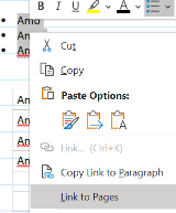
You can manually create links to any page by selecting the text you want to hot-link from, and press CTRL+K; then either select the destination in the dialog box, or paste the link to the page (or paragraph) if you’ve already copied that link to the clipboard.
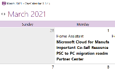
Its big brother, OneTastic, also allows using pre-written Macros to automate tasks like custom sorting of sections and loads more. |
Category: Apps
#571 – Save the Daylight
|
If the country or state you’re in observes summer time, then you’re either about to enter (if in the northern half of the marble) or leave it (if southern). To keep us on our toes, this movement back or forth often happens around the world on different dates. To keep us on our toes, some countries have less-than-hour gaps between time zones, and in the past, others have decided to change time zone permanently.
– eg if it’s 2:30am in Iran, then lining Tehran up with the red hand would put both London and Paris at midnight, since they’re both at GMT+1. eh? In October 1968, the UK decided to move to British Standard Time – GMT+1 – all year round. This particular wristwatch was produced between 1968 and the end of 1971, when the practice was reversed – so for a while, it was correct that London would be in the same time zone as Paris and Rome. Except the watch wouldn’t know when Paris and Rome went into summer time, thus putting them an hour further ahead… oh well, never mind. In a global working environment, especially one where everything is done online rather than having people in the same location, the friction of time zones changing has never been more obvious. Usually, you’ll only move through time zones relative to everyone else when you travel – flying across large distances, or maybe just driving across a bridge or dam. But now, a digitally-oriented meeting can shift its time for some of its attendees, relative to the others – depending on where the originator is based.
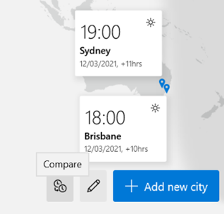
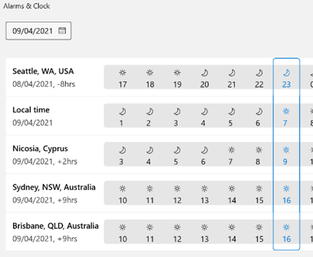
Those parts of the US which observe DST, are due to move an hour forward this coming Sunday (ie March 14th). In common with doing things differently to everywhere else, that brings the US (and Canada) one hour nearer most of Europe for the next two weeks, until the end of March. Much of the southern hemisphere comes out of DST the week after that, so by then Sydney will be two hours nearer London than currently. The impact of this can be seen in peoples’ calendars, when regular meetings somewhat inexplicably start to clash with each other – if a UK organiser set a recurring meeting for 4pm GMT, that would normally compel Seattleites to be there at 8am, but since they’ll be only 7 hours behind for a couple of weeks, that shifts to 9am in their calendar, potentially clashing with some existing 9am Pacific Daylight Time meeting. Conversely, a 9am PST / 5pm GMT meeting as created by the person in the US a few weeks ago, would now start at 4pm in the afternoon in London. Great news if that meeting is a Friday afternoon, as it brings beer o’clock one hour forward. Although Outlook does a pretty decent job of juggling the differences between time zones, there is no obvious way to show what time zone a meeting had been created in (eg show me all meetings that are going to be affected by this shift for the next 2 weeks). A simple trick if you want to check on a specific meeting, is to start a Reply to a meeting you’ve been invited to, whereupon you’ll see the time zone of its creator…
While It won’t help you identify the meetings that are causing the clashes, it might help restrain you from firing angry missives at the organiser of the meeting, if you know what’s causing it. |
570 – Automation for all
|
All were replaced in time with rebranded but otherwise similarly targeted variants:
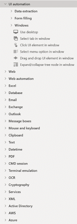
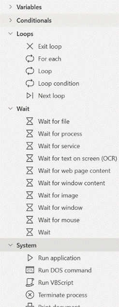
2020 saw a fast move to hosting everything digitally and for the most part got away with it. 2021 was always going to be different, and the first big do of the year took place this past week – a spring Ignite. When you don’t need to book a conference centre 12 months in advance and get thousands of people to fly in to attend, why not do some of the big events more often or a different time of year? For a summary of what was being announced at Ignite 2021, check out the excellent Ignite Book of News. Charles Lamanna’s keynote on Power Platform highlighted some news around Power Automate – one of the key components of the Power Platform and formerly known as Microsoft Flow, Power Automate began as an online service that could make workflows to stitch together actions that happened across multiple online applications –a new booking alert email to a hotel mailbox could add an appointment to a Google Calendar and send a notification to someone on Microsoft Teams, and so on. Just announced is that the fairly new Power Automate Desktop will be included in Windows 10 and is free to download and use now. This tool brings automation concepts right down to the desktop, allowing any end user to create flows that span multiple apps and services; it’s not unlike an advanced Macro Recorder, where the user can perform a task that is regularly repeated, and the software will keep track of the steps they’re making. With PAD, however, it’s more than just repetition – they can go back and inject data into those steps, like take the email addresses from column B of this spreadsheet and send a specific email to each one, with logic determining what should be different for each message (so a lot more granular than a simple mail merge).
This capability has come about through Microsoft acquiring Robotic Process Automation specialist company Softomotive in early 2020. The impact of RPA is explored when looking at how this technology could remove boring, repetitive tasks thus freeing up clever and creative people to do something better with their time and attention. On one hand, automating processes could be a threat as we’ll need fewer people to do the same things, but a more optimistic view is that it will increase productivity and satisfaction. If you have 17 minutes free, then check out a great TEDx talk on “White Collar Robots”. There’s a great demo of Power Automate technology being used in real-world scenarios, on Microsoft Mechanics. See more videos from the makers on Microsoft Mechanics – YouTube |
566 – Who’s Better, Who’s Best?
|
565 – 88 Edge updates
|
(it doesn’t necessarily have 88 updates – that was just a ploy to get in the Crazy 88 link above) The latest version of Edge shipped to mainstream users recently; release 88 is named after the core engine version, so Google shipped Chrome 88 at the same time. Some of the “what’s new” in Chrome will be consistent with Edge, since the rendering engine is the same – like the deprecation of a couple of features; Chrome & Edge no longer have FTP support natively, and they finally killed Flash. Back to Edge 88 – go to the … menu, then settings | about to find which version you have – there are a bunch of cool things to try out or investigate: Themes – there are some really nice pre-built themes packaging background images and colour schemes; see them here. You can apply a theme to a specific user profile, which might help you differentiate them from each other – so a Forza or Halo theme applied to your personal profile would change the colour scheme for that one, making it easier to spot which profile you’re using. You can also add themes from the Chrome web store.
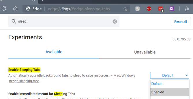
If you regularly use websites that fire notifications – like mail, or news readers – then be aware that they will not show when the tab is asleep. Work is underway to report back which sites should not be put to sleep, so Edge will be able to know when it’s a help and when it would be a nuisance.
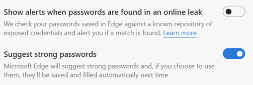
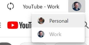
If you get a report of such a leak, you should change all of the passwords on affected sites as soon as possible. Looking under Edge Settings / Profile / Passwords, you should see the options to enable both Password Monitor and suggestion. For more info on how the Password Monitor works, check out this MS Research note. PWAs and Profiles – Progressive Web Apps are increasingly being seen as the way to take a site and treat it like an app; it can show up in Start menu, can be pinned to task bar, will run with a specific icon and name, and won’t have all the UI of a browser, so it looks just like a native app.
PWAs are cool. Unless you’re using Firefox, where PWAs are not cool. |
563 – Remove the Dupes
|
As storage got cheaper, the tendency to just keep old data gained prevalence, though some systems imposed limits due to the relative complexity and expense of managing their data, providing resiliency and backup services.
When Google launched Gmail in 2004 with a staggering mailbox limit of 1GB – 500 times that which was offered by Hotmail – the rules on what was expected for email quotas were re-written, with an expectation that you would never need to delete anything, and could use search to find content within. Leaving aside corporate policy on data retention, keeping piles of stuff indefinitely causes its own set of problems. How do you know which is the right version? Can you be sure that you have copies of everything you might need, in case the data is lost or damaged? If you have a backup, do you know that it’s a full copy of everything, and not a partial archive? Having multiple copies of the same content can be a headache too, if you’re not sure which is the true original and which might be later copies or partial backups. Applications might create their own duplicate content – perhaps through bugs, or through user activity. There was a time when syncing content to your phone or to another machine might risk duplication of everything – like having multiple copies of contacts in Outlook, for example. A variety of hacky resource kit utilities were created to help clean up mailboxes of duplicate contacts, appointments etc; you might want to check out a more modern variant if you’re worried that your mailbox is cluttered up.
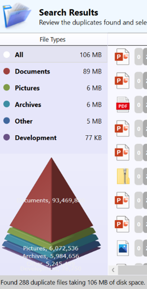
Cleaning up the dupes can help make sense of what remains. You could spend money on proper photo archiving and management tools like Adobe Lightroom, or you could roll your own methodology using a mixture of free and low-cost tools – tech pundit Paul Thurrott recently wrote about his approach. There are many duplicate-removing tools out there – just be sure you’re getting them from a reliable place, free from adware and other nasties. Be wary of anything that purports to “clean” your PC (registry cleaners etc), watch out when accepting T&Cs and don’t allow the setup routine to install any other guff you don’t need. Make sure you have the right protection on your machine, too. One recommended tool is Duplicate Sweeper – free to try but a princely £15 to buy, but worth the peace of mind that comes with a tidy photo library or Documents folder. |
562 – Connect your phone to Your Phone
|
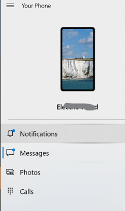
If you’re an iPhone user, the connected experience is somewhat watered-down and achieved in a different way, and is mostly about syncing content and continuing web browsing from your phone to your PC. Thank the differences in Android vs iOS ecosystems for that… For various Samsung phones and the Surface Duo, you can also control and mirror apps from your phone on the PC as well as transfer content. If you have a phone with the shiniest of shiny Android 11, you may be able to treat mobile apps just as if they are Windows apps – pin them to Start menu, run them in their own window on the PC etc. See more here. For most other Android devices, you can’t yet do the mirroring within the Your Phone experience, but you do get to share app notifications on your PC (so you’ll get “toasts” in Windows for WhatsApp etc), exchange photos and files quickly and easily, manage messaging and even, should you want to, take and make calls on your PC.
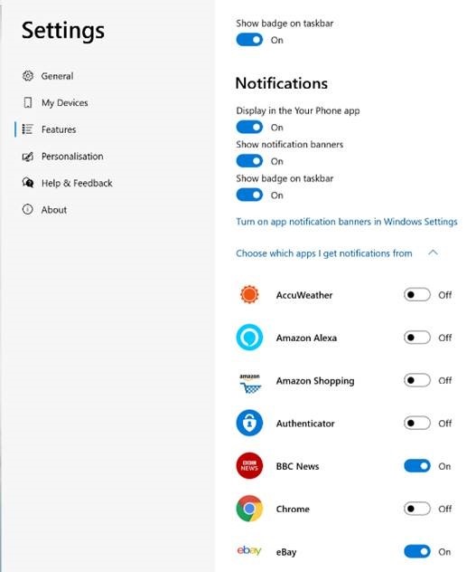
If you’re going to enable notifications, be careful – you’ll want to go through the list of apps that are on your phone, and only allow the ones you really need, or you’ll be getting a blizzard of unwanted toasts on your PC, assuming you’re not in Focus Assist mode. Perhaps the best feature on Your Phone is the rapid ability to copy photos – without having to send them by email or wait for OneDrive to sync them. Using Your Phone, you can copy the file immediately to your PC, or just browse the photos on a larger screen and possibly screen grab bits of interest to insert into documents or emails. Sadly, what it won’t let you do is manage the photos easily, like delete the garbage… Still, it’s free and it’s potentially useful for anyone with a Windows 10 PC and an Android phone – so definitely worth a look. For more info on how to use and troubleshoot Your Phone, see here. |
559 – Teams steams ahead
|
There are numerous new calling features coming, which will help in managing real (PSTN) phone calls and VoIP calls, as well as a Read more about the new devices here. There are also some useful updates to bring other applications into Teams meetings, like allowing you to set up Polls in advance (using Microsoft Forms, configured within the Teams app with an easy-to-use wizard), and using Power Apps and other elements of the Power Platform, it’s never been easier to roll your own apps for including in Teams. There’s a $45K prize fund available for the best apps that are built and submitted by February 2021, so if you have ideas, better get cracking… |
556 – Using MFA more widely
|
So 2FA – or its cousin, Multi-Factor Authentication (MFA) – is a better way to secure things, as a remote system can validate that the user knows something which identifies them (their username & password, secret phrase, date of birth etc etc) but also has something that identifies them too; a security token, smart card, digital certificate or something else that has been issued, or even just a mobile phone that has been registered previously with whatever is trying to validate them. Although such systems have been around for a while, the average punter in the EU has been more recently exposed to 2FA through a banking directive that requires it for many services that involve transfer of funds, setting up payments or even using credit cards. In some cases, the tech is pretty straightforward – you get a SMS text message with a 6-digit one-time code that you need to enter into the mobile app or website, thus proving you know something (you’re logged in) and you have something (your phone), so validating that it really is you. Or someone has stolen your phone and your credentials… MFA is stronger than 2FA, as you can combine what you know and what you have, with what you are. An example could be installing a mobile banking app on your phone then enrolling your account number, username & password; the know is your credentials, and the have is a certificate or unique identifier associated with your phone, as it’s registered as a trusted device by the banking service that’s being accessed. Using your fingerprint to unlock the app would add a 3rd level of authentication – so the only likely way that your access to the service (for transferring funds or whatever) could be nefarious, is if you are physically being coerced into doing it. 2FA and MFA aren’t perfect but they’re a lot better than username & password alone, and Microsoft’s @Alex Weinert this week wrote that it’s time to give up on simpler 2FA like SMS and phone-call based validations, in favour of a stronger MFA approach. And what better way that to use the free Microsoft Authenticator app? Once you have Authenticator set up and running, It’s really easy to add many
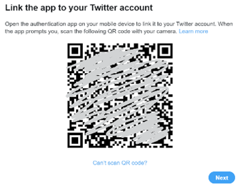
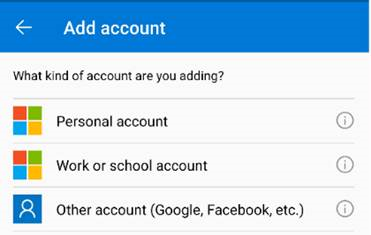
In the Microsoft Authenticator app itself, add an account from the menu in the top right and then choose the option that it’s for “other” – presuming you’ve already have enrolled your Work or school Account (Microsoft/Office 365) and your Personal account (MSA, ie Outlook.com etc). After tapping the option to add, point your phone at the QR code on the screen and you’re pretty much done; you’ll need to enter a one-time code to confirm it’s all set up – rather than getting an SMS, go into the list of accounts in the Authenticator app home screen, open the account you’ve just added then enter the 6-digit code that’s being displayed. This is the method you’ll use in future, rather than waiting to be sent the 6-digit code by text. As you can see from the description, there are lots of other 3rd party apps and websites that support MFA using authenticator apps –
|
553 – Android Autobahn
|
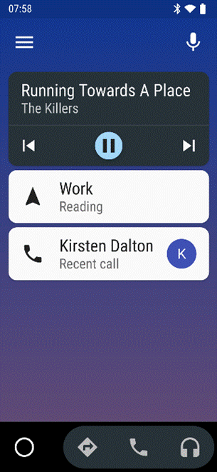
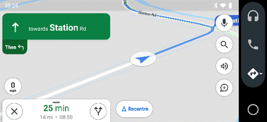
The main Android Auto app can either be run manually or set to start automatically when the phone connects to your car’s Bluetooth system. The app displays a simplified arms-reach or voice-driven UI, showing navigation, telephone and music apps, and the settings allow for a good amount of choice – Waze or Google Maps, Spotify or Amazon Music etc. Assuming you’re There are 120-odd Android Auto compatible apps, so even if you don’t see their UI on the main menu, you could respond (with voice) to incoming messages on WhatsApp, or choose to listen to podcasts with Stitcher as one of several interchangeable “music” apps. If your car does support Android Auto (check compatibility here) then it might take a bit of experimenting to understand how to connect it and how to get the car’s display to show the app outputs, though the results are largely the same as what you’d see if you just ran the host Android Auto app on your phone screen directly. You might be able to replace the satnav system in an older car with one which does support Android Auto – see here for some ideas – as aftermarket satnavs are increasingly simple, ditching a CD/DVD player and maybe not even having a radio tuner – perhaps all you need in your car stereo is a 7” screen to which your phone connects, and an amplifier. Some retro-fit satnav systems use Android as their own OS, and offer a whole host of Carlos Fandango features for little more than the cost of a maps update for an older in-car system. |
