#22: A Moment in time

clip_image002

As the sun momentarily disappeared for many, strange things happened – like 50 year-old album-closing songs from moon-related LPs making into the iTunes charts, alongside that 80s power ballad about dove throwing.

You might think days like these don’t happen very often, but they’re probably more regular than you think, though often the path of totality is not over such a populous area as the latest eclipse. Book your Airbnb in Cornwall ready for the next total eclipse in only 66 years, or hang out in London for the one after that? Still, this time at least, we survived the Rapture.

For more moon-related shenanigans, do go and see The Moonwalkers in London before October 2024, and check out the ever-engaging The Rest is History duo interviewing Tom Hanks and shooting the breeze about the fascination with the Apollo lunar missions.

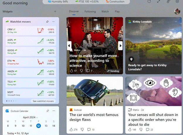
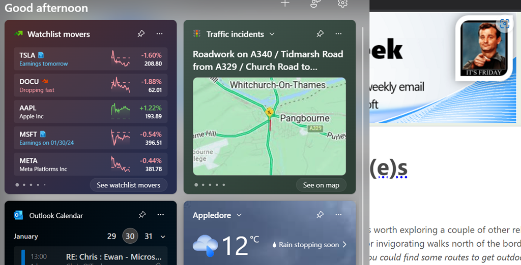
Back on terra firma, this past week saw Microsoft push out the latest stack of updates to Windows 11 which provide fixes to known issues as well as tweaks to the operating system, including the previously-discussed ability to remove the click-bait “news” stories from the Widgets board that may be visible on the lower left of the task bar or by pressing WindowsKey+W.

clip_image004

Windows 11 “Moment 5(remember the days when Service Packs didn’t need to be all Saturday Night TV with their names?) has been available for a while if you sought it out. You should see it – masquerading as the less exciting KB5036893 – in Windows Update; if your PC says you’re up to date, you should see it under Update history…

clip_image006

As well enabling the switching off the stupid ads and AI-selected stories on the widgets board…

clip_image008

… you’ll get undreamt of delights like tabs in Notepad, snap layout suggestions, accessibility improvements and more reliable nearby sharing, as well as new AI powered stuff in Copilot for Windows and in the Photos app (with Generative Erase to cut things out of photos).

#11: Widgets a Go-Go

There’s been a trend in computing and related technologies running back to the birth of the Graphical User Interface in the 1970s at XEROX, for representing real-life things with digital versions that follow their design.

Take your average Calculator app; its form has changed little from the desktop calculator on which it’s based, or any Calendar application used for organizing appointments which still follows the idea of a planner or physical monthly calendar.

This “skeuomorphic” approach has its pros and cons – it might be easier to pick up a new concept through association with the old way of doing it, but that might over-complicate things in the long run or just take up lots of space.

How many people born in the 21st century have ever used a Floppy Disk, or the non-floppy version that is still widely used as the “save” icon? There’s even a meme about that.
 

When Apple brought out the first Mac forty years ago, the new paradigm of the “gooey” (or WIMP) extended to having a virtual desktop with things on it that might be on or beside your real desk – the wastepaper basket, a clock, a notepad, calendar, inbox and so on. Apple thought of these ancillary programs as “ornaments”, but the Mac and other OSs adopted them as widgets that could run on the desktop behind other application windows.

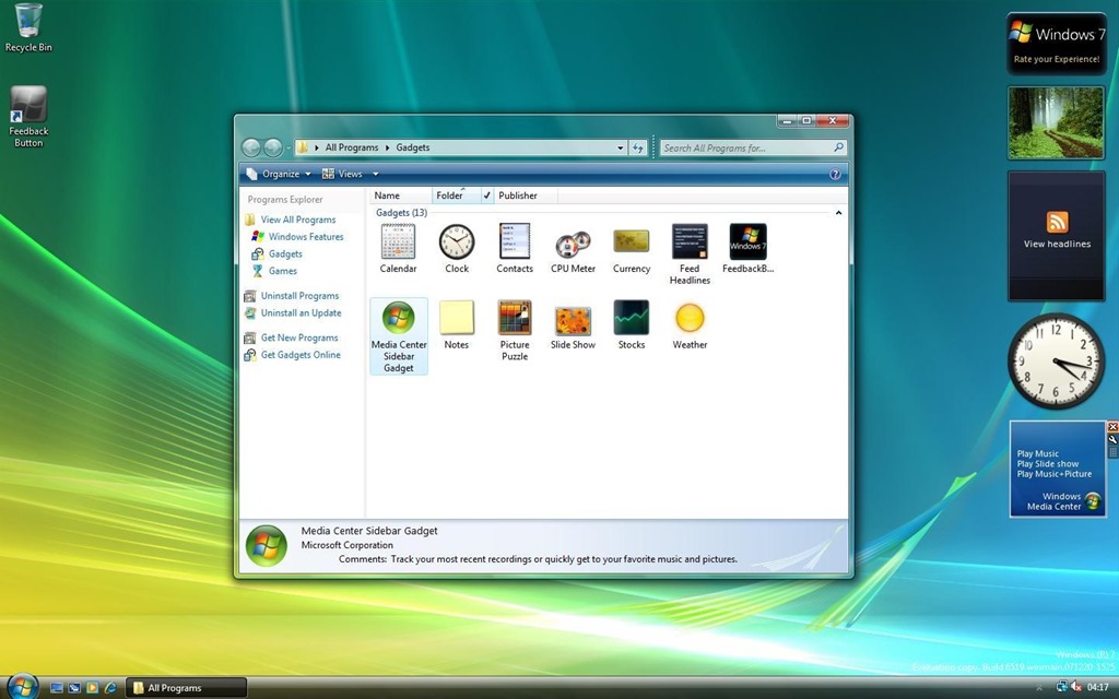
Apple’s commitment to a widget ecosystem has waned and come back to a degree, as has Microsoft’s – remember Gadgets in Windows Vista?

After parading the Sidebar and its gadgets as a new dawn for Windows, the whole thing was killed off after security vulnerabilities rendered it risky.

Widgets in Windows

Windows 11 introduced “Widgets(press WindowsKey+W to get them, or wave your mouse on the lower left of the screen) and later bulked up the UI with the same stuff you get on Microsoft Start, the Edge home page feed and so on, which probably means few people will use Widgets unless they want to find out about that heater that energy companies don’t want you to find out about, or that one thing (do it) that all Android users should know.

Great news, readers! The ability to switch off the “News” section is coming; at the moment, it’s dribbling out to some users on the Windows Insider program but at some point will be more widely available – read all about it here.

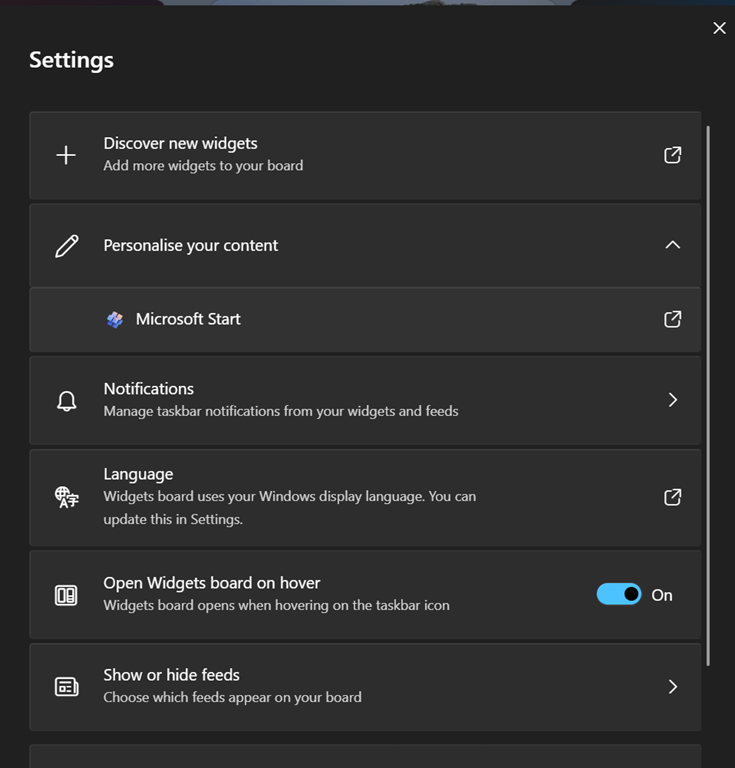
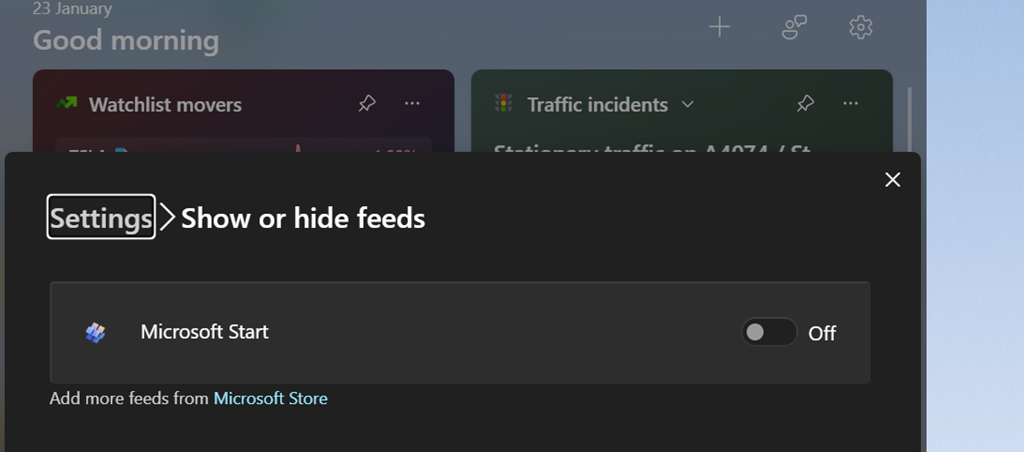
If you get the option (you should see a settings icon at the top of the Widgets board, rather than having to click on your profile photo to get to Settings), you can go into the Show or hide feeds option and be able to switch off the Start feed.

As well as being able to control the entire “feed” of content and present the gadgets on a 2-wide grid instead of a single column to the side, this update lets you choose which account to use to sign in to the Widgety experience, thus allowing users to sign in with their M365 account and use the widgets to surface stull like To-Do lists of tasks, or Outlook Calendar, showing data from their work or school account rather than only the Microsoft Account that it was previously locked to.

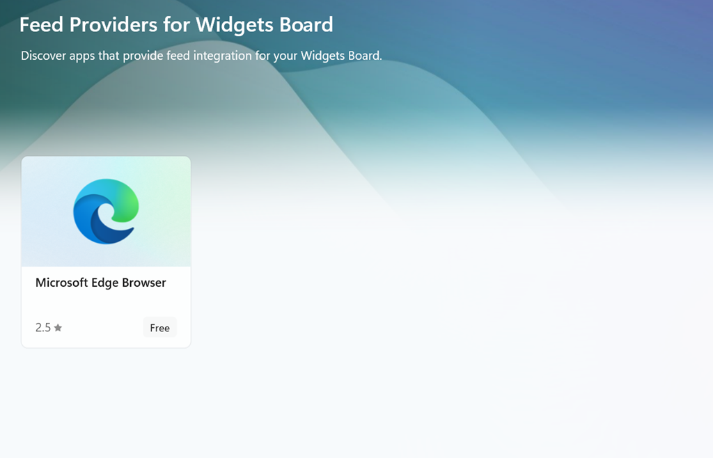
At some point, it looks like the Widgets feeds will be supplemented by other sources besides the Microsoft Start one (via the Add more feeds from Microsoft Store link in the show/hide feeds settings), with enthusiastic content providers lining up to publish their high-quality materials for all to consume…

But not today.


610 – Windows 11 Hokey Cokey

clip_image002The Hokey Cokey / Hokey Pokey is a childhood party tradition many of us will recall, where you put something in and take it out again, or a step forward then a step back. The transition from Windows 10 to Windows 11 aims to simplify the user interface to a large extent, hiding things that some people think just get in the way, while beautifying the stuff that remains.

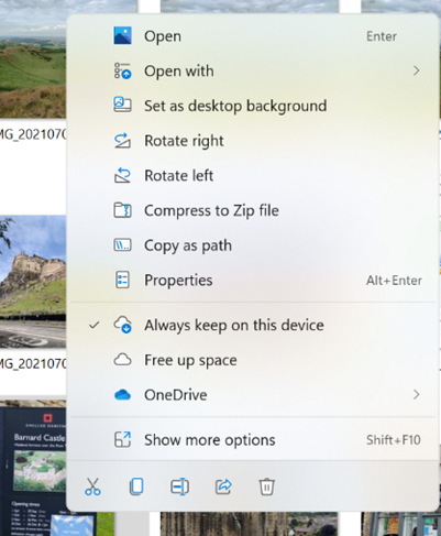
clip_image004Power users might grind their teeth at some choices – like the context menu when you right-click on a file; it’s more spaced out (in terms of screen size) but designed to be clearer and more relevant, hiding some of the chaff that 3rd party applications might install.

It even adds some hitherto hidden features, like Copy as path, which puts the full path & name of the selected file into the clipboard, ready to be pasted into a file selection dialog, for example. Some common commands – like cut or copy – have been replaced with icons at either the top or bottom of the dialog. If you want to use the old-style menu with the full set of options, you can do that too by selecting Show more… or pressing SHIFT+F10.

You can disable the new menu if you prefer the old style – just run a single command from an elevated command prompt then use Task Manager to restart the Windows Explorer application (or reboot).

Another piece of Windows that’s had a refresh is the notification function – first appearing in Windows 8 and having redesigns with every variant of Windows since, this is an attempt to summarize alerts from multiple apps in a similar way to how smartphones do it.

clip_image005Windows 10 shows a little callout in the corner of the screen with the number of notifications to read; click on that or press WindowsKey+A and you’ll see a pane slide in showing notifications on the top, and a load of Quick Actions icons below.

clip_image007Windows 11 has cleaned the UI up somewhat, with notifications and Quick Actions being separated out – clip_image009look for a simple bubble with a number in the corner of the screen. Clicking on that or the date/time in the system tray (or press WindowsKey+N) displays notifications.

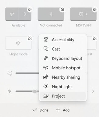
Pressing WindowsKey+A or just clicking on one of the network / sound / battery icons on the system tray will display the Quick Settings pop up, which can be tweaked by clip_image011clicking on the pen icon. You can easily remove settings you don’t use – like Battery Saver, maybe – and swap in others from a fairly short list. Perhaps that list will grow in time.

Also worth a note is that WindowsKey+W brings in widgets from the other side, showing news, weather, calendar etc.