|
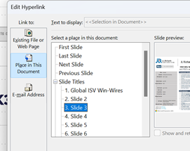
True hypertext documents or applications don’t just link pages to each other, but specific contents – it could be a fly-out or a pop-up with a definition of what a specific term was, or it might be a link that jumps into a particular part of a longer document. Many web pages have bookmarks defined within – eg Wikipedia typically has links on the left side which jump to parts later in the document, and the bookmark is added to the end of the URL – like https://en.wikipedia.org/wiki/Hyperlink#HTML Office docs offer similar things – Word and Outlook have Bookmarks, PowerPoint can have hyperlinks inside slides that jump to a different slide etc. If you look at documents stored on OneDrive or SharePoint, it’s often possible to create a link directly from within the full fat Office application, to a part of that document – eg When dealing with web pages, there are some other tricks you can do to jump straight to a part in the page, even if that page itself has not defined the bookmarks for you to reference like the Wikipedia one above. The WWW Consortium fairly recently defined a standard for handling “Text Fragments”, which means you could link to a specific phrase on a page. Clicking the link will navigate to that point on the page and highlight the text. This is done with a strange looking tag at the end of the URL: #:~:text=whatever.
Example: one of the most-visited articles in the TipoWeek archive, Killing me Softly, part I (a wistful post looking back at some of the Microsoft tech which has ceased to be) has a part which deals with the audio file format, Windows Media Audio – see it on https://tipoweekwp.azurewebsites.net/2016/10/21/tip-o-the-week-350-killing-me-softly-part-i/#:~:text=Windows%20Media%20Audio.
|
Tag: PowerPoint
675 – Does size matter?
When disk size was measured in Megabytes and network bandwidth even less, size of files really mattered. When non-floppy floppy disks were sized in 1.something MB, IOMega Zip drives promised 100x as much storage for only a few times the outlay.
The dramatic growth in capacity and drop in cost of storage has radically outpaced Moore’s law, where a gigabyte of disk storage might have cost $100 in 1997 and only $10 by the year 2000. Nowadays, if you bought your gigs on a spinny platter, they’d cost you less than $0.01 each. For most end users, solid state storage has largely replaced the traditional hard disk and even with 10x performance, the price is still only a few cents per GB.
That said, storing data in the cloud costs money over the long term, and has a potentially negative environmental impact – a Stanford report from a few years ago estimated that saving and storing 100GB in the cloud for a year costs the equivalent of 0.2 tonnes of CO2, or about the same as a one-way flight from Seattle to San Francisco. So reducing unnecessary cloud storage can be worthwhile.
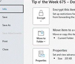
If you’re writing an email in Outlook, you can see the current size from the File | Info menu.
 In Word, Excel and PowerPoint, you can see the document size and other useful info in the same place (varying details depending on which application).
A previous Tip dealt with the scourge of bloating PowerPoint files, where it’s not uncommon to have unnecessary large images lurking within the template you’re using, but there’s a simple trick that’s common across all Office apps – compressing picture size.
 Especially if you’re embedding photos from a phone or even screen-grabs from a high-res display, individual files can be in the multi-megabyte* category. In many cases, you might resize your image so doesn’t take up such a huge part of your document, but the app will still be storing the full resolution of the image – including any bits you’ve cropped out – behind the scenes.
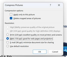
To compress pictures in your document – and let’s use PowerPoint as an example given that it’s the chief culprit – 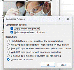 simply select an image and in the Picture Format menu which appears, choose the Compress Pictures option.
This will let you determine the level of detail to keep for this image – if it’s a simple presentation, then it probably doesn’t need a very high definition picture. You also select whether to keep or discard any cropped areas, and importantly, whether to apply to just this one or by clearing the top option, applying to all images in the file.
Try taking any large PowerPoint file, delete cropped areas and apply Web or Print resolution to all images, and you might see it drop to 10% of its previous size.
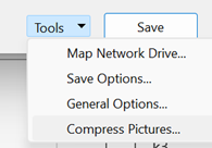
The Compress Pictures option is also available from the folder picker in the old File | Save As dialog, and there are other options to change the default resolution available from within the File | Options menu.
|
*Remember kiddos, there are 1000 MB in one GB; smart alecs might believe that a kilobyte would be 210 bytes – 1024 – but for 25 years international standards have defined that as a kibibyte or KiB, trying to assert with less ambiguity that a kilobyte is actually 1000 bytes, therefore a Gigabyte is 1,000 x 1,000 x 1,000 = 1,000,000,000 bytes, whereas a Gibibyte – srsly – is 1,0243, or 1,073,741,824 bytes). |
630 – slimming your PPT
|
Estimates of the energy cost to transmit and store data vary wildly, but if 1 GB cost 1 kWh power and the average CO2 output for generation was ~500g/kWh, then even shaving 10MB off a file can make a material difference if it’s going to be heavily used†. There are a few tricks you can follow to make your PPTs less massive – like compressing the images within, meaning that an embedded picture which was originally sized to print on a poster could be re-sized to fit on a screen.
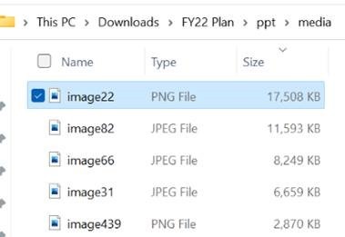
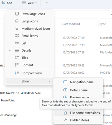
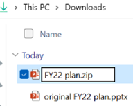
A somewhat cavalier way of looking for large things you can torch, is to make a copy of your PPTX file and then rename it so you can look within. The OfficeXML file formats (prevalent in Office 2007 and onwards) use the same compression as ZIP files, so if you rename your file as such, you’ll be able to open it in Windows Explorer or other ZIP handling utilities, to see its innards. Opening the file shows you a folder structure, and if you navigate into ppt \ media then sort by Size, you’ll quickly see what’s making your file so big.
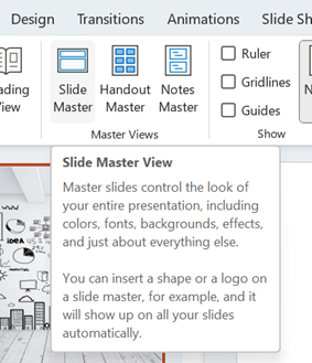
Go into View menu and look under Slide Master, which will open a whole new tab specific to the management of these template slides that form the bones of the presentation. You may well see lots of title slides or similar, which have embedded background images – if you know you don’t need those graphics or those layouts, just delete them.
This title slide in the Slide Master view had a graphical background which was 17Mb in size
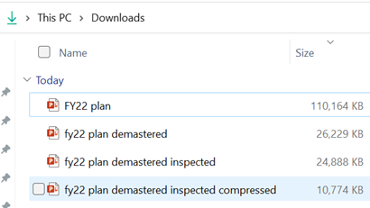
Selecting an image from one of the 70-odd slides in the deck, and choosing Compress Pictures from the Picture Format tab reduced it again to only 11MB, or 10% of the original file size – all for a few minutes’ effort.
†NB: the irony of sending a 2MB email to thousands of people, and sharing online and on LinkedIn, is not lost. |
624 – Present in Teams, like a Boss
 Even after 2 years of mostly enforced remote meetings, it’s still amazing how many people have yet to master some of the basics of online meetings – like management of the mute button and general audio interference, positioning of screen/camera so you’re not looking up their nose or side of their face, professing to having bandwidth issues as the reason for not enabling video, and many more. One “room for improvement” function is that of presenting PowerPoint slides and not looking like an idiot. Even after 2 years of mostly enforced remote meetings, it’s still amazing how many people have yet to master some of the basics of online meetings – like management of the mute button and general audio interference, positioning of screen/camera so you’re not looking up their nose or side of their face, professing to having bandwidth issues as the reason for not enabling video, and many more. One “room for improvement” function is that of presenting PowerPoint slides and not looking like an idiot.
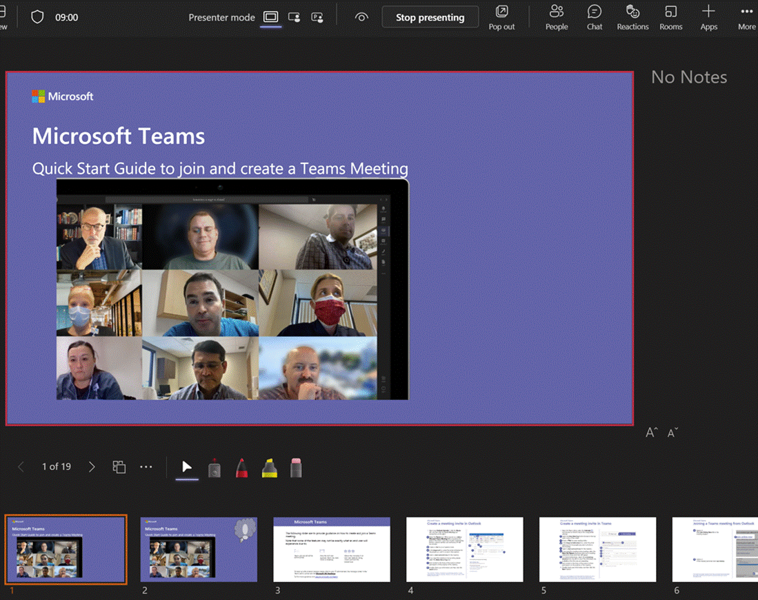
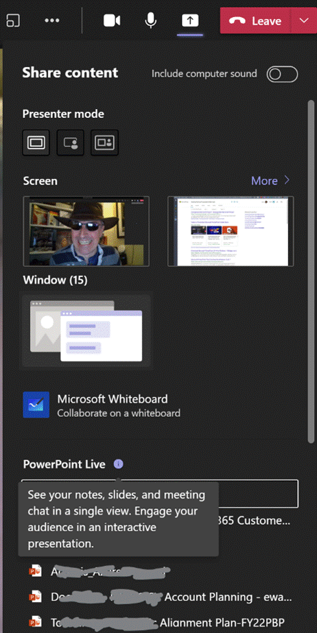
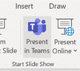
Don’t share your screen to present slides in Power Choosing this opens up a Presenter View akin to the one in PowerPoint, which is the default if you have multiple monitors and you start a Slide Show. This view lets you see Speaker Notes, jump quickly to specific slides rather than paging through them, and be more interactive with the meeting than you could ever be if you were simply sharing a screen showing a PowerPoint slide on your computer.
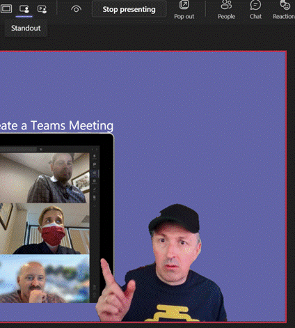
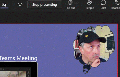
Next to that icon, there are some others which define the presenter mode – Content Only on the left, shows just the slide you want. Next to that is Standout, which takes your video and overlays it onto the slide rather than having it appear as one of the surrounding gallery A downside of the Standout mode is that you don’t get to control where your image goes on screen, or how big it is – so you might well obliterate some part of the content you’re presenting. This new feature gives you a way to solve that. In PowerPoint, go to the Insert tab and on each slide add a Cameo (or a Camera as the object it creates is described in some controls), then place and size it as you want. If you select the new object, the Camera tab will give you more customization options.
You will need to add a Cameo to every slide you want to show up on – potentially useful if you want to only appear for intros and Q&A but perhaps leave the content on its own for other parts.
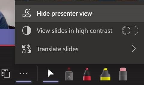
Using Pop Out might help if you have a larger second screen connected, though chances are you’ll be using the camera on a laptop so ideally want to be looking at that display. Since nobody really uses Speaker Notes anyway, you could try Hide presenter view, which means you’ll lose the slide thumbnails and speaker notes, but still keep the other controls. Go to the View control on the top left of the window and choose Full Screen to increase it even more. For more details on using the new Cameo feature, see here – it is in preview which is rolling out through Office Insiders first so you may not see it right away. If you are presenting using simple app or desktop sharing rather than the PowerPoint Live model described above, there are some other options in how you appear alongside your content. As well as launching the PowerPoint Live sharing from within PPT itself, you can choose to share recent presentations while in Teams – just scroll down past the various “share screen / app” options and you’ll see more. This topic was covered previously on ToW #576. |
623 – What’s .new pussycat?
|
Having blazed a trail with email in Hotmail and later Outlook Web Access, in 2010 Microsoft launched the first version of the Office web applications, meaning you could run lightweight Word, Excel and PowerPoint in your browser, as a companion or even as an alternative to the full-fat desktop versions. A few years earlier, Google Docs released as an online word processor (and later, other types of productivity apps, rebranding as G Suite and now Google Workspace). There are pros and cons of the browser-only experience; you tend to sacrifice some functionality compared to the desktop applications in favour of ubiquitous availability, though web clients can be updated more easily and sometimes new features appear there first – as ToW #605 covered, with snoozing email. Check out What’s new in Excel for the web or look for the summary covering Visio, Forms, Words and more, here.
If you like being browser based rather than desktop bound
|
593 – It’s a Date
|
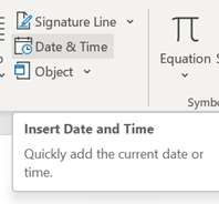
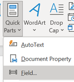
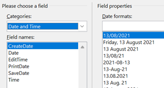
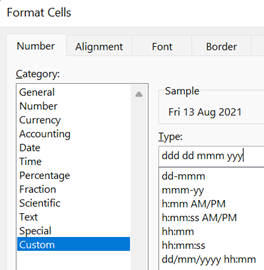
On the Insert tab / Quick Parts, look under Field, then pick the doc property and format you’d like to show. It is worth pointing out that showing a date as 10/1/21 (or similar) is ambiguous given that a few hundred million people will expect it be month-day-year while many of the remaining 7 billion will assume the day comes first, with a couple of billion presuming the format should normally start with the year, such as yyyy-mm-dd (which is arguably the most sensible of all; and it sorts properly, too). A more daily usable short format like dd-mmm-yy (ie 13-Aug-21) should perhaps be the norm, especially when the date is appearing as text in a document. Pressing SHIFT+ALT+D in Word will insert the current Date as a field (so you can edit the format to remove ambiguity) and SHIFT+ALT+T inserts the current time too. In PowerPoint, both of these combos bring up the “Date & Time” dialogue to add the chosen content and format as plain text.
While in Excel, it’s worth learning the short cut key to insert the date and time – CTRL+; and SHIFT+CTRL+; respectively (no doubt there’s a reason why Excel has a different shortcut to other Office apps – some legacy of Lotus 1-2-3 perhaps?). OneNote fans will want to remember that SHIFT+ALT+D / T combo as it inserts the date/time into the notebook; really handy when taking notes of a phone call or similar. SHIFT+ALT+F puts both day and time, something that Word doesn’t offer. In both Desktop OneNote and users of the Windows Store version, it’s just plain text that gets added, so you’re on your own when it comes to formatting. OneNote pages will typically have a date & time showing under their title – on the Desktop version, it’s possible to change that so as to mark a page as having been recently updated. No such luck on the lame duck Store version.
At least when stalwarts insist on writing – or worse, saying – a short-form date as something like “ten one”, there’s more than half of each month where one number in the date could only mean “day” – starting with the thirteenth (as in, 8/13 can never by the 8th of a month, but 8/12 could be a few days before Christmas to Europeans, or the date when tweedy Americans start looking for grouse in the Yorkshire moors and Scottish Highlands). |
583 – Zooming PPT
|
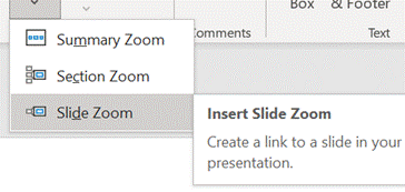
Way back when, there were numerous product incubation groups in Microsoft, who tried out new features as addins or companion products; over time, most of them have disappeared or the prototype products they produced made their way into the mainstream (or just quietly went away). Innovation continues within the various engineering groups, of course, and some is curated in the Microsoft Garage. One OfficeLabs project that showed promise was pptPlex – an addin to PowerPoint that made it easy to create and present “non-linear” presentations, offering a kind of “Seadragon” type experience of zooming into content. The actual pptPlex software is long-gone but if you want a reminder of what it was like, or even to recall how funky Office 2007 looked, check out this video tutorial.
|
576 – Presenter guidance
|
It’s still worth tailoring your presentation style, especially so when you can’t necessarily see the audience – that guy who’d be dozing off in the front row of the presentation room? He’s now doing that on mute and with camera switched off. Creating compelling content is another huge topic which is even more important than the means by which you present it.
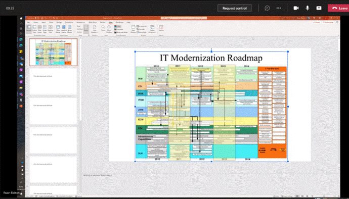
If you have a specific reason to share the screen or app then please at least “Present” in PowerPoint, since simply showing a PPT window is a massive waste of screen real estate and your attendees won’t be able to read it.
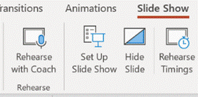
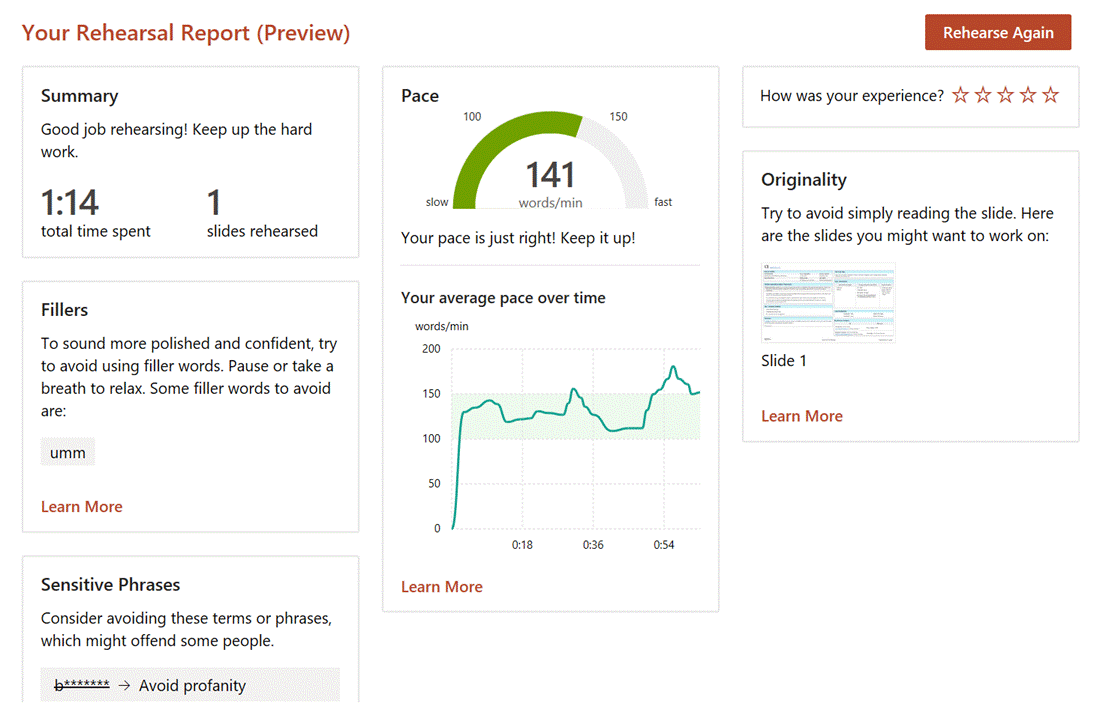
The simplest way to present slides on Teams is to use the This view will let you share content in a more efficient manner, and also gives the option of letting other presenters easily manage the transition from slide-to-slide, rather than having to rely on trying to take control of the presenter’s PC in order to advance them, and avoiding the “Next Slide Please” request. Attendees can privately move around your deck if you allow it. You can also start the sharing from within PowerPoint, as long as the source slide deck is saved to OneDrive or Sharepoint, as the content is rendered as a web view. Go to the Slide Show tab Assuming you’ve managed to create slides which are not a mess and are comfortable about how you’re going to present them, the next step might be to polish your own performance. You could use Rehearse Timings to do a dry run of your presentation, and it will record the time it takes to cover each slide (and will also save that timing so If you’d like an unbiased assessment of your presentation style, try out the new Rehearse with Coach feature – as well as getting some real-time tips during the rehearsal, you’ll get a report when completed, praising for a job well done or admonishing you for speaking too fast, just reading the slides out loud, using, errm, non-inclusive language etc – all of which might be used to help improve your delivery for the next time. Have a play with the Presenter Coach – presuming it’s an automated service rather than a real human listening in, it’s fun to try and see how the recommendations given – see how many profanities you can get it to recognise? |
516 – More Teams Sharing
|
502 – Presenting PowerPoint Subtitles
|
When they do it properly, you’ll often see presenters kick off by fishing
PowerPoint will typically be set up to use Presenter View by default, and the screen that’s being shared will be showing the speaker notes / next slides etc, while the full-screen content is being displayed on the 2nd monitor that isn’t being shared.
Choose the language you’d like to display, the location of the subtitles and when you start presenting, the machine will listen to every word you say and will either display what it thinks you’ve said in your own language, or it can use an online service to translate to subtitles in over 60 languages. It’s fantastic. See more here. Go and try it now.
Windows has a closed captioning setting page that applies to other apps that support it, too, if you’d like to show subtitles on video that has the content already defined. Closed Captioning is legislated by several countries, for traditionally-broadcast media as well as online video. You may also want to add captions to videos that you plan to embed – more, here. |




















![clip_image002[4] clip_image002[4]](https://tipoweek.azurewebsites.net/wp-content/uploads/2020/03/clip_image0024_thumb.png)
![clip_image004[4] clip_image004[4]](https://tipoweek.azurewebsites.net/wp-content/uploads/2020/03/clip_image0044_thumb.png)
![clip_image006[4] clip_image006[4]](https://tipoweek.azurewebsites.net/wp-content/uploads/2020/03/clip_image0064_thumb.png)
![clip_image008[4] clip_image008[4]](https://tipoweek.azurewebsites.net/wp-content/uploads/2020/03/clip_image0084_thumb.png)
![clip_image010[4] clip_image010[4]](https://tipoweek.azurewebsites.net/wp-content/uploads/2020/03/clip_image0104_thumb.png)
![clip_image012[4] clip_image012[4]](https://tipoweek.azurewebsites.net/wp-content/uploads/2020/03/clip_image0124_thumb.png)
![clip_image014[4] clip_image014[4]](https://tipoweek.azurewebsites.net/wp-content/uploads/2020/03/clip_image0144_thumb.png)
![clip_image016[4] clip_image016[4]](https://tipoweek.azurewebsites.net/wp-content/uploads/2020/03/clip_image0164_thumb.png)


