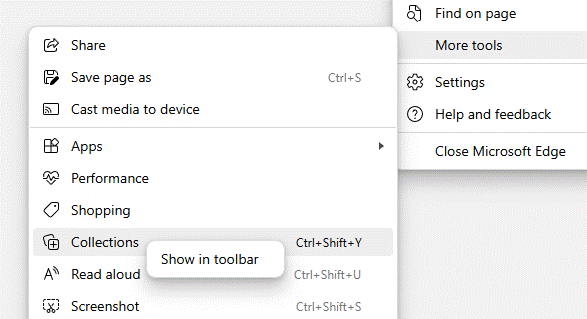
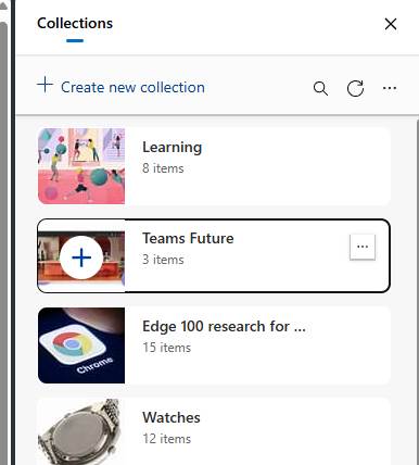
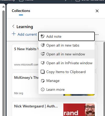
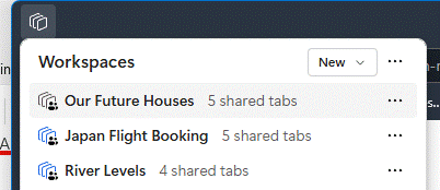
#50: Object Oriented browsing notes

clip_image002

Obscure Computer Science theory had an obsession with “object orientation” some years ago; both a technique in how applications are written but also design thinking on how they might be used. Sensei Steve Jobs, while walking the earth before coming back to save Apple, had a famed obsessions for design and rooted his NeXT computer on an object-oriented approach. The NeXT Cube itself was arguably ahead of its time, but in 1990 cost a cool $10K (that’s about $25K in today’s money). There were few takers, though the odd geek still gets excited to pick them up 2nd hand.

An example of object orientation in user interaction is that you go to a thing you want to work with, rather than a tool with which you want to work. Elements of this are all over UX in Windows, like going to a document in Explorer, and it lets you open, edit, print, etc. Most people will still go to Word and open a file from there; that’s why the Most Recently Used list and Search features exist.

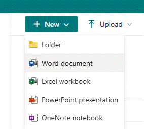
To start something new, you’ll likely open your app of choice then use it to create a file or open an existing one. When did you last go to SharePoint and use the New -> menu option to create a document in situ, much less a OneNote notebook? Exactly.

clip_image004

There are other places where things are less cut and dried: you might open a notebook like OneNote, Evernote, Notion etc, and start taking notes on a thing you’re working on. Or you might want to be in the flow – in a Teams meeting, or viewing a document on which you want to make some side notes – and it makes more sense to bring the notepad to the side and ideally keep the context so when you revisit that document or that webpage, you’ll (optionally) see the notes you had previously.

Progress is not forthcoming

Sadly, as apps evolve some features are sacrificed perhaps because telemetry tells the developer that they’re not much used, or they just decide that newer things are more important. One key villain in this regard is the “new” (Chromium) Edge browser, which left behind many of the features of the old(“Spartan”) Edge, which might not have been much used but then neither was the old Edge. The dev roadmap appears to focus on more ways to inject adverts and to jam Bing services and Copilot into everything, than to actually make the browser as useful as the one it replaced.

Linked Notes

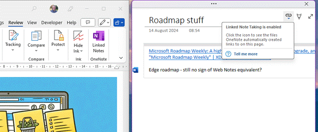
As covered 18 months ago on old testament ToW 683, OneNote has the capability to be docked to the side of whatever other window is being used, and in some cases, maintains a link to the document that is in the main window.

clip_image006

You’d create the page you want to make notes on in OneNote, and when Linked Notes are enabled, it will tie back to the Word etc doc you were using in the other window. That way, if you re-open the notes in OneNote you’re only a click away from pulling up the document they relate to.

If you later go to back to it in Word, however, or open the doc directly from Explorer, there’s no obvious way to bring up the notes you were taking, without going to OneNote, finding the page you took the notes on, and perhaps docking the window again. Even the Linked Notes option on the Review menu doesn’t quite work as expected – it’s for establishing a new link, not reanimating an old one.

This is an example where true object orientation would work well – you’d open the Word doc which you had linked to OneNote, and you’d automatically see the notes in a sidebar.

Remember Internet Explorer?

Even ye old IE had an option of being linked in OneNote so you could take notes on a page you were viewing. Sadly, Edge has torched this feature – along with Reading List and one of the more helpful and semi-OO feature, which didn’t use OneNote but was still potentially handy…

Web Notes RIP

Web Notes was a feature of Old Edge, for jotting down simple notes on whatever page you were viewing, and the next time you visited that same page, the notes would be shown alongside.

Imagine if you were looking to buy a house or pretty much any other major piece of shopping; whilst conducting research, you might browse to several properties of interest and could make some notes about each one – near a good school but close to a busy road, nice rear garden, high crime area down the road, neighbour has planning permission to build a house in their back yard…

It could be so useful to jot the notes as you go and have them presented again if you happen to revisit the same page in future (so you remember you’ve already looked into it). If you could later see a list of every note you took, with a link back to its source, so much the better.

Sadly, there is no way to do this in Edge, without relying on extensions. There are many out there but none really hit the brief well – if you find a better one, please do mention in the comments below.

The OneNote Clipper is worth a look if you want to keep a list of notes with links back to pages, but is old school in that you’d go to OneNote to find that list and then see which pages you had commented on, rather than the more Object Oriented approach of viewing a page and having the notes offered to you.

clip_image008

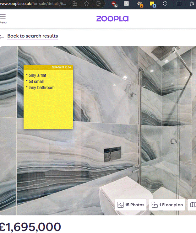
Perhaps the extension which comes closest to the functional requirement (even if it doesn’t win many prizes for looks) is Note AnyWhere, available from the Chrome store (and can therefore be installed on both Chrome and “new” Edge).

clip_image010

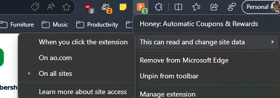
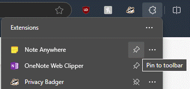
For ease of use, after installation, click the Extensions icon on the toolbar and Pin the Note Anywhere icon to the toolbar, after which taking notes on a new page is only a couple of clicks away. When you next visit a page, previous notes will be displayed (or you can choose to just show a number on the toolbar by the icon, to show how many notes you’ve made).

clip_image012

It would be nice to have some simple formatting, and searching previous notes is a little clumsy (requiring you to sign up and sync with the developer’s web front end), but for a free app that doesn’t (yet) nag you to subscribe for extra functions, it’s not half bad.


PS – Remember, this weekend is when Europe (mostly) ends Daylight Saving Time, meaning next week could see clashing of meetings arranged with international attendees, before North America catches up on 3rd Nov. New Zealand and some of Australia has already made the leap.

This topic has been covered ad nauseam on previous ToWs … spring forward, fall back

#14: Meetings are a drag

Last week’s rant on New Outlook’s stupefying licensing enforcement was quickly and neatly responded to by Microsoft Outlook Product Manager, Allen Filush, in a comment and more publicly on a blog post which had neatly been written the week before. Chapeau, Allen… Anyway, a new release of New Outlook also neatly deals with the issue and now allows you to add certain M365 subscriptions that were previously blocked, and should be available now.

The scourge of feature parity

One of the problems inherent in widely used software which has been around a long time, is that of technical debt. Microsoft saddled itself hugely with the effort of backwards compatibility in old versions of Windows; occasionally companies will take the other approach and sacrifice short term user pain for the benefit of moving forward quickly.

It’s never easy building a new application which is intended to take the place of the old, without necessarily replicating all the features of its predecessor. Cutting some obscure shortcut key sequence that application telemetry tells you 0.1% of the userbase ever invokes, will still annoy the 0.02% of those who do it every day. One such deprecation – if you want to call it that – is to be found in New Outlook.

A bit of Drag and Drop history

The metaphors of drag & drop were present at the outset of the Graphical User Interface, as an easy way of moving files around. Other forms of drag & drop have evolved since – like clicking on a tab in your browser, and dragging it off the window to launch a new window with just that tab in, or dragging browser tabs between open windows.

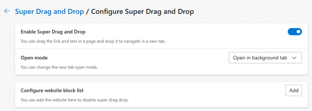
Edge even has an experimental new feature called Super Drag and Drop which lets you open a link in a new tab by dragging it as you click on it.

If you like opening other stuff while reading online articles, but want them to open in a new tab, just hold Control key down as you click on them, or enable Super Drag and do it with a deft flick of the wrist.

clip_image002

To the chagrin of some Windows 10 users, one of the side-effects of the redevelopment / simplification of the taskbar in Windows 11 was the lack of drag & drop support; previously it was possible to drag a file from Explorer and by hovering it over an icon in the taskbar, that app would open up and let you open that file by dropping it in. That was no longer possible in initial versions of Windows 11 but was hurriedly re-implemented.

Outlook Droppings

One handy trick in Old Outlook, was when you wanted to turn an email into a calendar appointment. Some people like to use their calendar as a task list, so if they intend to reserve time for something, they might start from the email they need to work on. In the Outlook Heritage Edition™️ you could simply drag an email from your Inbox to the Calendar icon on the Wunderbar to generate an appointment in your diary with the contents of the email. It might throw away some of the formatting and the attachments etc, but at least it was a start.

clip_image004

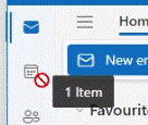
Try doing that in New Outlook and you’ll get less success. You’ll get a little “denied” icon if you try to drop your email onto the calendar node, so what to do? Copy all the contents to the clipboard, switch to calendar, create an appointment and paste the contents in… ?

Quick Steps to the Rescue

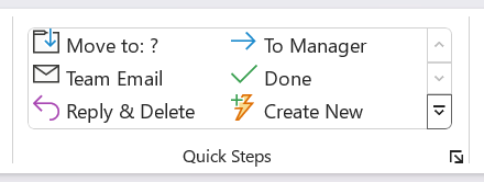
The old Outlook app had a Quick Steps capability where users could define easily-repeatable tasks, like moving an email to a specific subfolder, categorizing it or creating related tasks.

clip_image006

The New Step wizard lets you select from a list of pre-defined templates, including picking up the content of your email and creating a new meeting or appointment with it.

clip_image008

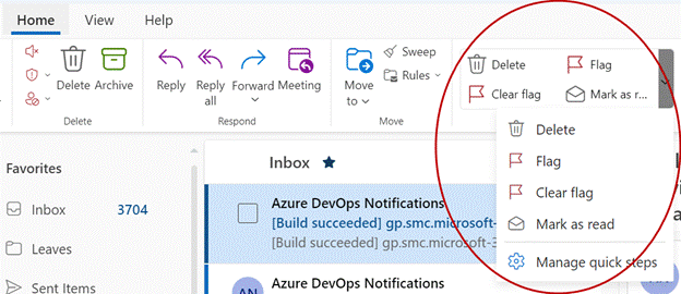
But that’s old Outlook, the one that might one day be replaced by New Outlook. Though some of the decades’ worth of Outlook functionality has been left behind, Quick Steps are not one of them.

clip_image010

That said, not all of the Quick Steps templates carry over – including that thing with the Appointments seen in Dusty Old Outlook. But there is a workaround.

When you put something in your calendar, that’s an appointment. As soon as you invite other people or resources to it, then it’s now a meeting. They are handled differently even though they’re closely related – you save an appointment, you send a meeting request, for example. New Outlook can has a quick step that could be useful.

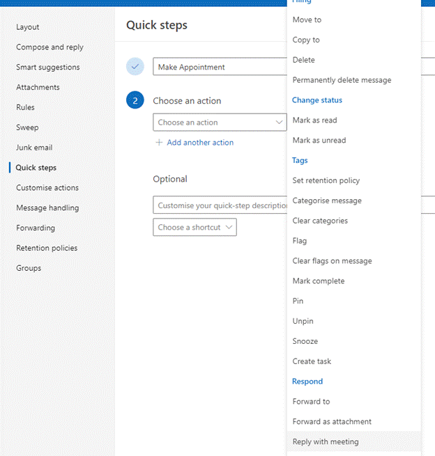
Create a new quick step (by going into Manage quick steps) and near the bottom of the list, you’ll see the option to Reply with meeting. You can add other stuff like assigning categories, putting in a description which will show in a tool tip if you hover over the quick step or give it a shortcut key if you want to use it all the time.

clip_image014

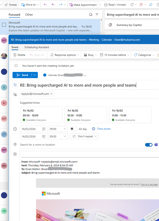
When you click on the new quick step, it will add a new draft meeting to your calendar, insert the recipients of that email to the invitation, and copies the body text of the source message into the main part of the new meeting). It does a better job of formatting than the old Outlook version, but still dumps any attachments, sadly. (A useful scenario could be adding an email about an event with attached PDF tickets to your calendar, but you could always put the attachment in manually, later).

If you remove the attendees (and change the “Teams Meeting” toggle if that’s on by default), you can then simply save the appointment in your own calendar.

clip_image016

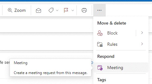
There are other ways of doing the same thing, though the UI is somewhat inconsistent. In the preview pane, if you click the “…” ellipsis at the top right of a message, you’ll see the option to reply with a meeting or forward as an attachment.

clip_image018

Open the message up in its own window and the ellipsis gives a single-click Respond with meeting option:

clip_image020

686 – What’s that #:~:text?

clip_image002Hypertext was a concept first coined in the 1960s, inspired by an idea in the early 1940s as a way of thinking about organising information. The first practical implementations of Hypertext let a document or application reference a link to some other content, just as we now know web hyperlinks to do. It’s no wonder that when Sir Tim was conceiving the means of writing what came to be pages on the web, he envisaged hypertext – or even hypermedia – as the glue that holds it all together.

True hypertext documents or applications don’t just link pages to each other, but specific contents – it could be a fly-out or a pop-up with a definition of what a specific term was, or it might be a link that jumps into a particular part of a longer document.

clip_image004

Many web pages have bookmarks defined within – eg Wikipedia typically has links on the left side which jump to parts later in the document, and the bookmark is added to the end of the URL – like https://en.wikipedia.org/wiki/Hyperlink#HTML

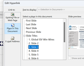
Office docs offer similar things – Word and Outlook have Bookmarks, PowerPoint can have hyperlinks inside slides that jump to a different slide etc.

If you look at documents stored on OneDrive or SharePoint, it’s often possible to create a link directly from within the full fat Office application, to a part of that document – eg clip_image006in PowerPoint, right-click on a slide in the sorter view and it will display a URL to that specific slide, that you could share or link from elsewhere.

When dealing with web pages, there are some other tricks you can do to jump straight to a part in the page, even if that page itself has not defined the bookmarks for you to reference like the Wikipedia one above. The WWW Consortium fairly recently defined a standard for handling “Text Fragments”, which means you could link to a specific phrase on a page. Clicking the link will navigate to that point on the page and highlight the text. This is done with a strange looking tag at the end of the URL: #:~:text=whatever.

Example: one of the most-visited articles in the TipoWeek archive, Killing me Softly, part I (a wistful post looking back at some of the Microsoft tech which has ceased to be) has a part which deals with the audio file format, Windows Media Audio – see it on https://tipoweekwp.azurewebsites.net/2016/10/21/tip-o-the-week-350-killing-me-softly-part-i/#:~:text=Windows%20Media%20Audio.

clip_image008Handily, if you want to generate a link straight to a word or phrase on a page, both Edge and Chrome offer a feature if you right-click on some text on the page – it may use other text fragment features to help steer to this specific piece of text, rather than just the first time that phrase appears on the page. See it in action, here.

685 – Browser searching

Screenshot 2023-06-06 181351Research from a couple of years back showed that the most-searched-for term on Bing.com was “google”. While it seems crazy that people would type the name of a search engine into the search box of another, it’s possible they were entering “google” into a box on their homepage or even in the browser address bar, and that term was sent to bing.com as a query, rather than sending the browser to google.com.

If you’re using Edge and have Bing as the default search experience – other search engines are available – then you may see the prominent search box in your new tab page, but it’s worth remembering that the address bar at the top of the browser is also a search box. You can jump to the address bar in Edge or Chrome by pressing ALT+D, which also selects the current site’s URL (if there is one) so you can edit it or just replace by typing something else.

clip_image004If you start putting the name of a site into the address bar, you’ll be offered autocomplete suggestions from your favourites and your previous browsing history, so it may be very straightforward to jump to not just the website but a specific and previously accessed page within.

Entering a site name and pressing CTRL+ENTER will add the https://www. and .com bits so you don’t need to; therefore, to go to the BBC website, you could press ALT+D bbc CTRL+ENTER and you’d go there directly.

Although the address bar will ultimately use your default search engine to query a word or phrase that doesn’t appear to be a web site address, you can force it by starting to type ? in the address bar, then enter your search term after the question mark.
clip_image006Some sites will allow the browser to search within them by adding the site name and then pressing TAB. Whatever text you enter after the TAB will be sent to the specific search page of that site. Not all sites support this method, but many common ones do, like Twitter, Amazon, YouTube and more.

clip_image008Go to the search engine settings in Edge (or jump to the address bar and enter edge://settings/searchEngines) to see which sites are set up already. You can add your own “search engine”, which means you can direct Edge how to search within that site.

Click Add to include one of your own, using the appropriate site URL while replacing the bit where the search term is specified with %s – eg searching the OneDrive photos section for “dogs” would give a URL of https://photos.onedrive.com/search?q=dogs.

Give the Search Engine a shortcut name you want to use and then paste the modified URL and hit save. Now, in this example, typing photos | TAB | cats | ENTER would seach OneDrive for cat pictures.

If you are a Microsoft 365 user then you might be able – if it’s been enabled for your tenant – to search internal work documents and Sharepoint sites, just by typing work | TAB | etc. It’s on by default, but admins could also give you custom keywords / shortcut words too.

clip_image010Finally, on the topic of Searching in the browser, it’s possible to search across all the tabs you have open; start typing something in the address bar and you’ll see the option of filtering that search to apply to Work, history, favourites or tabs.

clip_image012Alternatively, press CTRL+SHIFT+A to kick the search off, type in the word of phrase you’re looking for and it will filter the list of current tabs to show only ones that match.

To quickly jump to that tab, use the up and down keys to select the one you want, and press Enter.

680 – Edgy emails

clip_image001

The Edge browser has seen a lot of change in its life. Originally conceived as a successor to Internet Explorer, with its own modern web rendering engine and lots of additional features which are designed to complement the usage experience, like taking handwritten notes on top of a webpage or building a Reading List of pages or publications to come back to.

Later, the decision was taken to replace the browser with one based on a new core using Chromium, largely for reasons of compatibility and performance, but to carry on building new capability that would differentiate the new Edge browser from others that also use the Chromium rendering engine, including Google Chrome itself.

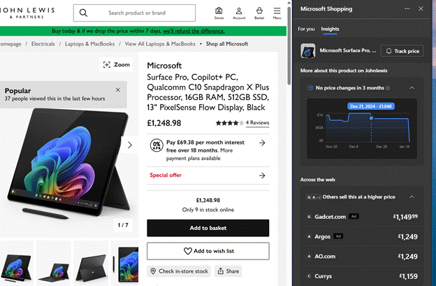
clip_image003Recent builds of Edge have a Sidebar which includes a load of apps and integrations – the goal being that it can help multitask on the web by sharing complementary information or functionality alongside the page the user is looking at; think a shopping widget that would compare prices of the product on the page you’re viewing, showing where else you could buy that same thing.

A recent update to the Sidebar has been the inclusion of the new Bing search, which adds some very cool relevance capabilities that would allow you to fire the current page content straight at the Bing’s AI engine to summarize, rewrite or explain the contents – selected text, or the entire page you’re visiting.

Here’s an example of a reasonably detailed blog article (from early 2021) summarized into a few key paragraphs:

clip_image004

One of the more useful integrations in the Sidebar is the Outlook app (individual icons on the Sidebar can be enabled and disabled through the settings option; you can also dock other sites which will appear in the sidebar, though not necessarily with the context of the page you’re currently looking at). A recent – and somewhat controversial – change means that when you click a link from an email in desktop Outlook on a PC, it will open in Edge and the Outlook sidebar will be shown alongside, displaying the email that you clicked it from.

Once you’ve got the hang of this feature, it’s actually pretty cool – especially if the email is offering some context about what you’re supposed to be doing on that page, or if it’s a densely-packed missive full of clickbait and other nonsense:

clip_image005

Why is it controversial? Well, the point is that the extra functionality is happening due to the Sidebar in Edge, so clicking a link in Outlook if you’re using a different default browser wouldn’t have the same effect. Outlook, therefore, has decided to send links to Edge even if that’s not your usual browser, to the chagrin of some netizens. Be careful with doing things that annoy some people.

If you’d prefer that Outlook and Windows respected your choice to send all your links to a specific, non-Edge, browser, then it’s fairly easy (if not exactly easily discoverable) to set that. Go to File | Options | Advanced within Outlook, and look for the Link Handling option, and change it to Default Browser. clip_image007This will mean opening the hyperlink in Chrome / Brave / Firefox / whatever, without the Sidebar doing its thing.

More change is on its way to Edge and Bing AI.

If you like Edge but would rather dispense with the Sidebar altogether, go to the “…” menu on the top right, select Settings | Sidebar and disable the Always show sidebar toggle.

You can use the same clip_image009settings UI to play with other behaviours in the various apps that are pinned to the sidebar, too.

To add or hide apps on the sidebar, just show it, right-click on something and choose Customize sidebar, or use the “Add or remove apps…” feature from the Settings | Sidebar screen.

clip_image011If you’d rather not to have the somewhat prominent Bing icon on the very top right of your Edge screen, look under the Discover section of this Settings UI, and if you flick the switch, the big blue b goes away.

663 – Optimize Edge start screen

clip_image002Happy New Year! Do you have any resolutions that you’ve decided to follow, other than the usual (eat less, move more, try all you can to write 2023 instead of 2022)? How about cleansing your web browser start up screen to something more useful and/or less distracting?

With the Edge browser, the default New Tab Page (or NTP) presents a configurable and sometimes useful way to display information, however the source of news articles and the advertising that is shown alongside can sometimes be, er, challenging.

Clickbait

Third party advertising aggregators take sponsored content from an originator and present it as an advert. This presents a problem for the sites that choose to sell advertising space – in tiles mixed with legitimate sources in the likes of the NTP, or in chumboxRecommended for You” type content at the bottom or side of articles.

Some of the ads often lead users to a site which will do more than try to sell them something – some try to get them to install browser addons, show faux review sites recommending dubious-at-best products, or fraudulently push get rich quick schemes and the like.

clip_image004If the originator keeps foisting nonsense adverts with poor quality visuals and clickbait headlines through the aggregator, the content owner who relies on the revenue stream from the ads can complain and have it blocked – it doesn’t do their reputation any good if their site is littered with stupid adverts.

clip_image006Ad blockers don’t work on the Edge new tab page, but you can report a dodgy ad by clicking the ellipsis on the top right of the tile. Or submit a report here. This is a whack-a-mole game in a modern sense, since even if the original is blocked they may just appear the next day on a different URL but with substantially the same garbage content.

If this kind of insidious spam drains your energy, there are things you can do to minimize or remove the nonsense, even without switching to a different browser.

clip_image008Looking at the Edge NTP, if you are using a browser profile signed in with a Microsoft 365 account, you might see “Work” or similar in the Enterprise page; it’s extremely useful and quite customizable, and administrators could make Edge default to that tab. If users click on My Feed, they’ll get the same view as a non-Enterprise tab, and it will stick for that user on the next new tab.

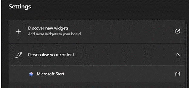
clip_image010clip_image012You can customize the “My Feed” section by choosing to Personalise your content selection and how you want it laid out, but if you want to switch the whole lot off altogether then look on the settings cog on the top right.

Switching the clickbait off will mean you get a beautiful Bing image taking up most of the screen (click the double-headed arrow on the bottom right to find out what it is), with a search bar and some collapsible quick links tiles pointing to pinned or recently-used sites, and other subtle info points like weather or stock prices.

clip_image014

Replace NTP altogether

There is no option within Edge to set what the New Tab Page should be – it’s only possible to tweak the one that’s there already.  Install a simple extension like Custom New Tab, however, and you can point it to any URL you like (a largely clickbait and ad-free news source like Google News might be one choice, or a customized set of sources from something like Feedly). After installing and configuring, you’ll need to deal with Edge checking if you really want to replace the NTP and making sure that it’s not being subverted by some malicious code. Just say Yes.

A final nail in the NTP could be to just silence all the distractions by installing the Blank New Tab extension: that’s the equivalent of setting the new tab page to be about:blank.

If you’re still using Edge and have replaced the NTP with something else, yet feel like checking in on either your M365/Enterprise page or you’d like to outrage yourself over the stupid adverts polluting the “My Feed” section, just drop https://ntp.msn.com/edge/ntp?query=enterprise into the address bar to get the classic NTP experience.

654 – Browsing across devices

imageOne of the most profound changes in the way most people use the internet has been broadening out to using a variety of devices. As well as having a selection of laptops, phones and tablets, people will surf across them all the time – from playing with a phone while watching TV, to reading an article or book on a larger-screen slate as well as working on a regular laptop or desktop. Browsers have added functionality to smooth the transition, but most people are probably unaware.

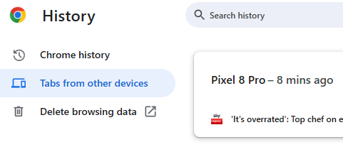
clip_image001You’ll typically be offered the chance to sign-in and sync your favourites, history and passwords across any other device that you’re using when running Edge or Chrome. If you’re browsing across multiple PCs, one way to easily pick up where you left off would be to go into the browser’s history and revisiting sites browsed from current or previous machine, or use Favourites/Bookmarks or Edge’s Collections.

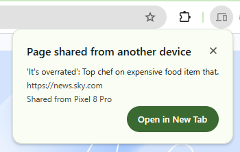
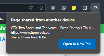
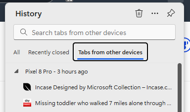
clip_image003Edge gives you a simple way of sending a currently-viewed tab to another PC or a mobile device – right-click on the browser tab and choose from a list of other devices that you’re signed in on. You’ll then see a near-real-time notification on the other machine that the page has been shared with you.

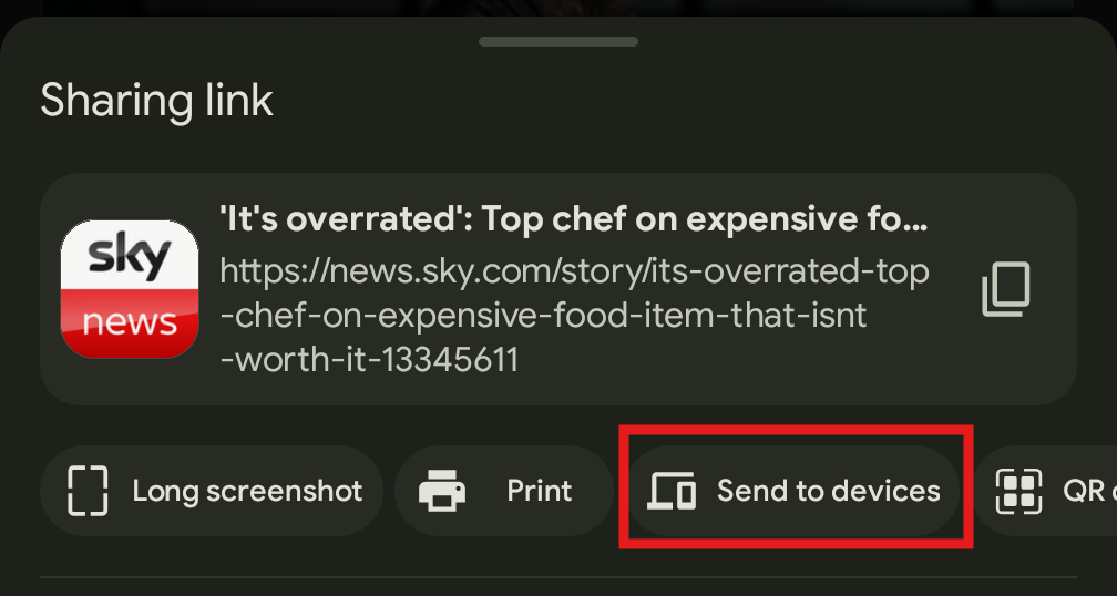
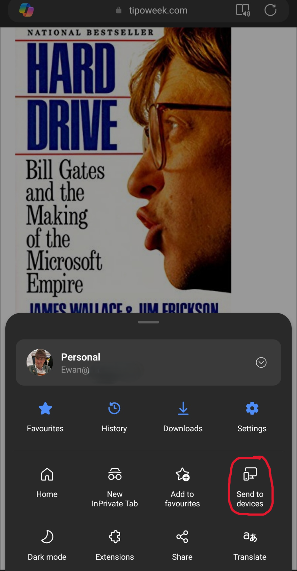
clip_image005On phones and tablets, if you’re also using Edge and signed in, you’ll see a Send to Devices option on the browser menu, so you can fire links straight to your PC.

There are other options, too – the browser menus in both Chrome and Edge have a Share option that lets you send a link to another application, send via Bluetooth to nearby devices of other types and more.

clip_image007If you don’t yet have enough toolbars in your life, you could look on the Edge Sidebar, at the new Drop feature, which lets you transfer snippets of text or whole files between browsers on multiple PCs or mobile devices. clip_image009 It might be the quickest-yet way to send a photo from a phone to your PC, where received files are dropped into the Downloads folder and stored in OneDrive for other devices to access.

629 – Edge Task, Man

clip_image002Following on from ToW #627, which talked about the efficiency of the latest versions of the Chromium-based Edge browser, avid reader Brad Wilson commented on another natty feature of the ChrEdge Edgmium Edge browser: the built-in Task Manager.

If you’re in Edge already, press SHIFT+ESC, or go to the “…” menu in the top right, choose More Tools > and find Browser task manager under there. Even though the main Windows Task Manager has been overhauled recently with extended support for Edge, the browser task man gives even more insight into what’s going on with the various tabs, extensions and supporting processes.

clip_image004For one, you can see specifics about the different bits of the browser to find out if things are bogging down and start to troubleshoot why, and kill off potentially rogue processes if you feel like living dangerously.

Right-click in the task list to add more columns to the display, like CPU Time to show longer-term vampire processes, or Profile, to display which of the potentially multiple browser profiles are hosting that tab or extension.

If the browser is taking up a bit more CPU or memory than you think it should, it may be time to prune the installed extensions list somewhat (disabling certain extensions from lesser-user profiles or removing some altogether), or engage in a more protracted exercise to find out where the memory is being used.

clip_image006In further Edge updates, a new built-in VPN feature is being tested; powered by Cloudflare, it will give users signed in with a Microsoft Account an encrypted channel with up to 1Gb of data every month to run through what it calls “Microsoft Edge Secure Network” – it’s not there to let you watch iPlayer or Netflix while you’re abroad, but it could be handy for syncing email on a coffee shop Wi-Fi network. Presumably, when your free 1Gb runs out, you’ll get some warning and an opportunity to add some more coins to the meter.

Also, Edge is now 101, though there’s not much excitement for most users.

627 – Sleeping as Edge hits the ton

clip_image002Ever since Microsoft switched the Edge browser from its own page rendering technology to instead use the open-source Chromium, it benefits from regular rolling updates and the version number keeps increasing to match. If you use Edge already, you can see what release you have by going to the “…” menu > Help and Feedback > About Microsoft Edge or paste edge://settings/help into the address bar.

The release number ticked over from 99 to 100 recently, causing a few legacy websites to fall over: when you visit any site, your browser’s User Agent String identifies to the web server what type of client it’s dealing with, including the version number (so the server can modify the page to suit the client, if necessary).

In Shades of Y2K, a few sites balked at a browser showing up with a 3-digit number – if you have problems with any, you could make Edge stick to telling sites it’s running v99 – go to edge://flags/#force-major-version-to-minor on the address bar. Mozilla – creators of the Firefox browser which also uses Chromium – tracked known issues in sites and which ones have been fixed.

As well as taking whatever goodies come from the evolution of Chromium, the Edge development team can devote more of their time building stuff with a view to making Edge better than other browsers.

clip_image004One feature which made it into Edge a while back is sleeping tabs; meaning open tabs you haven’t used it for a while can be put into an inactive mode and consume less memory, CPU and ultimately, power.

Look in Task Manager (CTRL+SHIFT+ESC) and you’ll likely see lots of entries underneath the Edge application; some are processes in support of the overall app, Extensions and the like, but you’ll also see each Tab appear separately. If you think Edge is running amok, it’s worth looking here to see if some specific site is chewing up CPU and consuming lots of memory.

clip_image006Tab sleeping has been updated and given extra capabilities to manage tabs which are inter-connected, reckoned to mean that 8% more tabs will be put to sleep. When a tab is dozing, it typically saves 99% of CPU and 85% of memory compared to when running.

Other updates which came into v100 include some changes to handling of PDF files and some tweaks to policy-based control and other improvements to the way the browser works.

The Performance view on sleeping tabs Is rolling out now; if you don’t see it in Settings, then sit tight, or try visiting the Edge Insiders site and install one of the test versions, either Canary (daily updates – not really recommended for the average user), Dev or Beta; pre-release and stable versions of the browser can be run side-by-side so there’s low risk in having both on your machine.

For more information on browser evollution, keep an eye on the release notes for the Beta channel and watch the release schedule for when to expect further browser updates. There’s a feature tracker too, to see what’s in development and learn what’s coming, and summary news is regularly shared via the What’s New blog.

582 – Edgy Profile Switching

clip_image002The “new” Edge browser has been around long enough to be just “the Edge browser”, given that old Edge is not only deprecated but being removed from Windows 10. If you’re still clinging onto Internet Explorer, then get ready for its demise; it’s got a year left, then the plug gets pulled. Plenty of ToW’s past have dealt with the Edge browser, especially the benefits of having multiple profiles (useful to keep work and personal stuff separate, or even having different sets of credentials for common sites, like demo accounts vs real users).

A feature which was added to the profile functionality was the ability for Edge to switch between them automatically – in other words, Edge would try to determine if you’re opening a site in the “wrong” profile, and it also lets you set the default on which profile should be used when you click an external link in an email or a document (other than in the browser itself). This not only changes how the site might be displayed, but also sets where the browser history is saved, and which set of cookies, cached usernames / passwords etc should be used…

clip_image004

You could set that a specific profile should be used for “external” links; if set to “Work”, then all external links (from other apps) would open in that profile; automatic does a pretty good job but sometimes gets flummoxed by M365 sites like Sharepoint, which could mean clicking a link to a doc in Outlook will try to open it in your personal profile, and fail to authenticate (since you’d want it to use the work profile’s credentials).

Similarly, if you had it set up to open links in whichever profile was last used or to hard-default to Work, then clicking a URL that you’d want to view in Personal might cross the streams. Fortunately, an unreleased feature could be just what you need in this scenario.

There’s a still-experimental “flags” feature set that is part of both Google Chrome and Microsoft’s Chromium-based-Edge; different releases of each browser have a changing set of flags features which can be enabled if you know they’re there and are prepared that they might not work, or at least might not work in the same way as they eventually will.

clip_image006
 

Many flags tweak how the browser operates under the covers and will never be noticeable by the average user; others enable features that are hidden by default or are still early in their development cycle.
The plan is that (in some form) flag features will be part of the mainstream release, though not necessarily in the same way. You can view the flags by entering edge:flags in the address bar.

clip_image008One flag which is eminently and quietly useful in this potential multi-profile befuddlement is edge://flags/#edge-move-tabs-to-profile-window. It does pretty much what it says; right-clicking on a browser tab will let you switch it between the profiles, so if you’re presented with a login screen for a site that should be opened in the other profile, one click is all it takes to flick it across.