|
Excel makes it easy to take a static table with rows of data arranged into columns that correspond to measures or fields – like sales of a product, or assignments of a relationship such as an export from a CRM system – and then represent the inherent hierarchy in a super-powerful fashion. If you haven’t really used Pivot Tables, the simplest way to get your head around what they can do is to try messing around with some real data, or use some relatively simple sample data to unearth the power within. Free sample data at Contextures is a good place to start – in fact, here’s one sample that has been turned into a Pivot table to get started with (just download it somewhere, open the Zip file and then open the example XLSX file within).
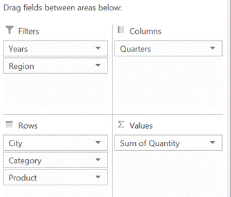
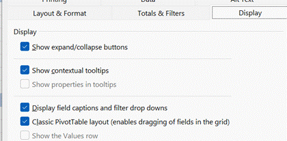
By showing the PivotTable field list (right-click on the table and you’ll see either show or hide field list at the bottom of the menu), you can easily drag things around to change the grouping order.
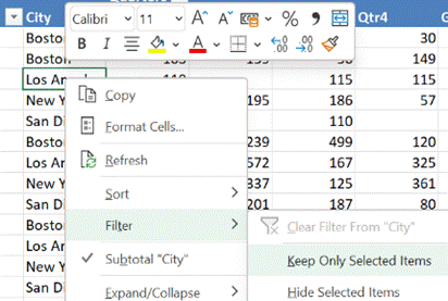
In our foodstuff example, we could have a different layout of fields and want to filter on City – but a quicker way to doing so is to just right-click on the name you want to focus on, and choose Filter > Keep Only Selected Items and it will quickly set the filter to just that name. |
Category: Office
595 – Emoji reboot
|
Emojis are mostly agreed and defined by the Unicode Consortium, which controls the Universal Coded Character Set, adopted by many systems to maintain compatibility between each other. When a user sends a symbol in a text message, the phone of its recipient needs to know which character was being sent or confusion may occur. Interpreting what the actual emoji symbol means is still down to the end user, and there are many pitfalls to avoid.
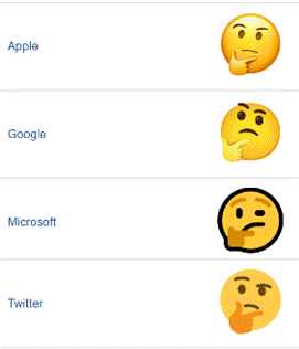
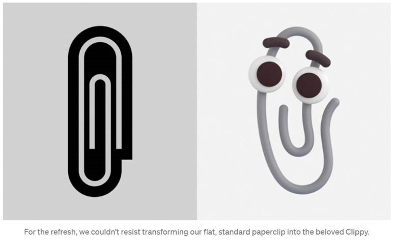
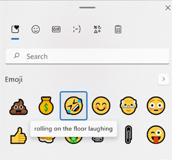
Microsoft decided to adopt a “flat” emoji look in the Windows 10 timeframe, but that is starting to change again with the upcoming release of Windows 11 and the evolution of Microsoft 365 – as Art Director and “Emojiologist” Claire Anderson previewed, we’re going 3D and Fluent, due late this year. Oh, one more thing… ToW reader Paul Robinson draws attention to the shortcut way of inserting emojis in Windows – it’s been a feature for a while now – just press WindowsKey + . and it will allow you to insert emojis into pretty much anywhere that accepts text. The UI for the emoji panel is changing in Windows 11 too, with GIFs and other types of symbol being included and the whole thing is easier to search. A useful tooltip shows you what the symbol represents, though as said before, be careful with the potential interpretation of some of them. Peachy.
Paul likes to start Teams channel names with an emoji, and if you want to illustrate one difference between old world and new, try using them in email subject lines and see just how they appear in Outlook |
593 – It’s a Date
|
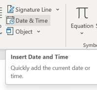
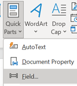
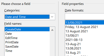
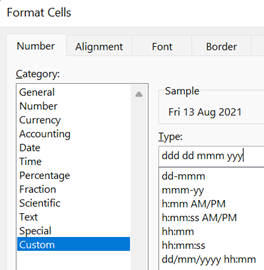
On the Insert tab / Quick Parts, look under Field, then pick the doc property and format you’d like to show. It is worth pointing out that showing a date as 10/1/21 (or similar) is ambiguous given that a few hundred million people will expect it be month-day-year while many of the remaining 7 billion will assume the day comes first, with a couple of billion presuming the format should normally start with the year, such as yyyy-mm-dd (which is arguably the most sensible of all; and it sorts properly, too). A more daily usable short format like dd-mmm-yy (ie 13-Aug-21) should perhaps be the norm, especially when the date is appearing as text in a document. Pressing SHIFT+ALT+D in Word will insert the current Date as a field (so you can edit the format to remove ambiguity) and SHIFT+ALT+T inserts the current time too. In PowerPoint, both of these combos bring up the “Date & Time” dialogue to add the chosen content and format as plain text.
While in Excel, it’s worth learning the short cut key to insert the date and time – CTRL+; and SHIFT+CTRL+; respectively (no doubt there’s a reason why Excel has a different shortcut to other Office apps – some legacy of Lotus 1-2-3 perhaps?). OneNote fans will want to remember that SHIFT+ALT+D / T combo as it inserts the date/time into the notebook; really handy when taking notes of a phone call or similar. SHIFT+ALT+F puts both day and time, something that Word doesn’t offer. In both Desktop OneNote and users of the Windows Store version, it’s just plain text that gets added, so you’re on your own when it comes to formatting. OneNote pages will typically have a date & time showing under their title – on the Desktop version, it’s possible to change that so as to mark a page as having been recently updated. No such luck on the lame duck Store version.
At least when stalwarts insist on writing – or worse, saying – a short-form date as something like “ten one”, there’s more than half of each month where one number in the date could only mean “day” – starting with the thirteenth (as in, 8/13 can never by the 8th of a month, but 8/12 could be a few days before Christmas to Europeans, or the date when tweedy Americans start looking for grouse in the Yorkshire moors and Scottish Highlands). |
591 – An Excel Smörgåsbord
|
May the F4 be with you One of the neatest features in Office yet largely hidden; the F4 key repeats the last command without needing to faff about selecting the option from the menu. So what, you might say? Well, what if you’re formatting cells and want to repeat the same format over and over again – you could change one, then use the Format Painter option to apply that to select other cells, or possibly just apply the format you want, then select each additional cell in turn and press F4. One slight downside is that it only repeats the very last action, so changing a number format and then making it bold wouldn’t be easily repeatable since those are two actions. Still, there are so many uses for this “Magic Key no one knows about”. CTRL+y does the same thing in case you’ve got one of those annoying keyboards where the function keys do other things, you never know without looking if you’ll be pressing F4 or changing the system volume.
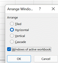
Layouts and Tabs Now, Windows has lots of tricks for arranging application windows side by side, especially if you have multiple monitors; there’s a particularly shiny new way of doing it in Windows 11 with Snap Layouts. In the context of Excel, that’s OK if you’re using two spreadsheets side by side and you might want to reference or copy data between them, but Excel has its own window-handling functions that could be more useful.
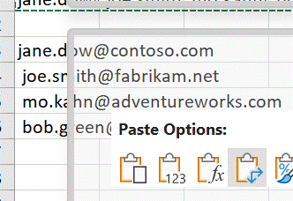
The Synchronous scrolling feature means Click on the Arrange All menu option to automatically distribute the open Excel windows, optionally confining the process to just the windows from the active workbook. Transpose data with paste It’s a fairly common exercise to take a load of data that’s in one format and want to represent it differently; there is a useful Transpose feature that takes data from columns and paste it back as a row, or vice versa. One useful scenario could be when you want to take the names of everyone who got an email or meeting request and put them in a tabular format.
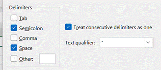
Now you have a list of addresses on their own row, and without the “;”s, but they do have a leading space ahead of all but the first one. It might be quick to correct each line in turn, and there’s always the TRIM function which could be used to tidy stuff up through formulae.
When you’re happy, remove the original line that had the text in columns, leaving just the separate email addresses on their own rows. Now, snacks just make you hungry, don’t they? |
590 – OneNote Tagging
|
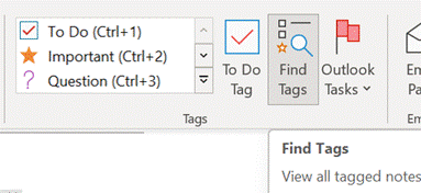
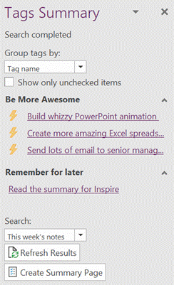
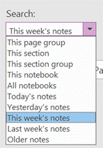
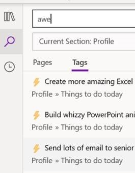
Try using the Search filters at the bottom to restrict the results set, so you only show tags within a given notebook location or across all your notebooks, but for a specific time.
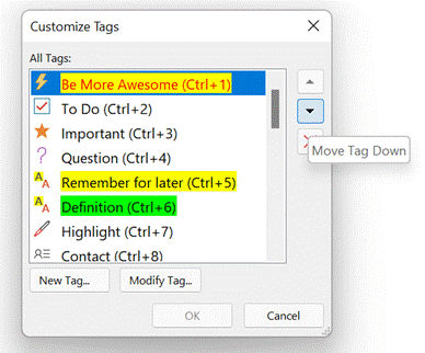
In the OneNote for Windows 10 store app, you can search for Tags but custom ones created in the desktop app don’t appear in the Tags list when editing a page. Only a handful of tags are initially offered in the store version, and if you add a custom one it’s still possible to press CTRL+n to use it, but you need to count where your tag is in the list as it doesn’t show you the shortcut. Custom tags added in the store version don’t appear in the tags list of any other client though do sync across other devices, to some degree. Given the slight rough edges between the versions if you routinely open the same notebook in mobile, web and store/desktop apps, then Tags may not prove so useful – but if you tend to stick to a single UI – especially if it’s the older desktop one – then it’s worth exploring how custom tags could help you organize your stuff. |
587 – New Line please
|
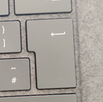
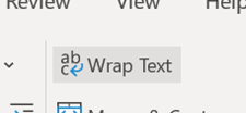
As well as the QWERTY keyboard layout, a few things were carried over to the modern computer from the typewriter – the backspace and tab keys and the carriage return key. Purely mechanical typewriters had an end-of- Early computer systems aped the same approach of the line feed (ie the paper being shuffled up one line) and the carriage return (going back to the left side), as being separate activities and they were given specific control codes – so CR, LF and CR+LF are still things. For some time, consternation still applied as Windows considered that CR + LF needed to be noted to really start a new line, whereas the Unix fraternity simply thought that LF was all you needed. It is possible to hack the registry so Notepad acts Unixsy should you need it to. In most applications, if you want to start a new line, you’d just press Return or Enter (in effect, the same thing, though not always the case). Pedants would say that ENTER doesn’t mean you necessarily need a new line, you’re just committing some data you’ve typed, redolent of the old terminal where you might be submitting a form rather than typing in free text. Applications perform sometimes completely different actions when you press a modifier key like CTRL or ALT, and ENTER. In Word, CTRL+ENTER starts a new page, ALT+ENTER repeats the last typing action. In Outlook, CTRL+ENTER sends the current email and ALT+ENTER – like the same keystroke normally does when looking at a file in Windows Explorer – shows the properties of the current message. In Excel, CTRL+ENTER has some other meanings, notably it completes the entry of data into a cell, without moving the selection to the next cell along or to the line below (depending on config). SHIFT+CTRL+ENTER can be used to create a powerful but quite complex array formula. ALT+ENTER also has a useful trick for formatting text in-cell, alongside some tips to control cell text formatting.
Another way of editing text in an existing cell; select it and the text will be displayed in the formula bar, but only the first line, unless you have the formula bar expanded out, by clicking the down-arrow on the right.
|
584 – Office Apps expansion
|
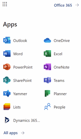
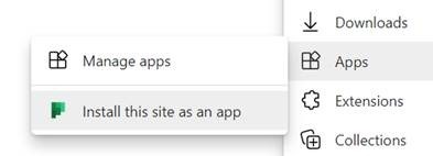
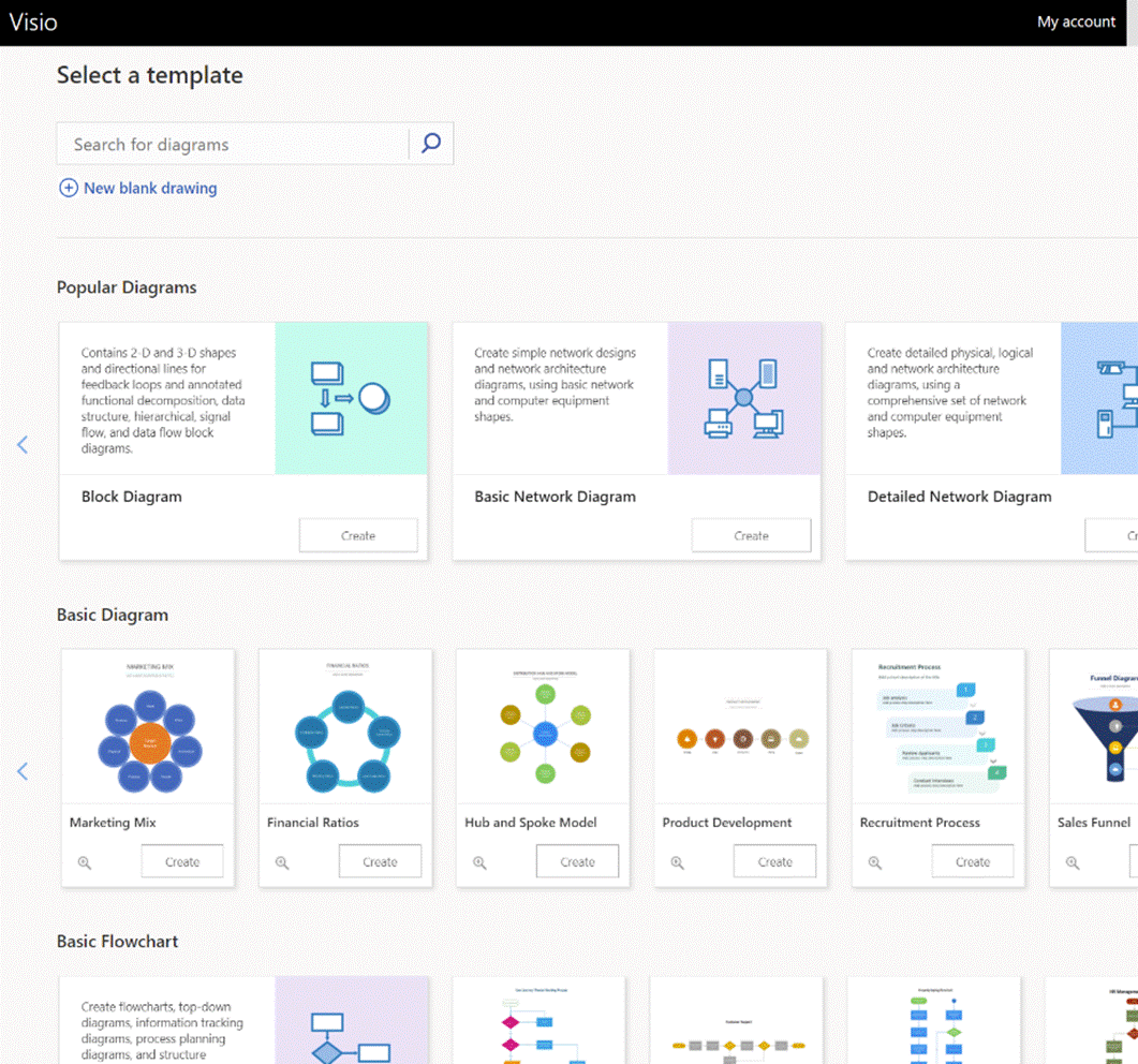
What you’ll see depends on what kind of subscription you have and what previews you might have opted into, as well as what apps may have been published by your subscription’s administrators (eg internal HR website or IT support desk sites could be listed there). To keep things interesting, you can also install most of these web apps as Progressive Web Apps on your PC – using Edge, go to the Settings “…” menu in the top right, and look for the Apps menu option. They will then appear in the Start menu, can be pinned to the Task Bar and run in their own discrete window, just like a “real” program would. One app which could roll back the years for a lot of people is Visio. Microsoft bought the diagramming software company at the turn of the century, for what was the largest acquisition to date – check out the list of other deals and see if you can remember many of those other $100M+ names… Microsoft Visio became a premium addition to the Microsoft Office suite, latterly being sold as an add-on like Project. The software has continued to evolve over the years and has its own band of fans who use it for mind mapping, flowcharting, network diagrams, room layouts and so much more. You can even build Power Automate workflows using Visio (see more here).
If you’d normally turn to PowerPoint to try to create graphical documents like flow diagrams or simple org charts, keep an eye out on the All Apps list to see when Visio makes an appearance, and give it a try. |
583 – Zooming PPT
|
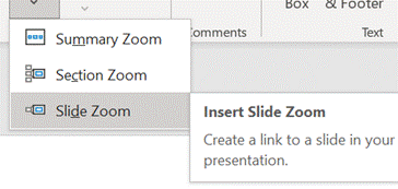
Way back when, there were numerous product incubation groups in Microsoft, who tried out new features as addins or companion products; over time, most of them have disappeared or the prototype products they produced made their way into the mainstream (or just quietly went away). Innovation continues within the various engineering groups, of course, and some is curated in the Microsoft Garage. One OfficeLabs project that showed promise was pptPlex – an addin to PowerPoint that made it easy to create and present “non-linear” presentations, offering a kind of “Seadragon” type experience of zooming into content. The actual pptPlex software is long-gone but if you want a reminder of what it was like, or even to recall how funky Office 2007 looked, check out this video tutorial.
|
580 – Let’s Lens
|
The “Office Lens” app was originally produced for Windows Phone before being ported to iOS and Android. Later, a PC version came along but with the death of Windows Phone it hardly seemed worth keeping going, since scanning docs and business cards etc is so much easier from a handheld device. As a result, Office Lens on the PC is now gone – dispatched at the end of 2020; if you had installed it previously, you could still use some of its functionality, though the smarter online services that sat behind it are no longer available.
There are tweaks to the algorithms used to detect edges of documents when scanning pages or turning a receipt snapped at an angle into a square-on image. It’s not always perfect, but you can drag the apices to tidy up the process, and save pages as images on their own or multiple pages of a document into a single PDF file, straight to OneDrive or local on the phone.
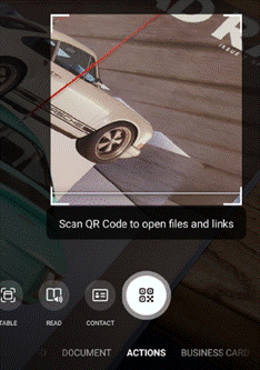
Similarly, barcode reading just brings back the number, whereas some other apps will provide a bit more context – Lightning QR Reader for Android, for example, can read any text encoded in a QR code and will also give some more details for barcodes, like decoding ISBN codes on books to let you search for more info on that specific title. Still, Lens provides a neat & quick solution for scanning or capturing all kinds of info.
|
578 – Let’s talk about fonts
 Most people don’t really think too much about which font they’re using in written works. The novelty of having different font designs, weights and sizes soon wears off, especially if you like to try all of them in the same document. Most people don’t really think too much about which font they’re using in written works. The novelty of having different font designs, weights and sizes soon wears off, especially if you like to try all of them in the same document.
Yet, there is a lot of thought which goes into creating a font, especially when considering how it’s likely to be used. Typeface design goes back to the earliest days of printing, with fashions changing from heavy and elaborate block type to lighter and perhaps easier to read lettering. To serif or to sans? The author Simon Garfield has written extensively on the subject of typography, including articles on What’s so wrong with Comic Sans? or The 8 Worst Fonts In The World and his really excellent book, Just My Type, which delves into the history behind lots of common typefaces and how or why they came about. It really is fascinating. Even the design of the text used on road signs was a hot topic in the 1950s, with the UK facing a need to choose a standard for the upcoming motorway network, which could be easily read at speed. Designers Jock Kinneir and Margaret Calvert came up with many road signs and the typeface design still used today (theorising that at 70mph, a driver looking for Birmingham won’t actually read the letters, but will recognise the shape of the word). Trials were done by fixing words to the top of a Ford Anglia and driving it past a group of seated, bemused volunteers, to test the fonts’ efficacy. A lot of technology we take for granted today has its roots in the 1970s at Xerox’s PARC research establishment or was materially advanced there – ethernet, bitmapped displays, laser printers, the mouse, the GUI, object orientation, distributed computing and so much more – and the two founders of Adobe, who went on to define PostScript, started their work together there. This font-rendering software – along with the Apple Macintosh & LaserWriter and the Desktop Publishing software PageMaker – laid the way to revolutionise the printing industry.
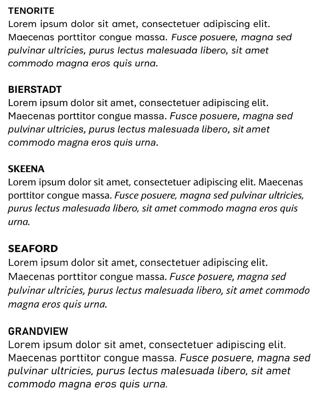
“Cloud Fonts” are available to Microsoft 365 subscribers (more info here) – in Word, go to File / Account and look for the optional settings. Five of the Cloud Fonts collection are being considered to be the new default font for Office apps in the future… which would you choose?
|


