|
Even in 1990, NOSS allowed any user to browse a hierarchical directory (showing contact info, job titles, manager/reporting relationships etc), email or instant message anyone, and look at their calendar to see what they When Microsoft Exchange first came out, email was handled with the Exchange client and calendaring was from Schedule+, which had been updated to support Exchange (and lives on in some backward Microsoft lingo, where people who start every sentence with “So,” ask you to send them an S+, meaning, invite them to a meeting). Outlook came along in 1996 and became the preferred and unified way to do email, calendars, address books etc.
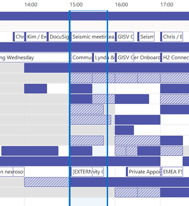
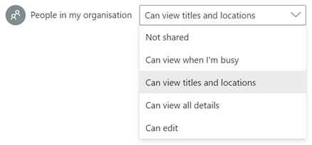
With M365 in general, newly-created mailboxes have no calendar sharing set up, and the action is on the user to choose how to let co-workers see their info. Be a nice person, and check to make sure your colleagues can view your calendar. Ideally, share so that others will see the title and location of any appointment; useful when someone is trying to arrange a meeting, as within the schedule view they can figure out if you are likely to be able to make the proposed meeting time – if your diary is full of blocks marked busy or tentative, they’ll have no idea if you really are in a meeting or have just marked time to do something that you might be happy to move. Or had a colleague’s FYI notice of being on holiday obliterate the view of your calendar. In the early days of Exchange/Outlook, if you had read access to someone’s calendar, you could open up appointments, see who else was attending a meeting, download any attachments and so on, unless the appointment was marked “Private” – though it’s somewhat possible to open Private appointments programmatically if you know what you are doing.
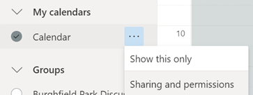
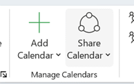
If you choose titles & locations, viewers can’t open your appointments to peer inside, so can’t see who else is attending or what the body of the meeting says, but they can at least see if you’re likely to need travel time between meetings. See here for more info on calendar sharing & delegate access. |
Category: Office
630 – slimming your PPT
|
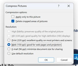
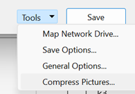
Estimates of the energy cost to transmit and store data vary wildly, but if 1 GB cost 1 kWh power and the average CO2 output for generation was ~500g/kWh, then even shaving 10MB off a file can make a material difference if it’s going to be heavily used†. There are a few tricks you can follow to make your PPTs less massive – like compressing the images within, meaning that an embedded picture which was originally sized to print on a poster could be re-sized to fit on a screen.
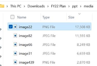
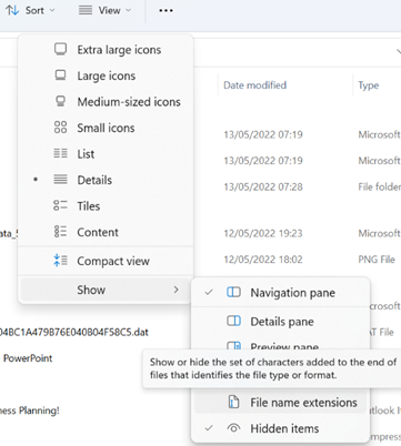
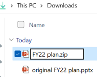
A somewhat cavalier way of looking for large things you can torch, is to make a copy of your PPTX file and then rename it so you can look within. The OfficeXML file formats (prevalent in Office 2007 and onwards) use the same compression as ZIP files, so if you rename your file as such, you’ll be able to open it in Windows Explorer or other ZIP handling utilities, to see its innards. Opening the file shows you a folder structure, and if you navigate into ppt \ media then sort by Size, you’ll quickly see what’s making your file so big.
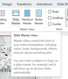
Go into View menu and look under Slide Master, which will open a whole new tab specific to the management of these template slides that form the bones of the presentation. You may well see lots of title slides or similar, which have embedded background images – if you know you don’t need those graphics or those layouts, just delete them.
This title slide in the Slide Master view had a graphical background which was 17Mb in size
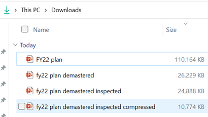
Selecting an image from one of the 70-odd slides in the deck, and choosing Compress Pictures from the Picture Format tab reduced it again to only 11MB, or 10% of the original file size – all for a few minutes’ effort.
†NB: the irony of sending a 2MB email to thousands of people, and sharing online and on LinkedIn, is not lost. |
628 – Text handling in Excel
|
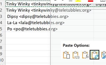
There are simple ways of bulk handling text without resorting to writing a formula – copy all the names from the To: line in an Outlook email, for example: paste into a new spreadsheet and you’ll end up with
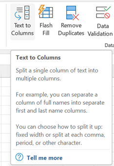
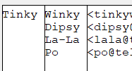
In the example above, we have a “;” separating – or “delimiting” – each address, so
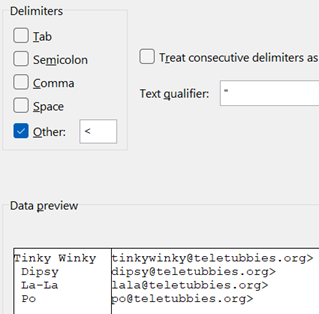
There is some other cleaning up to do with this text, though; the Text-to-Columns function chopped everything at the “;” but there’s a space which follows the semicolon, so all the Display Names after the first one have a leading space. We could repeat the Text-to-Column feature on the selection again, but use a Space as delimiter now –
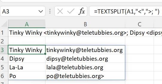
In cases like this, it’s easier to use a formula to clean things up – the Trim function being a good place to start; it removes both trailing and leading spaces in string, so the name can be fixed up into a new column. Since we know the email address has one errant character – that trailing “>” – left behind from the earlier text-to-column operation, there are a variety of ways to strip it off. There’s the After all this palaver, you might be thinking that some of this
You could use another formula to find and strip out any left-over characters like that, or just manually delete the last “>” off the original line you pasted in. |
625 – Journaling now and then
|
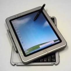
Turning to technology and looking back to relatively near-term history brings up all kinds of product that was ahead of its time or was ultimately overtaken by other developments that nobody saw coming. Sometimes, the perfect blend of genius, timing, execution and luck combines and creates a durable and wildly successful category – like the Smartphone and the plethora of services and apps that were created. Inversely, one of those tech innovations that was just a bit ahead of its time was the Tablet PC; a fully-functional Windows PC that was blessed with a pen and touch screen so you could take notes by hand just like on paper, yet by flipping it around it could be used to run Office apps and all the other stuff you’d need a PC for, 20 years ago.
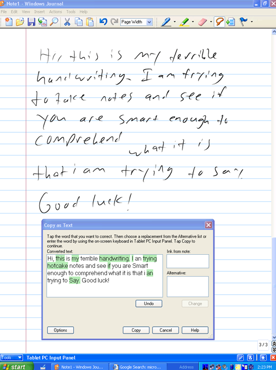
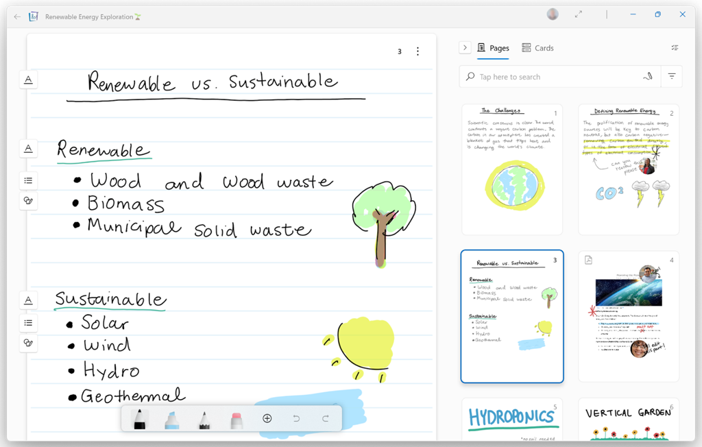
One new app that was built for the Tablet PC to take advantage of its pen, was Windows Journal, a relatively simple yet effective note-taking app, with surprisingly good handwriting recognition built in. To read more from someone who was in the room – figuratively and, at times, literally – around the time of Tablet PC, the Journal software and the Office app originally called Scribbler which went on to become OneNote, check out Steven Sinofsky’s Hardcore Software post. It’s a fairly long but fascinating read. Using pen and paper for taking meeting notes might be less popular now, but many of us will still jot down reminders or lists on Post-it notes, perhaps doodling on paper to help creativity and flow. If you have a pen-capable computer now, the newly released Microsoft Journal app is worth a look. Billed as an app for digital ink enthusiasts, this new Journal presents a modern take on the original Windows Journal idea – an infinitely scrollable canvas for jotting down anything, though with AI capabilities in the app providing quiet yet powerful functionality. Journal started as a research project (from the “Garage”), but has now graduated into a fully-fledged, supported app. Read more about it here.
|
624 – Present in Teams, like a Boss
 Even after 2 years of mostly enforced remote meetings, it’s still amazing how many people have yet to master some of the basics of online meetings – like management of the mute button and general audio interference, positioning of screen/camera so you’re not looking up their nose or side of their face, professing to having bandwidth issues as the reason for not enabling video, and many more. One “room for improvement” function is that of presenting PowerPoint slides and not looking like an idiot. Even after 2 years of mostly enforced remote meetings, it’s still amazing how many people have yet to master some of the basics of online meetings – like management of the mute button and general audio interference, positioning of screen/camera so you’re not looking up their nose or side of their face, professing to having bandwidth issues as the reason for not enabling video, and many more. One “room for improvement” function is that of presenting PowerPoint slides and not looking like an idiot.
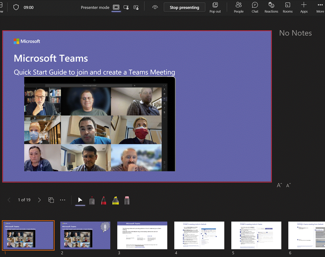
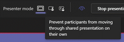
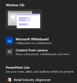
Don’t share your screen to present slides in Power Choosing this opens up a Presenter View akin to the one in PowerPoint, which is the default if you have multiple monitors and you start a Slide Show. This view lets you see Speaker Notes, jump quickly to specific slides rather than paging through them, and be more interactive with the meeting than you could ever be if you were simply sharing a screen showing a PowerPoint slide on your computer.
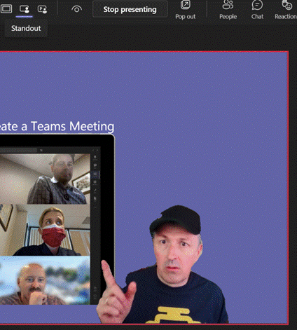
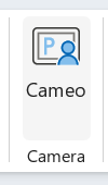
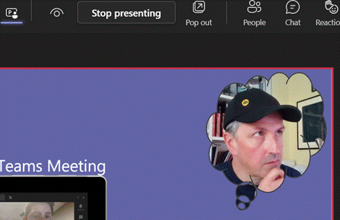
Next to that icon, there are some others which define the presenter mode – Content Only on the left, shows just the slide you want. Next to that is Standout, which takes your video and overlays it onto the slide rather than having it appear as one of the surrounding gallery A downside of the Standout mode is that you don’t get to control where your image goes on screen, or how big it is – so you might well obliterate some part of the content you’re presenting. This new feature gives you a way to solve that. In PowerPoint, go to the Insert tab and on each slide add a Cameo (or a Camera as the object it creates is described in some controls), then place and size it as you want. If you select the new object, the Camera tab will give you more customization options.
You will need to add a Cameo to every slide you want to show up on – potentially useful if you want to only appear for intros and Q&A but perhaps leave the content on its own for other parts.
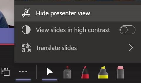
Using Pop Out might help if you have a larger second screen connected, though chances are you’ll be using the camera on a laptop so ideally want to be looking at that display. Since nobody really uses Speaker Notes anyway, you could try Hide presenter view, which means you’ll lose the slide thumbnails and speaker notes, but still keep the other controls. Go to the View control on the top left of the window and choose Full Screen to increase it even more. For more details on using the new Cameo feature, see here – it is in preview which is rolling out through Office Insiders first so you may not see it right away. If you are presenting using simple app or desktop sharing rather than the PowerPoint Live model described above, there are some other options in how you appear alongside your content. As well as launching the PowerPoint Live sharing from within PPT itself, you can choose to share recent presentations while in Teams – just scroll down past the various “share screen / app” options and you’ll see more. This topic was covered previously on ToW #576. |
623 – What’s .new pussycat?
|
Having blazed a trail with email in Hotmail and later Outlook Web Access, in 2010 Microsoft launched the first version of the Office web applications, meaning you could run lightweight Word, Excel and PowerPoint in your browser, as a companion or even as an alternative to the full-fat desktop versions. A few years earlier, Google Docs released as an online word processor (and later, other types of productivity apps, rebranding as G Suite and now Google Workspace). There are pros and cons of the browser-only experience; you tend to sacrifice some functionality compared to the desktop applications in favour of ubiquitous availability, though web clients can be updated more easily and sometimes new features appear there first – as ToW #605 covered, with snoozing email. Check out What’s new in Excel for the web or look for the summary covering Visio, Forms, Words and more, here.
If you like being browser based rather than desktop bound
|
618 – Listing
|
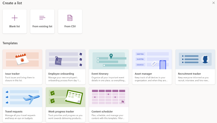
A while back, Microsoft released a new app for Microsoft 365 users called Lists, which was essentially a front-end to SharePoint, itself a staple of the Office 365/Microsoft 365 offering since the beginning, and providing much more functionality than simply a place to stuff documents. The original SharePoint Portal Server 2001 (codenamed “Tahoe”) is nearly old enough to buy itself a beer in its homeland, and relatively advanced logic and custom data validation & handling has been a major part of its appeal for a lot of that time.
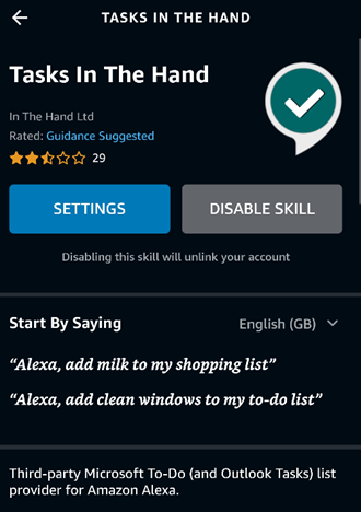
Recently, the Lists experience was made available – in preview – for non-M365 users who could sign in with their Microsoft Account. A “lightweight” version of the app, it’s still pretty functional and pitched at individuals, families or small businesses who need to keep lists of things. Taking a slightly different tack, the To Do application is a good way of making other sorts of lists – that could be Tasks or flagged emails as well as simple tick-lists to mark off what needs to be done. In something of an overlap with Lists, To Do can share its lists with other people – think of To Do as primarily for personal use that you might share, whereas Lists is for managing shared endeavours first and foremost.
|
605 – Snooze la differénce
|
One modern incarnation of the multiple-ways principle is electronic mail; despite many attempts to replace email with other means of messaging, persistent chat etc, it’s still a huge deal (especially in business) and it’s still growing. In the days when companies ran their own IT on-premises, there was Exchange, and the companion mail client Outlook arrived shortly after. Web-based consumer services like Hotmail, Yahoo! and Gmail changed the expectations of many users. Home and work email services have been getting closer in form and function since. Microsoft’s current email clients are quite diverged: you can use the full-fat Outlook application to connect to your business email as well as your private The Mail app is pretty good – it can connect to a variety of sources including Office 365, so while it might not be an ideal primary business email application, it can be a good way of connecting to multiple personal email services.
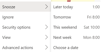
Well, that’s how it works on some combinations. In the browser versions of both Hotmail / Outlook.com and Outlook client and Office 365 – there is no snooze feature. Sorry. Just be more organised. If you snooze an email from another client, it will disappear from Inbox, but when it reappears, it’ll be in the same place as it was before – eg. if you Snooze a 9am email from the web app until 1pm, it will move into the Scheduled folder – but when it moves back into the Inbox, the Outlook and Windows Mail clients will show it down at 9am again so you might as well flag it and be done.
Mobile Outlook and Web clients on Outlook.com or Office 365– Mail disappears and shows up again at the allotted time, right at the top of the mailbox. In the web clients, you’ll see the time stamp of the message as if it has literally just arrived; in the mobile version, though the message is ordered correctly (eg a 9am snooze to reappear at 1pm will show up between 12:30 and 1:15 mails), the displayed time is correct but a little clock icon is shown alongside. Clever. At some point, there is a plan to deliver a single, unified, email client. An Ignite 2020 session talked about the roadmap and further commentary speculated that the One Outlook client may be coming, but isn’t going to be with us for some time yet.
|
602 – re-drawing Whiteboard
|
Fortunately, there are digital equivalences – you could be in a Teams meeting and co-authoring a document, where multiple people are editing at the same time and marking up comments. You could be watching someone share their 4K screen so they can walk through only a few dozen PowerPoint slides, or you might even have had a play with the shared Whiteboard app that’s been around and been part of Teams for a while now.
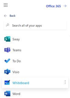
The whole UI has been given an overhaul in line with the latest colourful design ethos, and there are lots of neat new features like the automatic shape recognition for mouse-driven drawing. Hold the Shift key down while you’re drawing with a mouse pointer or a Surface pen, and it’ll straighten lines for you. It’s available in a variety of guises; there’s a web UI (app.whiteboard.microsoft.com) and it shows up in the menu on the top left of Office 365 web applications, such as subscribers would find by going to office.com and signing in with your ID. It’s on iOS and Android, though updates may flow through at different rates to other platforms.
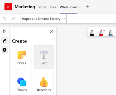
You can pin whiteboards to Teams channels or chats too; just add a Tab, select Whiteboard from the app list, and the content will persist within that context rather than a point-in-time meeting. |
599 – Time for a short survey?
|
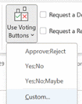
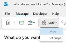
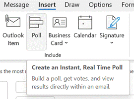
Recipients get prompted in Outlook and can vote with a single click, rather than having to type a response, and the sender can see a Tracking One downside of voting buttons, though, is that they only work in Outlook – there’s no Web App or mobile support, so it does restrict the usability somewhat. Great news, though – a more modern approach is available; not only does it work using the Outlook mobile apps and the browser but it’s a bit more in-your-face for most Outlook users too, with a simple and quick way of responding.
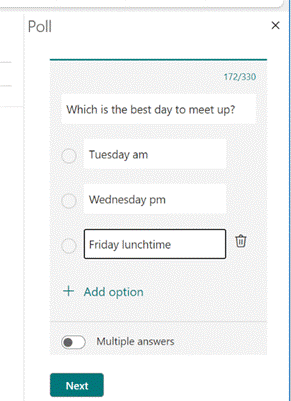
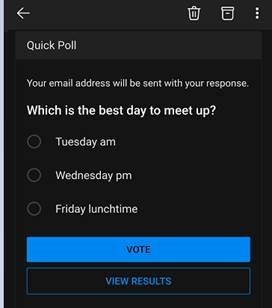
Clicking on the icon gives you a single question with two or more options; it’s powered by Microsoft Forms, but there’s no fancy branching or data validation – it’s a straight “choose one of these short text responses” feature and all the better for it.
Since it’s delivered as part of a Microsoft 365 / Office 365 subscription, it’s a little less slick when dealing with users outside of the organization / tenant (the inline previews don’t show up, so outsiders will need to click the link and use the web UI, and will need to type their email address into the response too), so think of it as a friendly and visible way of collecting simple internal votes. |


