|
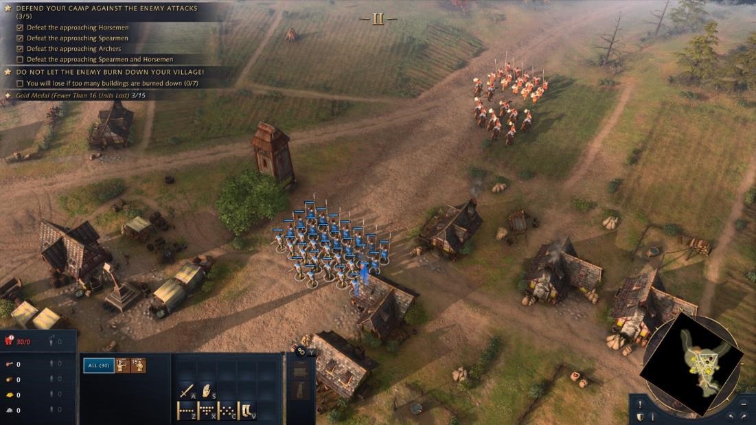
The companion Xbox Live gaming service arrived in 2002, and set the high-bar for online and multi-player gaming services alongside the original console and its online and multi-player-enabled games. The Xbox Live Gold service was threatened with a price increase earlier this year, though that was quickly walked back; commentary at the time was that Microsoft was trying to make XBL Gold less attractive in order to push people to using the newer and more comprehensive (also, more expensive) Xbox Game Pass offering. Game Pass Ultimate is a superset of Xbox Live Gold – and includes access to lots of games as part of the subscription, akin to getting movies through a Netflix subscription rather than buying or renting individual titles. In January 2021, Microsoft said there were 18 million Game Pass subscribers, with the number likely to be a good bit higher now. Different Game Pass levels are aimed at PC games fans or Xbox games, or both – starting at £1 for a month’s trial, up to £10.99 a month for the full kahuna, which includes XBL Gold and both PC & console games. This week sees the launch of the latest edition of one of the biggest PC games from the 1990s; Age of Empires. Originally released in 1997, the civilization-building strategy game was hugely popular and kept growing through community-provided expansion packs and “mods”, despite sporadic attention from Microsoft directly. If you played the original, you’ll probably remember the Priest who could turn an enemy into a friend, or recall losing hours being absorbed in the minutiae of building farms, training soldiers and waging war on your neighbours. Well, the franchise is being rebooted, in a clear signal that the PC is still considered a major gaming platform. Leading the 20-year celebration of Xbox with a flurry of both PC and console game launches, is Age of Empires IV. The new release has a variety of |
Category: Apps
603 – Sysinternals @ 25
|
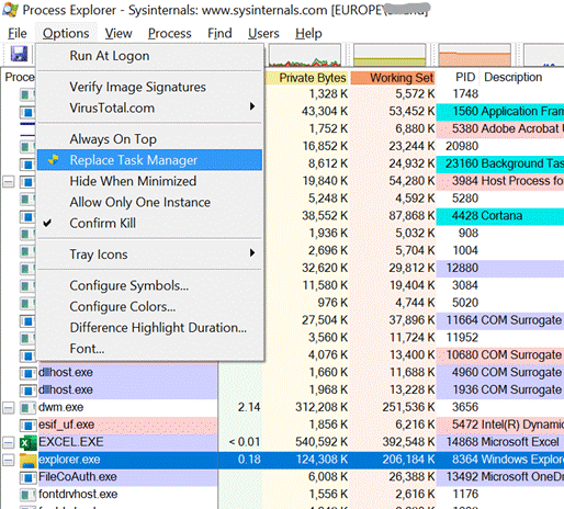
Early and popular tools, which went on to be published on the sysinternals.com website, included RegMon – which monitors what was happening in the Windows Registry – and FileMon, which kept an eye on the file system. Both of these tools could help a user figure out what an application is doing, maybe to check it’s not misbehaving, or seeking undocumented settings where the app might be looking to see if a particular file or registry key existed. Sysinternals made the tools free, and since Winternals was acquired by Microsoft in 2006, they still are.
Despite moving to becoming the CTO for Azure and being a member of the most Technical Fellows, he still has a hand in with Sysinternals, culminating recently in a celebration of the 25th anniversary of the first set of utilities. The day-long virtual conference gave deep dive sessions into a few of the most popular tools, along with an interesting fireside chat with Mark and an overview of Sysinternals tools for Linux. See the recording here. Oh, and one more thing. The Sysinternals Suite is now available in the Windows Store – so you can grab the latest versions of all the core tools (70 of them… yes, that’s right, 70, and for how much?) with just a few clicks. |
602 – re-drawing Whiteboard
|
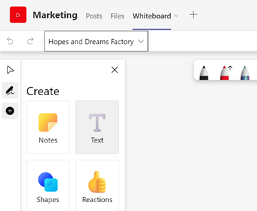
Fortunately, there are digital equivalences – you could be in a Teams meeting and co-authoring a document, where multiple people are editing at the same time and marking up comments. You could be watching someone share their 4K screen so they can walk through only a few dozen PowerPoint slides, or you might even have had a play with the shared Whiteboard app that’s been around and been part of Teams for a while now.
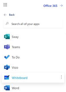
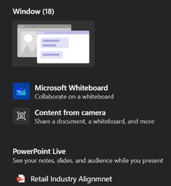
The whole UI has been given an overhaul in line with the latest colourful design ethos, and there are lots of neat new features like the automatic shape recognition for mouse-driven drawing. Hold the Shift key down while you’re drawing with a mouse pointer or a Surface pen, and it’ll straighten lines for you. It’s available in a variety of guises; there’s a web UI (app.whiteboard.microsoft.com) and it shows up in the menu on the top left of Office 365 web applications, such as subscribers would find by going to office.com and signing in with your ID. It’s on iOS and Android, though updates may flow through at different rates to other platforms.
You can pin whiteboards to Teams channels or chats too; just add a Tab, select Whiteboard from the app list, and the content will persist within that context rather than a point-in-time meeting. |
601 – Time and Focus
|
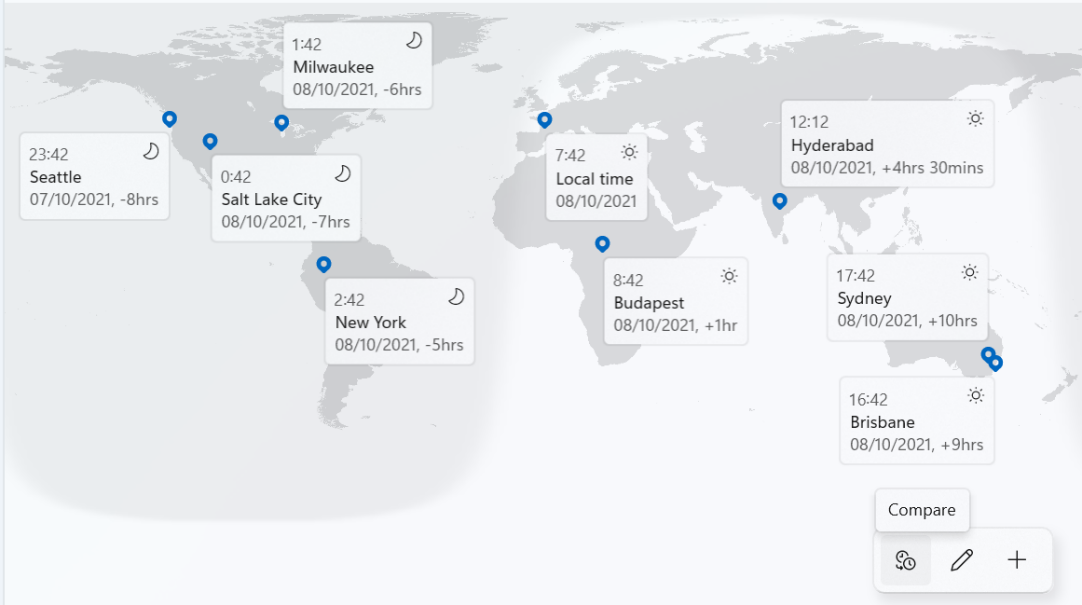
Many Windows 10 users may have escaped knowing about the app known as Alarms & Clock, and the groovy World Clock which shows a map with pinned locations of your choice, detailing the current time in each.
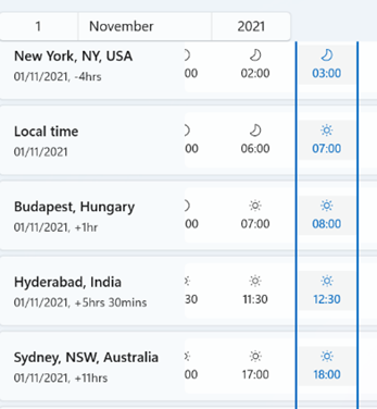
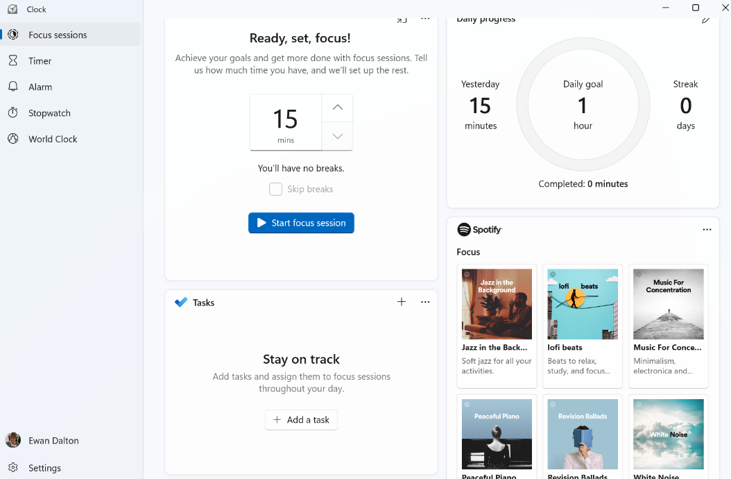
Especially useful when figuring out relativity of time zones and future dates, is the Compare feature which lets you see what the time will be at a chosen point for each of your pinned cities, on a particular date. Take for example, Monday 1st November, when in the space of one month, Sydney has moved two hours further away from London, yet the Atlantic is temporarily one hour shorter. Well, the Clock app, as it’s now known – even though it doesn’t actually feature a clock per se, but let’s not split hairs – has been given a UI polish as part of Windows 11, and one additional new feature pane – Focus Sessions. It was shared with Windows Insiders a couple of months back, but is now mainstream for Windows 11 users. Long-time ToW readers may recall an internal-to-Microsoft app called FocusTime, which let the user run a timer to focus on a given task, while putting Outlook into Offline mode so you didn’t get any new emails, and setting Office Communicator/Lync status to Do Not Disturb so you didn’t get annoying IMs. Well, Focus Sessions in Clock is doing a similar job though without (yet, at least) the integration to Outlook and Teams. As well as tracking the number of Focus Sessions you have, the app can also let you create and pin tasks with Microsoft To-Do to achieve at a later focus time. One slight grind at the moment is that the app only allows you to sign in with a Microsoft Account, not your The Focus Sessions feature is newly released and the team behind it is looking into how to integrate with other tools and services, such as the Focus Assist feature in Windows (which quietens notifications, formerly known as Quiet Hours). If you’d like to see improvements or new features in the Focus Sessions section of the Clock App, make sure you go to the Feedback Hub and either upvote existing suggestions or add your own (instructions here). For some more tips on using Focus Sessions, see here. |
598 – Start me up
|
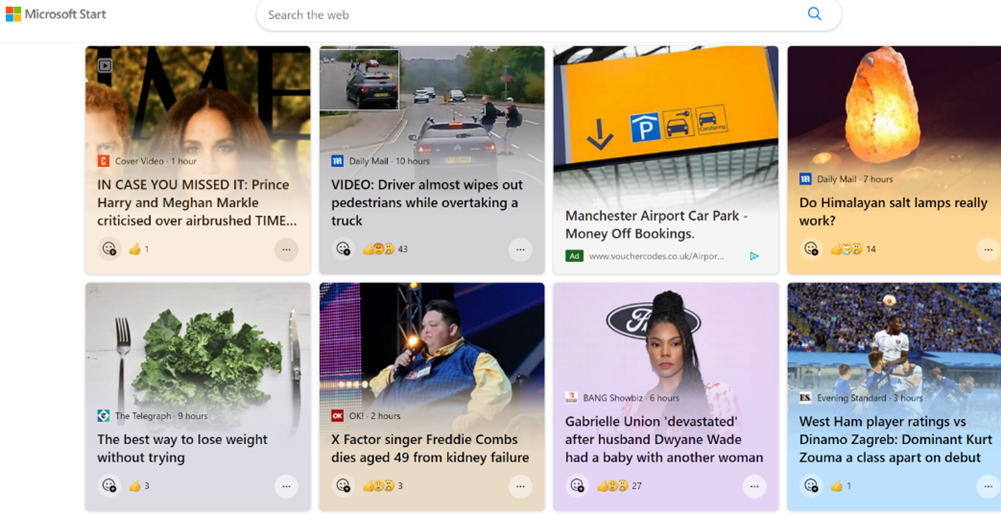
Now, Start is a new thing – a relaunch of Microsoft News.
Users of Windows 11 in preview – due to release soon – can see the widgets for news on their task bar, or any users can go to MicrosoftStart.com. If you feel ` reducing the clickbait and garbaj, you can tune the sources and types of news you’ll receive and save the settings with your Microsoft Account. Apps are available for iOS and Android, on the web, the Windows taskbar / widgets, and on the new tab page on Microsoft Edge (like it or not). One notable absence from the announcement? The Microsoft News app for Windows. Install it while you still can. |
592 – Take Note
|
Another handy use of Notepad is to quickly strip text of formatting; you might find that copying and pasting text from multiple documents often drags unwanted font choice, size, colours etc. In many apps Some people – for whatever self-flagellatory reasons – actually use Notepad for taking notes during meetings or calls, and then maybe format their raw text into something more structured afterwards. ZDNet’s Microsoft commentator Mary Jo Foley is devout Notepad user. The fact that it’s simple and quick appeals to many, it seems.
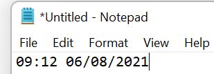
Despite its relative simplicity, there are some obscure features – like the ability to add content to the header and/or footer of a page that’s being printed, even if there’s nowhere to save that Following last week’s F4 tip for Office apps like Excel, ToW reader Flaviu Comanescu-Balla goes one better in highlighting that pressing F5 in Notepad will insert the current date and time, In fact, Flaviu also spotted an even more obscure feature, where if you put .LOG as the first line in a Text file saved from Notepad, every time you open that file, the current date and time is appended at the end, so you can jot something down, save it again and keep a log of activities. |
584 – Office Apps expansion
|
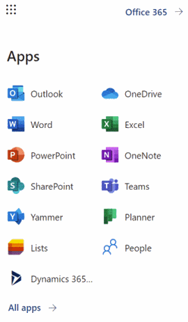
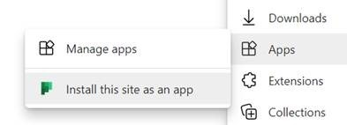
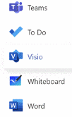
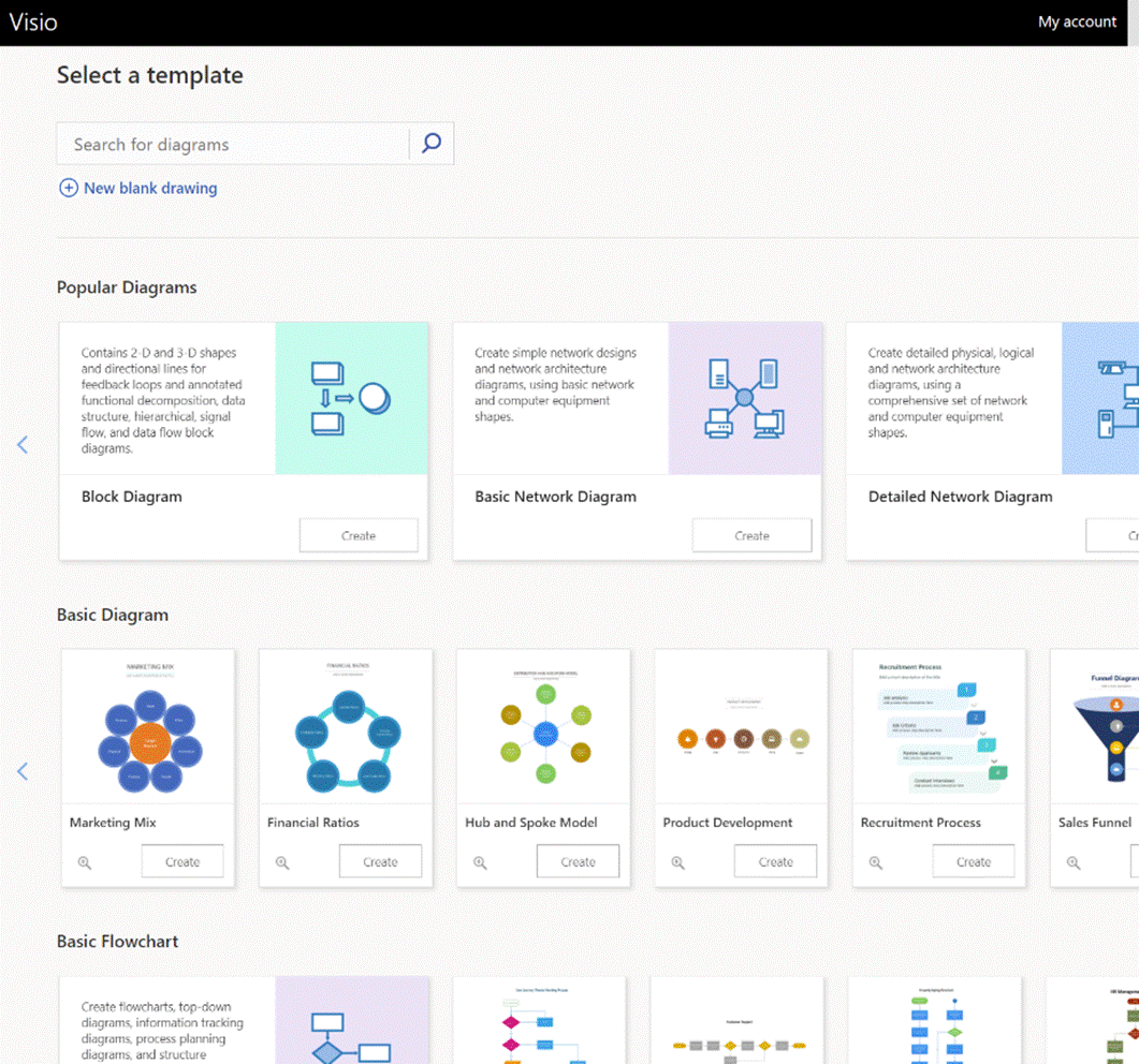
What you’ll see depends on what kind of subscription you have and what previews you might have opted into, as well as what apps may have been published by your subscription’s administrators (eg internal HR website or IT support desk sites could be listed there). To keep things interesting, you can also install most of these web apps as Progressive Web Apps on your PC – using Edge, go to the Settings “…” menu in the top right, and look for the Apps menu option. They will then appear in the Start menu, can be pinned to the Task Bar and run in their own discrete window, just like a “real” program would. One app which could roll back the years for a lot of people is Visio. Microsoft bought the diagramming software company at the turn of the century, for what was the largest acquisition to date – check out the list of other deals and see if you can remember many of those other $100M+ names… Microsoft Visio became a premium addition to the Microsoft Office suite, latterly being sold as an add-on like Project. The software has continued to evolve over the years and has its own band of fans who use it for mind mapping, flowcharting, network diagrams, room layouts and so much more. You can even build Power Automate workflows using Visio (see more here).
If you’d normally turn to PowerPoint to try to create graphical documents like flow diagrams or simple org charts, keep an eye out on the All Apps list to see when Visio makes an appearance, and give it a try. |
580 – Let’s Lens
|
The “Office Lens” app was originally produced for Windows Phone before being ported to iOS and Android. Later, a PC version came along but with the death of Windows Phone it hardly seemed worth keeping going, since scanning docs and business cards etc is so much easier from a handheld device. As a result, Office Lens on the PC is now gone – dispatched at the end of 2020; if you had installed it previously, you could still use some of its functionality, though the smarter online services that sat behind it are no longer available.
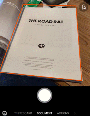
There are tweaks to the algorithms used to detect edges of documents when scanning pages or turning a receipt snapped at an angle into a square-on image. It’s not always perfect, but you can drag the apices to tidy up the process, and save pages as images on their own or multiple pages of a document into a single PDF file, straight to OneDrive or local on the phone.
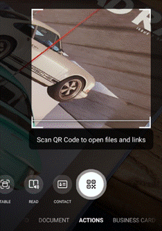
Similarly, barcode reading just brings back the number, whereas some other apps will provide a bit more context – Lightning QR Reader for Android, for example, can read any text encoded in a QR code and will also give some more details for barcodes, like decoding ISBN codes on books to let you search for more info on that specific title. Still, Lens provides a neat & quick solution for scanning or capturing all kinds of info.
|
579 – Archive that email
|
There are tools – some mythical and magical – to reduce volumes of unnecessary emails, and automatic processing via features like the Focused Inbox or Clutter can help to filter out stuff that is getting in the way, but fundamentally the decision on whether to delete, defer, delegate or just leave it lying about, rests with the user. There is still an AutoArchive function in Outlook, but you probably don’t want to use that.
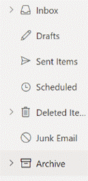
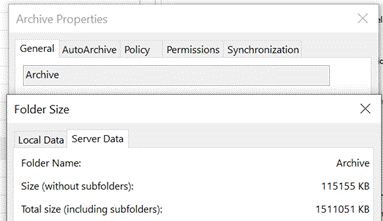
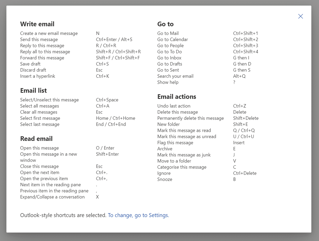
If the Archive option shows up in the web UI (with suitable icon), the folder should also be visible in desktop Outlook in the main folder tree. Just like you have an Inbox, Drafts, Sent Items Check out the Archive folder properties, and you can see its size on your own machine or on the server (assuming that you’re not storing everything in your mailbox within your Outlook cache). To fire an email into the Archive folder from the desktop Outlook client, just press backspace if you’re currently viewing the message in the preview window. The default shortcut key to archive a message in Outlook Web App is E though you can reconfigure the app to use different shortcut schemes, in case you’re more familiar with other web clients. To see the shortcuts in Outlook web app at any time, just press the ? key. |
577 – Wir Fahren auf der Autobahn (virtuell)
|
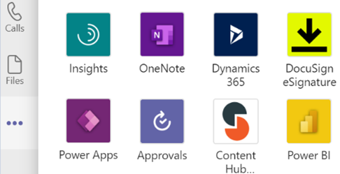
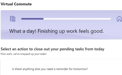
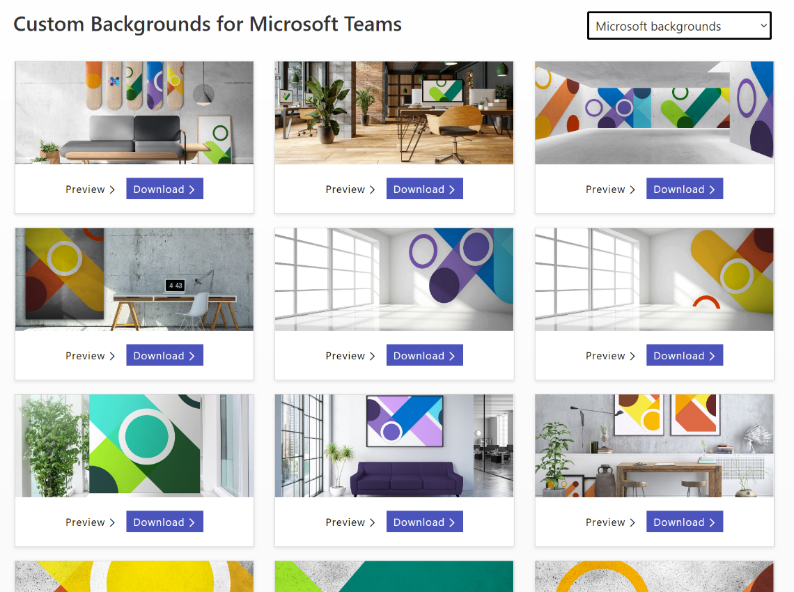
You can jump between the apps in Teams by pressing CTRL+n, where n is the corresponding location on the bar (ie CTRL+1 for the top app, CTRL+2 for next down etc). Open the Insights app to see the first-released Viva application, which has also been recently updated. Viva Insights lets you send praise to colleagues, do some quick & mindful breathing exercises, check on actions you may have mentioned in email (eg “I’ll get back to you on Monday…”) and block out time that’s currently free in your schedule to give you a chance to focus on work you’re supposed to do, rather than meeting with people to talk about it. Newly added, is the Virtual Commute – go to the Protect Time tab, or look in the top-right settings menu “…”, to set up the time to finish your work day. You can now have Teams remind you that it’s time to go home, even if you’re home already. Jared Spataro wrote recently about the need to give yourself breaks between meetings and to transition from “work” to “home” modes. If you’d like to jazz up your Teams background image rather than showing your real backdrop, check out the Viva backgrounds now available in the custom backgrounds gallery for Microsoft Teams. |

