#42: Making Gestures in & out of Windows

clip_image002[6]

Windows, you may or may not know, has a lot of gestures built in. Not the kind that Mr Clarkson observes while driving a flash car, thinking oncoming motorists may be drying their hands, but more useful. Windows 8 pioneered gestures on touch-screen machines, where you’d swipe around the edges of the screen to perform certain tasks.

If you’re unfamiliar with modern-day gestures, they inhabit a number of rooms in the house. They are perhaps less on the critical path to making stuff work than the Win8 things that confused regular end users; gestures these days are there to provide a quicker or snazzier way of doing something for those in the know but if you don’t use them, you don’t know what you’re missing.

Touch

Firstly, there are touch gestures – if you have a touchscreen machine, obvs. These are relatively simple actions you can do on-screen using multiple fingers, which control the way you interact with Windows. You might have them turned off, but they should be on by default – look under Bluetooth & devices in Settings, and under Touch you can switch them on.

clip_image004[6]

If you see the “Touch screen to wake” option, you’re using an up-to-date machine which supports Wake-on-Touch, allowing you to poke the screen with a single digit to wake from standby.

If you have a touch screen, you’re probably familiar with selecting stuff by tapping it or scrolling the screen by dragging it around, but there are other moves you might be less familiar with. What about showing the Notifications Center by dragging one finger – Win8 stylee – from the outside right edge of the screen, or the Widgets by doing the same from the left?

How about using THREE fingers to swipe up, down, left and right?

clip_image006[6]

Pad

If you don’t have a touch screen but do have a laptop with a touchpad, there are loads of gestures you can enable and configure there… somewhat similar to the on-screen versions.

clip_image008[6]

Did you know that tapping two fingers (close to one another – eg two fingers on one hand) on the touchpad has the same effect as right-clicking? See more on Touch gestures for Windows.

Browsing gestures

Finally, even if you don’t have the delights of touch on screen or pad, there are gestures you can set up on Edge for using your mouse while browsing – in fact, they’re possibly best done with an actual, physical mouse rather than faffing about with a touchpad.

To enable, make sure your browser is up to date then check Settings / Appearance and scroll a long way down to Customise browser. Or just search gesture in the settings and look for the enable/configure Mouse Gesture buttons.

clip_image010[6]

Gestures in the browser let you do stuff by holding the right* button on your mouse in combo with an action like swiping the mouse in a direction or using a pattern:

clip_image012[6]

While you hold the right mouse button down and make an appropriate mouse movement, you’ll see it being drawn on the screen with a banner telling you what it means…
clip_image014[6]

If you don’t like the default gestures in Edge, or you’re using Chrome, then you could try a 3rd party gesturing addon: Chrome Web Store – Search Results.

* for a while, Microsoft tried to call the right mouse button – one of the big differentiators between Windows and Mac (whose users could only deal with a single button) – the “secondary mouse button”, in recognition that left-handers who swap the buttons around are not using the actual button on the right. Or right-handed deviants who like using the wrong button.
clip_image016[6]

#41: New ≠ better

Tip o' the Week

Last week’s tip talked about product Roadmaps and the search for new features; this week’s focuses on two evolving applications that readers may have a fondness for or perhaps an aversion to.

As previewed in Tip o’ the Week #678, both Outlook and Teams have been getting some New-ness by having completely re-written applications with the goal of taking the baton from the old one. This model doesn’t always turn out to be successful – see the confusion that was OneNote supposedly transitioning from a classic Windows app to a Store / UWP app, then giving up and moving back. Or the slow-motion car crash that is Sonos’ new app rollout.


As an aside: LinkedIn really doesn’t make it easy to search previous newsletter articles; that’s one reason why these are also published at www.tipoweek.com, providing a nicely tagged way of re-locating stuff that you might have seen before.


Sometimes, the effort that goes into keeping an old application fresh, secure and performing well can be more than just re-writing it from scratch and phasing the old one out. But Better does not always come with New, at least not in the early stages.

One Teams to Rule Them All

Three years before its pandemic-fueled usage explosion, Teams was launched as a kind of amalgam of Skype for Business and the technologically separate and consumer-oriented Skype (which still exists, to some degree). Teams came along with added collaborative stuff that had been brewing for some years, to try to offer an alternative to Slack.

To help the development cycle, and to keep a degree of parity between Windows, Mac and web apps, the original Teams app used a variety of technologies which caused a pretty high memory overhead on Windows. Later acknowledge by Microsoft, the decision was taken to rearchitect completely with the goal of reducing memory usage by half whilst doubling performance.

After releasing “New Teams” in October 2023, that left Microsoft with 3 separate Teams clients – the original, resource hog one, then the New Teams one which did more-or-less the same things, and the inexplicable “Teams for Home” which was a different version that could only use a Microsoft Account to sign in.

Fortunately, Microsoft has updated New Teams (now just “Microsoft Teams”) to fold in the “Teams (free)” / “Teams for Home” functionality, so there’s only really a single version of note. If you still want to make sure all your PC’s memory gets a good workout, the original Teams app is still available as “Teams classic (work or school)”, at least for now. Phew.

The Old Dog and the New Pup

Outlook has a much longer legacy, dating 20 years before Teams and with some of its innards back to the early 1990s and the original Exchange “Capone” client (and Exchange was dubbed “The Big Dog of BackOffice“).

Microsoft has a long-held desire to move away from the old design and architecture, to something more “Modern” and webby. Just as Teams was built using technology that could span different client architectures, the intent is to create a new Outlook family centered around the same Web UX as seen in Outlook Web App.

Having been in preview for a while, the now-released “New Outlook” was being developed to replace Windows’ built-in Mail & Calendar app(s) in the near future, though not to universal approval. Plus ça change and all that.

Some reviewers want to hold on to the Mail & Calendar apps

Building an app which is effectively a web experience but looks like a desktop one, has its own challenges that Microsoft is trying to address before the inevitable full retirement of Old Outlook in favour of the new one.

If you’re an existing Outlook (classic) user, do not be tantalized by the Try the new Outlook option on the top right – press the button only if you’re already prepared for the consequences.

Actually, you can run classic Outlook and New Outlook side by side if you like; selecting the “Try the new…” button just means that trying to start Old Outlook will just bring up the new one instead; if you go through the routine of Trying the new, it will set up your profile and when done, you can switch it off and have both clients set up to connect to the same accounts.

There are some downsides. Web Applications aren’t typically very good at being offline, and email is one of those things that you might like to use when on a plane or even being on a slow network. New Outlook is getting some offline capabilities but don’t expect it to be the same as the old one.

And don’t even think about using local archives, not for a while…

Most users of Teams would see the New version as an improvement, even if it doesn’t match all the functionality of the original. It’s certainly easier when switching around between tenants, such as when you’re working with several different companies. Almost everyone will automatically get the new version in place of the old, with a few diehards holding out before eventually being subsumed.

New Outlook is going to take a bit more time to get used to. There is a feature comparison which gives some idea of the differences; if you don’t get vast amounts of email, then New Outlook is OK. If you have multiple email accounts to deal with, it makes a reasonable fist of showing them in one place rather than needing a separate browser window for each, but then Old Outlook did that too. Somewhat annoyingly, New Outlook can’t combine mailboxes into a single Inbox view, like the mobile Outlook client does, and it won’t let you search across different mailboxes either.

It looks like Old Outlook will still be with us for at least 5 years – maybe it’ll live on while email has not yet been replaced by other messaging apps like WhatsApp and Teams.

#40: Product Roadmaps – over/under promise/deliver?

clip_image002[4]

Since the early days of personal computing, products were always defined and sold to their eager customers on the basis of what features they had, or were going to have. ACME Computers would produce a feature matrix showed its widget program was better than XYZSoft’s similar one because it could start quicker or store more pages or print nicer fonts or whatever seemed important at the time.

Talking about features – or, even better, showing them – would be enough to convince users to open their chequebooks, so before RoI, business value, personas or use cases showed up, the product feature sheet and product demo were all important.

The brilliant Bob Cringely wrote in his seminal tome Accidental Empires of many significant bits of the history of the PC, Mac et al (or Accidental Empires: How the Boys of Silicon Valley Make Their Millions, Battle Foreign Competition, and Still Can’t Get a Date to give its full title). One tale was of a young Bill Gates demonstrating Word for Mac 3.0 somehow navigating a demo of a product so buggy that any number of clicks in the wrong place could have blown the whole thing up.

As well as selling what you have – or are going to have, real soon now – to prospective customers, there’s also a need to show that more stuff is coming down the line. The Product Roadmap shows long-term commitment and vision but also ties you into doing things that people bought your product for, even if they prove harder than you thought or less important because other things have changed.

Does saying you’re going to deliver this feature or that function tie one hand behind your back, but without it, customers could go elsewhere? In the old days, a roadmap or a demo of something that wasn’t really finished was as much a reason to stop people buying a competitor’s product, causing them to wait to see how yours turns out, as it was to get them to commit to buying something today – especially when the thing you’re showing isn’t yet available.

In the 1980s and perhaps later, Microsoft was a well-established peddler of “vaporware” – BillG even received a “Golden Vaporware” award for the years-late arrival of Windows 1.0, though the practice of promising much a long time before delivery had been going on for more than a century before.

When it all goes wrong

Sometimes a company will have scored such a momentous own-goal that its roadmap is more a plan for recovery and survival, than a yellow brick road to a brighter future. One such example is maker of homey WiFi HiFi gear Sonos, who rushed out a whole new software stack so they could launch some new products.

Sadly, the new app was missing a lot of features from the old one, was slow and unreliable and in forcing it out, they shot themselves in both feet and greatly annoyed many of their loyal fans.

clip_image004[4]

Sonos’ CEO later had to apologize and promised to make things better over coming months, surely made harder by recently announcing a 6% staff layoff. Added to the 7% cuts made the year before, whatever the future holds for them might be that bit harder to reach.

Microsoft Roadmap update

Sometimes, a roadmap leads to a cul-de-sac – the product is killed, dies of natural causes or similar. But when it supposedly gets many users, the majority won’t really care what features and functions are being added day-to-day.

Over in Redmond, the roadmap of specific products and features might seem less important (unless they’re selling the products, or others selling products to them), yet quite some effort goes into maintaining roadmaps for the Microsoft 365 offerings. Presumably it’s to keep existing customers informed and happy enough, reminding them what they’re getting for their continued subscription. Or sometimes to provide early signal that certain things are going away, even if only so they can later point to that notice when someone moans about their favourite thing being wiped out.

clip_image006[4]

The Roadmap site has been growing its coverage outside of core M365 products, and there are other sources of roadmap info – Azure, Windows (and info for Insiders), Dynamics & Power Platform and probably more.

In other parts of Microsoft, the moderately-loved Paint 3D – the supposed successor to the venerable MSPaint – has now been given it’s marching orders. Back when the future was in 3D – from the TV in your living room, to the massive goggles on your face, it’s was all about that 3rd dimension until it wasn’t.

#39: OneNote Shortcuts, Favourites and Pins

clip_image002

Regular ToW readers may share in a collective for OneNote – and there have been plenty Tips over the years to celebrate. There are other note-taking apps out there, of course, but if you have invested time and years of notes in one, it’s hard to shift.

OneNote comes in a variety of versions spanning web, mobile, Mac & PC, and you have the ability to organise pages of notes in sections, groups and whole separate Notebooks, should you wish. Notebooks can be shared with other people and could be used to contain stuff that’s specifically for one particular project or role.

Personal vs Work

If using OneNote on the web (which needs you to be online to access it), you could have different browser profiles for work and home, and therefore all your work notebooks would be in one and your home-related ones in another. The PC version of OneNote lets you mix notebooks from different accounts, so you could have them all open in one app – handy for some, though it can lead to lots of notebooks being open and searching right across them can be bothersome (see Classic ToW #646 for help with that).

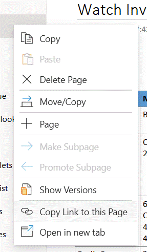
If you keep going back to a few pages for shopping lists or the likes, it’s quite easy to grab a link directly so you can find it again quickly. Go to a section or page in the web version and you can right-click to copy a link to it, forming a simple https:// URL to wherever the source is stored (on OneDrive if you’re using a personal Microsoft Account or in SharePoint if using a M365 login).

clip_image004

Save that URL to wherever makes sense for you and it will launch directly to that page in a new browser upon activation.

Desktop vs Web

If you’re using the PC OneNote app, however, you’d want to have the page open in that app rather than in the browser. In the old days, you could drag a OneNote page to your desktop or some other Explorer folder, and it would create a shortcut to it – but not any more.

If you repeat the above process of right clicking / copying a link when in the app, then paste the resulting link into Notepad or similar, you’ll see there are actually two links – firstly, a https:// formatted URL and a second beginning onenote:https:// and finishing &end.

clip_image006

Select and copy the line(s) beginning onenote: to the end, then you can create a shortcut elsewhere – it’s a bit of a palaver, but…

· right-click on desktop or in your chosen folder,

· choose New > Shortcut and paste the onenote: link in there… hit Next,

· give it a meaningful name and save it

· now you could launch OneNote directly to your chosen page, with a simple tap or double click on that icon.

OneTastic to the rescue

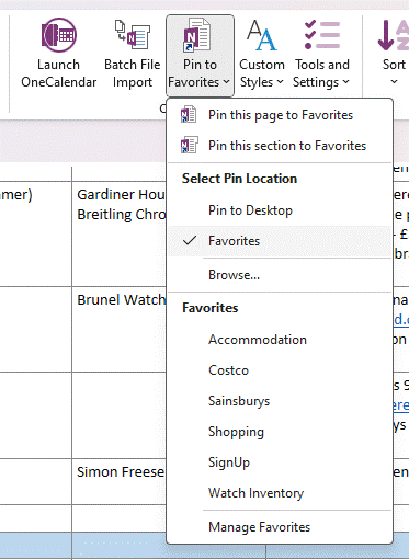
A simpler way is to use the Pin to Favorites (sic) feature in the most excellent addon, OneTastic; this lets you create and pin links to a variety of locations, perhaps most usefully within the “Favorites” section of that menu itself – and to recall a Fav in future, just go to that menu to quickly navigate to several pinned OneNote pages and sections.

clip_image008

The “Favorites” location can be accessed in the file system if you like, too – just press WindowsKey+R to get the Run command up, then enter %appdata%\OneTastic and you’ll find the folder in there.

Pin it on the move

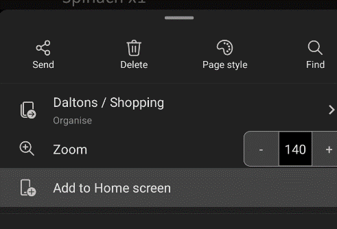
Mobile users have a simpler way, at least Android users do. Within OneNote, select the 3-dot menu on the top right of a page, and you can Add to Home screen; this will try to pin a shortcut to whatever kind of homescreen / launcher you have.

clip_image010

iOS users might need to rely on a Widgety solution instead.

#38: Get ahead: get a proper monitor

clip_image002

As WFH became normalised during the pandemic, a lot of people went from having access to a reasonable working environment in an office, to sitting on the sofa or camping on a kitchen table. A trend of working from a laptop in coffee shops had already been underway and got additional legitimacy when things opened up again.

For the lucky ones with space at home, the increasing trend for WF there sometimes means they have a better environment than in the office – no desk sharing, putting up with co-workers’ smelly/noisy/annoying habits, perhaps even a faster internet connection. This doubtless contributes to the reported reluctance to return to the rat-race in the office.

Make the most of your screen

One huge downside of working off a laptop is that the screen – even for the biggest ones – is small.

There’s little doubt that productivity gains can be had by having larger monitors or more of them. Carnegie Mellon Professor Randy Pausch from gave a seminal talk on time management in 2007 – prescient, since he was dying of pancreatic cancer at the time and had only months left to live (his Last Lecture is also worth watching). In that session, he advised that maximizing screen real estate is one of the best things you can do.

The simplest way to improve screen area for a home office desk is to buy a decent monitor. Find one with adjustable height (so you can be looking straight at it, not down at a laptop screen) and position the laptop in front of you, below the monitor.

clip_image004

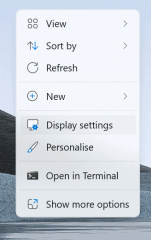
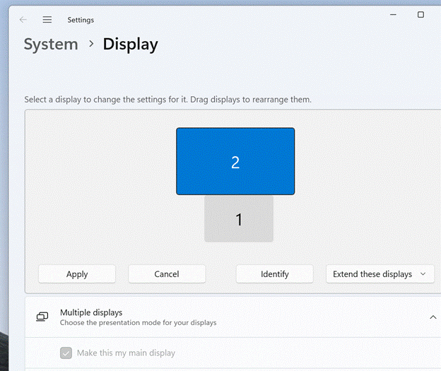
Extend the desktop to the big screen and make that your main display (so new windows, the task bar, Start menu etc will appear there rather than on your laptop).

clip_image006

Side-to-side

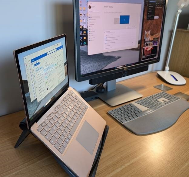
It’d be even better if you can use a proper keyboard and mouse, maybe with a suitable docking station, then park the laptop to the side. Ideally you should prop it up so that its display and your monitor are similar in height – there are plenty laptops stands available, or you could even just put it on a pile of books…

clip_image008

Big screen x little screens

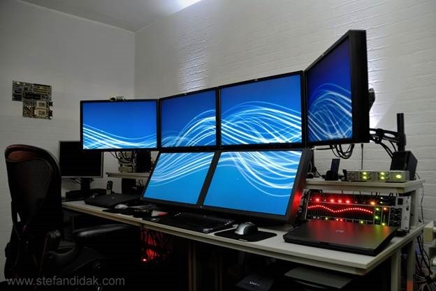
If you’ve had a home office setup for a while, it’s possible you’ll have one or two old monitors that won’t be worth much at resale so you could always bring them into action in a true “multi-monitor” setup (without delving into additional hardware to allow more, Windows 11 supports up to 6 displays).

clip_image010

Then again, a single large monitor might be a bit more feng shui, and there are plenty of good displays out there. A single, widescreen, curved monitor could give you the same kind of functionality as having two side-by regular widescreen ones, with less cabling and fuss.

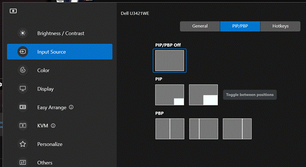
Modern displays often have USB hubs and lots of other features such as display modes where two inputs are shown side-by-side (so you have two different PCs on display, or a PC on one side and an Xbox on the other half, or take two inputs from one PC into one physical screen – the computer would see it as two side-by-side monitors, which might have benefits when it comes to app layouts).

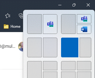
Managing the placement of windows is a lot easier with the groovy window snapping stuff introduced in Windows 11 (hover over the maximize icon on the top right of your window, and you’ll see options for where to snap it onto the screen… it’s more than just left/right since if you have a mahoosive screen, you’ll likely have several windows side-by-side). If you need more control, or you’re running Windows 10, try the Fancy Zones utility as part of PowerToys.

clip_image012

Dell Ultrasharp and Display Manager

Dell have long made some of the best PC monitors; particularly their more expensive Ultrasharp range. If you’re shopping for a new screen, there are various ways to save money too – they have a Dell Advantage program where you can get specific vouchers (eg Microsoft employees can get theirs by entering their work email here), and they have an Outlet store for refurbished goods.

clip_image014

If you have a Dell monitor already, there’s an app for Windows and Mac which could make your life a little better, especially if you routinely switch between inputs / PiP modes etc – the Dell Display Manager. Connect your PC and the monitor with a USB cable, and you can use the software on the PC to control how the monitor works, rather than monkeying around trying to press tiny buttons to drive the On-Screen Display menu. You can even set up shortcut keys to make it easier to dive in.

Tidy.