#20: Choosing Characters

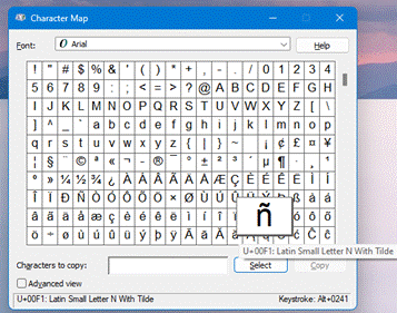
clip_image002Windows still has lots of really old bits that can trace their lineage back to Windows 95 or even before. One such app is “Character Map” – used for picking a specific letter or symbol from the many fonts available, the idea being that you can then paste it into the document you’re working on.

clip_image004

Selecting some of the characters, you’ll see a “Keystroke” comment on the lower right; if you hold the ALT key down and type those numbers on your numeric keypad (only), it’ll insert that character in your document, email or whatever. Or just Select it, click Copy then paste as normal.
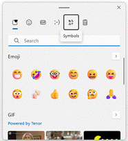
clip_image006There are other ways to choose characters, of course – press WindowsKey + . (ie Win+full-stop) and you’ll get the dialog introduced to make it easy to pick emojis, but which also presents myriad symbols.

Office Apps typically have a “Symbols” item on the Insert menu, which lets you pick the more commonly used ones too. There’s a somewhat obscure Office feature, too, where if you type the corresponding hex number (like 00F1 as in the screenshot above) then press ALT+X, it will convert that code to the requisite symbol. Insert a special symbol through another means, and if you put the cursor after it and press ALT+X, it will replace the symbol to show the code you could use – press ALT+X again and it’ll be back to symbol as before. How obscure.

21st Century Charmap

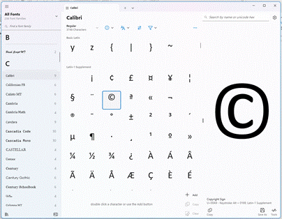
If you fancy a modern looking character chooser which also gives you lots of info about the fonts as well, check out the free 3rd-party Character Map UWP from the Microsoft Store.

clip_image008

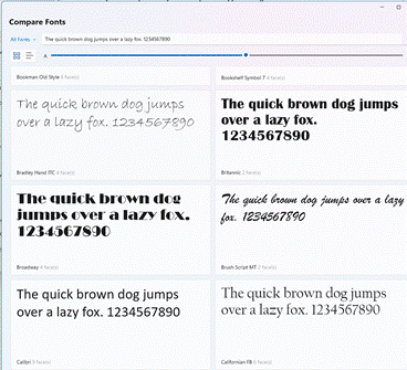
There are lots of other functions, like an easy visual comparison of different fonts – even if the default phrase has a quick brown dog and a lazy fox…

clip_image010

See more on its history on GitHub.

#19: Where have you been?

clip_image002

There are lots of topics that divide people into ‘them’ and ‘us’; politics, religion, fashion, belief in science, PC/Mac, iPhone/Android… just about everything to some extent.

One set of related considerations concern the tendency of Big Tech to track users’ every moves so they can sell advertising and other stuff. Tin-hat wearers will be playing snake on their Nokia 6310 so they don’t have social media companies snooping on them. Ordinary people may passively recognise that using any mobile and a credit card gives away so much about your movements, that they just submit, accept all cookies and don’t really care about trying to be “private”.

If providers give you – the user – enough functionality in exchange for knowing all about you, most people will happily subsume to their free services. If you’re a smartphone user who takes lots of photos and they’re uploaded to the cloud, there’s every likelihood you’ll also be adding GPS coordinates for where the picture was taken, as well as date/time and all the other usual EXIF stuff about the picture, the model of phone and more.

clip_image004Upload those pics to Google Photos (or Apple Photos if you’re an iPhone user) and you can look at all the images you’ve ever taken in a given place, helping you realise both when you visited that place in the past but also giving the easy ability to compare photos over time.

Look at Google Photos in a regular web browser (having signed in with a Google Account) and by clicking Explore, you’ll see your photos grouped by the place they were taken. If you upload photos from a phone or camera which doesn’t have GPS tagging on the pics, you can add location manually.

clip_image006The experience is considerably better using Google apps on a phone, though. Go to the Google Photos app and you’ll see various groupings of photos based on time or on what the has been identified as a “trip to…”, where you’ve clearly taken a cluster of photos in a specific place.

Select the Search option on the lower right, however, and as well as seeing similar place groupings to what you’d get on a PC browser, you can also look at your photos arranged on a map, under the “Your map” heading.

clip_image008Initially, you’ll see a map broadly centred on your current location with splodges of colour which indicate where you’ve taken photos. If you zoom in, you’ll see more specific blobs and a gallery showing only those pictures which feature those particular locations on the map; it’s an incredibly powerful way to look back over the years at how favourite views, landmarks, people or pets might have changed.

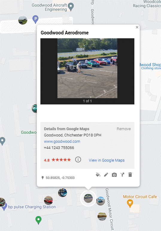
There’s no immediate equivalent of the “Your map” functionality when viewing Photos or Maps in a full-size browser – there is a Timeline view in Maps which shows you places you’ve been (regardless of whether you took photos or not), and there is a “My Maps” feature where you can create your own map view and import all kinds of info, such as a list of location coordinates to make a custom route.

Bing Maps, despite spending years trying to be as good as Google, removed the ability to import and export GPS trails unless you’re a developer embedding a map in your site. Boo.

Anyway, back to Google and My Maps (not Your map, they’re mine):

clip_image010

Custom maps – and the photos associated – can be shared with others too, so if building a route map for guidance, photos of key landmarks can be easily inserted to let people know they’re going in the right direction.

#18: Linking Phones and PCs

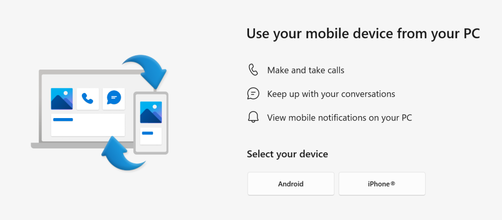
If you’re using a PC with Windows 10 or 11 and you have a smartphone, it’s worth exploring the Microsoft Phone Link app which lets you interact with the handset from your computer.

Microsoft has made several attempts to link phones and PCs, from the Continuum feature at the twilight of Windows Phone’s life (before it was knifed) to a variety of bespoke apps for Samsung devices and ultimately “Your Phone”. The latter has now evolved and expanded to be “Phone Link”. The array of features varies slightly depending on what OS your phone is using, and which manufacturer it originates from.

The app is likely pre-installed on Windows; make sure it’s up to date. It then needs to pair with a companion app called Link to Windows on your phone – either Android or iOS. For step-by-step instructions on how to set it up, see Sync Your Smartphone to Your Windows Computer.

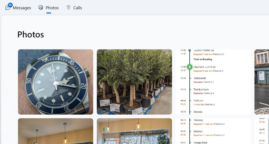
For Android users, arguably the most compelling quick win is being able to easily access Photos without requiring them to have synced to Google Photos or OneDrive first – while the phone is connected to the PC either via Bluetooth or through the same WiFi network, you can interact with the last 2,000 photos on the device’s camera roll, so copying and pasting them into other apps is a snap.

iPhone users will have to use other means to get their hands on pics, at least for now.

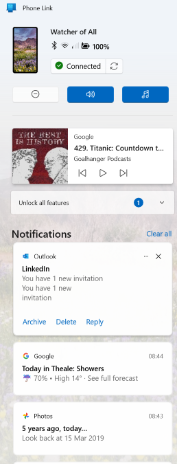
The Phone Link app allows notifications on the device to be seen and managed on PC, which sounds more useful than it really is. It can also set the PC up to use the phone to make and receive calls (think of it like the PC is a smart Bluetooth headset), though some handsets might be a bit flaky. It seems even new phones don’t always provide the right level of support for some features to work well, such as Google nobbling the ability to output to an external display over the USB-C port on Pixel phones (a behaviour which will be fixed, at some point).

Some Android devices will allow you to display and control phone apps on the PC itself (or even mirror the whole phone screen) – which can be very useful, especially if you’re having to input a reasonable amount of text. It’s pretty much always going to be quicker to type on a keyboard than tap on a screen. Other options do abound, though, depending on the apps you use – there’s a native WhatsApp client for the PC, for example, so you could use that rather than relying on Phone Link.

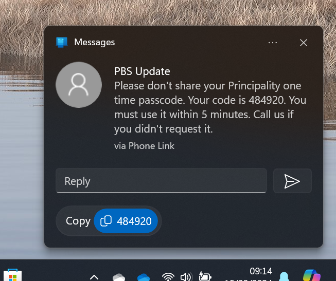
You can use the PC to work with text messages on the phone, even supporting iMessage for Apple devices. Arguably the handiest part is when you get a text message as part of a multi-factor authentication sequence like logging into a bank account. The notification which Phone Link displays includes a “copy” shortcut so you can easily grab the code and paste it into the waiting logon page… even if the phone is on the other side of the room.

#17: Stickier than a sticky thing

clip_image002

When a researcher at 3M accidentally failed to invent the kind of adhesive they were trying to, and instead produced what went onto become the iconic yellow sticky note, no-one could have imagined that more than 50 years later, there would still be a $2.5B market for them.

Even digital note-taking hasn’t quite replaced the scribbled-down utility of a little note by the side of your desk, though IT security boffins would surely wish that users would stop writing their passwords down and sticking them to the side of the screen.

Software developers have, of course, produced many apps which can be used to semi-replicate the quick note-taking capabilities of the paper version, and 3M even sued Microsoft back in 1997 for referencing a similar feature in Office 97 as “post-it”. Oops.

Fortunately, hatchets were buried and 3M even launched a Post-It® app for Teams, though that lasted less than a year and has since “gone away”.

Microsoft produced its own Sticky Notes app (also for iOS devices and Anroid phones, especially if you’re using the Microsoft Launcher) which latterly integrated with OneNote and even back to the old Outlook notes capability.

Windows users might also be excited to learn of the new Sticky experience which was announced a few weeks back – currently available in the preview version of OneNote, but soon to arrive as a fully-fledged replacement of the previous Sticky Notes app.

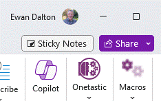
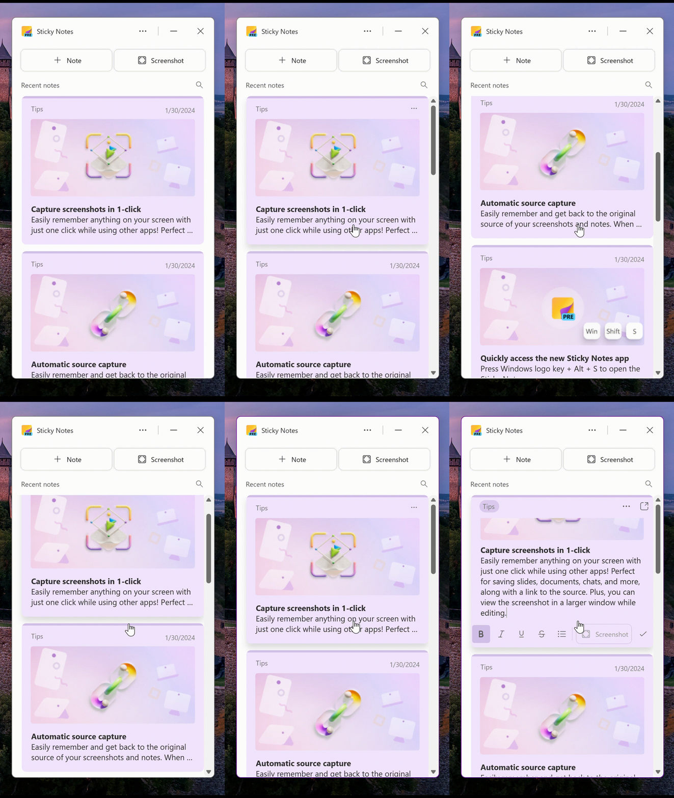
You may see “Sticky Notes” appear next to the Share drop-down at the top right of the OneNote window; click that to open a new window showing your current notes.

clip_image004

There’s an easy way to take screenshots with a single-click though it will grab the entire window so you might need to go and do some after-the-fact editing. In that vein, it appears that the notes are stored in your M365 mailbox – https://www.onenote.com/stickynotes – rather than in the “Quick Notes” section as defined in the OneNote app.

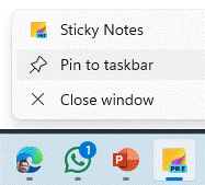
At some point, it may appear as a separate application which will retire the current UWP-based Sticky Notes 6.0 application that’s still listed in the Store. For now, you could launch the new Sticky Notes from within OneNote, then Pin to the taskbar so you can quickly jump to it in future. An alternative is to press WindowsKey+ALT+S, which will start it up.

clip_image007

The app can be docked to the side of the desktop so even with other apps in full-screen mode, you can reference numerous recent notes, and when you create a new note, it will add a link back to the web page or document you were viewing when the note was added.

If you like to get the latest previews of Office apps and services, sign up to Join the Microsoft 365 Insider Program and decide how often you’d like to get updates containing both features and fixes.

#16: All about dat font

Typography and the use of lettersets and fonts was the preserve of (mostly) men working in the printing industry, until the invention of the laser printer alongside DTP and word processing software brought to the masses that ability to have 20 different fonts in all the sizes you like in a single document.

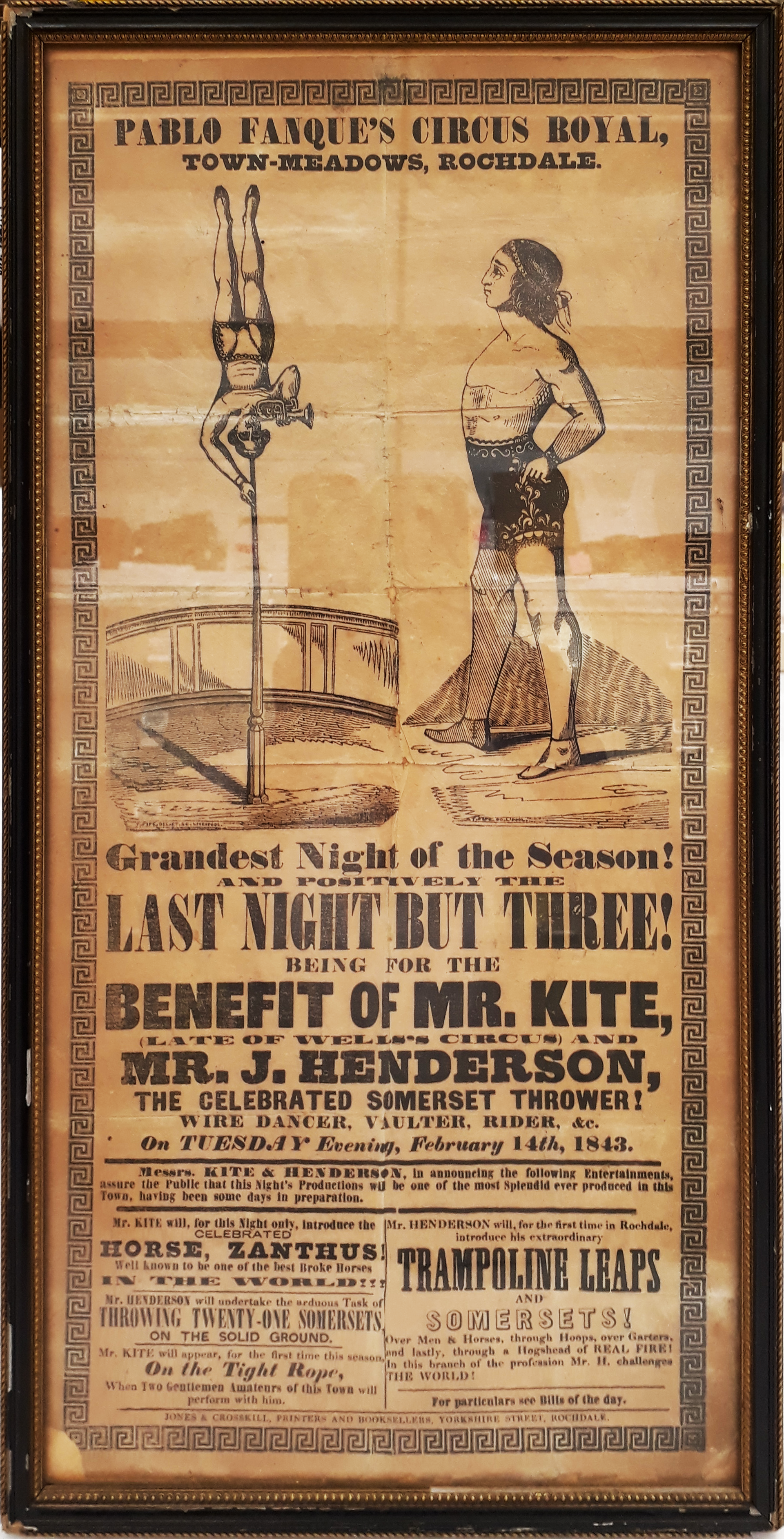
Historically, using lots of fonts, sizes and weights might have been a way of attracting attention – look at the 1843 poster which was the inspiration for John Lennon to write “Being for the Benefit of Mr Kite” as one example …

Mr_Kite_-_Full_Color_Photo (Custom) (1)

… but these days, simplicity and consistency is generally preferred.

For a fascinating diversion into modern history, check out Jock Kinnear and Margaret Calvert’s seminal work on the UK’s motorway signage. Most people wouldn’t give it a second thought, but carefully designing the font and the layout of the signs to be employed in the late 1950s was a central part of the rollout of the new motorway network.

To test how legible signs might be at speed, an assembled group of volunteers sat on a platform at RAF Benson airfield while sample signs were driven past on the roof of a car. The thinking was that if you’re travelling as fast as 60mph, you won’t have time to read the words on a sign, instead relying on their shape – so the consistency of capitalization, the tail of the g and the stem of the h in Birmingham become second nature to the driver.

clip_image004

For more font-related history, check out Simon Garfield’s surprisingly engaging Just My Type.

Back to the present

Typeface trends tend to be a dating mechanism; Times New Roman looks very mid-1990s, whereas cool kids would use a sans serif default like Arial. Microsoft switched to using the newly designed Calibri for Office 2007, moving from a default font whose primary purpose was to look good in print to one which was specifically designed to be readable on screen. Similarly, the Segoe font family took a leading role as the default font for Microsoft logos and in the UI of many apps.

Incidentally, if you want to try a font out to see how it looks in a large block of text, you can enter =lorem(nnn) onto a new line in Word, and it will generate nnn paragraphs of the ‘lorem ipsum’ cod Latin gobbledygook to fill your pages up. Or you could go to Copilot or ChatGPT and ask it to write a 1,000 word essay for you

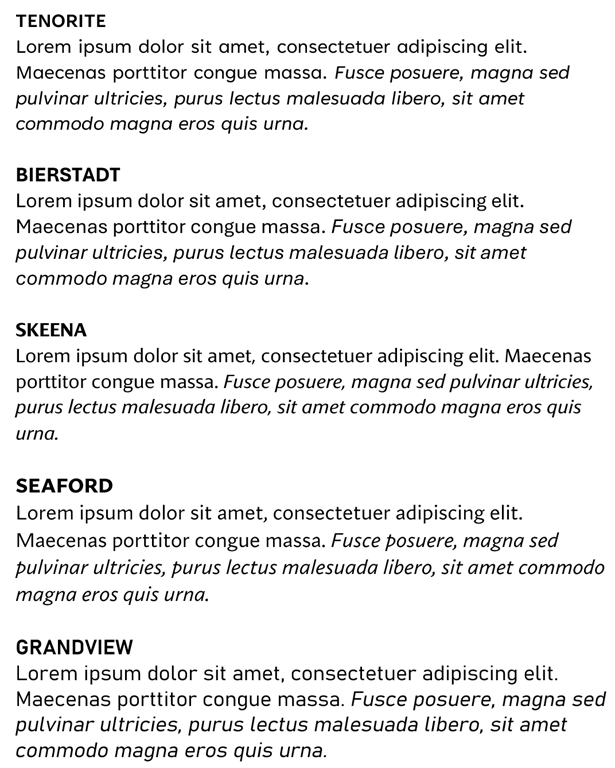
Well, Calibri’s default-ness has been under threat for a few years – Microsoft announced its intent to switch and outlined several new fonts which might be the default. Last year, it announced the decision to switch Calibri to a newly-named font called Aptos, previously known as Bierstadt.

clip_image006

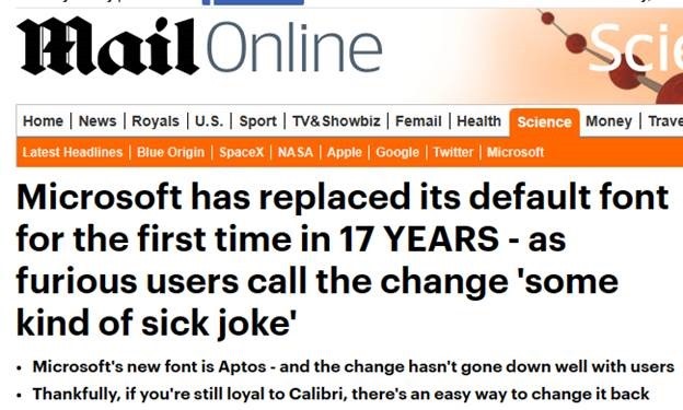
After a period of testing for preview customers, the switch has now been flicked and M365 users will see Aptos as their default. Cue some amusing anthropomorphism of the fonts’ particular characters and histrionic headlines from the usual clickbait foundries.

clip_image008