683 – OneNote Docking

imageSince the OneNote desktop app is getting a reprieve from its previously-announced retirement, and the anointed successor UWP app is itself being put on notice, maybe it’s worth looking at a few tweaks which can make the old app a bit more useful. There were a load of updates announced about a year ago, and further improvements to the OneNote family are on the way too.

If you use OneNote to take meeting notes – especially if you’re meeting virtually and want to have your notes alongside the Teams/Zoom/Chime app – then it makes sense to arrange the windows side by side. Students of ToW past will know that in Windows 11, pressing WindowsKey+ ‎← or → will snap the current window to the sides of your display, and there are other ways to control window placement if you have especially complex desktop arrangements.
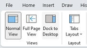
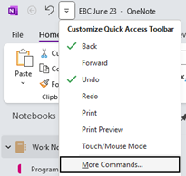
clip_image002clip_image004There is an old feature in OneNote which is worth revisiting; Dock to Desktop. Invoke it at any time by pressing CTRL+ALT+D or go to the View tab to select it.

You could also try pinning it to the Quick Access Toolbar on the very top left of the OneNote window. The QAT in Office apps was covered way back in ToW #321, from March 2016.
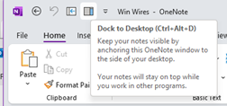
clip_image006Docking has the effect of minimizing the UI for OneNote and sending it to a (horizontally resizable) section of your screen, on right-hand-side.

Usefully, it also means other apps respect that space, so even if you maximize another window, it will only grow to appear alongside your docked OneNote.

clip_image008

If you don’t like the position of the docked window, drag it using the “…” at the top of the pane, and position it on the top, bottom or the left side of the screen instead. If you press CTRL+ALT+D again while docked, it will fill the entire screen – maybe useful if you have a 2nd monitor.

The rest of the minimal UI lets you access the pen menu, restore back to the full UI or you can use a somewhat obscure feature called Linked Notes. This will add a link back to another clip_image010document that you could also be working on; you’ll see an icon showing the source document when you select text that has been linked.
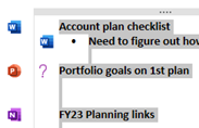
Hover over the icon and you can get a summary or thumbnail of the document, and left-click the icon to open the document.

The original intent with Linked Notes was that you could use it across Office apps and also when browsing the web; how useful to be able to make notes on a specific web page and then jump back to the source when revisiting the notes you took! Sadly, the feature was integrated only to the dearly departed Internet Explorer, and it is not available in modern browsers. The topic of Edge support has been raised in online forums but thus far, responses have been less than forthcoming.

Even the Help page on Linked Notes talks about how it works with Word 2013, PowerPoint 2013 and other OneNote 2013 pages… no mention of Excel either.

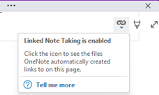
clip_image012If you do find yourself going back in time and using Linked Notes, you’ll see an additional icon (when un-docked and back in full OneNote mode) in the top right of any page where you have links, allowing you to go straight to the source docs or to manage the links themselves.
682 – Lens scanning

clip_image002

Continual advances in the quality of smartphone cameras mean that most people don’t use a physical camera any more; unless you are really demanding when it comes to control over digital imagery, phone cameras are good enough for most people, most of the time.

Compact cameras have evolved too, providing phone-beating snaps through better sensors and lenses than could possibly fit in the body of a handheld communicator. More light hitting a larger sensor through a bigger, higher quality lens gives you a better starting position to get a decent picture, though smartphones have powerful software and – increasingly – cloud services available to help improve the photo after it’s been captured. Higher-end cameras are changing, too – even Hasselblad (famed for moon shots but also for the most famous photo of the world) is ditching the DSLR model and going mirrorless. The horror!

clip_image004Marrying high-resolution imaging with powerful software in the palm of your hand does give you access to new capabilities that a generation ago would be almost unimaginable science fiction.

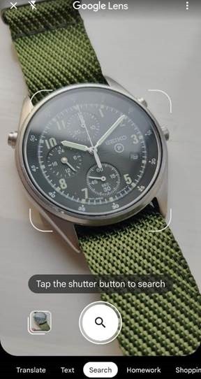
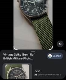
clip_image006Check out Plant Viewer to identify which is weed and which is flower, or Google Lens to capture information from the camera or even just to try to identify whatever you’re pointing it at.

As the world has discovered with ChatGPT and Google’s Bard, responses from AI powered services are not always quite correct, even if they appear convincing.

As any fule kno, this item in question is in fact a Seiko RAF Gen 2 (not a Gen 1), even though Google successfully found one for sale, that looks identical.

Google Lens is available on iPhone and iPad too, and depending on the Camera app you use on Android, it might also be launched clip_image008from there (and most Android devices will launch the Camera app if you double-tap on the power button, so it’s a quick way of getting to Camera, even if the device is locked).

Microsoft Lens is one of the best “Lens” or scanning apps in either mobile store (Fruity | Googly). Formerly “Office Lens”, at one point also available as a Windows app (but now discontinued) and since rebranded somewhat by its listing in the mobile app stores as Microsoft Lens: PDF Scanner, though it can do lots more.

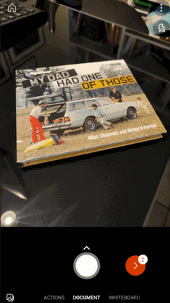
The premise of Microsoft Lens is that clip_image010you can point the camera at something and scan it, by taking a high-resolution photo of the thing and then using the software to manipulate, crop and adjust the image. The most obvious use case is scanning a Document; start the Lens app, lay the doc out as clearly as you can and then step through grabbing each page in turn.

clip_image012The red > icon in the lower right shows how many pages have been captured so far. In earlier versions of the Lens app, you’d try to frame the page at the point of capture but now you just grab the images one-by-one (using the big white button) and do the tidying up later.

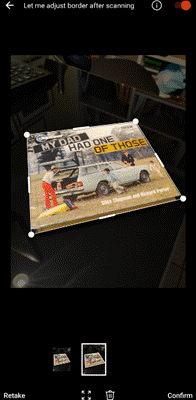
Press that red button and you’ll go to the UI where Lens tries to identify the corners of each page, and lets you tweak them by dragging the points. You could retake that individual image or delete it from the set of captures.

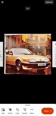
Press the confirm button on the lower right and you’ll jump to a review of the captured images, giving the option of rotating or adjusting each one, cropping, applying filters to brighten and sharpen them and so on. Once you’re happy that you have the best-looking images, tap on Done to save your work.

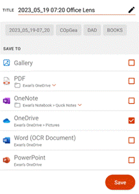
clip_image014You could send all the pictures into a Word or PowerPoint doc, drop them all into OneNote or OneDrive as individual files, or combine all the “pages” into a single PDF and save to your device or to OneDrive.clip_image016

There are other tools on the primary screen of the Lens app, too, if you swipe left to right. The Whiteboard feature lets you grab the contents off the wall and applies a filter to try to flatten the image and make the colours more vibrant.

There’s a Business Card scanner which will use OCR to recognize the text and will drop the image of the card and a standard .VCF contact attachment into OneNote, ready to be added to Outlook or other contact management tool.

The Actions option on the home screen gives access to a set of tools for capturing text and copying it to other applications or reading it out. There’s also a QR code and barcode scanner too.

clip_image018One somewhat hidden feature of Lens could be particularly useful if you’re sitting in a presentation and want to capture the slides for your notes.

clip_image020Start the Lens app, and instead of using the camera to grab the contents and then faff around trimming them, tap the small icon in the bottom left to pick images from your camera roll. This way, you could just snap the slides quickly using the normal camera app and do the assembling and tweaking inside the Lens app, later.

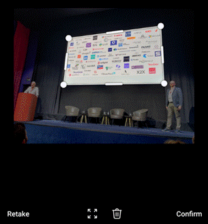
This photo was taken on a 4-year-old Android phone, 3 rows back from the stage at an event using the Camera app with no tweaks or adjustments. It was then opened in Lens, which automatically detected the borders of the screen and extracted just that part of the image into a single, flat picture.

clip_image022That logo on the top right looks familiar…

For more info on Lens, check out the Android and iOS support pages. Oh, and it’s completely free.

681 – AI Push Me Pull You

clip_image002As more AI hoo-hah continues to pour from the hype machine of big tech, some of the puffed-up services are starting to become more accessible. Even if it’s still badged as “preview”, Bing’s AI chat is now more widely available and further functionality will be along soon.

Stepping onto the bandwagon before it fully departs, AI technology behind Google’s Bard chatbot is being embedded into Search, as announced at Google’s I/O conference, whose theme was all about how everything is being re-engineered to embrace generative AI. El Reg has neatly summarized the keynote here if you’re interested to learn more (“We sat through the Chocolate Factory’s PR blitz so you don’t have to”).

Google announced copilot-like functionality for its cloud productivity suite while Microsoft unveiled the M365 Copilot preview that’s been running for a few months, is being extended further.

Not all is rosy in the garden of AI, however. Distinguished scientist Geoffrey Hinton, a Turing Award winner and widely-described as “Godfather of AI”, has walked out of his Googly role amid concerns that AI will become sentient and enslave or kill us all. Interestingly, Hinton did not sign the Elon Musk-backed petition to halt AI development, effectively saying that if those currently working on it were to stop, others would pick up the baton. Microsoft’s chief scientist agrees.

clip_image004Making AI pay for itself is one challenge that will need to be addressed, as the intensive computation required can be very expensive – costs of running ChatGPT are eye-watering, according to OpenAI’s boss, and reckoned by some to be in the region of $700K per day. Still, investors can’t get enough of it and OpenAI is piloting a $20/month ChatGPT Plus subscription.

The expanded M365 Copilot preview is a “paid-for” thing, and Microsoft’s Q3 earnings call did mention that Copilot will be additionally priced over and above whatever Office licenses a customer already has (though some AI related features will show up in E3/E5 licensed environments, such as the new Semantic Index which can be harnessed by Copilot but will be useful for giving more accurate search results even if Copilot is not in use).

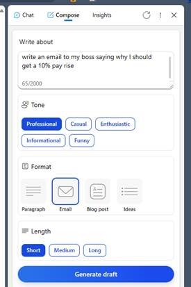
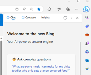
Back in the present, there are some relatively new practical capabilities in both Bing AI and in the Edge browser’s discover feature, as discused in last week’s ToW. The Compose feature in the Sidebar lets you play with generating different types of written content, the kind of thing which will be integral to Copilot in all kinds of Office applications before long.

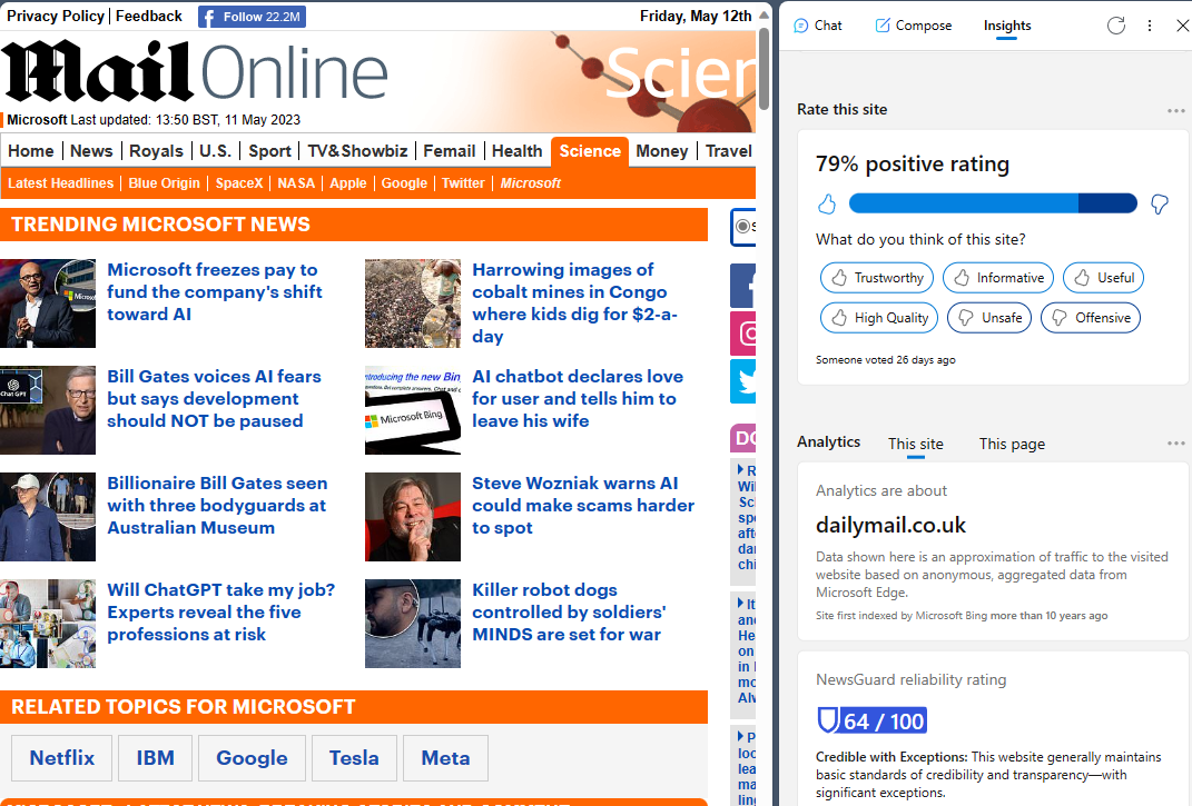
The Insights tab on the same Sidebar gives you more info on the page you’re currently looking at, from a summary of the key points of the page, to some background on where that site is accessed from, how likely it is to be reliable and more.

clip_image005

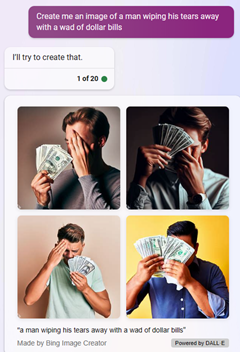
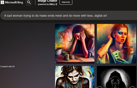
The core Bing AI search in a browser – in case you’re itchy about using Edge or its Bing Sidebar – has some new clip_image007capabilities, especially the integration of Bing Image Creator, which is available clip_image009separately from the AI chat function.

Another one of OpenAI’s groovy tools – Dall-E – generates images based on a text description, and Bing AI chat can feed directly into that.

The image generation capability is now multi-lingual (with over 100 languages supported). It will also soon be possible to upload images to Chat, so you could ask it questions about what’s in the image.

All free for now, but someday soon, we will need to pay the ferryman or the robot overlords will wreak their revenge.

680 – Edgy emails

clip_image001

The Edge browser has seen a lot of change in its life. Originally conceived as a successor to Internet Explorer, with its own modern web rendering engine and lots of additional features which are designed to complement the usage experience, like taking handwritten notes on top of a webpage or building a Reading List of pages or publications to come back to.

Later, the decision was taken to replace the browser with one based on a new core using Chromium, largely for reasons of compatibility and performance, but to carry on building new capability that would differentiate the new Edge browser from others that also use the Chromium rendering engine, including Google Chrome itself.

clip_image003Recent builds of Edge have a Sidebar which includes a load of apps and integrations – the goal being that it can help multitask on the web by sharing complementary information or functionality alongside the page the user is looking at; think a shopping widget that would compare prices of the product on the page you’re viewing, showing where else you could buy that same thing.

A recent update to the Sidebar has been the inclusion of the new Bing search, which adds some very cool relevance capabilities that would allow you to fire the current page content straight at the Bing’s AI engine to summarize, rewrite or explain the contents – selected text, or the entire page you’re visiting.

Here’s an example of a reasonably detailed blog article (from early 2021) summarized into a few key paragraphs:

clip_image004

One of the more useful integrations in the Sidebar is the Outlook app (individual icons on the Sidebar can be enabled and disabled through the settings option; you can also dock other sites which will appear in the sidebar, though not necessarily with the context of the page you’re currently looking at). A recent – and somewhat controversial – change means that when you click a link from an email in desktop Outlook on a PC, it will open in Edge and the Outlook sidebar will be shown alongside, displaying the email that you clicked it from.

Once you’ve got the hang of this feature, it’s actually pretty cool – especially if the email is offering some context about what you’re supposed to be doing on that page, or if it’s a densely-packed missive full of clickbait and other nonsense:

clip_image005

Why is it controversial? Well, the point is that the extra functionality is happening due to the Sidebar in Edge, so clicking a link in Outlook if you’re using a different default browser wouldn’t have the same effect. Outlook, therefore, has decided to send links to Edge even if that’s not your usual browser, to the chagrin of some netizens. Be careful with doing things that annoy some people.

If you’d prefer that Outlook and Windows respected your choice to send all your links to a specific, non-Edge, browser, then it’s fairly easy (if not exactly easily discoverable) to set that. Go to File | Options | Advanced within Outlook, and look for the Link Handling option, and change it to Default Browser. clip_image007This will mean opening the hyperlink in Chrome / Brave / Firefox / whatever, without the Sidebar doing its thing.

More change is on its way to Edge and Bing AI.

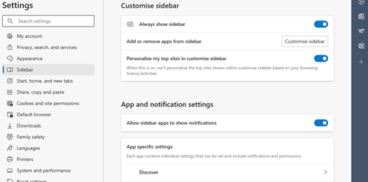
If you like Edge but would rather dispense with the Sidebar altogether, go to the “…” menu on the top right, select Settings | Sidebar and disable the Always show sidebar toggle.

You can use the same clip_image009settings UI to play with other behaviours in the various apps that are pinned to the sidebar, too.

To add or hide apps on the sidebar, just show it, right-click on something and choose Customize sidebar, or use the “Add or remove apps…” feature from the Settings | Sidebar screen.

clip_image011If you’d rather not to have the somewhat prominent Bing icon on the very top right of your Edge screen, look under the Discover section of this Settings UI, and if you flick the switch, the big blue b goes away.