|
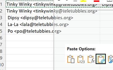
There are simple ways of bulk handling text without resorting to writing a formula – copy all the names from the To: line in an Outlook email, for example: paste into a new spreadsheet and you’ll end up with
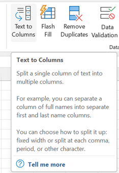
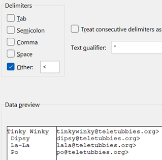
In the example above, we have a “;” separating – or “delimiting” – each address, so
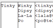
There is some other cleaning up to do with this text, though; the Text-to-Columns function chopped everything at the “;” but there’s a space which follows the semicolon, so all the Display Names after the first one have a leading space. We could repeat the Text-to-Column feature on the selection again, but use a Space as delimiter now –
In cases like this, it’s easier to use a formula to clean things up – the Trim function being a good place to start; it removes both trailing and leading spaces in string, so the name can be fixed up into a new column. Since we know the email address has one errant character – that trailing “>” – left behind from the earlier text-to-column operation, there are a variety of ways to strip it off. There’s the After all this palaver, you might be thinking that some of this
You could use another formula to find and strip out any left-over characters like that, or just manually delete the last “>” off the original line you pasted in. |
Month: April 2022
627 – Sleeping as Edge hits the ton
|
The release number ticked over from 99 to 100 recently, causing a few legacy websites to fall over: when you visit any site, your browser’s User Agent String identifies to the web server what type of client it’s dealing with, including the version number (so the server can modify the page to suit the client, if necessary). In Shades of Y2K, a few sites balked at a browser showing up with a 3-digit number – if you have problems with any, you could make Edge stick to telling sites it’s running v99 – go to edge://flags/#force-major-version-to-minor on the address bar. Mozilla – creators of the Firefox browser which also uses Chromium – tracked known issues in sites and which ones have been fixed. As well as taking whatever goodies come from the evolution of Chromium, the Edge development team can devote more of their time building stuff with a view to making Edge better than other browsers.
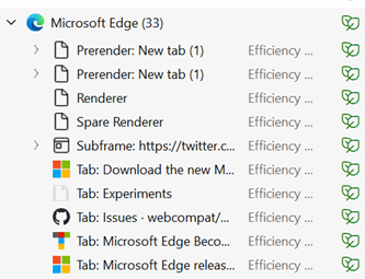
Look in Task Manager (CTRL+SHIFT+ESC) and you’ll likely see lots of entries underneath the Edge application; some are processes in support of the overall app, Extensions and the like, but you’ll also see each Tab appear separately. If you think Edge is running amok, it’s worth looking here to see if some specific site is chewing up CPU and consuming lots of memory.
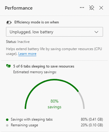
Other updates which came into v100 include some changes to handling of PDF files and some tweaks to policy-based control and other improvements to the way the browser works. The Performance view on sleeping tabs Is rolling out now; if you don’t see it in Settings, then sit tight, or try visiting the Edge Insiders site and install one of the test versions, either Canary (daily updates – not really recommended for the average user), Dev or Beta; pre-release and stable versions of the browser can be run side-by-side so there’s low risk in having both on your machine. For more information on browser evollution, keep an eye on the release notes for the Beta channel and watch the release schedule for when to expect further browser updates. There’s a feature tracker too, to see what’s in development and learn what’s coming, and summary news is regularly shared via the What’s New blog. |
626 – Android Link
|
Microsoft has made great strides in the Satya Nadella era to embrace other ecosystems, from releasing Office apps for iOS to wide support of Android to emulate some of the best bits of Windows Phone.
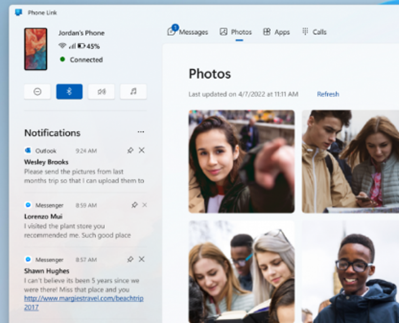
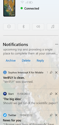
Previously known as Your Phone, this app lets you access a variety of features of your phone from your PC; from reading and sending SMS messages and working with photos easily, to making and taking calls using your PC as a headset to the phone.
There are some things you can’t easily do with Phone Link, though – while it will mirror notifications you receive on the phone, it doesn’t necessarily allow you to interact with the app that generated them (eg a notification from Twitter won’t let you open the Twitter app to view the full thing). It does allow you to clear notifications though, so if you’re the type with loads of unacknowledged notification badges on your phone, this could be a good way to get rid of them. While on the topic of mirroring, it is also possible to use WhatsApp on your PC – so you can type messages and paste photos etc into WhatsApp messages, without dealing with the vagaries of autocorrect on the phone. |
625 – Journaling now and then
|
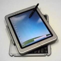
Turning to technology and looking back to relatively near-term history brings up all kinds of product that was ahead of its time or was ultimately overtaken by other developments that nobody saw coming. Sometimes, the perfect blend of genius, timing, execution and luck combines and creates a durable and wildly successful category – like the Smartphone and the plethora of services and apps that were created. Inversely, one of those tech innovations that was just a bit ahead of its time was the Tablet PC; a fully-functional Windows PC that was blessed with a pen and touch screen so you could take notes by hand just like on paper, yet by flipping it around it could be used to run Office apps and all the other stuff you’d need a PC for, 20 years ago.
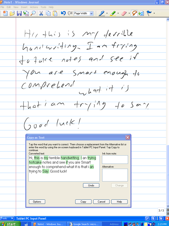
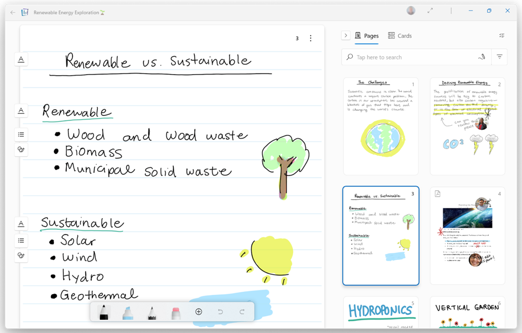
One new app that was built for the Tablet PC to take advantage of its pen, was Windows Journal, a relatively simple yet effective note-taking app, with surprisingly good handwriting recognition built in. To read more from someone who was in the room – figuratively and, at times, literally – around the time of Tablet PC, the Journal software and the Office app originally called Scribbler which went on to become OneNote, check out Steven Sinofsky’s Hardcore Software post. It’s a fairly long but fascinating read. Using pen and paper for taking meeting notes might be less popular now, but many of us will still jot down reminders or lists on Post-it notes, perhaps doodling on paper to help creativity and flow. If you have a pen-capable computer now, the newly released Microsoft Journal app is worth a look. Billed as an app for digital ink enthusiasts, this new Journal presents a modern take on the original Windows Journal idea – an infinitely scrollable canvas for jotting down anything, though with AI capabilities in the app providing quiet yet powerful functionality. Journal started as a research project (from the “Garage”), but has now graduated into a fully-fledged, supported app. Read more about it here.
|
624 – Present in Teams, like a Boss
 Even after 2 years of mostly enforced remote meetings, it’s still amazing how many people have yet to master some of the basics of online meetings – like management of the mute button and general audio interference, positioning of screen/camera so you’re not looking up their nose or side of their face, professing to having bandwidth issues as the reason for not enabling video, and many more. One “room for improvement” function is that of presenting PowerPoint slides and not looking like an idiot. Even after 2 years of mostly enforced remote meetings, it’s still amazing how many people have yet to master some of the basics of online meetings – like management of the mute button and general audio interference, positioning of screen/camera so you’re not looking up their nose or side of their face, professing to having bandwidth issues as the reason for not enabling video, and many more. One “room for improvement” function is that of presenting PowerPoint slides and not looking like an idiot.
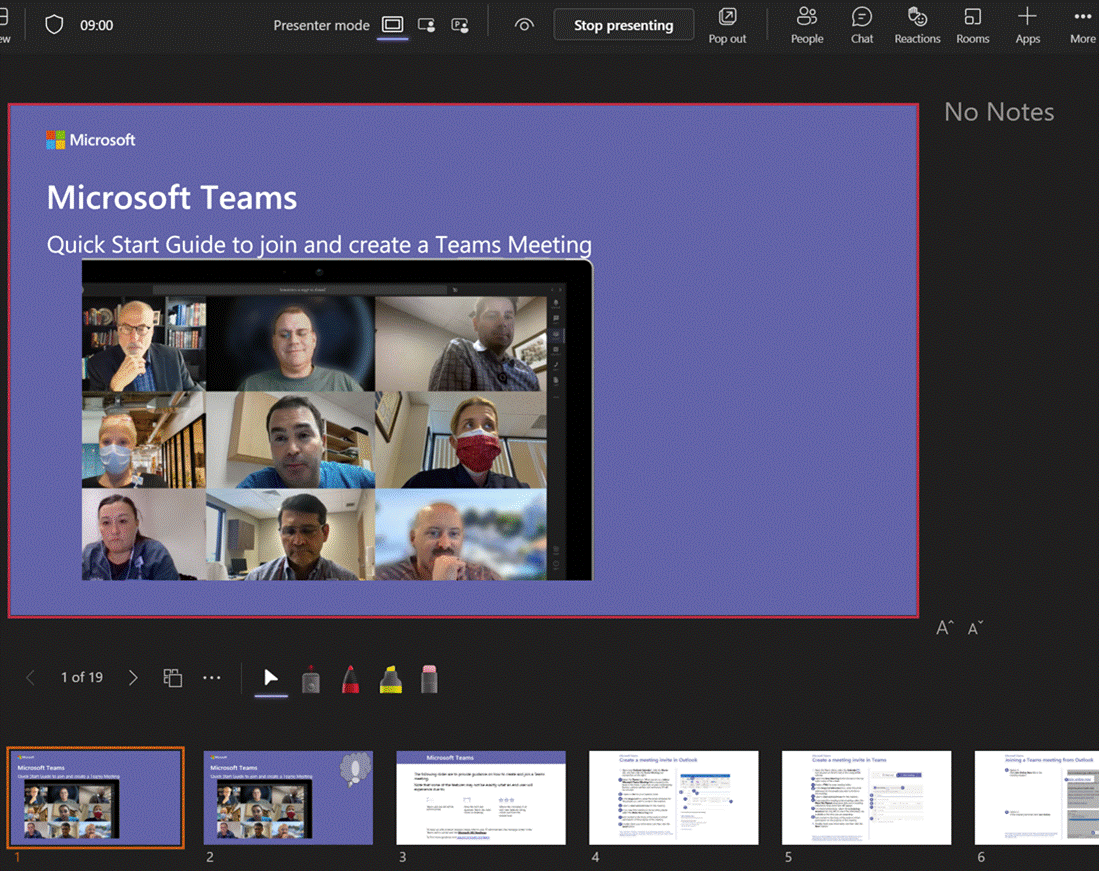
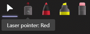
Don’t share your screen to present slides in Power Choosing this opens up a Presenter View akin to the one in PowerPoint, which is the default if you have multiple monitors and you start a Slide Show. This view lets you see Speaker Notes, jump quickly to specific slides rather than paging through them, and be more interactive with the meeting than you could ever be if you were simply sharing a screen showing a PowerPoint slide on your computer.
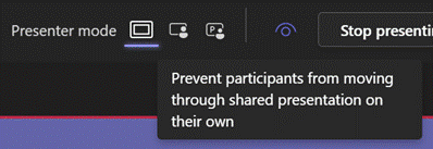
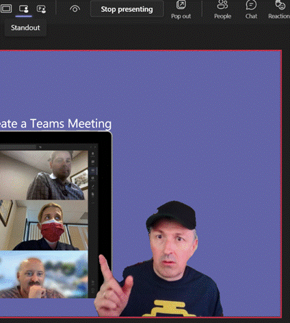
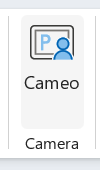
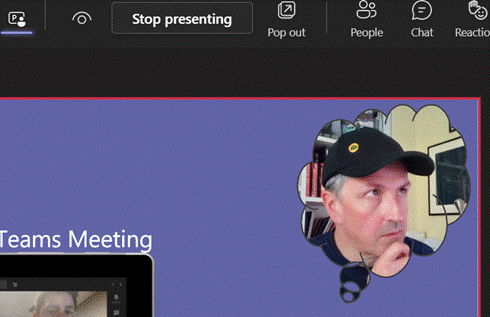
Next to that icon, there are some others which define the presenter mode – Content Only on the left, shows just the slide you want. Next to that is Standout, which takes your video and overlays it onto the slide rather than having it appear as one of the surrounding gallery A downside of the Standout mode is that you don’t get to control where your image goes on screen, or how big it is – so you might well obliterate some part of the content you’re presenting. This new feature gives you a way to solve that. In PowerPoint, go to the Insert tab and on each slide add a Cameo (or a Camera as the object it creates is described in some controls), then place and size it as you want. If you select the new object, the Camera tab will give you more customization options.
You will need to add a Cameo to every slide you want to show up on – potentially useful if you want to only appear for intros and Q&A but perhaps leave the content on its own for other parts.
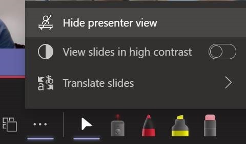
Using Pop Out might help if you have a larger second screen connected, though chances are you’ll be using the camera on a laptop so ideally want to be looking at that display. Since nobody really uses Speaker Notes anyway, you could try Hide presenter view, which means you’ll lose the slide thumbnails and speaker notes, but still keep the other controls. Go to the View control on the top left of the window and choose Full Screen to increase it even more. For more details on using the new Cameo feature, see here – it is in preview which is rolling out through Office Insiders first so you may not see it right away. If you are presenting using simple app or desktop sharing rather than the PowerPoint Live model described above, there are some other options in how you appear alongside your content. As well as launching the PowerPoint Live sharing from within PPT itself, you can choose to share recent presentations while in Teams – just scroll down past the various “share screen / app” options and you’ll see more. This topic was covered previously on ToW #576. |


