|
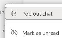
It’s also a familiar word used in annoying UX concepts like a pop-up in your browser, or a toast on your desktop. Applications often put out toolbars or separate content in side windows, to help users make the most of their functionality: especially handy when the user has more than one display. In its evolution over the past couple of years of explosive user growth (270M MAU!), Microsoft Teams has started to move away from the one-window-to-rule-them-all idea of having all your chats, activities, documents etc in one place, and started offering to pop things out into their own window. If you’re in a meeting and want to have a side channel going on with a subset of participants, just start a multi-party chat, then
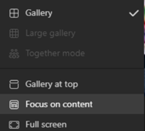
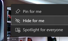
You could therefore dismiss all the other sidebars – like chat, or participants list – make the gallery go away, focus on presented content in full screen and hide your own preview – all in the name of being able to see what someone else is sharing.
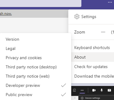
Once the preview-enabling policy has been applied by Admin, then individual users will have the option (from the … / About menu) to enrol their machine in the preview; after doing so, signing out & in again, and a “Check for updates” cycle should see them have the latest available preview version. The holy grail for popping out in Teams meetings would be the ability to separate the content being shared so you could have that on one screen, and see a large video gallery of attendees, with chat sidebars etc on another. In the meantime, keep an eye on what’s new in the main branch of Teams, by looking on the Teams blog. |
Month: February 2022
618 – Listing
|
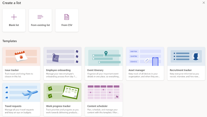
A while back, Microsoft released a new app for Microsoft 365 users called Lists, which was essentially a front-end to SharePoint, itself a staple of the Office 365/Microsoft 365 offering since the beginning, and providing much more functionality than simply a place to stuff documents. The original SharePoint Portal Server 2001 (codenamed “Tahoe”) is nearly old enough to buy itself a beer in its homeland, and relatively advanced logic and custom data validation & handling has been a major part of its appeal for a lot of that time.
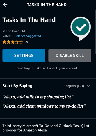
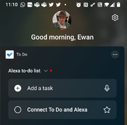
Recently, the Lists experience was made available – in preview – for non-M365 users who could sign in with their Microsoft Account. A “lightweight” version of the app, it’s still pretty functional and pitched at individuals, families or small businesses who need to keep lists of things. Taking a slightly different tack, the To Do application is a good way of making other sorts of lists – that could be Tasks or flagged emails as well as simple tick-lists to mark off what needs to be done. In something of an overlap with Lists, To Do can share its lists with other people – think of To Do as primarily for personal use that you might share, whereas Lists is for managing shared endeavours first and foremost.
|
617 – OneNote online & off
|
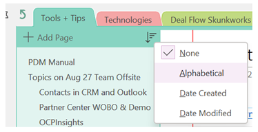
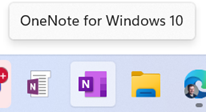
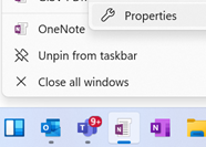
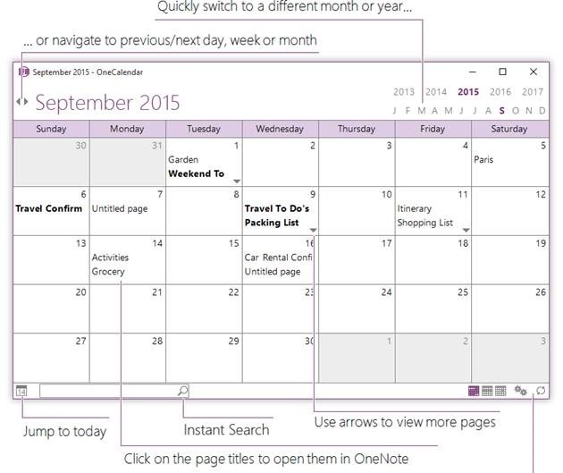
The plan was to ditch the original Office app version in favour of the shiny new world of the cleaner but substantially less functional Modern app, but that decision was later unwound and instead the better bits of the Store version (still called OneNote for Windows 10) will migrate to the desktop app during 2022 or thereabouts. While the OneNote offerings continue to evolve ahead of the quickening, we’re se It is possible to use both clients at the same time – perhaps partition work stuff in the more capable OneNote for desktop, and then keep your home notebooks in the store version. Doing so makes it easy when searching, so you don’t end up with shopping list items mixed up with your Try pinning the desktop icon to your Taskbar and right-click on the icon; on the pop-up menu, right-click on the OneNote label, choose Properties and then click the Change Icon button to select a different one. The web UI has evolved considerably too – go to onenote.com and sign-in with either your Microsoft Account, for your own personal notebooks, or your work/school M365 account, for the content associated with your job or school. The same web application is also the view that you see when accessing OneNote from within Teams. The recently improved web client includes some new capabilities like having a Read Only / Edit mode, akin to other Office web apps, as well as some improvements in handling embedded content, inking and more. There’s a short video showing the new capabilities in both desktop and online versions. If you’re a fan of desktop OneNote, make sure you get OneTastic, a suite of addins and macros to make OneNote more productive. Some of the macros plug gaps in OneNote functionality that have somewhat been filled – like sorting pages – but there are still many useful ones, like creating a table of contents for a large notebook. OneTastic also includes OneCalendar, which shows you all the pages – across any of your notebooks – which you have edited, on a calendar view. It sounds simple, but try it out and you’ll realise how useful it is to find notes based on the day you took them…
|
616 – Feature Power
|
The path to how new features for Windows 11 will be rolled out is changing a little too. Having previously said that there would be only one Feature Update each year, rather than the spring/fall update cadence that has been with Windows 10 for some time, there are going to be intermediate feature experience packs which will deliver some updates, like the forthcoming Android subsystem which will allow Windows 11 users to install and run a subset of Android apps and games on their PC.
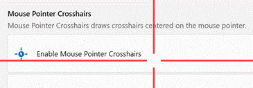
If you want some groovy new features for your PC without grubbing around in the command line or waiting for a future update to arrive, do check out the recently-refreshed PowerToys package. The tl;dr history is that PowerToys started as a collection of side projects built during the Windows 95 days, shipped as freebies for power users to play with. The name was dusted down a couple of years ago to collect up similar skunkworks projects for Windows 10 (and now, 11), and has been updated fairly regularly – though the release version is still way off v1.0. The New PowerToys comprises a collection of addons which will Of particular interest (and most recent) are utilities to do with your mouse – how many times have you tried to find the location of your pointer (especially if you have multiple screens) by waggling the mouse or tickling the trackpad? Press CTRL key twice to Find My Mouse and the screens go dark, except for a spotlight that shines on the current pointer location. There’s a Mouse Highlighter which – when activated via a configurable shortcut key – leaves a little short-lived blob on-screen where you clicked the mouse; great if you’re recording a training video or doing a demonstration.
The PowerToys use a lot of different shortcut keys – some configurable – and also have a handy Shortcut Key guide, which displays common Windows shortcuts; none of those used by the PowerToys themselves, though. |

