Anyone who has worked in IT for long enough will likely have seen cases where unwitting users are wielding completely the wrong utility or application to get stuff done. Perhaps the entire company finance system is running on an old Access database, or the accountants were using a spreadsheet for holding something other than numbers? It’s one thing having lots of tools, but knowing which one to use when is sometimes a lost art.
Sometimes, organizational culture is to blame – if all you have is a hammer, everything looks like a nail (as how Microsoft leaders once felt about Oracle’s Larry Ellison saying that “database” was the answer to every question). Some companies use email for everything, others have moved all their internal comms to Teams or Slack, and occasionally use email only for customers.
The advent of Electronic Forms
One early measure of effectiveness of newly-installed IT systems, was the inefficiencies it managed to replace – and reducing paper forms was one often paraded benefit. Literally cutting red tape, not only speeding everything up and reducing wasted paper, moving to electronic forms was and is an easy case to make. Nowadays, you’d use a web form onto some kind of cloudy data store without even thinking about it, but it wasn’t always so simple.
In the late 1990s, forms were a key component of “Groupware”, with Lotus Notes being the early market leader (and which spurred Microsoft into competitive action in trying to build an alternative).
Microsoft had a separate E-Forms product as far back as the early 1990s, running on top of the old MSMail system, later being migrated into Exchange. The idea was that companies could easily make forms to send around in email, capturing data fields and making smart routing and workflow decisions along the way. It’s safe to say, they never really took off…
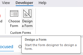
Outlook picked up forms duty (see here, in the cutting edge “Developing a workflow application” Exchange 5.5 whitepaper). There are still vestiges of Forms Designer in Outlook today (if you’re on Outlook (classic) rather than the upstart New Outlook, that is).
Forms in the 2020s
It’s so easy to use forms now – quickly building a web front end to a set of data is par for the course with Google Forms and Microsoft Forms, to name just two examples. Both are available in free versions (using a consumer Gmail/Outlook type login) or are part of corporate packages which bring extra functions and access to other data.
It is easy to create a form with some simple validation, and then collect responses from people – anonymously or (if they’re in your organization) capturing the logged-in username of the person who submitted it. Results are easily summarized and viewed with charts, word cloudswordclouds and the like.
Each form is basically a series of questions, with different types used to validate data – like getting a rating, picking a date, choosing from set options or even entering specific types of text or numbers.
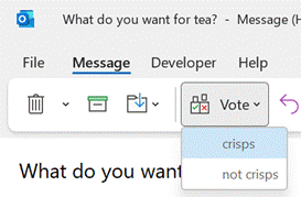
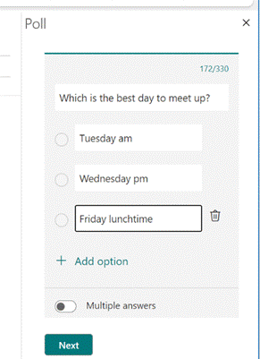
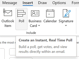
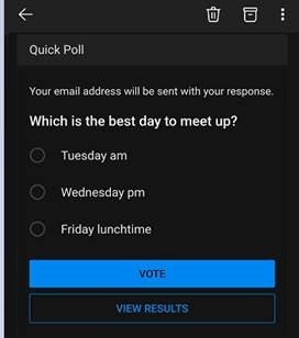
There are lots of scenarios where a simple form could take the place of sending an email – like registering for an event and collecting dietary requirements, or asking a group of people for a time and place that works best to meet; instead of trying to juggle lots of responses, a form could be the ideal way to present options and get their selections.
For meeting arranging scenarios there are numerous ways of trying to make this simpler – from websites like Doodle, the various Calendly/Bookings options for 1:1 meetings, or the former add-in utility FindTime for finding group availability in Outlook, which has now been replaced with a built-in Scheduling poll feature.
2020s meet 2000s
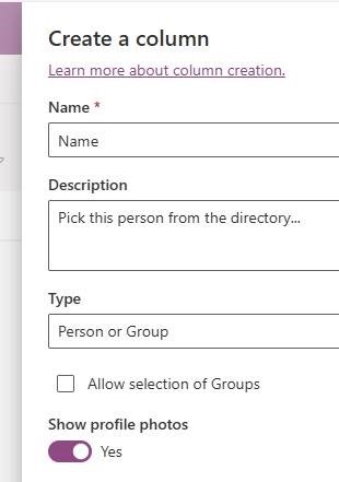
There are some things which should be easy, using Microsoft Forms, that are just not. Even though Forms can be run inside a M365 organization’s own tenant, and therefore we know who everyone is as they’ve already signed in, there’s no way of adding a “Person” to a form, such that they could be picked from the directory.
To do that needs to revert to an altogether older form technology – the SharePoint List. Originating from 2001, SharePoint really hit its stride by 2007, offering lots of web-based collaboration functionality that almost equalled what Lotus was doing a decade earlier. Microsoft did have another forms/data toolset, InfoPath, with SharePoint integrations – but that’s gone away now, not replaced with any single thing. We don’t really talk about InfoPath any more.
Using SharePoint and withWith a bit of nous, you cancould quickly build a detailed list – think of it like a simple database – and generate a form with data validation, branching logic and so on.
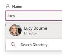
But a much easier way is to look at the newer Lists web app, which combines simple forms stuff with a SharePoint based back-end, meaning there’s more integration with M365, including directory integration …
… which looks a lot better than having to type someone’s name in.
Lists is part of M365 (look in the app grid on the top left if you go to Office.com and sign in, then peek under the More Apps section). )
In true Microsoft fashion, there are many ways to skin this feline – there’s also Loop, which could be used to do all kinds of groovy things in browsers, Teams, Outlook and more. Oh, and PowerApps. Mash all these tools together and you can build a spidery app legacy to keep your successors entertained for years.


