679 – Wordlament

clip_image002

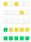
Even if you weren’t taken with the viral word puzzle game Wordle, you’ve probably seen the coloured grid that people would share on social media. Sometimes bragging on how lucky smart they were in getting the answer in a couple of goes, or complaining that it was too hard and that they missed out.

It also gives whingeing poms a new thing to complain about on Facebook groups, every time the Wordle answer is a 5-letter American spelling like FAVOR or LITER.

If you’re still playing Wordle each morning, you might have happened across the numerous other -dle games out there, like Quordle (same idea as Wordle but you 9 goes instead of 6, but need to solve 4 squares), Octordle (like Quordle but x8), Kilordle (x1000 – it’s getting silly). Lots of other “guessing things” online games jumped on the bandwagon, too – there’s Heardle (play it while you can – it’s shutting down on 5 May), Worldle, Cardle and, missing out on the ‘-dle’ suffix, Framed. Who needs to be productive anyway?

Wasting time while keeping your brain occupied is a time-honoured tradition, with crossword puzzles featuring in newspapers for over a century. One of the best word puzzle games to appear on mobile phones, originally launching in 2012, was Wordament. Published from a skunkworks project where two guys built it in their spare time (before moving on to be part of Minecraft), it has gone through several evolutions since, and is now available as a Windows app (in the Store, here), on mobile (Googly | Fruity) and it’s also playable in a browser.

clip_image004

In each of these settings, you do need to suffer some pretty intrusive advertising unless you want to pay a few £ a month (or £10 a year) to make them go away.
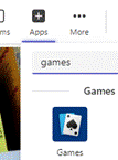
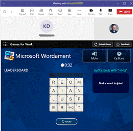
clip_image006If you want to maximise your time-wasting, you can even play Wordament – and other “Games for Work” – within a Teams meeting.

There are other fun games to play during Teams meetings, too – the familiar “Bingo” being one that could be enjoyed by only those participants “in the know”.
678 – New Old Things again

clip_image001

In ToW 632 – New Old Things, the topic of the old version of OneNote getting some spiffy new features was raised. This week carries on the same theme in a different direction – some altogether new versions of old applications, which might be worth taking a look at, even if they’re not quite fully featured yet.

In the beginning there was Skype. Well, actually, before that there was MSN Messenger and its variants. Business environments then got Live Communications Server, Office Communications Server, eventually Lync, and finally the confusingly branded Skype for Business.

Teams came along from the left field around 6 years ago and from a real-time collaboration product point of view, swept all before it (at least in Microsoft), eventually replacing Skype for Business, as the pandemic turbocharged its adoption and appeal. Skype is still with us, with reasonably recent releases and even integration of the new Bing and GPT driven AI.

The thing is, the original Teams client grew up pretty quickly and though it has had lots of improvements, it’s never been especially resource-light, or quick. The Teams team (herein lies one challenge with its name) took the decision to start over and build a new Teams client, shiny and slick and running like greased clip_image003lightning.

If you feel like giving it a try, you may see a Try new Teams slider on the top left of the main Teams client window; clicking that will restart Teams by closing the old app and starting the clip_image005new. There are some features not quite there yet, but the list is being updated frequently as functionality improves. If you switch to the new Teams preview and don’t like it, you can quickly switch back – but you’re either/or running one or the other.

Outlook has a longer heritage – it came out first with Office 97 so has its roots in early/mid-90s code, and even if the core of the app has been re-engineered and the UX has had numerous polishes over the years, there are still occasional peeks at a Windows 95 era application lurking beneath.

There has been a push for some time to make the Outlook Web client a more viable alternative for many users, including showing Outlook Web in an Edge sidebar even when clicking a link from the PC desktop client. Functionality differs between the full-fat desktop, the web client and the various mobile apps.

There’s a “new Outlook” on the way, now too – previously codenamed “project Monarch” it’s supposedly been in the works for years, yet looks a lot like the web client that happens to run in a window – it’s available in preview now. It may end up replacing the variety of desktop, web and mobile apps, though that could take a while. In near terms, the new Outlook will likely supplant the default Mail & Calendar apps in Windows 11.

clip_image007You may see a Try the new Outlook slider on the top right of the main Outlook window; flicking that will restart Outlook in its new guise, however unlike the new Teams, it is possible to run both new and old, side-by-side.

clip_image009One way would be to make the switch, then on the new “Outlook PRE” icon that appears on the taskbar, choose to Pin it. Then flick clip_image011back and you’ll now have both old and new Outlooks available together. You could configure the New one to remove your main M365 email account, and just have your Outlook.com / Hotmail or now even a Gmail account, while leaving all your work emails in the old Outlook UX.

If you want to keep old and new Outlook with different account setups – business in the old, private in the new, for example – go straight to the Store and install the New Outlook app, then configure it as you like when it starts.

677 – LinkedIn’s Blue Tick

clip_image002

The world’s fascination with what’s happening at Twitter and its charismatic leader (but not necessarily its CEO?) appears to remain high. One headline making topic was what to do with the “verified” blue tick service, previously offered to high-profile individuals but now turned into a monetization strategy. The full hour-long BBC interview with Elon is certainly worth watching.

clip_image004In related but somewhat less controversial news, LinkedIn has just launched a verification feature which lets a user validate that they are who they say they are, and best of all, it’s free.

There’s no obvious verification badge akin to the blue tick quite yet, though you may see some other info about people when you see their profile picture – a green blob means they’re online, a green hollowed-out blob means they’re not active but they will see messages on their phone. If you don’t like to show the green blob/circle, you can always switch it off, so no visible blob means someone else is either offline completely or just going incognito.

Verification is rolling out gradually but will eventually be available to everyone, either by validating their corporate email address, by using the Microsoft Entra verification service (if your company subscribes to Azure Active Directory, that will be an option soon), or by validating your ID using the CLEAR program favoured by smug airport travellers.

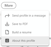
clip_image006Work email verification is probably the easiest for most people to use – sign in to LinkedIn.com and click the Me option on the toolbar at the top right and then View Profile to look at your own profile page. Now, click the More button and select About this profile – that will show you what verification options are open to you. Email verification just means entering your company email address, then clicking the link that is emailed to you. Once that’s done, return to the About this profile section and you’ll see that your account has been verified.

Visitors to your profile page wil see a prominent banner showing that you have been verified, and giving some details of how (without giving away the actual email address or details of Government ID etc). The Show verifications option gives some info about the means and timing of the verification.

clip_image008LinkedIn says it might change the way verification is displayed on your profile, in due course; maybe the plan is to make it more visible in search results too. Time will tell.

676 – Calendar spring cleaning

clip_image002

As spring continues to emerge from its wintry slumber in the northern hemisphere, it could be worth spending a little time tidying up your Outlook calendar as well as spring cleaning your nest. The following applies to Outlook on the PC, though similar colour-coding concepts exist for Outlook Web App and on other platforms.

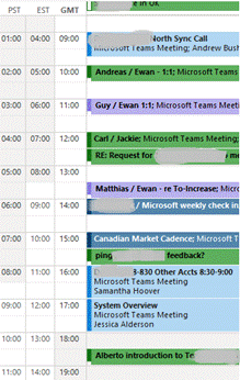
You could start by looking for “Ghost meetings” – those are ones where you’re the organizer, but none of the invited attendees have accepted your invitation. A good example is a 1:1 meeting when the other party is on holiday – they might have declined a meeting but you left it in your calendar.

clip_image004To quickly view Ghost (or maybe Zombie?) meetings in your calendar:

  • Download this ZIP file and open the downloads folder where it is saved.
  • Right-click the ZIP and choose Extract All then right-click the resulting file and Unblock it, so Excel will let you run the macro within (don’t worry, it’s perfectly safe). clip_image006
  • Now open the file in Excel. If asked, tell it you want to edit the file and allow macros to run, then hit the Scan Calendar button. You’ll now get a list of meetings to go and delete, or possibly to nag the invitees to respond.

clip_image008

Another trick is to colour-code your appointments, either by setting categories on them individually or by using rules. This way you could quickly differentiate an appointment (ie something you put in your calendar to block out time) from a meeting (ie an appointment which you invited others, or to which you have been invited).

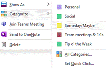
clip_image010Setting a colour category is a quick exercise once you have the categories defined – right-click on an entry in the calendar to pick a category, or you can set it from Categorize option on the Ribbon while creating or editing an appointment or meeting.

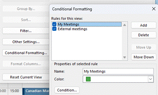
Rules are set by creating instructions that apply to the view you’re using; go to the View menu on the ribbon and choose the View Settings menu item.

This presents a somewhat old-fashioned looking clip_image012dialog box which lets you change the view, including using Conditional Formatting, where you define rules that will mean the select colour applies.

clip_image014

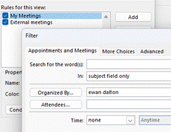
In “My Meetings”, if your name is the organizer, then the meeting shows as green.

Explore the conditions dialog a little and you’ll see all kinds of things you can filter by. It includes a powerful advanced mode that will let you set a condition on any property of the meeting or appointment (so you could have different colours for meetings whose locations were in different buildings etc).

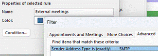
The “External meetings” condition above does require further hoops to be jumped through to get it set up, but it’s a one-and-done exercise. It involves adding a custom form to Outlook, which in turn exposes a new property called “Sender clip_image016Address Type” – if the value is SMTP, that means the message – or calendar meeting request in this case – came from outside, so you’ve been invited to a meeting organized by a 3rd party. The same field could be used to colour code your inbox so as to prioritize emails differently too.

To see how you could use the Sender Address Type to alter how your inbox is displayed, and for the instructions on how to install the form so that field becomes visible to Outlook, crank up the time machine and head back to Tip o’ the Week #275 – Prioritising External Email – Ewan Dalton’s Tip o’ the Week (tipoweek.com). Great Scot!