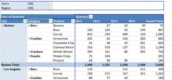
Pivot Tables are a somewhat esoteric spreadsheet feature which everyday Excel users probably shy away from, but for the enlightened can help to turn potentially large tables of raw data into summarised views that can be easily rearranged. Excel makes it easy to take a static table with rows of data arranged into columns that correspond to measures or fields – like sales of a product, or assignments of a relationship such as an export from a CRM system – and then represent the inherent hierarchy in a super-powerful fashion. If you haven’t really used Pivot Tables, the simplest way to get your head around what they can do is to try messing around with some real data, or use some relatively simple sample data to unearth the power within. Free sample data at Contextures is a good place to start – in fact, here’s one sample that has been turned into a Pivot table to get started with (just download it somewhere, open the Zip file and then open the example XLSX file within).
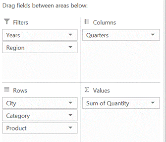
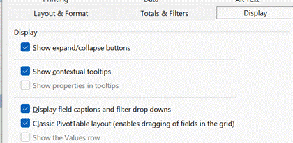
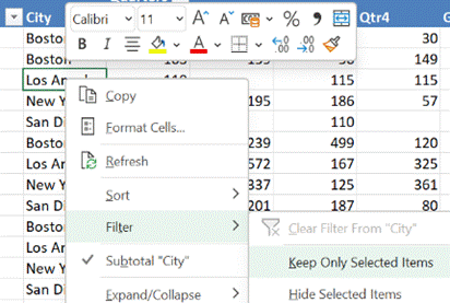
The sample data is sales of foods over a period of time; look at the FoodSales tab to see the raw data. The pivot table quickly lets you summarise by region, or category, or whatever fields are defined. By showing the PivotTable field list (right-click on the table and you’ll see either show or hide field list at the bottom of the menu), you can easily drag things around to change the grouping order. It’s easier to just try it out than to try and explain, though there are plenty of tutorials around – from overviews to walkthrough videos or all kinds of more advanced stuff. And if you end up making a mess of the table, there’s also CTRL+Z to undo… If you’re dealing with lots of fields that would go in the Rows section then you might find it easier to use the Classic layout by right-clicking on the table and choosing Pivot Table options, though you might want to remove the auto-totalling for most of the fields (right-click on a field and choose Subtotal…) otherwise the display gets a bit unwieldy. When handling very large volumes of data, filtering using the drop-downs to the right side of field names is a great way of showing only the specifics you’re interested in, though sometimes it’s easy to forget there’s a filter in force and think that the data you’re working with is not showing the full picture. To reset all the filters back to the start, just go to the Data tab and Clear the filters from there. If you want to filter on a specific value – eg. Let’s say you have a list of customer account names and you want to show only the customers associated to a single account manager (regardless of geography, industry etc), you could click the filter on the account manager field and find the person’s name within. In our foodstuff example, we could have a different layout of fields and want to filter on City – but a quicker way to doing so is to just right-click on the name you want to focus on, and choose Filter > Keep Only Selected Items and it will quickly set the filter to just that name. |
Month: September 2021
596 – Sorry for the eye-chart
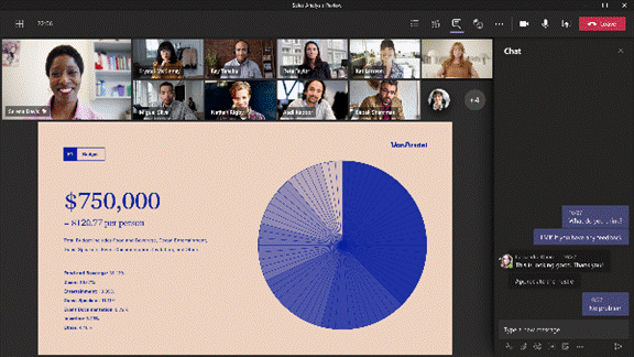
Before The Event, you’ll probably recall being presented at in a stuffy airless room, mainlining caffeine to stave off the postprandial doldrums in attentiveness. “On this slide…”, the presenter might have said, before reading out all the text that’s now being shown on a slightly-too-small screen. Some would apologize for the fact that the chart/table of data/timeline with 6pt text annotations etc, was too small for the audience to read. “I know this is an eye chart, but…” So hurray when all such in-person meetings were banished to Teams or Zoom if you’re lucky, or if you’ve been a horrible person in a previous life, you may have inflicted upon you Webex, Amazon Chime or whatever Google calls Hangouts these days. When presenting in Teams, there are some simple best practices to follow; some have been covered previously in ToW 576, with more online elsewhere. As an attendee, however, the Teams UI can get a bit busy if you want to follow online chat and see other attendees as well as the content being presented. You can make life a bit easier by going full-screen, from the view control in the top left. As well as tweaking the layout, and hiding/showing components like chat or the participant list, you can zoom the Teams client in and out by using CTRL = and CTRL – (or CTRL + / – on your numeric keypad if you have one), or by holding CTRL and moving the mouse wheel up and down, if you have a suitably-equipped rodent connected. This method, however, just makes the Teams UI get bigger and smaller, so although it might increase the size of the pane being used to present content, it is a marginal gain. Enter, a greatly useful tip espoused by Belgian usability maestro, Ingmar Boon – click on the content being shown in a meeting, then use CTRL+mousewheel (or if you have a Surface device and the touchpad is enabled then use the pinch in & out gesture on the touchpad). Teams will now let you zoom in & out and pan around the content being shared. C’est manifique! |