|
 There was a time when visiting a website gave you a 1/10 chance of being offered a user survey, asking why you’re visiting today and how you feel about the company. Presumably, response rates were low enough that such surveys are largely replaced with annoying cookies and tracker software so the company can see what you’re doing without needing to ask you why. There was a time when visiting a website gave you a 1/10 chance of being offered a user survey, asking why you’re visiting today and how you feel about the company. Presumably, response rates were low enough that such surveys are largely replaced with annoying cookies and tracker software so the company can see what you’re doing without needing to ask you why.
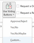
 Surveys in email can be a lot more useful, though, when trying to garner feedback about a particular topic. Outlook has had Voting Buttons since it first appeared in Office 97. They provide a simple way of asking a single question and getting recipients of the email to respond so that the sender can see what the votes cast are. You can take the defaults or add Surveys in email can be a lot more useful, though, when trying to garner feedback about a particular topic. Outlook has had Voting Buttons since it first appeared in Office 97. They provide a simple way of asking a single question and getting recipients of the email to respond so that the sender can see what the votes cast are. You can take the defaults or add  your own custom options, separated by semicolons. your own custom options, separated by semicolons.
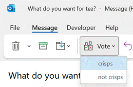
Recipients get prompted in Outlook and can vote with a single click, rather than having to type a response, and the sender can see a Tracking  tab on the message in their Sent Items folder to get the results. tab on the message in their Sent Items folder to get the results.
One downside of voting buttons, though, is that they only work in Outlook – there’s no Web App or mobile support, so it does restrict the usability somewhat. Great news, though – a more modern approach is available; not only does it work using the Outlook mobile apps and the browser but it’s a bit more in-your-face for most Outlook users too, with a simple and quick way of responding.
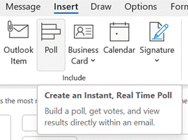
  The Poll feature in Outlook appeared in March 2020 but may have been easy to miss, given all the other stuff that was happening then. It’s accessible from the Insert menu on a new message, or if you look at the bottom of the Use Voting Buttons drop-down menu, it’s been added there too. The Poll feature in Outlook appeared in March 2020 but may have been easy to miss, given all the other stuff that was happening then. It’s accessible from the Insert menu on a new message, or if you look at the bottom of the Use Voting Buttons drop-down menu, it’s been added there too.
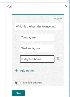
Clicking on the icon gives you a single question with two or more options; it’s powered by Microsoft Forms, but there’s no fancy branching or data validation – it’s a straight “choose one of these short text responses” feature and all the better for it.
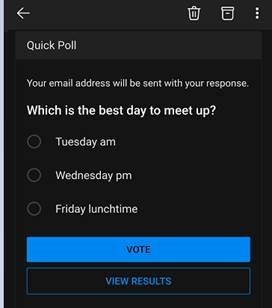
 If using Outlook (desktop or mobile) or OWA, when a recipient in your organization receives an email with a Poll included, it’s shown right at the top and is super simple to reply to. If the recipient is using a mail client that doesn’t understand the Poll, there’s also a link to the web-based version too. If using Outlook (desktop or mobile) or OWA, when a recipient in your organization receives an email with a Poll included, it’s shown right at the top and is super simple to reply to. If the recipient is using a mail client that doesn’t understand the Poll, there’s also a link to the web-based version too.
Since it’s delivered as part of a Microsoft 365 / Office 365 subscription, it’s a little less slick when dealing with users outside of the organization / tenant (the inline previews don’t show up, so outsiders will need to click the link and use the web UI, and will need to type their email address into the response too), so think of it as a friendly and visible way of collecting simple internal votes.
|

