TripAdvisor – an example of the web

I’ve been on holiday for the last 2 weeks. Whilst away (and trying not to think about work), we took a boat trip where 12 people went off on a catamaran for the day, 6 of us from the same hotel. During the chit-chat that goes on in such a scenario, we got to talking about the hotel and how its location was surprisingly good for getting around – and one thing struck me: all 3 couples who stayed at this hotel (it was a Hilton, not normally my 1st choice of a vacation hotel, really) had used www.TripAdvisor.com to select where to stay.


Now for the last couple of years, I’ve used TripAdvisor to research places for holidaying, and it’s always come up trumps… sometimes leading us to hotels or locations that we’d not normally have known about, or giving tips on what to do when we get there. I love the fact that it’s constantly being updated and that you can take or leave some of the more positive and negative comments based on the style of writing and after forming an opinion about how experienced the author really is (eg. if someone thinks everything is brilliant, maybe they don’t have much to compare it with).


There are plenty of web sites I’d use routinely, but there are relatively few that the “general public” might have cottoned onto and not see as a nice (eg. Microsoft Technet isn’t going to be on the radar of your average PC user).


Obviously, news sites like news.bbc.co.uk have a general appeal but they’re straightforward replacements for other sources of news. Sites like Amazon and any number of other shopping sites can replace the physical shopping in a store, and using their reader reviews might give you more context on what to/not to buy. Shopping comparisons like PriceGrabber or PriceRunner help the user find where the cheapest items are, so replace the need to shop around by going from store to store.


TripAdvisor, on the other hand, is like taking traditional holiday guidebooks and turbocharging them. I’ve already started researching the next 2 holidays 🙂


I mentioned a few other travel sites in a previous blog post – all part of the clued-up traveller’s kit bag.

Finally, a sidebar gadget worth having

Oooh, that’s a bit flippant. The whole Vista sidebar thing has kind of passed me by, though it really does make sense on widescreen monitors.

Kitten has nothing but destruction on his little mindI set about looking for a particular gadget today, though – one of my cats managed to knock my home PC over last night (it’s a desktop which I have standing vertically under the desk, propped up on a couple of old plastic floppy disk boxes to allow airflow under).

Following Arnie’s destructive rampage, the PC refused to boot. So I had to drag it out from under the desk, and start pulling it apart to figure out what was wrong. After a process of elimination, I figured that the CPU must be the problem and sure enough, the CPU cooler had come loose. On closer inspection, the CPU itself had been yanked out of position (by the weight of the huge heatsink/fan combo) and managed to mangle numerous of the 478 pins…

… which is never going to be a good thing.

Anyway, I eventually gave up trying to straighten the pins (that’s one way to make you go cross-eyed) and decided to sacrifice the CPU from another PC that happens to be elsewhere in the house. By the time I’d taken *that* one to bits, put the CPU in my main machine, reassembled both and reinstalled the system unit under the desk, I was pretty happy.

Until about 5 minutes in to using the thing, when it abruptly shut itself down and emitted a selection of beeps on restarting… uh oh, sounds like a thermal shutdown where the system throws itself on its own sword rather than bursting into flames.

It turns out the CPU fan cable had got wrapped around the fan itself so the cooling forces were less than optimal (ie none, apart from the heatsink). After fixing that and reassembling/reinstalling the machine, I went looking for SpeedFan, a great little bit of diagnostic software that displays all the temperatures, fan speeds, voltages etc from the numerous internal sensors within the case (if your system supports it).

There’s even a beta SpeedFan gadget, 
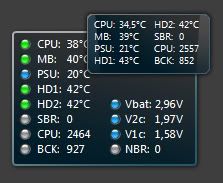
which will report any of the info that Speedfan can grab, right there on the sidebar. Excellent!

More information here.

PS – another tip for Sidebar usage… Windows Key + Space bring it to the fore.

Chris Bangle – an inspiration

I was fortunate enough to listen to Chris Bangle, group chief of design at BMW, talk about design, about his own personal journey to where he is now and what inspires him, when he spoke at Microsoft’s TechReady conference in Seattle earlier this year. Paul Foster wrote a good review of that session, closing with a comment that Chris presented to us (bearing in mind the audience was several thousand technical people):

For generations, man has wondered what dreams are. We’ve had Freud and many others try to define dreaming, but Chris said Microsoft had helped him solve this mystery. Dreams are really just our brains defragmenting over night…

Now Chris is a man who has made quite an impact on car design at BMW, and has legions of fans and detractors in the car industry. His controversial “flame surfacing” design style, which first saw light in the BMW 7-series redesign of a few years ago and has gone to influence every model since, is a great example of the kind of design change which initially many people are resistant to, but get over it in the end and may even look back on it favourably.

When Windows XP came out, a lot of business people complained that it was too glossy and consumer-oriented, and they wanted to swtich off all the nice stuff and make it look like Windows 2000. I haven’t heard too many people say the same about Vista, but the question of whether there is a “classic mode” always comes up with any UI redesign, like the Ribbon in Office 2007.

Listening to Chris talk about the way design evolves, and how sometimes it takes a leap forward, it’s quite possible to draw comparisons with the world of IT, or wider into consumer devices, fashion etc.

I came across a video of Chris talking to car people, at the Autocar Awards 2006, on his thoughts of the cars of tomorrow. Quite a bit of the content he used was also part of his speech to Microsoft people, but what he said and the emphasis on what points he was making, were subtly different. It’s well worth 12 minutes of your time to watch this video – even if you don’t like Chris’s car designs, you can’t deny he’s a smart guy who appears really likeable in person.

Link to video | Link to Autocar TV |

How to really wipe a hard disk

In one of those weird coincidences, someone asked a question to an email DL in MS this morning, about how to securely erase a hard disk (since, as every skoolboy kno, deleting files doesn’t really remove them from the HDD, and even formatting a HDD still leaves residue that could be recovered).

A few suggestions came back:

As it happened, Robin Harris from ZDNet blogged today about some freeware utilities to go over the disk and overwrite every track, even blocks marked as bad, using the “Secure Erase” function that’s built into most ATA disks, but is not typically made accessible by the BIOS. It’s a process that’s not for the faint hearted, but still seems effective (and appears to be good enough for the US National Security Agency).

The best comment I saw in response to the internal mail was the final suggestion, though:

  • Military method – a team with angle grinders destroy the platters + one person to witness that it was done.

I suppose the military really like to do things properly 🙂

The day I met Tony Blair, talked about online healthcare

I am feeling under the weather at the moment.

Been off work for a couple of days with what seems to be some kind of chest infection. I finally decided to stop waiting for it to go away on its own, and went to see the doctor – starting by looking at the website of the surgery, since I’ve moved house in the last year and haven’t had a need to register with the new place yet.

Just as a precaution, I went off to NHS Direct to see what was wrong with me – they have a wizard that asks you about the symptoms you might be experiencing, after you give it a steer. So I thought, “Breathing difficulties in Adults”, yep… then filled out the next set of answers… 

Now my lips aren’t blue (as far as I recall), I can talk OK but now and again do have a bit of a wheeze, so that sounds about right..

YIKES. Anyway, I’m pretty confident I’m not in the midst of a heart attack so I’ll ignore that advice for now.

Having a look around my doctor’s website, though, it turns out they are now offering appointments which can be made online. Now that seems like a great step in the right direction for busy people. It set me thinking about the time when the UK’s Prime Minister, Tony Blair, and his wife & entourage, dropped in to see us in Microsoft UK.


The Blairs visit

This was in the run up to the June 2001 election, and the Labour Party had asked if Tony, Cherie & co could come and see us on the day they launched their business manifesto. Of course, Microsoft said yes, and went ahead arranging an event in our central atrium where we would do a few demos to the PM and Mrs Blair, on some forthcoming technology (Office XP) and some future directions stuff.

I was asked to do one of the demos, and with a colleague concocted a mock-up of a system that might be imlemented some time in the future, but in this case was using a Pocket PC with Wireless LAN (then a PCMCIA card in a Jacket that clipped to the back of a still-shiny Compaq iPaq).

(that’s me at the bottom in case you haven’t guessed)

The demo was a little app which a health visitor might use if doing a home visit to a couple with a new born baby, notices the baby’s a bit off-colour. The app would:

  •  issue a prescription of the appropriate medicine
  • let the parents chose which pharmacists they’d like to have the prescription details sent to automatically (advising back when the prescription would be ready for collection)
  • arranged a date of a follow-up appointment with a doctor at the surgery, based on their availability and the parents’ preference of time.

SIx years ago, this might not have looked like rocket science to IT people but could really change the way healthcare is delivered. Now, it looks like a straightforward thing to do technically, what with advances is size and power of mobile devices which would be 3G connected or similar.

I stepped through the wizard on the device, which was being shown on Plasma screens all round the place, and the deal was that I’d give the device to Mr Blair at the end of the wizard, so he could sign the prescription (as the parent, obviously – at this point, the Blairs had a fairly young baby themselves, so that scenario seemed plausible).

The trouble was, in order for the signature to be visible on screen, I had to remember to tap in a specific place (to set the cursor at the right point, actually) and in the nerves of the situation, forgot – so I handed the PM the device, asked him to sign, which he duly did with a flourish… but nothing came up on the screen. He did look a little bemused (and smiling) while handing the device back, but said nothing … he’s either a total pro, or had literally no idea what was going on… I’ll leave the judgment to yourselves 🙂 I just mumbled something about the signature being secure etc, and moved on quickly…

Anyway, the visit seemd to go well, and the whole demos were broadcast live on Sky News (where the news presenter said, on coming back to the studio after my piece, that he felt sorry for the PM after receiving “an ear bashing like that”!) There was a little negative commentary from the usual places, but otherwise a day to remember – for me at least, if not for the guests of honour!

The Design of Everyday Things

In part 2 of my book post about design (part 1 was earlier this week), I’ll revisit an old title which is still great reading for anyone interested in cognitive theory or design. It was written by Donald Norman, and first published nearly 20 years ago as “The Psychology of Everyday Things“. The author found that bookshops & libraries tended to lump the book in with all the psychology textbooks, so a later edition was re-released under the modified title of the Design of Everyday Things.

The book itself looks at lots of good examples of where a designer has clearly thought about a problem and taken account of it in the design, but the more interesting (to me, at least) cases are where the usability of a system is so totally shot just because the designer didn’t take a simple thing into account.

Examples of the kinds of scenarios that Norman deals with are cookers where the layout of controls for the burners is different to that of the burners themselves (eg the burners are 2 x 2 but the controls are in a line of 4 – very common) or light switches which seemingly bear no resemblance to the layout of the lights they operate. I’ve lived in houses for years, and still kept getting the switches in the hall round the wrong way, so I know where he’s coming from there. In fact, in my house right now, the left hand switch operates the lights at the right side of the room and vice versa – I really must get round to rewiring that switch one day.

My favourite examples in the book are of the humble door, however. Here are some example photos I’ve taken on a camera phone (my new Orange E600, a version of the HTC S620 which Darren recently raved about).

The first 2 pictures are of a fire door in Microsoft UK’s TVP campus; the point about design here is that there are no instructions on the door about what to do. If you walk up to a fire exit door, for example, and it has a horizontal bar across it, you would be drawn to grab it and do something – quite possibly pull on it, but when it doesn’t move up, you’d push, and the door would open.

Similarly, when you walk up to a door which doesn’t have any handles, the only thing you can do is push, so that’s what you’ll do, right? 

To make it a little easier, a good designer would put a plate of some kind on the door, to underline the fact that there isn’t a handle for a reason (ie it hasn’t fallen off or anything).

Conversely, when you see a handle, you’ll instinctively grab it and pull. So a well designed door will have a handle on the side that needs to be pulled, and nothing (or a plate) on the side that’s pushed.  The only other marks on these fire doors are signs saying that the door is to be kept closed. Interestingly, they was part of the original Thames Valley Park campus which opened in 1997.

Now if we move to a newer part of the campus, there are nicer-looking glass doors, but their design is less clear – there are handles on both sides which look swish, but offer no affordance – ie they don’t give the user any clue which way the door is going to open. Maybe you could look out for hinges or the likes, but it’s very common to see people walk up to a door and pull it when they should be pushing.

To try to avoid that confusion, the door company puts a little sign saying “Pull” or “Push” on the door – something that still evades many people’s attention, a bit like The Far Side cartoon of the School for the Gifted.

Here are just two examples…

Even the old part of campus has plenty of glass doors, but they are designed correctly. Evidence:

There is nothing on this door other than the furniture – a piece of design which looks good, doesn’t have anything superfluous, and yet is easier to use than the more fussily “designed” items.

It’s books like DOET which give you a new perspective on the mundane things you’d not normally notice, and as a result, are well worth a good thumb through even if not an exhaustive read.

When interaction design goes bad

For various reasons, I’ve been testing & driving several different cars lately, a process I quite enjoy – getting to know the foibles of the car’s cockpit, playing with the various toys and gadgets, as well as actually learning how to drive each one according to its size, performance etc. It’s really pleasing to find a well thought out design in some bit of car UI (Audi’s MMI system is just sweet), but even more frustrating that some companies can spend $100ms developing a car but overlook some really basic functions which will just make the driver crazy (like the clock which looks very smooth and lovely but has no obvious way of adjusting the time… I’m currently driving around in a loan car which is 1 hour adrift of real time because I haven’t figured out how to move the clock forward to Daylight Saving Time, and haven’t yet gotten around to RTFM).

Thinking about all of this reminded me of two great books which, if you’ve any interest in design at all, I’d highly recommend. I’ll do this review in 2 parts, this one being, as it is, part one.

The Inmates Are Running the Asylum: Why High-tech Products Drive Us Crazy and How to Restore the Sanity

The Inmates Are Running the Asylum: Why High-tech Products Drive Us Crazy and How to Restore the Sanity Alan Cooper

This is a fascinating book which talks about the doom-laden scenario of everything we use being computer controlled (and since the book was written around 10 years ago, shows a fairly decent grasp of the future, some of which has already come to pass), discusses the design of User Interaction, and a model which Cooper has used successfully for a number of years, centred around “Personas”.

Note the use of the term User Interaction as distinct from User Interface (UI)… in this case, we’re talking about the whole way that people interact with a system or device, not just the UI of the software – extending the user interaction model to include only as much information as required, without being stupidly modal (eg the same button doing different things at different times based on what mode a device is in, especially bad when the device doesn’t make it obvious what its mode is).


A great example of good user interaction is the iPod – good UI in software, but it works so much better because the device complements it totally. Bad user interaction design is evident in many remote controls – they have lots of identical buttons with confusing labeling (what *do* all those symbols mean?) and the software they’re controlling on the TV/DVD player etc, is sometimes less than intuitive and not helped at all by having a control that needs the manual to be open in front of the user to make any sense.

There’s one great example of good design that jumped out from reading the book – and that was Cooper’s commission to design an interaction model for a new airline video on demand (AVOD) system. Various attempts were made to get something that could display quite a lot of possible options (since there were many films & TV shows which could be watched at the user’s demand), without having to give any instruction on how to use the thing, even to people who weren’t familiar with what they might expect on modern consumer electronics or computer systems.

After selecting and rejecting various ideas, Cooper settled on a simple UI of a rotary dial positioned directly below and in the centre of the screen, combined with thumbnail views of the film/show. Show someone a rotary dial or knob (suitably designed – maybe one with serrated edges and no obvious way to pull it out) and they’ll instinctively turn it before trying anything else. (This is a topic also covered by the 2nd book in this series: it deals with how a device naturally affords itself to the user – eg if you pick up something with a single, raised button, your first instinct would be to press it rather than try and pull it off – it affords being pressed more than being prised).

If the user turns the dial back and forwards, the list of titles pans that way, and if they turn it more quickly, the list moves quickly. When they find something they want to watch, they press the button. End of user interaction model.

Again, note the distinction between user interaction and UI. As far as the user is concerned, they turn the dial and push it to pick stuff. The UI can later deal with minutae like what to do if the user selects something by mistake… how do they go back? How do they control the volume or screen brightness etc? Maybe other buttons or controls might be required for that… unless they got into some modal system where the dial would control volume… but that could just confuse things more than adding an extra button or two.

Alan also introduces Personas as a key way of focusing designers and developers on how to address the specific needs of a specific type of user; rather than being generic (“the users”, or even saying retired people, or young mothers, or teenagers or tech-savvy twentysomething males, is still vague), the concept means they actually embody a persona with characteristics as if it’s someone they really talked to – here’s John, he works in a small business IT provider, so he knows a good bit about technology but lacks the time to do lots of reading about how to implement it, etc etc.

The Exchange development group in Microsoft was one of the no-doubt many who have adopted personas when it comes to designing software – so the needs of a whole group of disparate people can be met, hopefully, by using more holistic design processes, than simply concentrating on making it look and function well to the people who’re doing the designing.

More info on Alan Cooper’s personas

Adjunct: There’s an amusing article courtesy of SAP, on Golden Rules for Bad User Interfaces – if you’re going to sit down and design a really bad UI, follow these rules and you won’t go wrong…

Hosting of applications – the inevitable future?

I’ve been musing over some medium term IT trends lately and one idea that keeps coming back into frame is the seemingly inevitable trend towards hosting of applications. Take Exchange, as just one example…

Hosted Exchange* has been available for years, from lots of different providers all around the world. The basic concept is that instead of buying the software, you just buy the service from a hosting company much like you buy line rental on your phone, or internet access from your ISP. Why not just have your company’s email sitting somewhere else, and save yourself the hassle of managing it?

*Hosted Exchange is not to be confused with the somewhat confusingly named Exchange Hosted Services, which is all about hosting the route to get mail into and out of your own email environment. EHS was formed by the procurement of Frontbridge, who had established a good name in hosted filtering… ie the MX record of your domain actually delivers mail to their datacentre, they scan it for spam and viruses, and the remaining “hygienic” mail is delivered down to you.

So what’s stopped everyone from adopting Hosted Exchange before? I suppose the cost is one thing – if you had 500 users and it cost, say, £10 a month to provide each of them with a mailbox, you’d be seeing £5k going out the door every month, and might think “surely I can provide the same service, in house, for less than £60k a year?”, and you might well be right. But start to dig into the detail, and it could be a lot closer… Think about buying:

  • the hardware (maybe £10k worth of servers, and any amount of money could be spent on storage, but let’s assume £15k),
  • the software (at full price, this could work out at something in the order of £30k for that kind of user population)
  • additional software, like anti-virus, anti-spam (if you didn’t want to just use what’s in the box in the shape of the IMF etc), backup software, archiving systems etc etc

… and then add in the time and expertise required to set it up and keep it healthy long-term, then maybe it is less expensive to do it all in house. But by hosting the application, you could free the time to do other stuff, or just have one less thing to worry about… especially in times when security threats can sap administrator time, and compliance requirements could mean lots more red tape and requirements for recoverability, let alone high availability.

I’ve seen various analyst reports which reckon that 70% of an average IT budget is spent just maintaining the status quo and keeping existing systems running.

As connectivity gets better and better, it seems almost inevitable that a “normal” Exchange deployment in a few years will actually be hosted by someone else. Of course, there are several models which could be adopted:

  • Hosting company just operates your own servers/software for you. I’ve seen this lots of times already, in the shape of IT outsourcing where the “hoster” is just a drop in replacement for an in house IT operation, and maybe even takes servers that were previously operated in house and moves them to their own datacentre for ongoing management
  • Hosting company provides your servers for you. This is a little less common, but growing – namely, the hoster has their own kit but they dedicate a given server/bank of servers just to you.
  • Hosting company just provides “service”. In other words, you get a mailbox of a given size, but don’t need to care how it’s provisioned. This is going to be more appealing to smaller businesses, maybe.

So what else? Sharepoint? Yep, you can do that too, as part of the snappily-titled Microsoft Solution for Hosted Messaging & Collaboration v4.0.

And what about after that? I could see the day when some companies want IT as a turnkey service just like they look at other utilities – you buy the bit of cable and down that comes whatever services you’re subscribed to, and you can add and remove services at will, just like you can with satellite or cable TV.

Want your phone system to be hosted and connected to by the same bunch of ethernet cables? No problem. Intranet applications and portals? Sure… I wonder where it’ll all end? Hosted desktops?

Free domain name, web site + email address with Office Live Basics beta

I got given a card yesterday proclaiming an offer of free domain name, web site and email service, all hosted by Office Live Basics, which is in beta at www.officelive.co.uk:


Sounded too good to be true, but literally minutes later I was logging in to my own Windows Live Hotmail-based email account and was able to start designing my own little web site. 24 Hours later, once DNS had all settled down, it’s public facing…


How cool is that?

Water, Water everywhere, nor any drop to drink

So it’s been a quiet week on The Electric Wand, largely because of the fact that I woke up the other day and looked out of the front of my house to see…

leaving the entire downstairs floor soaked in water, and the footwells of one of the cars with a nice puddle too 🙁

Bizarrely, 24 hours later, the view over the fence was…

and practically ALL the water had drained away. Now it’s time to stop thinking about technology, and start shopping for new carpets…