|
 The word “accessibility” has been used for decades as a catch-all for how people of differing abilities can interact with their surroundings, and often applies to technology which can help to overcome barriers. It’s very easy to go about your day with no thought to how others could be affected by things that you don’t even notice, whether as a result of actions you do or just objects you encounter. Design plays a big part in helping people who have disabilities or who may find certain things more difficult, and good design means that assistive technology does not get in the way of anyone who doesn’t need it. The word “accessibility” has been used for decades as a catch-all for how people of differing abilities can interact with their surroundings, and often applies to technology which can help to overcome barriers. It’s very easy to go about your day with no thought to how others could be affected by things that you don’t even notice, whether as a result of actions you do or just objects you encounter. Design plays a big part in helping people who have disabilities or who may find certain things more difficult, and good design means that assistive technology does not get in the way of anyone who doesn’t need it.
These technologies often spawn wider usage in unforeseen ways, and in many cases are developed not for goals of making a fortune or having global influence, but to help a particular individual:
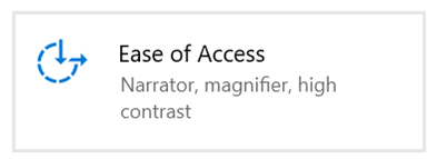
Microsoft has a long history in pushing accessibility technology – Windows 95 was the first  operating system to ship with accessibility options built in, and has developed a variety of tools and platform services aimed at developers. Windows 10 has many built-in options, grouped mainly under the Settings | Ease of Access applet. operating system to ship with accessibility options built in, and has developed a variety of tools and platform services aimed at developers. Windows 10 has many built-in options, grouped mainly under the Settings | Ease of Access applet.
You can jump straight to many of the settings applets by running ms-settings:easeofaccess-keyboard or ms-settings:easeofaccess-speechrecognition and so on.
 If you don’t need to use assistive technology yourself, it’s good practice to think about how your work might impact people who do – and there’s a tool built into Office applications which will give you tips to make sure your document or email is suitable for users with accessible needs, such as having the contents read out by the machine, or making sure there’s adequate contrast in text colours, for improved reading ease. If you don’t need to use assistive technology yourself, it’s good practice to think about how your work might impact people who do – and there’s a tool built into Office applications which will give you tips to make sure your document or email is suitable for users with accessible needs, such as having the contents read out by the machine, or making sure there’s adequate contrast in text colours, for improved reading ease.
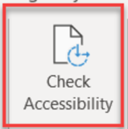
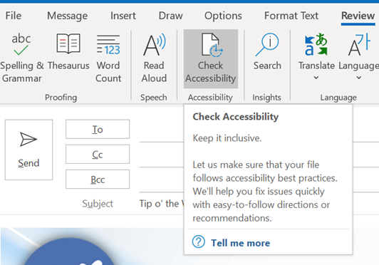
The Check Accessibility option on the Review tab in Office apps like Word and Outlook, should be run just as you’d check the spelling of a document when you think it’s finished. The tool will give you a series of recommendations with guidance as to why it may be better to change aspects of the document. Not every one will be viable – you may want to have images in a particular place on the page, for example, rather than just in-line with text – but many are quick to correct.
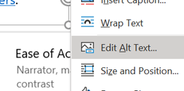
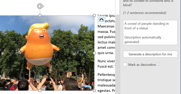
 If you’ve inserted graphics or charts, for example, then it’s worth adding “Alt Text” to describe what it is, so screen-reading software can read your description of what it is. Right-click on your image to add the text, or have the PC generate a description for you – sometimes with amusing results… If you’ve inserted graphics or charts, for example, then it’s worth adding “Alt Text” to describe what it is, so screen-reading software can read your description of what it is. Right-click on your image to add the text, or have the PC generate a description for you – sometimes with amusing results…
 Thanks to Jon Morris for providing feedback on ToW #554, about email signatures – Jon rightly points out that many of us have tiny logos (Twitter, LinkedIn etc) or other icons in our email .sig, but don’t have Alt Text on them. Thanks to Jon Morris for providing feedback on ToW #554, about email signatures – Jon rightly points out that many of us have tiny logos (Twitter, LinkedIn etc) or other icons in our email .sig, but don’t have Alt Text on them.
One call to action would be update your own sig to add Alt Text, or to mark the images as decorative so screen reader software ignores them.
For more tips on how to write documents which are more accessible, see guidance from Microsoft or from the University of Washington. Some resources for developers or web page designers from the UK Gov, with plenty of links to other sources – Testing for accessibility – Service Manual – GOV.UK (www.gov.uk).
|
